2025-05-05 08:32:04
One of the beautiful privileges of living in a city like New York is that you can just go for a stroll around town and encounter pieces of art that could plausibly belong in museums. My favorite such area of the city is the Rockefeller Plaza.
Imagine yourself as the son of John D. Rockefeller in 1930, one of the most capitalist capitalists to ever have been capitalized. The economy is tumbling into a recession and then a depression, jeopardizing your plan for a new metropolitan opera house — how European of the Rockefellers, an American success story! — by throwing the Met Opera’s own economics into disarray.
Millions deep into the financing of the project, Rockefeller Jr. digs his heels into the ground and pivots the plans for the opera into a home for new, rapidly rising American media industries like radio and broadcast TV — RCA, NBC, Associated Press, and others, many of which are corporate tenants to this day.
Commemorating this shift is the namesake of the reframed megaproject: not an opera house, but “Radio City”.
There are so many cultural and historical undertones in even the blurriest retelling of this story that I always struggle to find a place to begin. For one, the narrative poetry of pivoting from a retrospective story of preservation and continuation of the Met Opera to a progressive story about the increasingly entwined fates of technology and media! For another, the marriage of the rewards of unbridled capitalism, the circumstances of economic ruin, a sense of legacy and civic duty, an affinity for the arts and media. The choice to commemorate prominent corners of the plaza with veritable works of art rather than nameless corporate sculptures or fountains.
Woven into all of these stories is the reason I turn to Radio City so often these days — it’s emblematic of a strikingly optimistic, progressive, humanist perspective on technology and its collision with culture. A perspective that’s increasingly difficult for me to find in modern-day San Francisco.
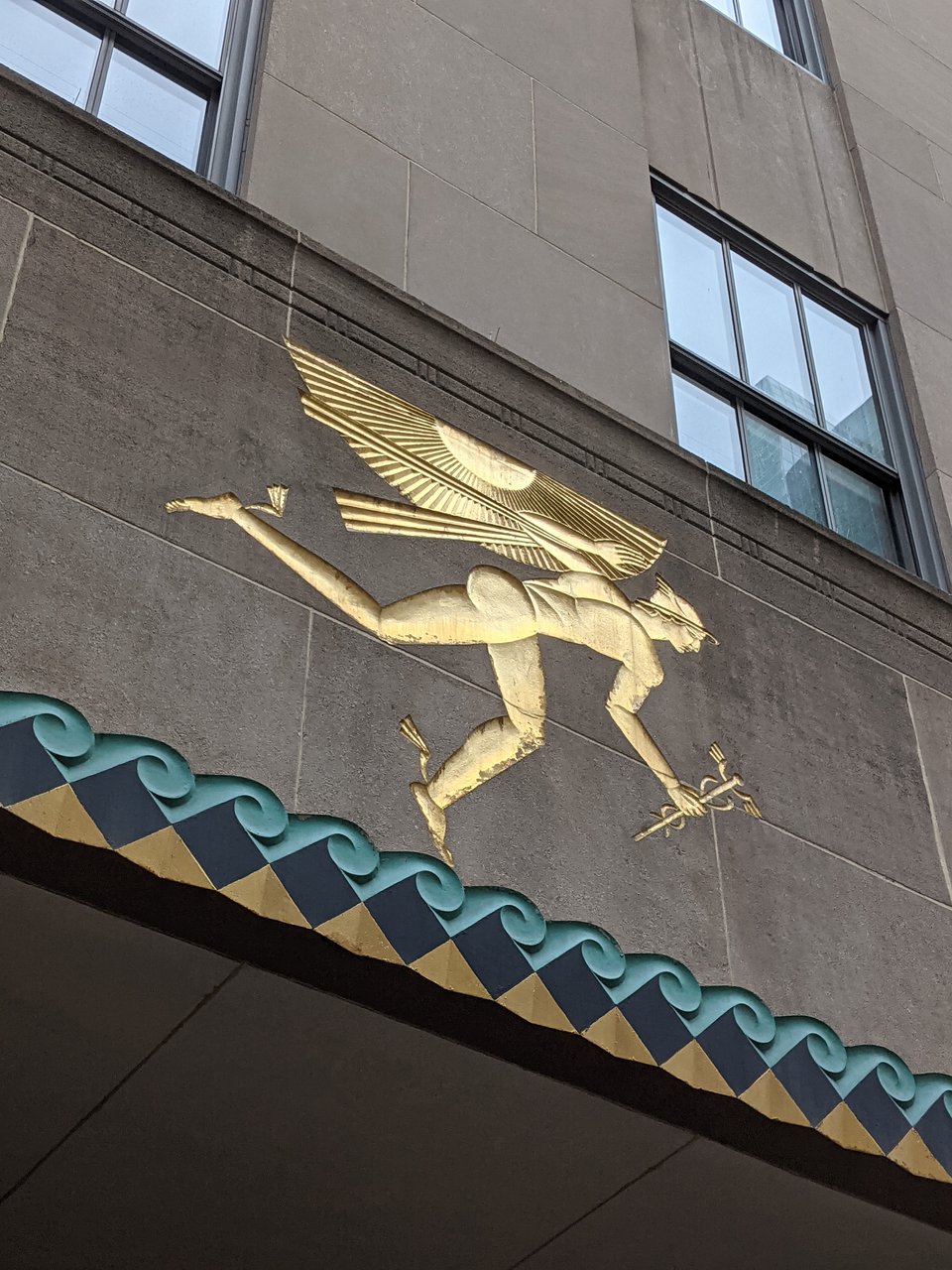
Radio City’s construction, murals, and sculptures commonly draw on the Art Deco period style, which you can identify by a blend of “old civilization” motifs like “2D” geometric character silhouettes, mixed with “jet age” elements like streamlined rays, smooth curves, and contemporary industrial elements like steel and aluminum. The resulting visuals often create the impression that you’re walking among ancient temples built in an alternate world where the Egyptians or Babylonians were also flying powered aircraft and transmitting stories over the radio.
This combination of ancient and industrial motifs also means that technology figures prominently in all the artwork, but always in relation to humans. You can see this really clearly in “News” in the Associated Press building by Isamu Noguchi:
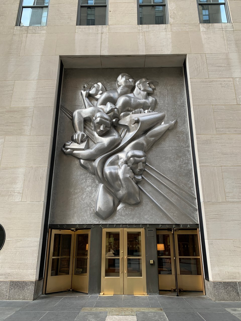
A telephone, a typewriter, a camera. But the subject of the sculpture isn’t any of these individual products or technologies. It’s the employment of these technologies by humans to create new things, to report and distribute stories about the world. The story is a story about technology, but here, technology is fundamentally a human endeavor. It is humans who give technology meaning and direction, and humans’ directed use of technology which Radio City celebrates. This humanist perspective on technology is simultaneously irreverent, principled, and agency-asserting.
We find the same humanist-industrial motif throughout the plaza buildings. For example in the mural “American Progress” welcoming visitors to 30 Rockefeller from over the grand lobby, technological and industrial progress figures as a kind of intrinsic good, a virtue to be celebrated in the cathedral that is the monumental skyscraper standing at the heart of New York City.
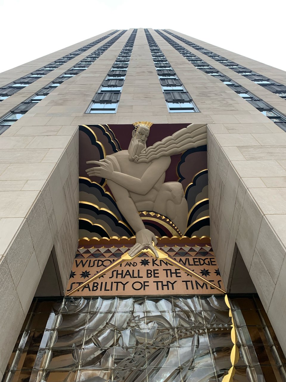
My favorite work among the complex, though, is a bit more proverbial. A relief of a divine entity wielding a compass, mounted over the entryway of 30 Rock, the work titled “Wisdom” borrows a Biblical passage:
Wisdom and knowledge shall be the stability of thy times.
In the original context, the phrase then continues in an appeal to divine judgment:
… and strength of salvation: the fear of the Lord is his treasure.
The relief at Rockefeller, taking only the first part as its own, shows a Promethean “Wisdom” reclaiming wisdom and knowledge — arguably even technology and progress, in context of the Plaza — as human pursuits. At a time of economic strife, it’s a secular prayer to human capacity for reason, knowledge, and technology to lift society out of its struggles.
Once again, technology does not march along by itself, leaving lowly humans to be merely dragged along as it reshapes society generation over generation. Technology writ large is a tool for humans to wield in pursuit of flourishing and prosperity. It is not technology that subjugates Wisdom, but rather Wisdom himself that dominates over the plaza, wielding knowledge and technology as his instruments of agency.
I yearn to see this more irreverent and humanist relationship to technology imagined more often today, when both technology and the industry backing its progress feel increasingly detached from culture and media and the humanities. I dream of a humanist revival with computing systems at the center, grasped firmly in the hands of Wisdom.
A modern Radio City.
2025-04-13 02:44:23
I will never forget the first time I watched Soul.
It was not the haunting soundtrack from the Reznor and Ross duo nor the whirlwind storyline that glued my eyes to the makeshift projector wall I had fashioned last minute out of my window curtains but this:
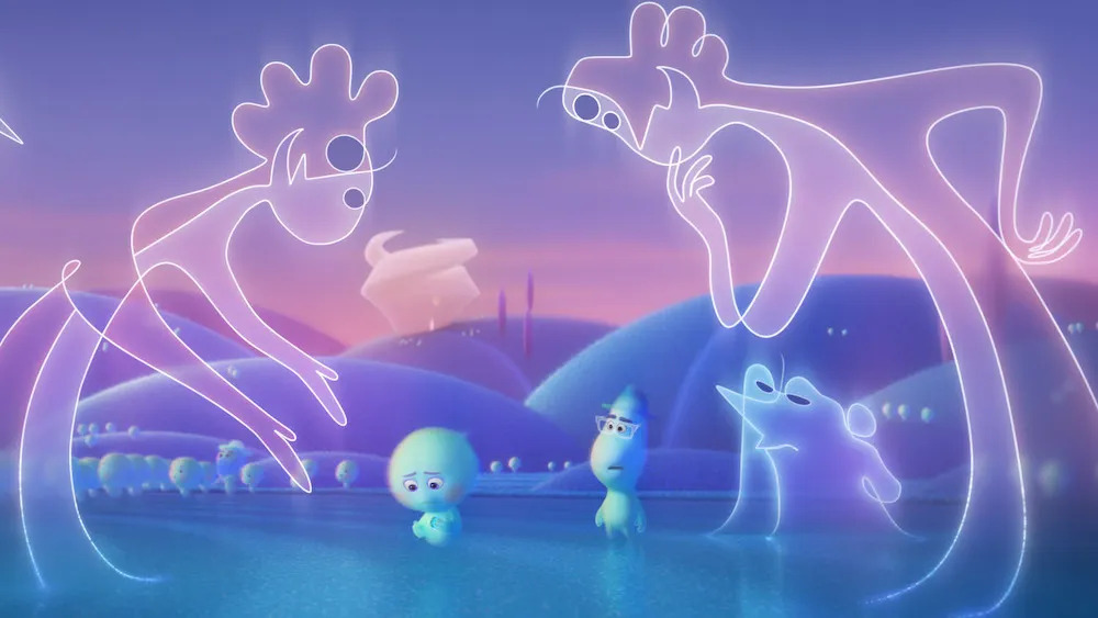
I mean–
How do you, as an ordinary mind walking around the physical world, surrounded at every turn with mundane, opaque objects fastened to the banal constraints of our three dimensions and material world–
How does one even begin to imagine this visual? This form?
I found myself sinking into the beauty and novelty of these figures, not quite one-dimensional line drawings and not quite two-dimensional ghosts. I talked about it to many friends. It was as if I had tripped and fallen into a completely new possibility of form. A way of being a shape and taking up space so hidden in between the density of familiar shapes that I didn’t even realize there was newness to excavate.
In anther fictional universe the protagonists of Greg Egan’s Luminous burrow into the cracks of a much different space of possibilities. Digging around (figuratively speaking, with their optically-operated supercomputer) in the space of possible mathematical statements the find bubbles of self-contradiction, a kind of fissure of falsehoods in the otherwise dense and uniform space of mathematical truths self-evidently derived from fundamental axioms, where “two and two make five.”
As the supercomputer churns through giga-proofs every second, Egan describes a computer display visualizing a visual map of the space of all mathematical statements, and a region of the map blossoming outwards, claiming dark patches of knowledge as self-consistent with the fundamental axioms of mathematics.
 |
 |
 |
I have long been drawn to physical depictions of spaces of knowledge. My favorite work of Egan, Diaspora, contains my favorite instance of this, the “truth mines” where sentient beings labor in a computer-simulated underground cave network chipping away to discover new mathematical insight.
Yatima, whom the reader is following through this passage, observes
A single tunnel led into the cavern, providing a link to the necessary prior concepts, and half a dozen tunnels led out, slanting gently “down” into the bedrock, pursuing various implications of the definition. Suppose T is a topological space…then what follows? These routes were paved with small gemstones, each one broadcasting an intermediate result on the way to a theorem.
Yatima observes quickly that this exercise of intellectual exploration could be delegated to efficient computer programs, a crowd of exponentially numerous “moles” to search the caverns for useful truths. To which Radiya, their guide, explains
If we were insane enough, we could try turning the whole planet – or the whole galaxy – into some kind of machine able to exert the necessary brute computational force…but even then, I doubt we’d reach Fermat’s Last Theorem before the end of the universe.
Instead, the miners chip away at the border between the well-known and unknown only at the speed at which their mind can grasp and map the space of known mathematics, their mental models learning and adapting in real-time rather than simply brute-forced by a machine then grafted onto their worldview.
Whether mathematics could be mechanized in this way or not, this vision of the space of knowledge as a concrete world through which I could explore and map captured me for many years thereafter.
In these visions I fell in love with the idea that there was some quality other than truthiness that ought to guide our search for knowing more about the universe and about living. This ineffable quality I’ve come to call by many names. Among them are words like novelty, surprise, and wonder.
 |
 |
 |
Wonder is what guides my search for meaningful problems to work on. Is what appears in the problem description all there is? Or is there something surprising or new to be learned? Will I emerge from this particular branch of the truth mines with a map that’s not just bigger, but somehow feels more satisfying and more fundamental?
At the start of the year, I spent many hours listening to talks and reading about different areas of modern pure mathematics, primarily number theory and topology. As a lay observer, I found both of these branches of math to feel like a process of unraveling cosmic structures out of some incredibly high dimensional ball of yarn.
Number theory begins with one of the most basic objects in all sciences, the integers. Then, by stacking thin layers of complexity on top of each other like addition and multiplication, the primes, and various kinds of infinities, number theorists are able to back out a stunningly rich map of statements about sets of numbers with different properties and how they might relate to each other in completely unexpected ways. The most famous among them is the Riemann zeta function, a simple-looking infinite sum of fractions that turns out to have surprising implications in something completely unrelated: precisely how “dense packed” the prime numbers are as we count up towards infinity.
What I find most compelling about this kind of domain of study is that there appears to be an infinite capacity for wonder and surprise – infinite capacity for holding the unknown but satisfying – in a space defined from a set of axioms you could count on one hand.
Closer to my home field, there are aspects of software and computing that feel similarly rich in wonder, like the concept of superposition in mechanistic descriptions of deep learning models or computational complexity or compiler optimizations. In each of these spaces there appears to be an unbounded capacity for discovering some new knowledge seemingly manufactured out of nothing but mere exploration.
I spent nearly the last decade of my working life driven by a kind of obsession over things I create that compelled me to sprint at every opportunity to the end of the next lap. To solve the next logical follow-up research question. To fix the next bug. To write the next essay. This certainly got me pretty far with a lot of creative exhaust produced along the way, but I much prefer my more recent way of working, where I try to spend as much of my time every week as I can manage on being pulled into problems by virtue of their capacity to contain wonder and compel my curiosity, rather than being thrust into them by my inability to leave ideas unfinished.
 |
 |
 |
This same capacity for wonder is also what I have come to search for in people, sometimes even against other more concrete qualities like raw intelligence or accomplishment. I find myself most fulfilled when I am around people who are in pursuit of wonder, and inspire it in myself.
If wonder manifests as a kind of capacity for infinities in the domain of problems, in the domain of people I observe wonder as a kind of life force propelling people through their days. A twinkle in someone’s eyes when they begin to talk about something.
It’s not quite curiosity, which I view as more innate to humanity, but rather an innate ability to be drawn by curiosity about the right kinds of things. A taste in subjects of curiosity, perhaps.
I find that even in brief conversations of a few minutes, I can tell whether someone is propelled through the world by wonder or by something darker like self-uncertainty or more blind desire to win. There isn’t anything necessarily wrong with other more exogenous motivators for great work, like obsession or social pressure or a desire to be the best. But those remind me of the more “brute force” approach to scavenging the truth mines for knowledge, which misses what I feel is the point of learning and creating.
In many of my favorite people the wonder spills out of them effortlessly. A slight conversational tug on the mention of a book they read last week or a film they’d like to watch compels forth a whole cinematic universe of related questions, idle ponderings, shower thoughts, deep curiosities behind their lifework.
 |
 |
 |
I’ve also spent a lot of my life thinking about a virtue that I consider the perfect foil of wonder – productivity. Pursuit of bare productivity often manifests as an extractive endeavor: how can we take something we are doing today, and make it more efficient, more scalable, more predictable? Productivity is about the industrialization of creation. Wonder, in contrast, defies systematization because it gets its power from uncertainty and surprise by nature. You can’t optimize wonder, because to optimize requires knowing the output and the process. Wonder is the discovery of new outputs and new ways of getting there.
Within my corner of the world of knowledge tools and artificial intelligence the dominant narrative seems to be about the promise of these technologies in the game of productivity and industrialization. People are eager to reduce, make more affordable, and produce more. I am sure all that will happen, but I think this ignores the fact that the most interesting ways in which civilization advances is through discovery guided by wonder. There are totally new kinds of ideas and aesthetics and ways of spending our time that are beyond the frontier of our understanding. Every time I see yet another attempt at forecasting economic productivity improvements from technological progress I feel that they are methodologically bound to only measure changes to the world as we conceive of it today.
Like the computations of the Luminous supercomputer propelling the frontier of mathematical theorems forward in the space of facts, I dream of tools that can illuminate new understandings of what it means to be born into this universe and spend time within it.
 |
 |
 |
On the front page of my website, at least at time of writing, is the first paragraph is a personal mission statement I’ve grown fond of through the last few years. It ends with:
I prototype software interfaces that help us become clearer thinkers and more prolific dreamers.
The former, “clearer thinkers” is intuitive and obvious. I’ve worked on many projects trying to help people learn faster or come to more informed conclusions about the world. The latter I’ve spoken less about due to its ambiguity, but I feel I’ve found a way to capture it that does the delicate construction of the phrase justice.
Capacity for wonder – tasteful curiosity that opens up rich new universes of wisdom – is the most fulfilling and productive renewable resource I know of in the world. I want to surround myself and fill my life with engines of wonder, whether people or problems. And I want to work towards a world where wonder is as worthy and celebrated a pursuit as creativity or productivity.
 |
 |
 |
I want to wander through this world in awe of the beautiful unimaginable symmetry and complexity within it.
Lost to wonder.
2024-09-11 21:35:25
I’ve joined Thrive Capital as an EIR and advisor, working with the Thrive team to support our founders in understanding and deploying AI thoughtfully, while furthering my own research and explorations around AI interpretability, knowledge representations, and interface design.
August was my last month as a part of Notion’s AI engineering team.
It’s been a privilege at Notion to get to work with a world-class team at the frontier of applied LLM products. Notion was one of the first companies to preview an LLM product, even before ChatGPT. I’m grateful to have been a part of the many ways the team has grown in the last almost-two years, across product launches, generational leaps in models, and many orders of magnitude of scale. We learned alongside the rest of the industry about prompt programming, retrieval, agents, evals, and how people are using AI day-to-day in their schools, companies, meetings, and life.
Notion’s “AI team” is really a team-of-teams spanning product, design, engineering, partnerships, finance, marketing, sales, and growth across the company. With all the talented Notinos that have joined since my first days, Notion’s AI team is poised to build and share a lot of beautiful, useful products in the next months, I have no doubt.
As Notion brings all the ideas we’ve explored (and more) to the world, I’ve been feeling an urge to (1) take a step back and understand how the broader world is adapting to this new technology, and (2) spend much more time on my research agendas around interpretability and interfaces.
After a brief break, I joined Thrive earlier this month.
As I’ve gotten to know the Thrive team over the last couple years, I’ve been consistently impressed with the thoughtfulness, depth of partnership with founders, and clarity of conviction behind investments across stages and industries. They’ve generously granted me an ambitious remit to pursue both of my goals as a part of the team, and based on my first week I’ve got a lot to be excited about on both fronts.
I hope to share what I learn and build along the way, as I always have.
2024-08-08 13:18:20
It’s not easy, but with a lifetime of dedication to the craft, many people become virtuoso guitar players. They learn the intricate nuances and details of the instrument and attain a level of mastery over it as if it were an extension of their mind. Some of the best instrumentalists even transcend traditional techniques of guitar performance and find their own ways of creating music with the instrument, like using it as a percussion voice. Alex Misko’s music is a beautiful example of virtuosity and novel techniques on the acoustic guitar.
No amount of such dedication can make you a virtuoso at Guitar Hero. Though also an instrument of sorts, Guitar Hero does not admit itself to virtuosity. At the cost of a lower barrier to entry, its ceiling of mastery and nuanced expression is capped. Its guardrails also prevent open-ended use. There is only one way to create music with Guitar Hero — exactly the way the authors of the video game intended.
I think great creative tools are more like the acoustic guitar than Guitar Hero. They:
Creative tools like Logic, Photoshop, or even the venerable paintbrush can be mastered. In these creative tools, artists can deftly close the gap between an image in their mind and the work they produce while worrying less about the constraints that the tool imposes on their expression. And where there are constraints, they are free to think beyond the tool’s designed purpose.
Both capacity for virtuosity and open-endedness contribute to an artist’s ability to use a medium to communicate what can’t be communicated in any other way. The converse is also true; if a creative instrument has a low ceiling for mastery and can only ever be used in one intended way, the operator can only use it to say what’s already been said.
Every established artistic practice and creative medium, whether acoustic instruments, digital illustrations, photography, or even programming, has standards of virtuoso-level mastery. The communities behind them all intimately know the huge gap that spans being able to just barely use it and being a master creative. Virtuosos attain their level of intimacy with their mediums from extensive experience and a substantial portfolio that often takes a lifetime to build up.
When new creative mediums appear, it’s never immediately obvious what virtuoso-level performance with that medium looks like. It takes time for virtuosity to take form, because several things have to happen concurrently to open up the gap between novices and virtuosos.
These changes happen in lockstep with each other: as tools improve, people must refine their sense for telling the bad from the good, and as the standard of mastery diverges from previous artistic medium’s standards, a new community of practice forms, slowly, over time. As a new community forms around the new medium, there is more space for its practitioners to develop their own sense of mastery and refine their toolset.
Electronics, software, and computing have all birthed their own communities of artistic practice through this process. I’m reminded of computational artists like Zach Lieberman. I have no doubt AI models will lead to another schism, another inception of a new legitimate creative community of practice with its own standard of virtuoso performance, cornucopia of tools, and unique set of values. AI models will become a creative medium as rich and culturally significant as animation and photography.
But we are clearly at the very beginning:
Popular culture still judges AI artwork by the standards of traditional digital art rather than a new set of values.
Creative tools today use AI to cheaply emulate or automate existing artistic techniques rather than embracing AI as its own kind of creative material. AI, like every other creative medium (photography, animated film, electronic music) has its own texture that I think practitioners will come to embrace. Artists like Helena Sarin have long demonstrated it. Today’s tools are built for the old world rather than the new.
Today’s tools for AI art also tend to have an extremely low ceiling for mastery. Many commercial tools meant to be accessible, like DALL-E, are so basic and guardrailed in its interface that it’s difficult to imagine any person become a virtuoso (there’s a ceiling to how complex prompts can be), let alone find a novel way to use the tool in a way its creator didn’t expect. This is why many artists I know are gravitating toward more complex, open-ended tools like ComfyUI, and perhaps soon Flora. Tools built first on prompting, like Midjourney, have also expanded their feature set over time to allow for other more nuanced forms of expression.
The AI creative tools of today are still mostly designed as augmentations for existing communities of practice like digital illustrators, photographers, or animators. There are pockets of nascent scenes emerging specifically around using AI as a creative medium, but in my view, we are barely on day one.
Over time, I think we will see creative tools built natively around AI separate itself from tools for augmenting existing mediums in applications like Photoshop. We’ll witness virtuoso levels of performance for expressing new ideas through this new medium, as difficult as it is for us to imagine now what such mastery might look like. We’ll see artists use neural networks and data in ways they were never meant to be used. Through it all, our capacity for creation can only expand.
I feel lucky to be present for the birth of a new medium.
Thanks to Weber Wong and Avery Klemmer for helpful discussions that sparked many ideas in this post.
2024-08-03 14:29:24
When I discuss interfaces on this blog, I’m most often referring to software interfaces: intermediating mechanisms from our human intentions to computers and the knowledge within them. But the concept of a human interface extends far before it and beyond it. I’ve been trying to build myself a coherent mental framework for how to think about human interfaces to knowledge and tools in general, even beyond computers.
This is the second of a pair of pieces on this topic. The other is Instrumental interfaces, engaged interfaces.
What makes a user interface good?
What are the qualities we want in something that mediates our relationship to our knowledge and tools?
When I visited Berlin earlier this year for a small conference on AI and interfaces, I spent my last free night in the city wandering and pondering whether there could be a general answer to this expansive question. My focus — both then and now — is on engaged interfaces, interfaces people use to deeply understand or explore some creative medium or knowledge domain, rather than to complete a specific well-defined task. (In this post, when I write interface, I specific mean this type.) The question of what makes an interface compelling is particularly interesting for this type because, as I noted in the other post in this series, inventing good primitives for engaged interfaces demands broad, open-ended exploration. I was hopeful that foundational principles could guide our exploration process and make our search more efficient.
I returned home from that trip with a hazy sense of those principles, which have since become more crisp through many conversations, research, and experiments.
What makes a good human interface?
A good engaged interface lets us do two things. It lets us
see information clearly from the right perspectives, and
express our intent as naturally and precisely as we desire.
To see and to express. This is what all great engaged interfaces — creative and exploratory tools — are about.
A good engaged interface makes visible what is latent. In that way, they are like great maps. Good interfaces and maps enable us to more effectively explore some domain of information by visualizing and letting us see the right slices of a more complex, underlying reality.
Data visualizations and notations, the backbone of many kinds of graphical interfaces, are maps for seeing better. Primitives like charts, canvases, (reverse-)chronological timelines, calendars, are all based on taking some meaningful dimension of information, like time or importance, and mapping it onto some space.
If we take some liberties with the definition of a data visualization, we can consider interface patterns like the “timeline” in an audio or video editing app. In fact, the more capable a video editing tool, the greater variety of maps that tool offers users, enabling them to see different dimensions of the underlying project. An experienced video editor doesn’t just work with video clips on a timeline, but also has a “scope” for visualizing the distribution of color in a frame, color histograms and curves for higher-level tuning, audio waveforms, and even complex filtered and categorized views for navigating their vast library of source footage. These are all maps for seeing information clearly from diverse perspectives.
Straying even further, a table of contents is also a kind of data visualization, a map of a longer document that helps the reader see its structure at a glance. A zoomed-out thumbnail grid of a long paged document is yet another map in disguise, where the reader can see a different more scannable perspective on the underlying information.
Even when there isn’t an explicit construction of space in the interface, there is often a hidden metaphor gesturing at one. When we open a folder in a file browser, for example, we imagine hierarchies of folders above and below to which we can navigate. In a web browser, we imagine pages of history coming before and after the current page. When editing a document, the undo/redo “stack” gestures at a hidden chronological list of edits. Sometimes, these hidden metaphors are worth reifying into concrete visuals, like a list of changes in a file history view or a file tree in the sidebar of a code editor. But over time these inherently cartographic metaphors get collapsed into our imagination as we become more adept at seeing them in our minds.
Once we’ve seen what is in front of us, we need to act on that understanding. Often that comes in the form of manipulating the thing being visualized — the thing we see in the interface. A good engaged interface also helps us here by transparently translating natural human interactions into precise intents in the domain of the tool.
Simple applications accomplish this by letting the user directly manipulate the element of interest. Consider the way map applications allow the user to explore places by dragging and zooming with natural gestures, or how the modern WIMP desktop interface lets users directly arrange windows that logically correspond to applications. When possible, directly manipulating the underlying information or objects of concern, the domain objects, minimizes cognitive load and learning curve.
Sometimes, tools can give users much more capability by inventing a new abstraction. Such an abstraction represents latent aspects of a domain object that couldn’t be individually manipulated before. In one type of implementation, a new abstraction shows individual attributes of some underlying object that can now be manipulated independently. We often see this in creative applications like Photoshop, Figma, or drag-and-drop website builders, where a sidebar or attribute panel shows independent attributes of a selected object. By interacting directly a color picker, font selector, or layout menus in the panel — the surrogate objects — the user indirectly manipulates the actual object of concern. To make this kind of interaction more powerful many of these tools also have a sophisticated notion of selection. “Layers” in image editing apps are a new abstraction that makes both selection and indirect attribute manipulation more useful.
A second type of surrogate object is focused not on showing individual attributes, but on revealing intermediate states that otherwise wouldn’t have been amenable to direct manipulation, because they weren’t concrete. Spreadsheet applications are full of UI abstractions that make intermediate states of calculation concrete. A typical spreadsheet will contain many cells that store some intermediate result, not to mention the concept of a formula itself, which is all about making the computation itself directly editable. Version control systems take the previously inaccessible object of past versions of a document or the concept of a single change — a “diff” — and allow the user to directly manipulate them to undo or reorder edits.
All of the interfaces I mention above are examples of direct manipulation, a term dating back at least to 1983 for interfaces that:
This kind of an interface lets us re-use our intuition for physical objects, movement, and space to see and express ideas in more abstract domains. An underrated benefit of direct manipulation is that it enables low-friction iteration and exploration of an idea space. Indeed, I think it’s fair to say that direct manipulation is itself merely a means to achieve this more fundamental goal: let the user easily iterate and explore possibilities, which leads to better decisions.
In the forty years since, direct manipulation has eaten away at nearly every corner of the landscape of knowledge tools. But despite its ubiquity, the most interesting and important part of creative knowledge work — the understanding, coming up with ideas, and exploring options part — still mostly takes place in our minds, with paper and screens serving as scratchpads and memory more than true thinking aids. There are very few direct manipulation interfaces to ideas and thoughts themselves, except in specific constrained domains like programming, finance, and statistics where mathematical statements can be neatly reified into UI elements.
Of course, we have information tools that use direct manipulation principles, like graphical word processors and mind mapping software. But even when using these tools, a user has to read and interpret information on screen, transform and manipulate them in the mind, and then relay their conclusions back into the computer. The intermediate states of thinking are completely latent. In the best thinking tools today, we still can’t play with thoughts, only words.
We are in the pre-direct manipulation, program-by-command-line age of thinking tools, where we cannot touch and shape our thoughts like clay, where our tools let us see and manipulate words on a page, but not the concepts and ideas behind them.
This realization underlies all of my technical research and interface explorations, though I’m certainly not early nor unique in pursuing this vision. To me, solving this problem means freeing our most nuanced and ineffable ideas from our individual heads. It would give us a way to translate those thoughts into something we can hold in our hands and manipulate in the same way we break down an algebra problem with pencil and paper or graphs on a grid.
What could we accomplish if, instead of learning to hold the ever more complex problems in our world within our minds, we could break down and collaborate on them with tools that let us see them in front of us in full fidelity and bring our full senses and dexterity to bear on understanding and exploring the possibilities?
2024-08-01 14:26:32
When I discuss interfaces on this blog, I’m most often referring to software interfaces: intermediating mechanisms from our human intentions to computers and the knowledge within them. But the concept of a human interface extends far before it and beyond it. I’ve been trying to build myself a coherent mental framework for how to think about human interfaces to knowledge and tools in general, even beyond computers.
This is the first of a pair of pieces on this topic. The other is What makes a good human interface?.
Maps are my favorite kind of interface, so I want to begin with a brief story about a map I use every day.
New York, where I live, is a fast-moving river. Friends and neighbors move in just as quickly as they move out. In my three years living in the city, most of my friends and acquaintances have moved apartments every year. Too many to count have also moved in, and then away again, to some other city.
In these circles, one of my sources of childlike pride is the Manhattan subway map and schedule that’s now as clear in my memory as in the posters on station walls. I know where which trains run, at what times of the day, and which stops different trains skip during rush hour. Sometimes, when luck cooperates, I can beat transit apps’ time estimates with a clever series of transfers and brisk walks.
Obviously, I didn’t start this way.
When I first moved here, I was glued to Google Maps, following its directions and timestamps religiously. I relied on turn-by-turn directions to get around, but I also checked the iconic New York subway maps to see how many stations were left or if I was passing any landmarks or neighborhoods I liked. Over time, I learned to navigate my routes from the hazy map taking shape in my head, and now I can find the shortest path between any location in Manhattan below 100th St from memory, any time of day. (Brooklyn and Queens, I’m still working on…)
These two kinds of navigation aids — turn-by-turn directions and the subway map — were valuable to me in different ways. Though both maps of New York, I relied on the directions to reach a specific goal, namely getting to my destinations on time. The maps on the train, though, were more multipurpose. Sometimes I was looking for landmarks, other times simply getting oriented, and all along, I was also learning local geography by engaging with the map in a deeper way than the directions on my phone.
These two different uses of a map represent two different kinds of interfaces, one more focused on a specific goal, and the other more about the process of engaging with the interface.
On second thought, most interfaces have elements of both. So perhaps it’s better to say:
A human interface serves two different kinds of uses:
Instrumental use. An instrumental user is goal-oriented. The user simply wants to get some good-enough solution to a problem they have, and couldn’t care less how it’s done.
Here’s a good litmus test to find out whether an interface is instrumental: If the user could press a magic button and have their task at hand completed instantly to their requirements, would they want that? If so, you are likely looking at an instrumental interface.
A turn-by-turn nav, a food delivery app, and a job application form are all interfaces that are used almost exclusively in an instrumental way. Let’s call these instrumental interfaces.
Engaged use. Engaged users want to be intimately involved in the mechanics of an interface. They’re using the interface not just to check off a to-do item, but because they get some intrinsic value out of interacting with the interface, or they can only get what they want by deeply engaging with the interface’s domain of information.
A musical instrument, a board game, and a flash card set are all engaged interfaces, because they’re used almost exclusively for the intrinsic value of spending time using them. The user wants to feel the joy of performing music, not just listen to a track on a computer. They want to enjoy playing a board game, not just be handed a victory or loss. They want to learn information they’ve written in a flash card by repeatedly engaging with it, not simply read a textbook for facts they may forget.
Many interfaces are sometimes instrumental and sometimes engaged. Consider:
Instrumental users have very different requirements, expectations, and goals from engaged users of an interface, and understanding the blend that applies to your particular context is a prerequisite to designing a good interface.
As I noted earlier, the ideal instrumental interface for any task or problem is a magic button that can (1) read the user’s mind perfectly to understand the desired task, and (2) perform it instantly and completely to the desired specifications.
In absence of such a perfect button, you, the designer, must conceive of the closest possible approximation you can manage within the limits of technology. In a sense, building an instrumental tool is very straightforward: you can work with your users to find out as much as you can about their intent when using the tool, and then engineer a solution that accomplishes that goal in the cheapest, fastest, most reliable way possible. The interesting details are in the necessary tradeoffs between how well you understand the user’s intent and how cheaply, quickly, and reliably you can deliver the result.
An engaged interface has no such top-line metric to optimize. Each kind of engaged interface has a different way it can be improved. A video game, for example, can sometimes be better by being more realistic and easier to learn. But this isn’t always true. Sometimes, the fun of a game comes from the challenge of learning its mechanics, or strange, surrealist laws of physics in the game world. A digital illustration tool is usually better off giving users more precise controls, but there are creative tools that lead artists to discover surprising results by adding uncertainty or elements of surprise.
In absence of a straightforward goal, to build a good engaged interface requires exploration and play. To discover the ideas that make good maps, data visualizations, video games, musical instruments, and social experiences, we need to try new ideas and see people experience them firsthand. This is a stranger environment in which to do design work, but I find the surprising nature of this process motivating and rewarding.
As a designer and engineer, I used to have a kind of moral aversion to instrumental tools and interfaces. I was drawn to creative, deeply engaging tools that I felt were most meaningful to my personal life, and viewed open-endedness as a kind of virtue unto itself.
I don’t think this way anymore.
These days, I think both instrumental and engaged interfaces are worth working on, and bring value and meaning to their users.
I do believe that the culture of modern life makes the benefits of instrumental interfaces much more legible than engaged ones: marketing tactics tout how fast and affordable things are. They talk about discounts and deals and out-compete the market based on easily quantifiable factors. Especially in business products, product makers view their customers as cold, calculating agents of reason that only pay for hard numbers. But the reality is more nuanced, and even the coldest corporate organizations are made of people. Look at the dominance of supposedly business tools like Notion or Slack. Those tools won not purely because it made employees more efficient workers, though these companies will lead with that argument. These tools won because they are beautiful and fun to use. In a tool that consumes hours of people’s days every week, beauty, taste, and fun matter, too.
Following any transformative leap in technology, it takes some time for popular design practice to catch up. This is especially the case for design practice of engaged interfaces, because unlike instrumental interfaces, where the goal is always straightforward and the leverage is in the enabling technology, better engaged interfaces often come from surprising new ideas that can only be discovered through a more open ended design exploration process.
There is always a delay between technological leaps and design explorations bearing fruit. I believe we’re going through just such a period right now. Most current work in “AI UI” is concerned about fulfilling the promise of faster, better, cheaper workflows with language models, used “out of the box” in conversational settings. This is because the implementation possibility is more obvious, and the goals are clear from the start. But there is still a second shoe to drop: interfaces that lean on foundation models somehow to enable humans to search, explore, understand, and engage with media deeper using completely new interaction mechanics we haven’t discovered yet. What direct manipulation is to the graphical user interface, we have yet to uncover for this new way to work with information.