


2026-10-10 14:12:00
I'm not updating my personal Mac so this isn't relevant to me but this script turns off all the Apple Intelligence shit on MacOS and gets the model space back.
I did link to this post from Cory but it's worth linking again now — this is like the sabotage field manual for the modern web.
Crawler Zoo is fun.
Blake made his own Solitaire game and I got distracted for a lot longer than I should when he linked it.
Da Vinci, the guy who totally "invented" the helicopter, drew some legged penises in his sketchbook. Inside every man there is a burning desire to draw knobs.
I wanted some new coloured pencils and I ended up down a rabbit hole of comparisons and information about who manufactures what for who. This comparison was my gateway drug starting point. I landed on this Melifluo/Brutfuner set.
This recreation of the Commodore 64 keycap font is perfect.
This AI generated copy of the Abode suite is certainly something to watch if only to see how long it lasts.
This person hired an artist to draw their house and now they're using it for their home assistant dashboard and it's cool as fuck.
2026-10-07 22:11:22
Here we are, a week into extended September and Relay's annual fundraiser has come to a close with over $750k raised — and nearly $9k of that came from mine and Adam's campaign.
This is short of our goal of $15k that I set without really thinking much about it and it is lower than previous years. A couple of people reached out privately to apologise that they couldn't donate this year — it's rough out there. I haven't donated as much as previous years either for various reasons but to raise nearly $9k is nothing short of amazing. Everyone who shared the campaign or donated, even a small amount, thank you.
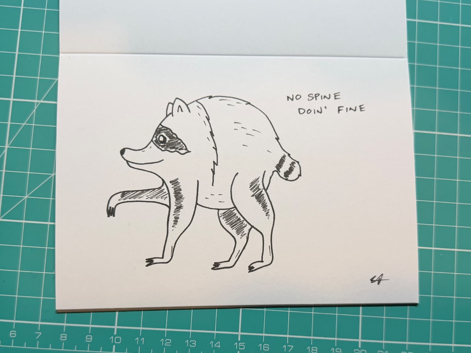
We did our usual offering of stickers this year, which expanded from a two pack into a four pack, then we added Jimothy. I offered my drawings again and once I have them all complete I will have done 32 of them, five more than last year. I'll put up a post once they've all arrived because I remembered to scan them all this year. Finally Adam decided to make his life difficult and offer friendship bracelets — he has 20 or so of these to make. Good luck.
I've started my note of ideas for next year — it's basically September already.
2026-10-05 03:43:52
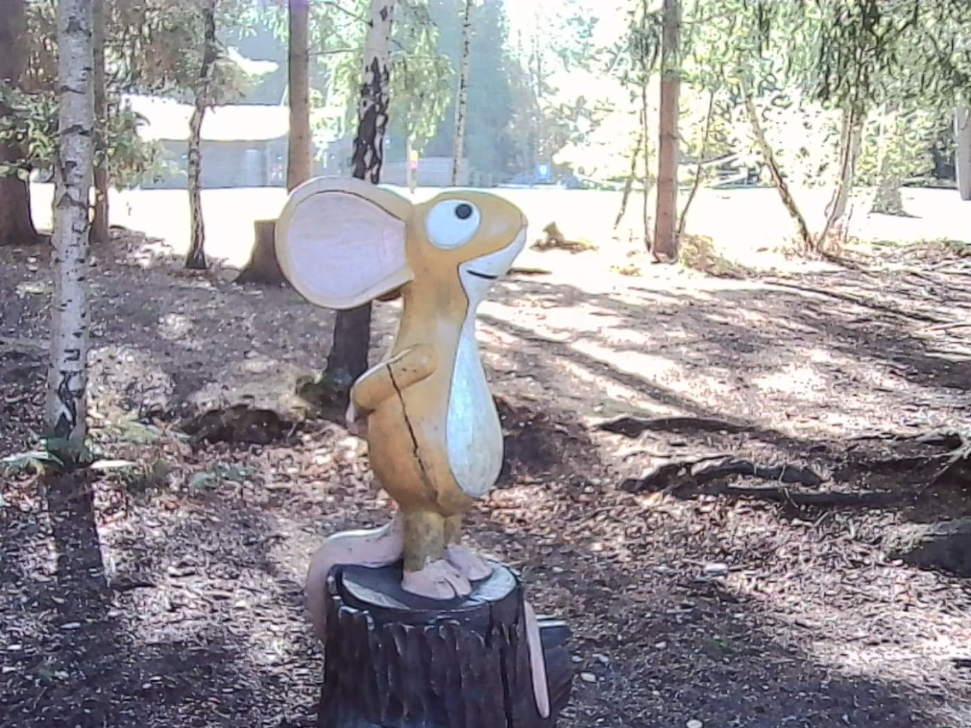
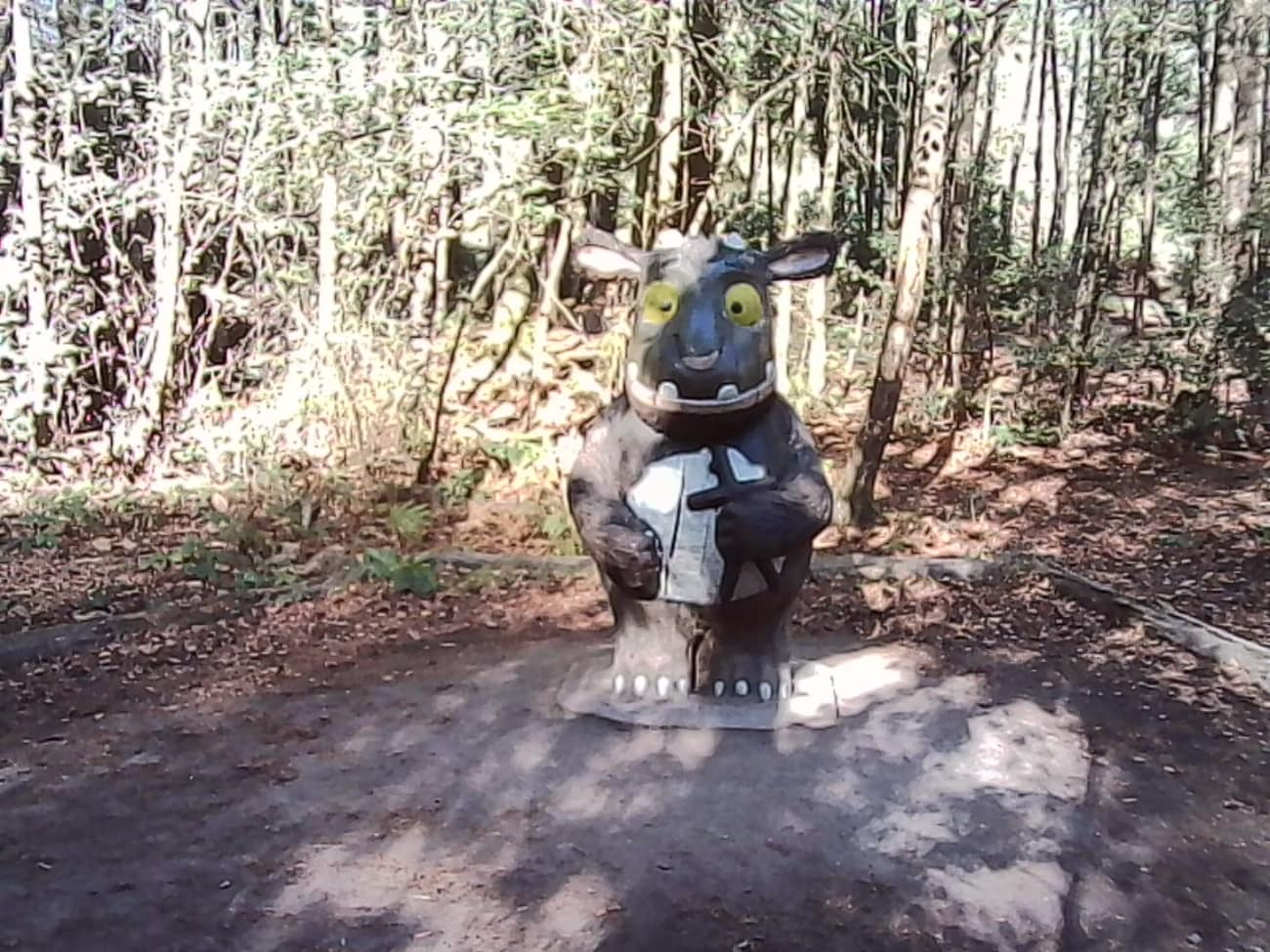
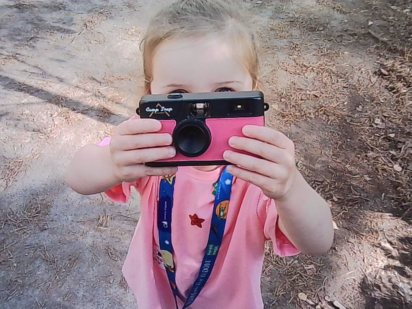
Over a year ago I bought a Kodak Charmera keyring mini camera; it's a tiny little camera that takes photos at 1440x1080 and I was lucky enough to get the best design. It's taken me until now to actually try it out at Alice Holt forest today — we went because they have Gruffalo sculptures and the Knightlings are obsessed.
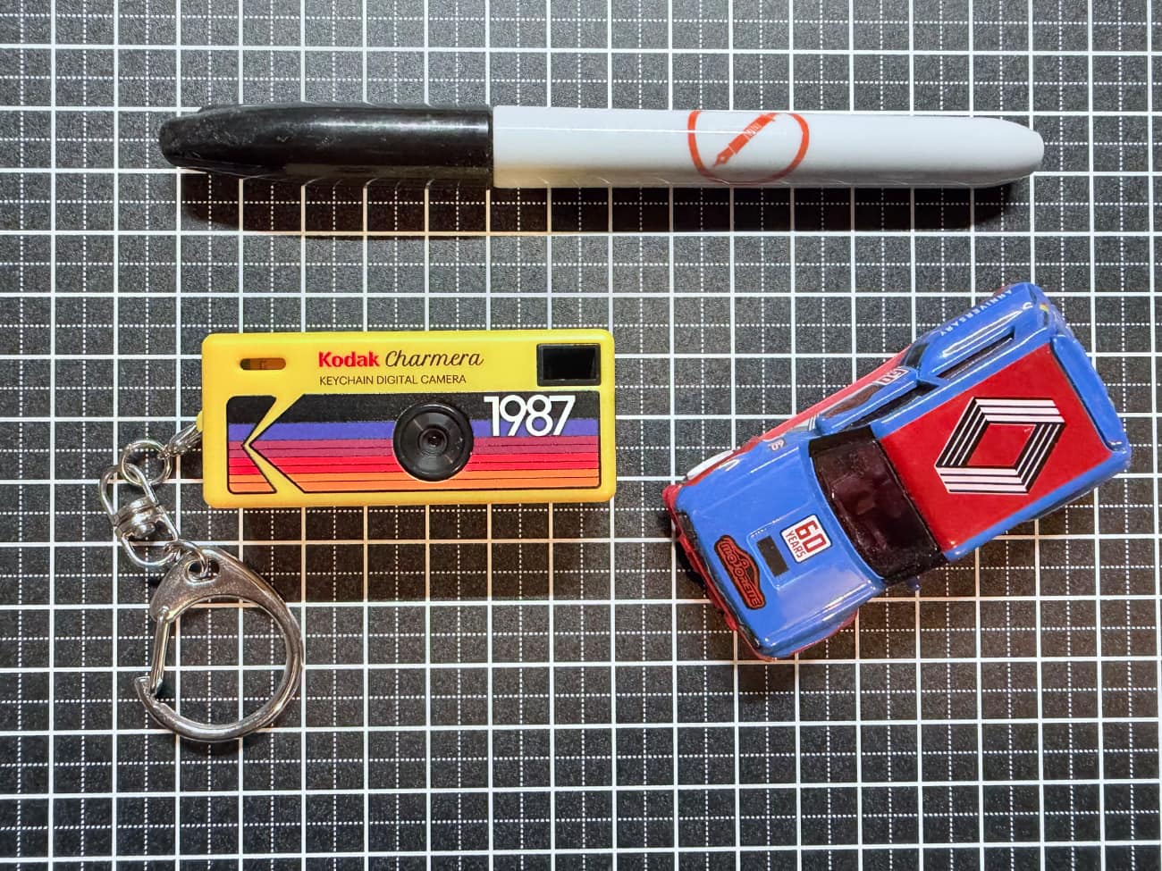
The photos are about as good as I expected which is not good at all but it is a fun camera to use. I think I'll stick with the Camp Snap.
A mouse took a stroll through the deep dark wood,
The mouse took photos with his Kodak Charmera and they were not good.
2026-10-03 16:08:00
Dave is doing important work here, holding Cadbury Heroes to account.
MacOS 27 broke the drivers for my thermal printer but thankfully someone made a new driver.
I'm on board with Spymarks, not watermarks.
The winners of the street photography awards are fantastic (obviously).
Side-eyeing projects like Una to try and get away from my Apple Watch at some point.
Hannah Fry's favourite fountain pens. Love this.
There's no world in which I can watch this documentary about Elon Musk but I'm glad it exists.
A gallery of control rooms on Flickr via SimpleBits.
While looking for an example of a Geordie accent, I came across this supercut of a "Geordie" character who has an accent that is so ridiculous I can't even work out what he thinks he's doing. They even brought in translator as a plot point. This whole thing is wild.
This monstrosity from Finn for the iPhone Duo.
Barstardica mixes different fonts into one for...reasons. I love and hate it.
This Tiny5 font is amazing and I need somewhere to use it as soon as possible.
Tyler has got me thinking about an old MacBook Pro we have at home with his post about repurposing a 15-Year-Old MacBook Air.
Lazygit is very nice but not something I have a need for.
littleFedi is a "small ActivityPub server written in Go". It's a single binary, designed to run on basically everything, and supports the Mastodon API.
2026-10-01 21:08:15
Brad is walking in Memphis this week for the podcastathon so we recorded this episode a couple of weeks ago.
We talked about the incentives we're both offering for St Jude and the work that goes into those as well as my progress as an "artist", and Jimothy. Then we discussed finishing notebooks and inks, and finished off with my analog defaults. There's still a few days to donate to St Jude.
2026-10-01 20:41:59
It's Inktober again which means I'm drawing one thing a day, in ink, from the official[1] prompt list. I'm tagging my posts with #Inktober and #Inktober2026 — these tag pages are flagged to render the images in a gallery instead of the usual notes pages. My first drawing is up as of this morning.
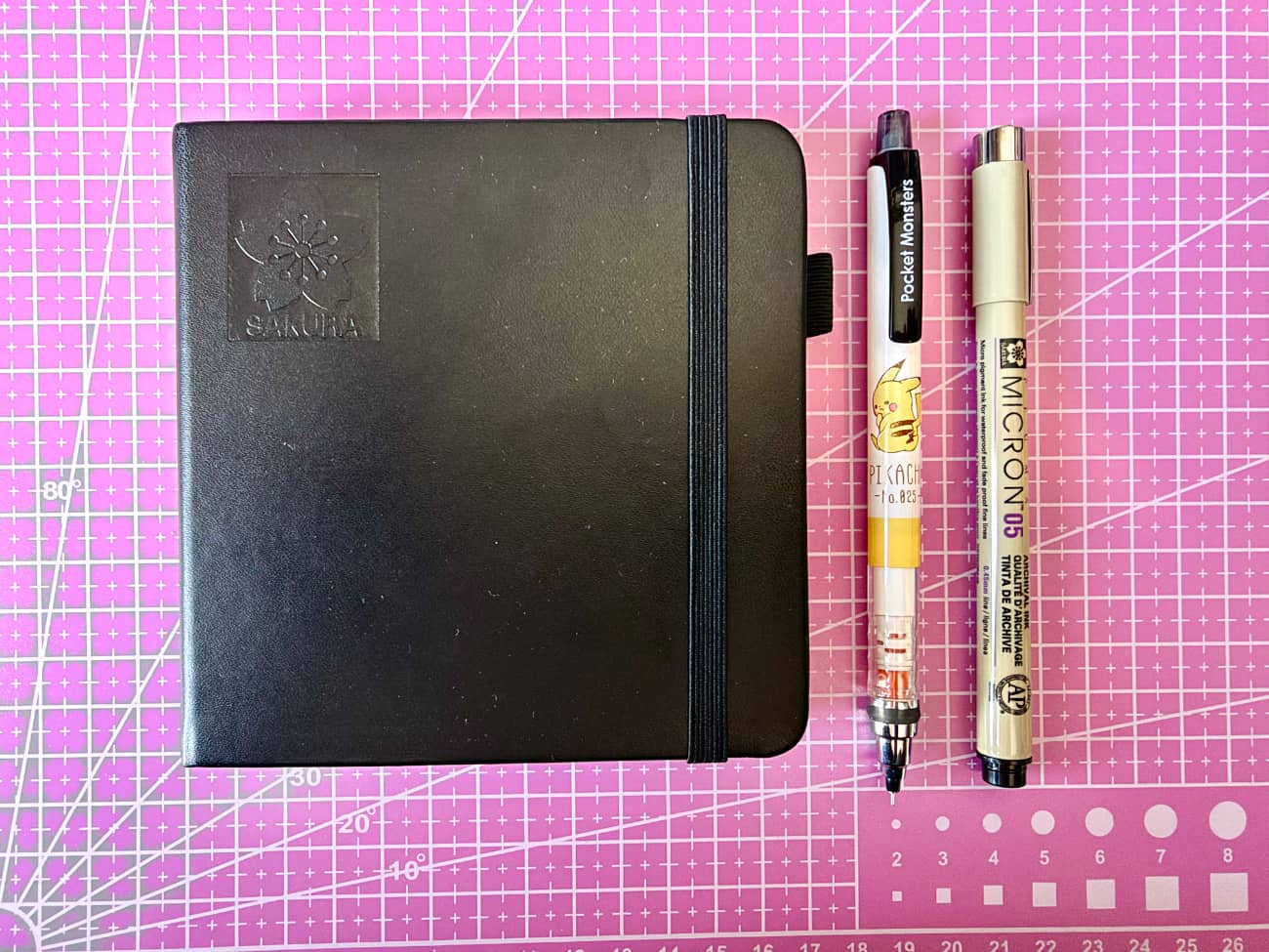
As much as I love Jeff the dinosaur from last year[2] it's too easy to fall back on "Jeff does/interacts with whatever the prompt is" so this year will be mostly Jeff-free. Last year my drawings were all over the place in terms of size so this year I bought a 12x12 Sakura sketchbook — I'll be using this exclusively for Inktober for the next few years. Unlike last year when I used Uni Pins, I'm a big Sakura Micron boy now. I talk more about this on this week's episode of The Pen Addict which will be out in a few hours.
One of the things with projects like this is I want to be consistent with how I'm posting stuff. Last year I would have to go back to the previous days post to see if I did a full stop or colon after the day number, did I put the prompt in quotes, what about the filename? So I set up two Alfred snippets — one for the filename and one for the post itself. Snippets is a feature I use a lot for other things.
# INKtober Filename
;inkf
# raw
inktober-2026-{date:dd}-
# becomes
inktober-2026-01-
# INKtober Post
;inkp
# raw
Day {date:dd} - {cursor}

#becomes
Day 01 -
