2026-07-24 08:00:00
While watching this Kevin Powell video (starting at 4:15), I found out about a really cool CSS pattern for styling prose (as in article text, just like what you’re reading right now). More specifically, it’s about defining the space between items. It’s based on Tailwind’s “prose” styling and uses the lobotomized owl selector (* + *).
[!info] The Lobotomized Owl 🦉 The name was introduced by Heydon Pickering back in 2014, and it’s an awesome name for a very straightforward selector.
The lobotomized owl (
* + *) will select any element that is not the first, which makes it basically the same as*:not(:first-child).
Let’s assume we have a blog post that has its content rendered like this:
<div class="prose">
	<h2>Lorem ipsum dolor</h2>
	<p>Ad officia consequat pariatur.</p>
	<p>Mollit eu anim qui qui et labore sit tempor sit.</p>
	<h2>Fugiat laboris esse mollit</h2>
	<p>Ad ipsum dolore laboris nisi</p>
</div>
How would you control the spacing between each piece of the text? You could either set a flat spacing (by setting .prose a flexbox and giving it a gap, among other ways), or target any child and give it a predefined margin-top depending on what type it is (so it’s larger on headings, for example).
An extremely elegant way of doing that, though, is by using em, which will make the margin vary by the font-size of an element!
/* The default value for 1rem is 16px */
h2 {
	font-size: 2rem; /* 32px */
}
p {
	font-size: 1rem; /* 16px */
}

.prose > * + * {
	/*
		Since we're using em, it will scale with
		the font size of the current element.
		For the h2, our margin would be 32px * 1.4 = 44.8px
		For the paragraph, 16px * 1.4 = 22.4px
	*/
	margin-top: 1.4em;
}
The CSS above sets a margin-top to any element (except the first) based on the text size of that element (because of em). So on a <p> with 16px font size, margin-top would be 16px * 1.4 = 22.4px. On an h2 with 32px font size, it’d be 44.8px.
[!info] A refresher on
emvsremIt’s not uncommon to get these two units confused — but it’s important to understand their differences or you might end up with some pretty nasty debugging challenges.Both scale off of font-size, what changes is what font-size they use.
remwill always refer to the font-size of thebodyelement, which defaults to 16px if not set. This means that it is a very predictable unit.1remwill always be the same value no matter which element uses it.
em, on the other hand, scales off of the font-size of the current element. This means that1eminside a heading tag can be very different from1emin a footnotes section. Both have their uses and can coexist, as we can see right now.
This sets a nice default spacing for all possible elements inside of your .prose div. But you can also use the same idea to handle special cases. Let’s say you always want your images to have bigger margin around them. We can target them specifically:
.prose > * + img {
	/*
		I am not setting a font-size for imgs,
		which means 1em will default to 1rem, which defaults to 16px
	*/
	margin-top: 2.8em;
    margin-bottom: 2.8em;
}
I am adding a margin-bottom for that one as well so that the spacing remains consistent. Since margins don’t stack in CSS, this means that even if the element below the image has a margin-top, it will merge with the image’s margin-bottom. In practice, only the biggest margin counts.
A really good practice when doing stuff like this is to use CSS variables with a fallback value, so you can easily override the default value whenever you need.
Consider your .prose styling has a default spacing of 1.4em, as we’ve established above. But now you want to use that same styling in a card component. Since on that card you have less space to work with, it’d be ideal if the spacing was a bit tighter than normal. You could do something like:
.prose > * + * {
	/*
		Use the --prose-spacing variable value if it exists,
		otherwise use 1.4em
	*/
	margin-top: var(--prose-spacing, 1.4em);
}

.prose > * + img {
	/*
		If we make the image spacing also based on --prose-spacing,
		it will scale on the card too.
	*/
	margin-top: calc(var(--prose-spacing, 1.4em) * 2);
    margin-bottom: calc(var(--prose-spacing, 1.4em) * 2);
}

.card .prose {
	/* When inside the card, prose spacing is a bit tighter */
	--prose-spacing: 1.2em;
}round
If the decimal values (like margin being 22.4px) bother you, you can use the CSS round function to make sure it maps to a predictable, integer value.
If you’re interested, I highly recommend reading this amazing article by Ahmad Shadeed about the round function, but the gist of it is that you can do something like:
/* The default value for 1rem is 16px */
h2 {
	font-size: 2rem; /* 32px */
}
p {
	font-size: 1rem; /* 16px */
}

.prose > * + * {
	/*
		h2's margin would be 44.8, becomes 44px
		p's margin would be 22.4, becomes 22px
		The "2px" second parameter tells it to
		round to the nearest multiple of 2px.
		If I used "1px" instead, it 44.8 would
		round up to 45px.
	*/
	margin-top: round(var(--prose-spacing, 1.4em), 2px);
}This kind of elegant, simple approach is one of my favorite things about CSS and web development in general. We can easily over-engineer things, but nothing beats something like this.
2026-07-23 20:00:00
Red Rooms
2023, Pascal Plante
My rating: I like it

This is a good one. A high quality psychological thriller that grips your attention right from the start and sticks with you after it ends. Amazing use of color, too!
2026-07-23 01:08:19
OverpAId is not coming for the people who do the actual work. It is coming, with extreme prejudice, for exactly one category of job: the one that spent the last forty years insisting everyone else’s job was replaceable.
This is fantastic.
2026-07-20 18:51:28
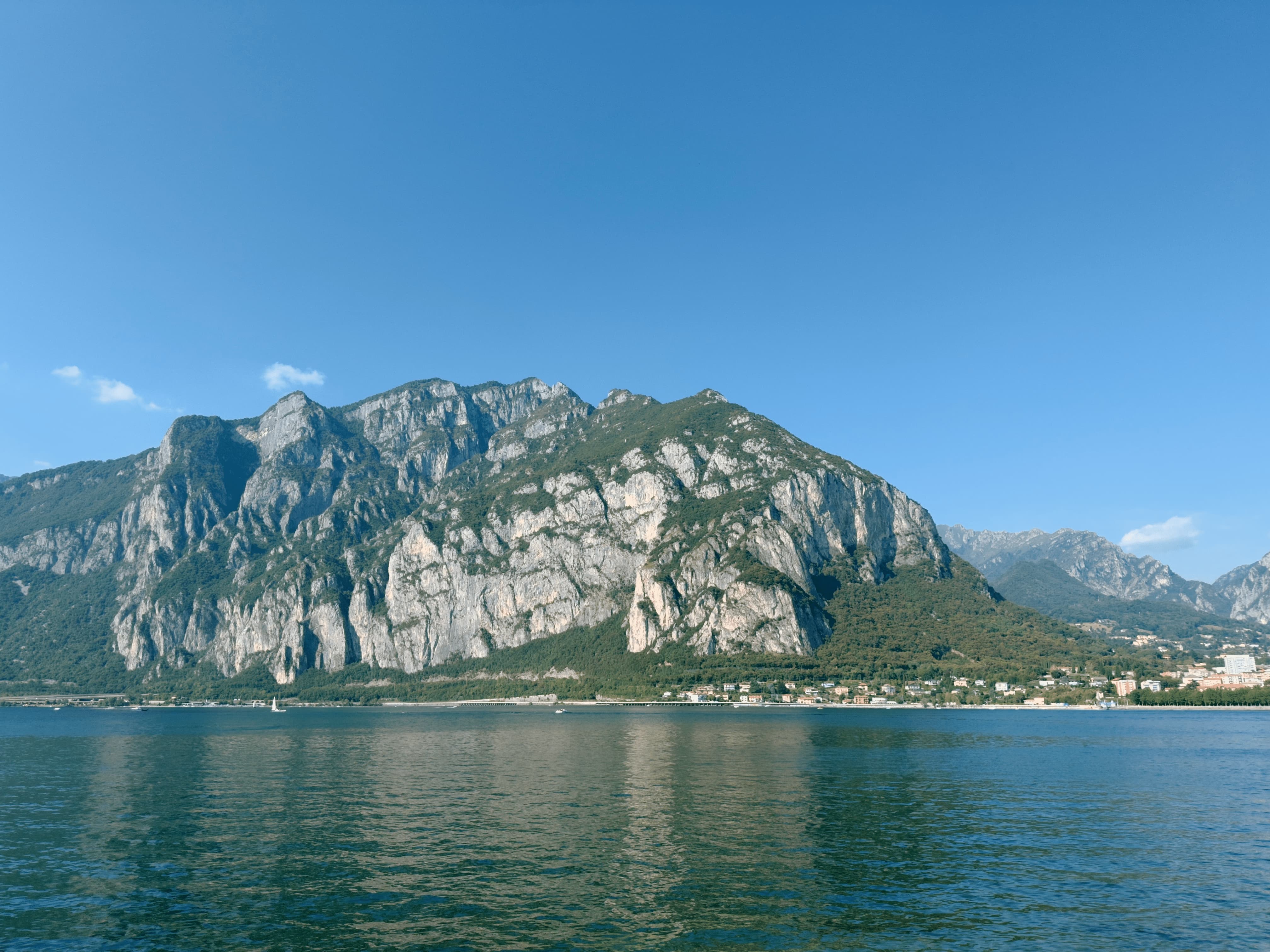
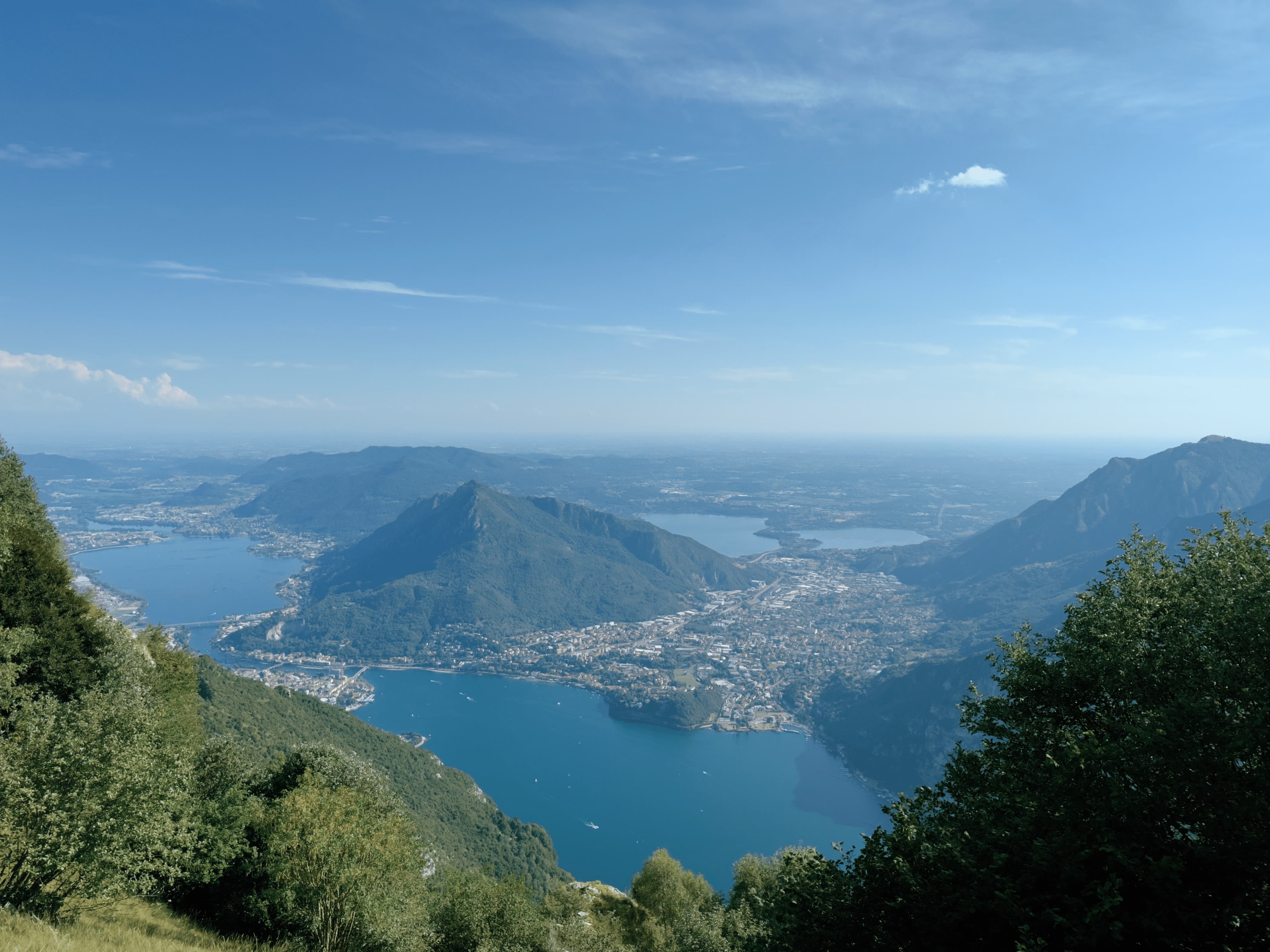
Monte Coltignone seen from Valmadrera / Valmadrera seen from the Coltignone. Photos taken 7 days apart.
Alternate title: How I see Mt. Coltignone / How Mt. Coltignone sees me.
Photos taken on Sunday, 19 Jul 2026
2026-07-18 20:00:00
The Sopranos
1999–2007, David Chase
My rating: Loved it!

What an incredible show! And to think it was made when nothing else on TV even came close. It’s easy to see how it inspired all the best shows that came after.
It’s a slow burn that really pays off over and over. And the ending is a masterpiece. 10/10 gabagools.
2026-07-17 00:03:31
by The Art of Storytelling
There will be at many points in your creative process opportunities to bypass the struggle of working and learning, but availing yourself of those shortcuts will gradually undermine your work in subtle ways that you cannot foresee.
So sure, go ahead and use generative fill to clean up your image. No one’s watching. I won’t tell anyone and no one will ever know. But you will pay a very small price in relieving yourself from the duty of learning some new Photoshop skills. You might not need those skills in this precise moment, but as you grow into your craft, those skills might come in handy in other ways that you do not presently anticipate.
While focused on people who do creative work, this video easily applies to everyone. It’s so easy to fall into the trap of letting the sparkles do something for you, and just as easy to prevent yourself from learning and improving because of that.
Even as someone who tries to limit and police my own usage of AI tools, I could see myself in a lot of these examples. Process isn’t only important to creative work; it’s important to our own personal development. AI can produce generic output that anyone else could, but only you, with your unique combination of skills and experiences accumulated over the years, can produce something unique.