2026-07-17 00:37:08
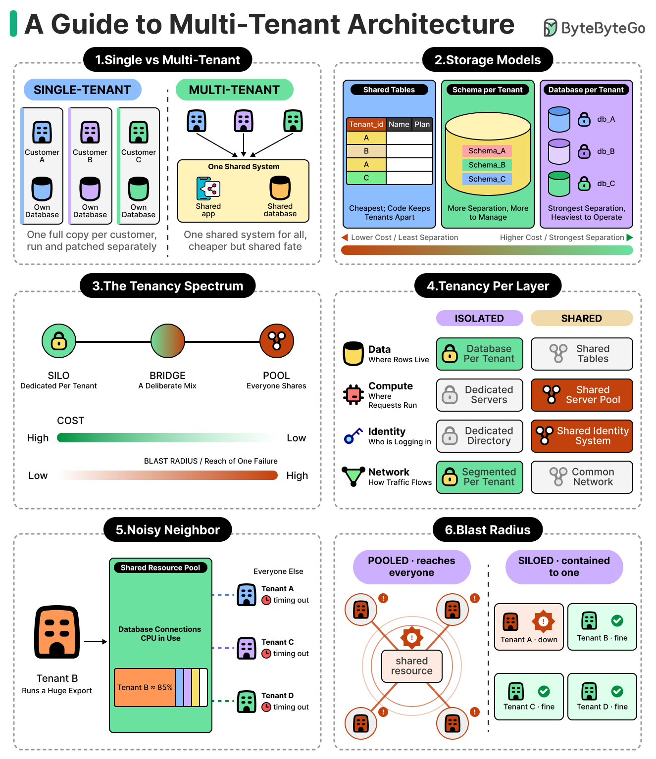
Every software company that builds an application serving more than one customer has to answer this question.
Should each customer get a separate copy of the system, or should they all share one?
Running a dedicated copy per customer is easy to reason about, but the cost of maintaining hundreds of separate copies increases with every new customer. On the other hand, sharing a single system across all customers is far cheaper. This is why most of the software we use every day is built to be shared rather than duplicated. Such systems are known as multi-tenant systems, where each customer is a tenant that shares resources with other tenants.
However, sharing is also where the difficulty begins.
Once many customers rely on the same database, the same servers, and the same background jobs, their fortunes become linked. For example, one customer running a heavy report can slow the service for everyone alongside them. A single faulty deployment can impact all of them at once instead of just the customer. And the most serious risk is around data leaks, where one customer is shown data that belongs to another. All of these situations have to be actively handled by a multi-tenant system.
In this article, we will understand multi-tenant architecture from the basics, along with its various benefits and challenges. Here’s a quick overview of what we will cover:
What a tenant really is.
Where each customer’s data can physically live, from one shared set of tables to a database of its own, and what each of those options costs.
Why the same choice between isolating and sharing also includes the compute layer and beyond, not only in the database.
The noisy neighbor problem, and why sharing can impact fairness and force a team to rebuild it with quotas and limits.
The role of blast radius in such an architecture.
The concept of tenant context that runs through every part of the system.
2026-07-15 23:30:53

Matic is the first visually intelligent robot vacuum that sees your home like you do, so it can clean how you want it to.
Matic’s hero features:
Runs entirely on cameras to deftly navigate obstacles
Recognizes floor types to auto-switch between vacuuming and mopping
Big wheels and a height-adjustable cleaning head handle thick rugs
Quieter than conversations at 55 dB
Handles pet hair without clogging or tangling
A single bag collects dry and wet waste—diaper-salts gel dirty water, antimicrobial powder prevents mold
A fresh HEPA filter in every bag for cleaner air, no washing or replacing
Travel platforms are increasingly using AI for customer support. This means an increase in automated answers with less human intervention.
However, the cases handled automatically are largely lookups and routine changes that map cleanly onto a structured workflow. The cases that remain are typically disputes, such as a host and a guest having different views about a cancellation. In such cases, the travel platform is positioned between them and is accountable for the funds. The platform needs to figure out how to deal with these cases. It is not just a business problem, but also an engineering problem.
There is an important question at the center of this problem. At what moment should the system stop and route a case to a human agent?
A platform fielding hundreds of millions of contacts a year faces that decision millions of times a day, across cancellations, refunds, and after-hours lockouts. A confident but wrong answer can ruin a traveler’s trip and the money at stake.
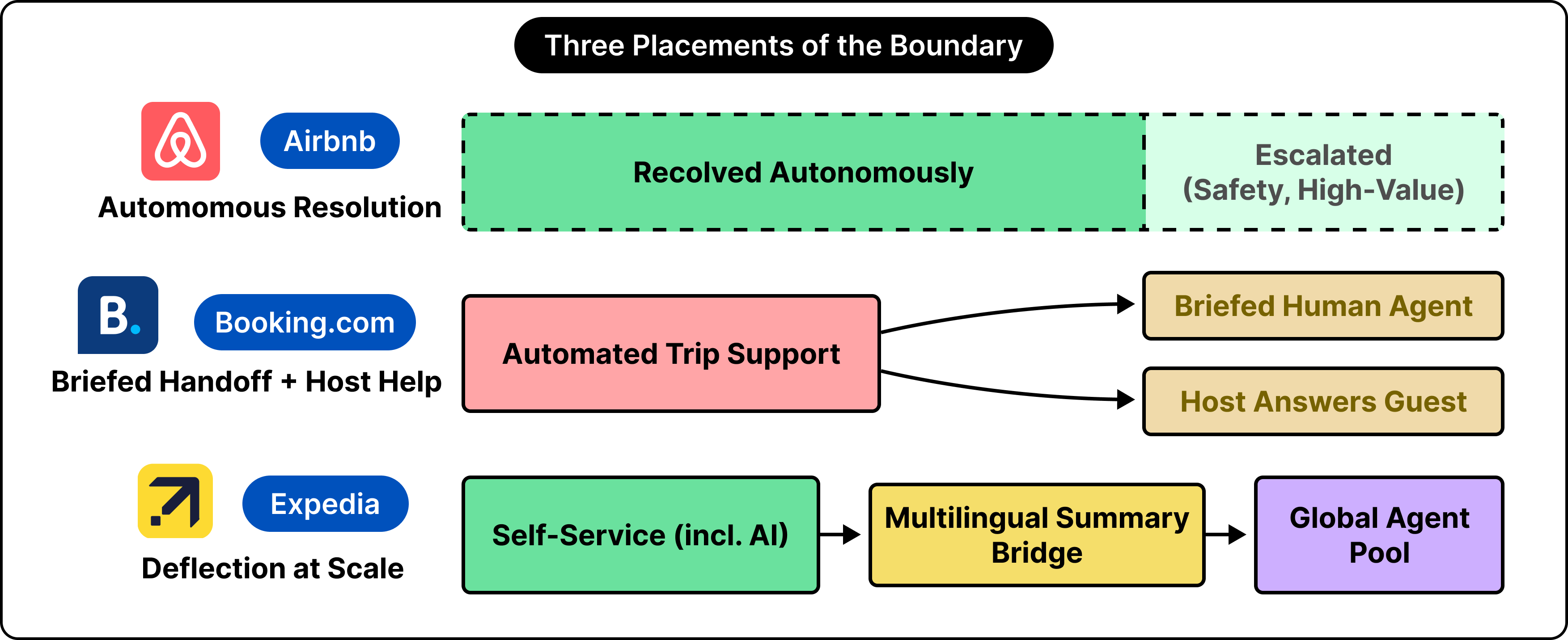
Airbnb, Booking[dot]com, and Expedia have each tried to solve this problem in different ways. Airbnb prioritized autonomous resolution, building models that settle cancellations and refunds before an agent enters the conversation. Booking concentrated on the handoff, routing complex cases to a representative briefed in advance while equipping hosts to answer guests directly. Expedia emphasized deflection at scale, investing in summaries that carry context across more than thirty languages so an escalated case arrives intact.
In this article, we will look more closely at the different solutions by following the support pipeline from first principles, show why a tail of cases resists automation regardless of model quality, and use these three approaches to understand how these can be handled.
Disclaimer: This post is based on publicly shared details from various sources. References at the end. Please comment if you notice any inaccuracies.
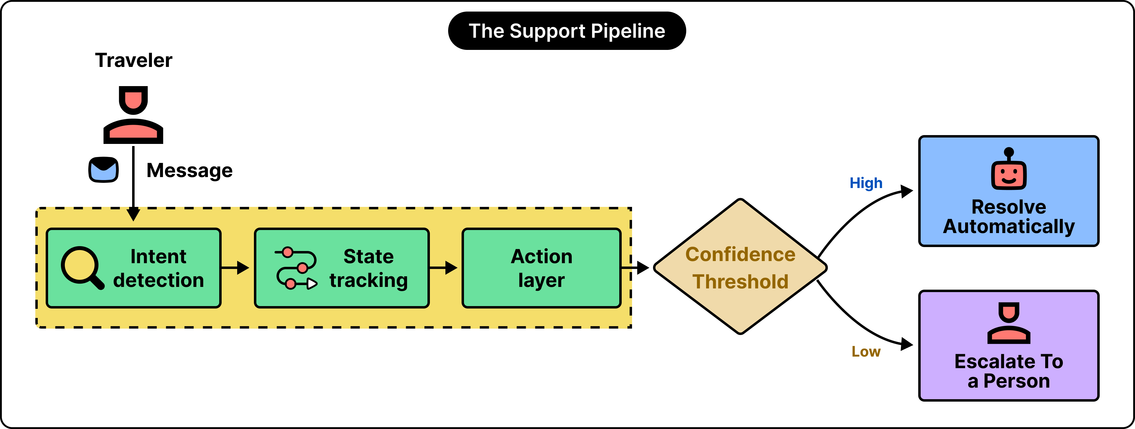
Start with the simplest version of automated support: a bot that matches a traveler’s message to a list of frequently asked questions and returns the closest article.
It works for questions like “What is your cancellation policy?”
However, it fails the moment a traveler writes something like “My host agreed to refund me, so what happens if I cancel now?” That sentence carries an intent, a history, and a financial consequence, and a simple keyword match treats it as a search query.
The first real component is intent detection. In plain terms, the system classifies the message and identifies what the traveler wants: a rebooking, a refund, or a question about an existing reservation.
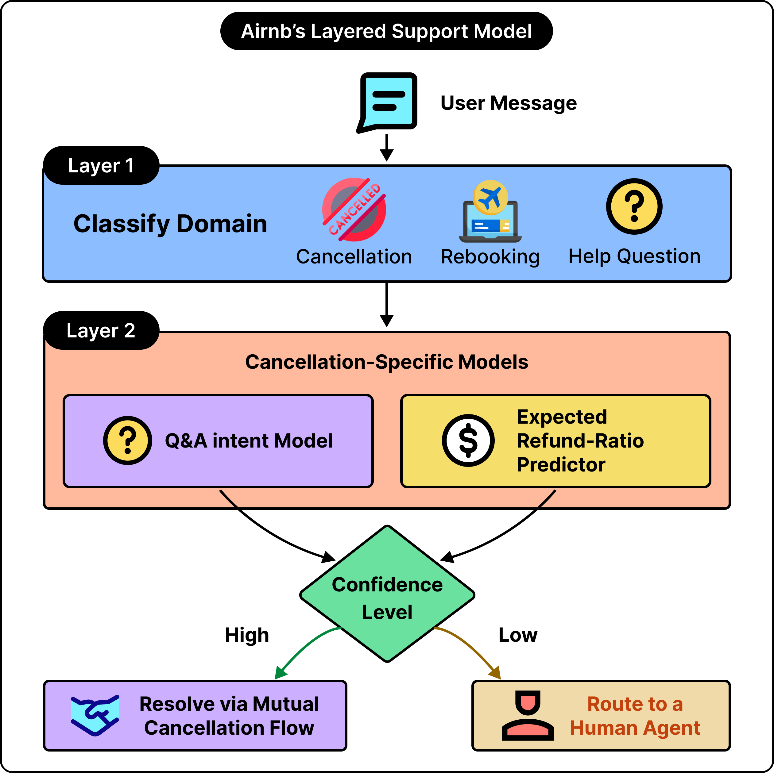
Airbnb frames this as a layered problem:
A top-level model performs domain classification, sorting the message into a broad category such as cancellation or a help-article question.
Once the category is settled, a second layer of domain-specific models takes over to work out the details.
For a cancellation, those second-layer models answer focused questions. Did the host or the guest initiate it? Have both sides agreed on a refund amount?
Alongside this, a separate model predicts the expected refund ratio (such as the share of the payment a human agent would typically return given the circumstances of the trip). That predictor is trained on years of past agent decisions, which lets the system produce decisions in line with how experienced staff have handled similar cases.
However, a message understood is still inert until two further capabilities exist:
The system tracks state, meaning it carries the context of earlier messages in the thread, so a follow-up reply makes sense against what came before.
And it has an action layer, the part wired into live systems that can issue the refund, move the reservation, or open the mutual cancellation flow.
Reading intent is the easier half. Taking a correct, reversible action against live booking and payment systems is what requires greater consideration.
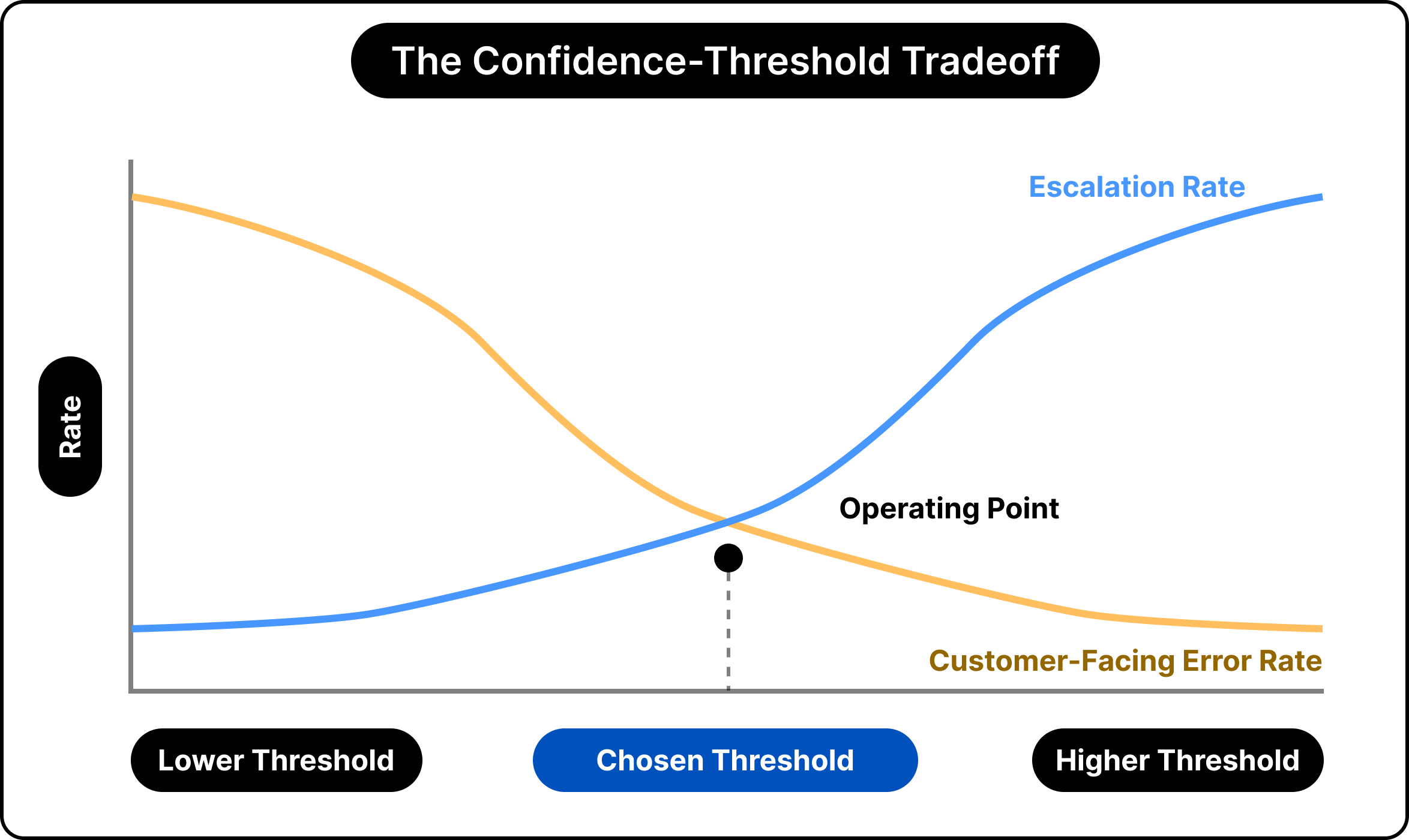
The final element is a confidence threshold. Each prediction arrives with a score, and the threshold determines whether the system proceeds on its own or routes the case to a person. If this bar is set too low, more cases clear automatically while errors creep upward. If it is raised, the accuracy improves, but more traffic lands on human agents. That single threshold value is where much of the tuning happens
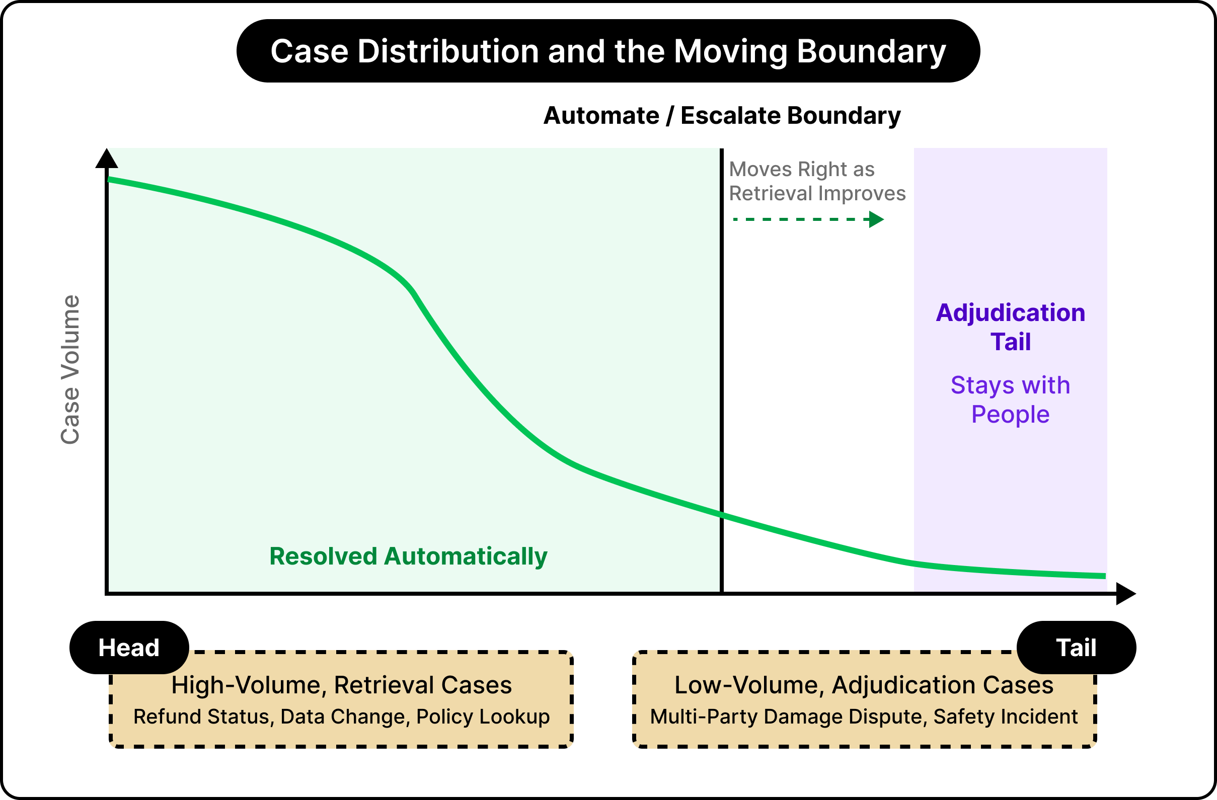
This pipeline, intent detection, state tracking, an action layer, and a confidence threshold, handles a large volume of everyday requests well. However, it keeps facing problems in one family of cases.
The cases that clear automatically share a quality. They are answerable by retrieval. In other words, the system finds a fact or applies a rule, such as the status of a refund or the steps to change a date. Volume here is high, and the work is repetitive. These are the types of problems where automation works well.
The cases that resist automation differ in kind.
They require adjudication, meaning a judgment between parties whose accounts and interests diverge. A guest says the apartment was misrepresented. The host says the listing was accurate and the guest simply changed their mind. A damage claim sits between them, and the platform holds the deposit.
There are three parties, three versions, and one decision about money. A better model produces a cleaner summary of the dispute, yet the underlying call still rests on weighing competing claims, which is difficult for even a powerful model.
Time pressure sharpens the divide.
When flights were cancelled across the Middle East, and a surge of travelers contacted Expedia at once, automation absorbed the routine rebookings and status checks at speed, which freed human agents to spend their attention on the tangled, time-sensitive cases. The same event produced both kinds of work in the same minutes, and the value of the split was that each kind reached the right handler.
This is why the resolution rate climbs and then flattens. The boundary separating automated from escalated cases advances as retrieval improves, and it approaches a region of adjudication-heavy cases that stay with people by design.
It also explains why headline percentages deserve careful consideration.
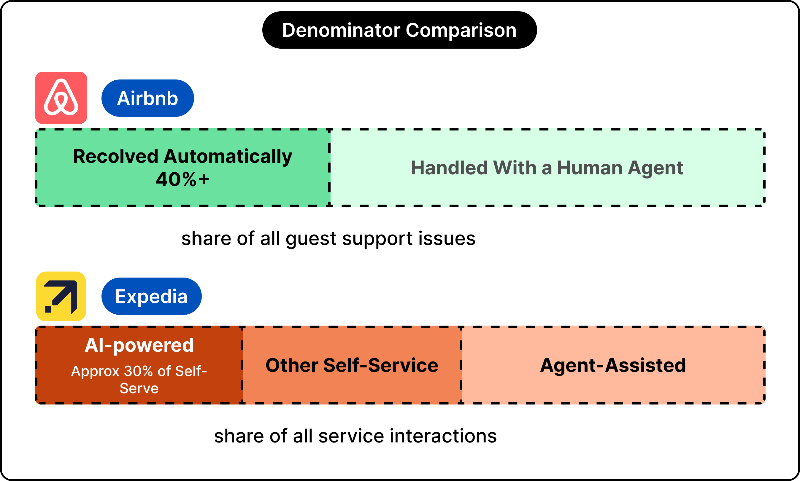
Airbnb reports that more than 40% of guest issues are resolved without an agent. Expedia reports that more than 30% of its self-service interactions are powered by AI, where self-service already accounts for more than half of all contacts.
Those two figures rest on different bases, so a side-by-side ranking would mislead more than it informs. Each number describes its own pipeline rather than a shared scoreboard.
When a case crosses to a person, the details of what is shared become important.
A handoff that passes along only “escalated, please assist” forces the customer support agent to restart the conversation, and the traveler retells the whole story to a second responder. A traveler who repeats every detail to a human after a stalled bot session ends up more frustrated than one who reached a person at the start.
This asymmetry is the reason handoff deserves real engineering attention. A weak handoff can leave the combined system performing worse than plain human support would.
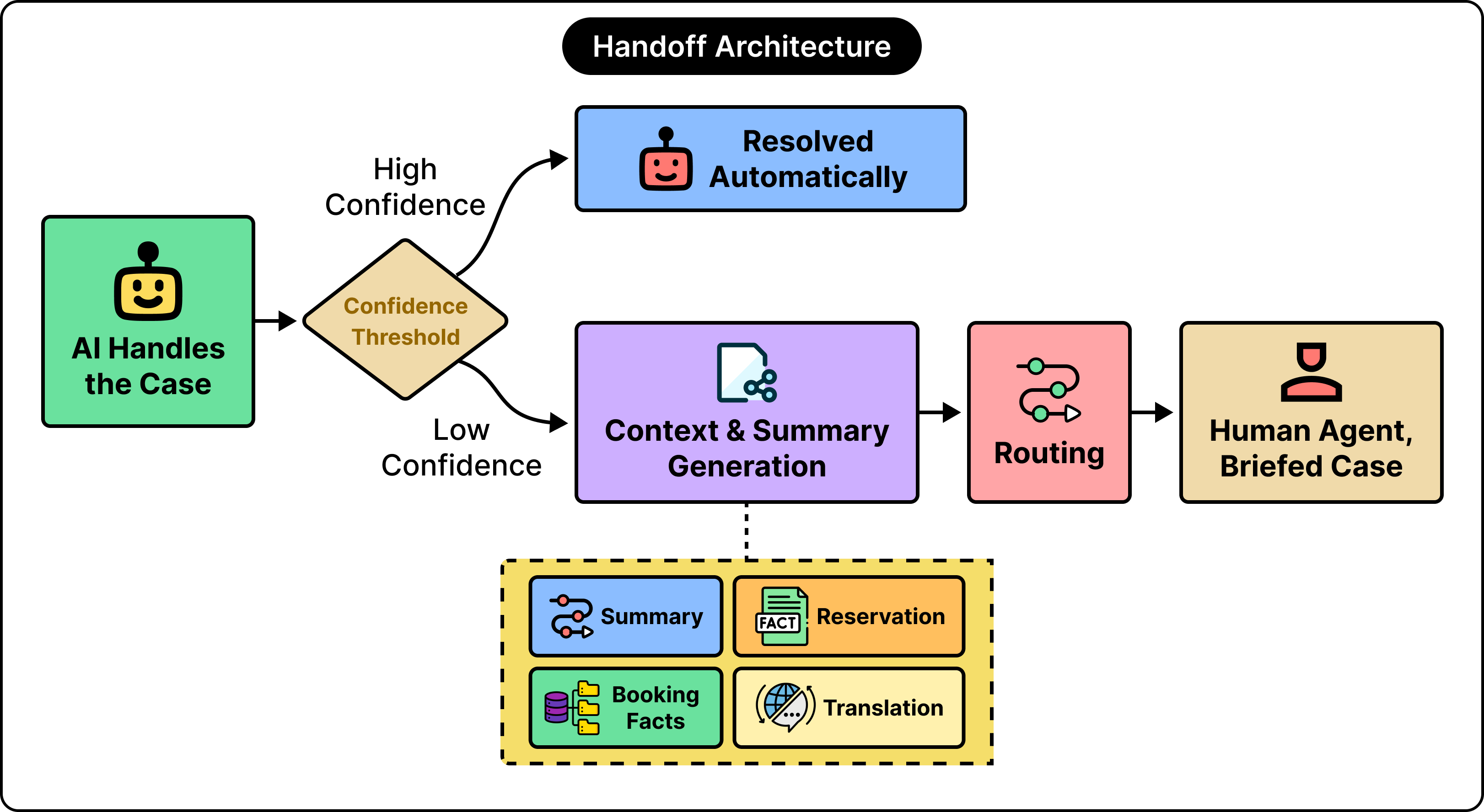
The solution to this lies in the payload: the bundle of context that accompanies an escalated case. A strong payload carries four elements.
A summary of the conversation so far.
The structured facts already gathered include the booking reference and the cancellation reason.
The live state of the reservation.
A translation, where the agent and the traveler use different languages.
The agent opens the case already informed and continues from where the automation left off.
Expedia leans on this idea at scale. Its systems generate conversation summaries across more than thirty languages, so a case handled partly in Portuguese can reach an English-speaking support agent with the thread rendered in a language they read fluently. The same summaries shortened the time required to bring new agents up to speed by a substantial margin, because a well-formed summary teaches as it informs.
Booking describes the same priority from the other side. Its tools route complex questions to a representative who receives the relevant booking and property details in advance, so the human starts the conversation already holding the facts.
Booking also adds a second component that the others treat as secondary. Much of its support volume is communication between a guest and an accommodation partner, so it built tooling that drafts partner replies from property and reservation data and suggests them to the host. Here, the friction is the message between two people rather than a decision the platform owes, and equipping the partner to answer quickly relieves pressure before a formal support case ever opens.
The pattern across all approaches is consistent.
The success path contributes to the headline percentage, while the failure path, the moment a case escalates, is where the overall customer experience is decided. The core work for building such systems concentrates on handoff far more than on the straightforward case where everything resolves on the first attempt.
The design decisions made by the three companies indirectly express three beliefs about which part of travel support is hardest.
Airbnb’s position is that the adjudication itself can be modeled. By training on the expected refund ratio and on the questions agents ask during a cancellation, it pushes the automated portion as far toward real decisions as the data supports, and it reserves human attention for safety, discrimination, and high-value claims. The wager is that a large share of disputes follow learnable patterns, and that an autonomous system applying a consistent standard serves travelers better than a queue of agents who each interpret a policy slightly differently. The cost of this position is a heavy, continuous investment in models and labeled data, and a high bar for caution wherever money and safety meet.
Booking solves the problem differently. Its emphasis on briefing the human agent and on drafting replies for partners treats communication as the primary friction. The implied belief is that a great deal of support volume is people struggling to reach each other, a guest with a question and a host with the answer, and that closing that gap quickly matters more than resolving every case autonomously. This keeps more humans in the loop while raising the quality of each human touch.
Expedia’s emphasis on deflection and multilingual summaries reflects a third belief that scale is the dominant variable. With well over two hundred million interactions a year, even modest gains in self-service rates and handling times compound into large absolute numbers, so the architecture optimizes for volume routed correctly and for context that survives a language boundary across a global workforce.
Every placement of the boundary carries a price on each side, and the confidence threshold makes the trade concrete.
Raise the threshold, and the system escalates more often, which guards against autonomous errors while increasing the load on human agents and the cost that comes with it.
Lower the threshold, and the system resolves more cases on its own, which trims cost while admitting more mistakes in situations that involve money.
There is an operating point that balances the two, and choosing it requires judgment about how expensive an error is relative to an escalation. In travel, where an error can mean a wrongly denied refund on someone’s holiday, that judgment leans conservative wherever the stakes run high.
There is also a more fundamental limit worth considering.
The chat interface itself suits travel poorly, because a chat thread is built for one person, while a travel dispute often involves several. A cancellation between a host and a guest, mediated by a platform, is a conversation among three parties, and a linear thread struggles to hold that arrangement sometimes.
It is not simply a matter of improving the interface. It suggests that the format through which support arrives may bound how far automation can go, separate from how capable the model becomes.
For that reason, regulated cases, high-value claims, and anything touching safety remain with people on purpose. The boundary moves rightward over time, and a margin is kept on the far side, where human judgment is meant to outweigh a confident automated answer.
The percentage of issues resolved without a human is an indication of two things: where a platform places its automate-versus-escalate boundary and how much of its work is answerable by retrieval rather than judgment. The model matters, yet it operates inside a structure built to manage that boundary.
A few points hold across all three platforms.
The pipeline serves the boundary. Intent detection, state tracking, the action layer, and the confidence threshold all feed the single decision to resolve a case or escalate it.
The handoff decides the experience. A case that crosses to a person succeeds or fails on the context that travels with it, which is why summaries, structured facts, and reservations carry so much weight.
The placement encodes a belief. Airbnb bet on autonomous adjudication, Booking on communication and a briefed handoff, and Expedia on correctly routed scale, with each placement reflecting a different view of where travel support is hardest.
Put together, the resolution rate reflects a design decision as much as a level of capability, and the boundary is the part of the system worth reading first.
References:
Airbnb, Inc., Q1 2026 shareholder letter and earnings call.
Expedia Group, Q1 2026 financial results and earnings call.
Expedia Group Sets the Standard with AI-Powered Service Agent.
2026-07-14 23:30:53

Enhance visibility into your cloud architecture with expert insights from AWS + Datadog. In this ebook, AWS Solutions Architects Jason Mimick and James Wenzel guide you through best practices for creating professional and impactful diagrams.
Ask a model the same question twice, phrased two different ways, and watch how it decides what to give you. It might offer a terse one-liner or a careful walk-through. It might sound fully confident, or it might hedge. Somewhere in training, the model learned which version you would rather have, even though both answers are correct.
That points to a harder question. How do you teach a model to be helpful when helpfulness changes with every request?
For a quick factual query, helpful means brevity. For a debugging problem, it means thoroughness. For a medical worry, it means caution paired with clarity. Each case requires a different direction with underlying trade-offs.
The model learned to handle those trade-offs from people comparing answers thousands of times over. This idea of learning from comparison rather than from a fixed answer key sits beneath every popular model you have used.
In this article, we will look at how that learning actually happens, starting with why instruction-following alone falls short, then walking through the two main methods for teaching preferences (RLHF and DPO).
A useful model gets built in three stages, as shown in the diagram below:
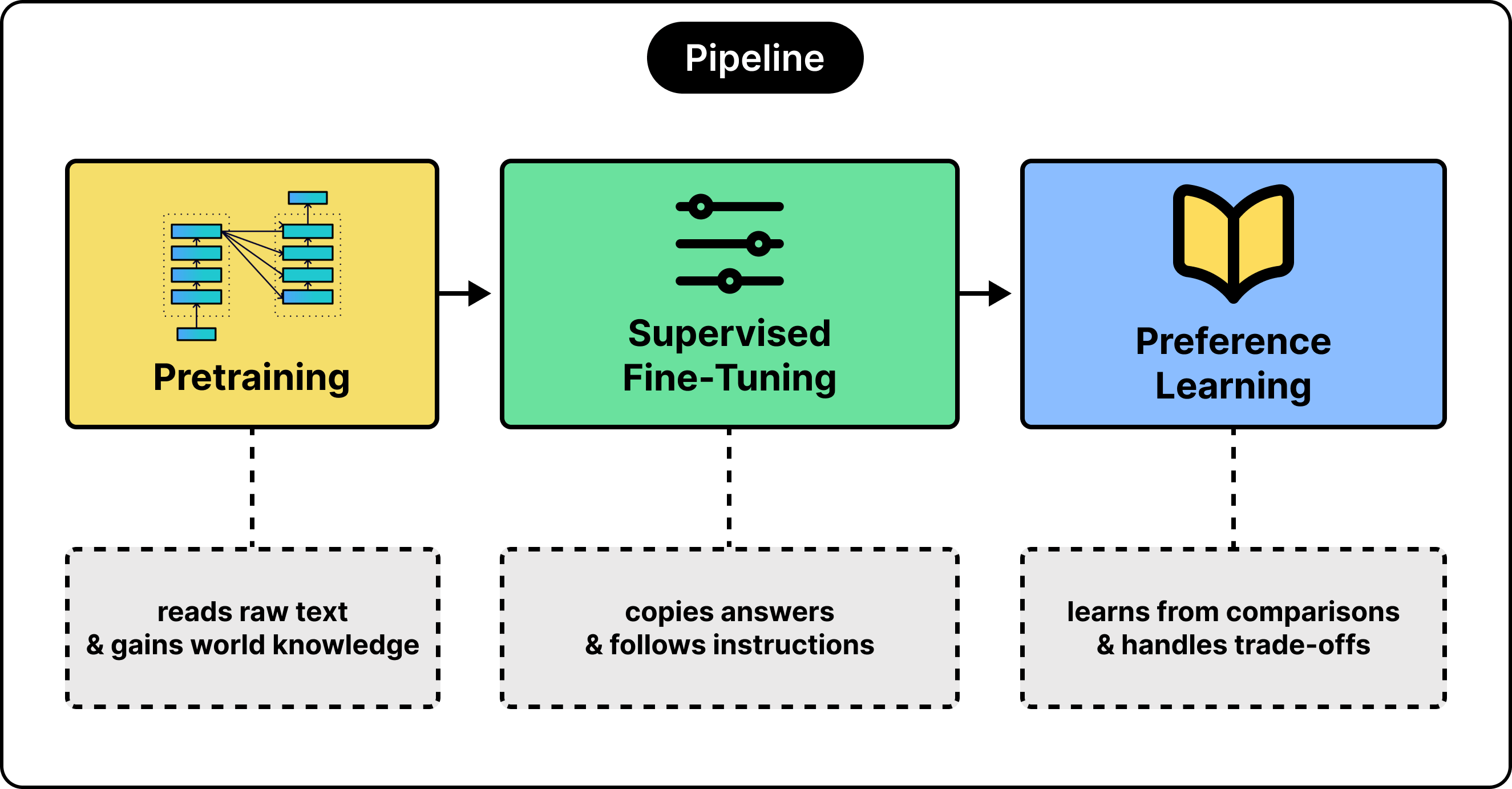
Let’s look at each stage in a bit more detail:
The first stage is pretraining. The model reads an enormous amount of text and learns to predict the next word. In other words, it builds a broad sense of how language works and soaks up world knowledge along the way. What it gains is raw capability. What it still lacks is direction, because predicting the next word and answering your question are two different goals.
The second stage is supervised fine-tuning, or SFT. We show the model thousands of example pairs, each an instruction together with a good response, and train it to imitate them. After this stage, the model follows instructions instead of continuing text. For example, if we ask a model to summarize a paragraph, it writes a proper summary. A raw model without SFT would have rambled on.
The third stage teaches preferences, which will be the focus of the rest of this article.
Why does a model that already follows instructions need a third stage at all?
This is because SFT works through imitation. The model sees a correct answer and learns to copy its shape, which holds up well when a question has one good answer, but runs into problems when a question has many possible answers.
Consider a request like “explain how a hash map works”. A short answer and a long answer can both be excellent, and which one helps depends on who is asking. An example dataset can show one of those answers, while the trade-off between them stays invisible. Imitation teaches the model what a good answer looks like, but struggles to teach it how to weigh two good answers against each other.
The payoff is larger than it might appear at first. For example, when OpenAI built InstructGPT in 2022, human raters preferred answers from a 1.3 billion parameter aligned model over answers from the 175 billion parameter GPT-3, a model roughly a hundred times larger. The alignment stage mattered more than a hundredfold jump in size.
Nevertheless, the line between pretraining and SFT is cleaner in the example than in practice. Some recipes blend the two, but the three-stage view is the right place to start.
Next up, we need a signal that captures the trade-off directly. That signal is comparison.

Attio, the agentic CRM, makes it incredibly easy for anyone to run workflows for any GTM play they need.
Describe what you want, and Attio builds it. I just built a workflow that runs every morning, surfaces the deals that need my attention today, like anything with a stage change or a new signal in the last 24 hours.
Hundreds of thousands of automations already run on Attio every day. Ready to try now?
Comparison turns a judgment call into something a model can learn.
A preference example is simple. We take one prompt, generate two responses, and ask a person which is better. The result is a small piece of data, a prompt with a winner and a loser. If we collect enough of these, a pattern emerges that captures the trade-offs accurately.
See the diagram below:
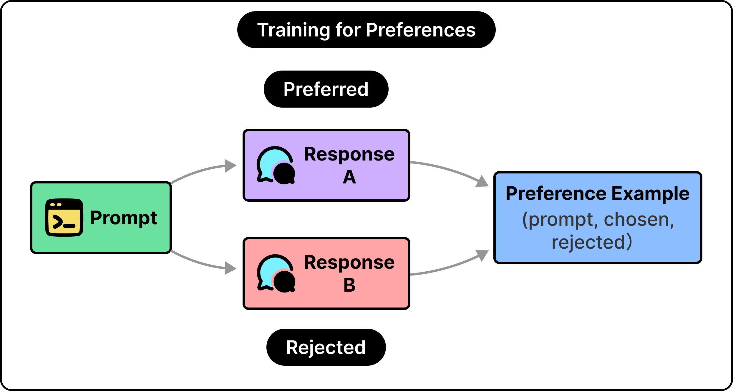
The reason this works comes down to what people are good at. Writing the single ideal response to a tricky prompt is hard, and two skilled people would produce different versions. Judging which of two responses is better is far easier, and people agree with each other more often when they compare than when they create. This is why labeling teams compare outputs instead of writing perfect ones from scratch, which makes the data trustworthy enough to train on.
This is the same comparison data InstructGPT collected, and the starting point for both methods we are about to compare. They differ in what they do with it, while the comparisons stay the same.
To clarify, the comparisons can come from another AI model in place of a person, an approach used in RLAIF and Constitutional AI. The overall mechanics stay the same.
Let us now look at the two different methods.
RLHF, short for Reinforcement Learning from Human Feedback, learns from comparisons by training a separate scorer and then coaching the model to score well against it.
See the below diagram that shows the basic RLHF flow:
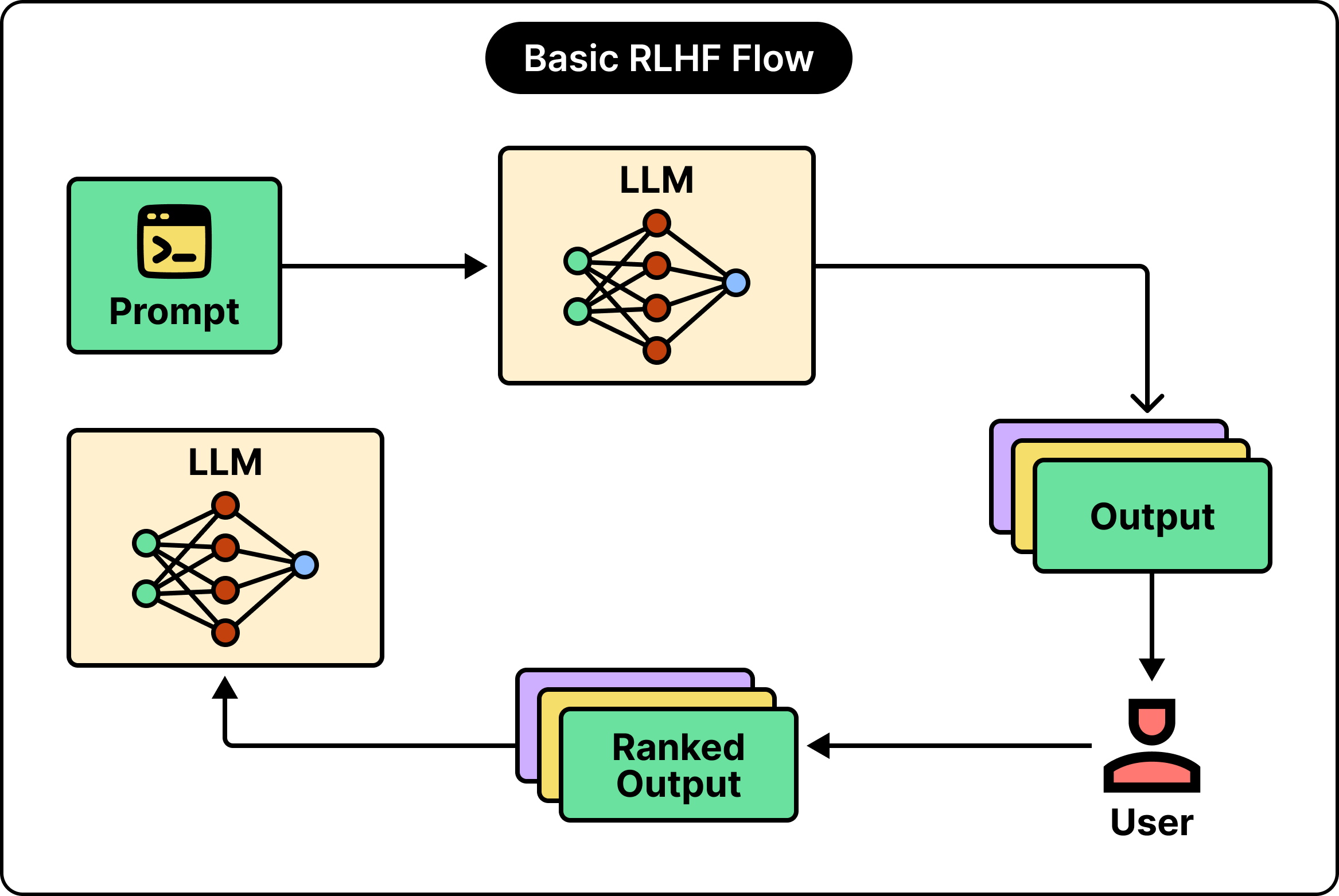
It works in two moves once the comparisons are collected.
First, we train a reward model. We take those prompt-with-a-winner examples and train a separate model to score any response, high for the kind people preferred and lower for the kind they passed over. The reward model turns scattered human judgments into a single function that grades fresh responses on its own.
Second, we use that scorer to improve the main model, which here we call the policy. The policy writes a response, the reward model scores it, and a reinforcement learning algorithm called PPO nudges the policy toward higher-scoring responses.
Reinforcement learning, in plain terms, means learning from a reward signal through trial and error in place of labeled examples. Run the loop many times, and the policy drifts toward the answers people prefer.
Left to chase a score freely, a model will discover strange, degenerate text that games the scorer while reading badly. To guard against that, we keep a frozen copy of the starting model, the reference, and penalize the policy whenever it strays too far from it. This penalty, the KL term, lets the policy improve while staying close enough to fluent language to stay useful.
The reward model, the policy, the frozen reference, and a value model that PPO uses internally add up to four models in play during training.
That is the source of RLHF’s reputation for being expensive, fiddly, and slow to get right. However, this is also the pipeline behind the first version of ChatGPT, and it produced the first generation of genuinely helpful assistants at considerable cost.
Running a separate reward model and a full RL loop is a lot of moving parts. In 2023, a study from Stanford showed that much of it can collapse into a single step.
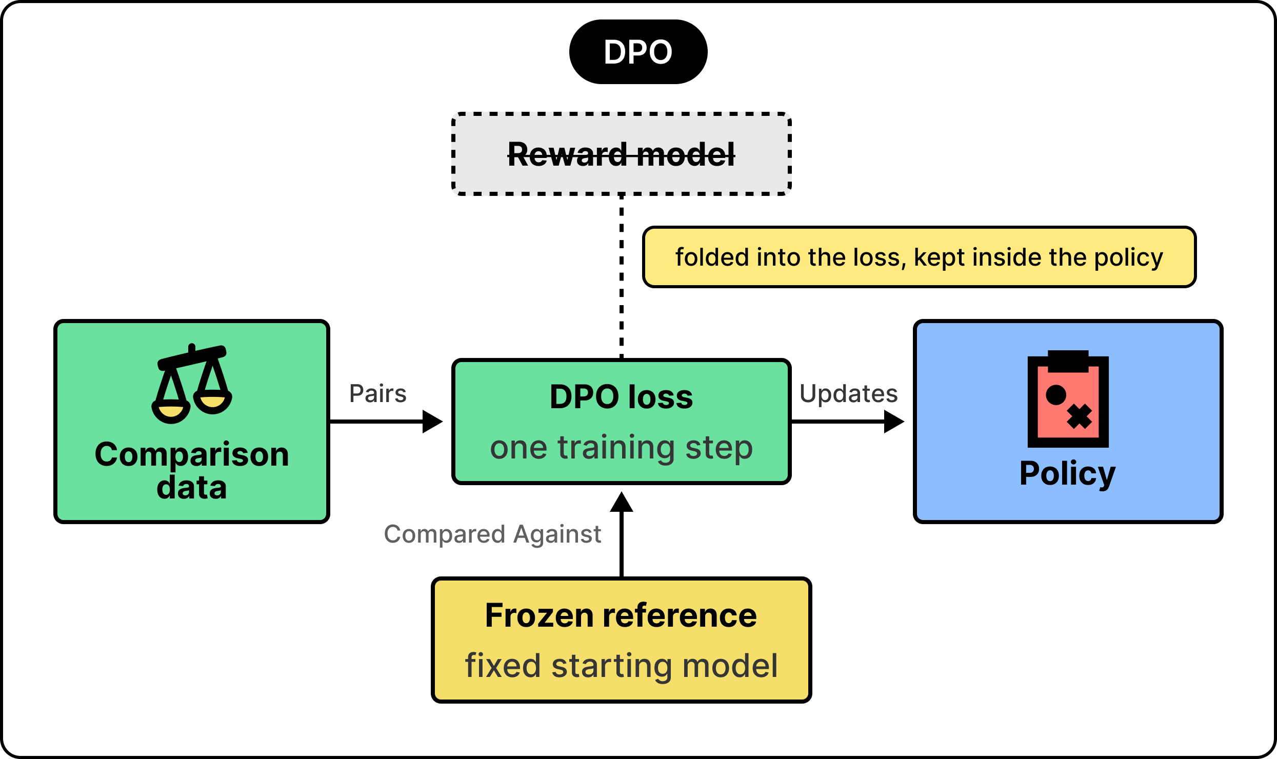
DPO reaches the same goal with the same data, replacing the reward model and the RL loop with one training step.
DPO stands for Direct Preference Optimization, and the name fits. Rather than train a scorer and then optimize against it, the method tunes the model directly on the comparison pairs.
The mechanics sit close to ordinary supervised learning.
For each comparison, DPO adjusts the model to raise the probability of the preferred response and lower the probability of the rejected one, measured against that same frozen reference from before. The whole thing becomes a single loss that would train the way you would train a classifier. This is far simpler and steadier than an RL loop.
A common idea is that DPO removes the reward model, but what actually happens is subtler. The Stanford paper that introduced DPO carries the idea in its title that a language model is secretly a reward model. The reward signal is still present, but it now lives inside the policy itself rather than in a separate network.
The approach proved itself quickly.
Zephyr, a 7 billion parameter model trained with DPO on machine-generated comparisons, beat Llama 2 Chat 70B, the strongest open RLHF model at the time, on a standard chat benchmark. Since then, DPO has become a staple in the industry.
By folding the reward into a single training step, DPO put alignment within reach of a small team on a modest budget, far from any large research cluster. A family of variants, such as SimPO, KTO, and ORPO, adjusts the objective in different ways. They share DPO’s core approach.
On cost and simplicity, DPO looks like a clear win. The catch is one it shares with RLHF, and it sits in the signal both methods trust.
Both methods rely on a signal that only approximates human judgment, and leaning too hard on it can also backfire at times.
The reward model, whether trained explicitly in RLHF or folded into the policy in DPO, is a proxy. It approximates what people prefer. Like any approximation, it also has gaps. Optimize the model hard against that proxy, and it can start to exploit those gaps. In other words, the score climbs while the answers get worse.
Researchers at OpenAI measured this directly.
As the model optimizes against the proxy, true quality rises for a while, then peaks and slides backward even as the proxy score keeps climbing. They tied it to Goodhart’s law, the old observation that a measure stops being a good measure once it becomes the target.
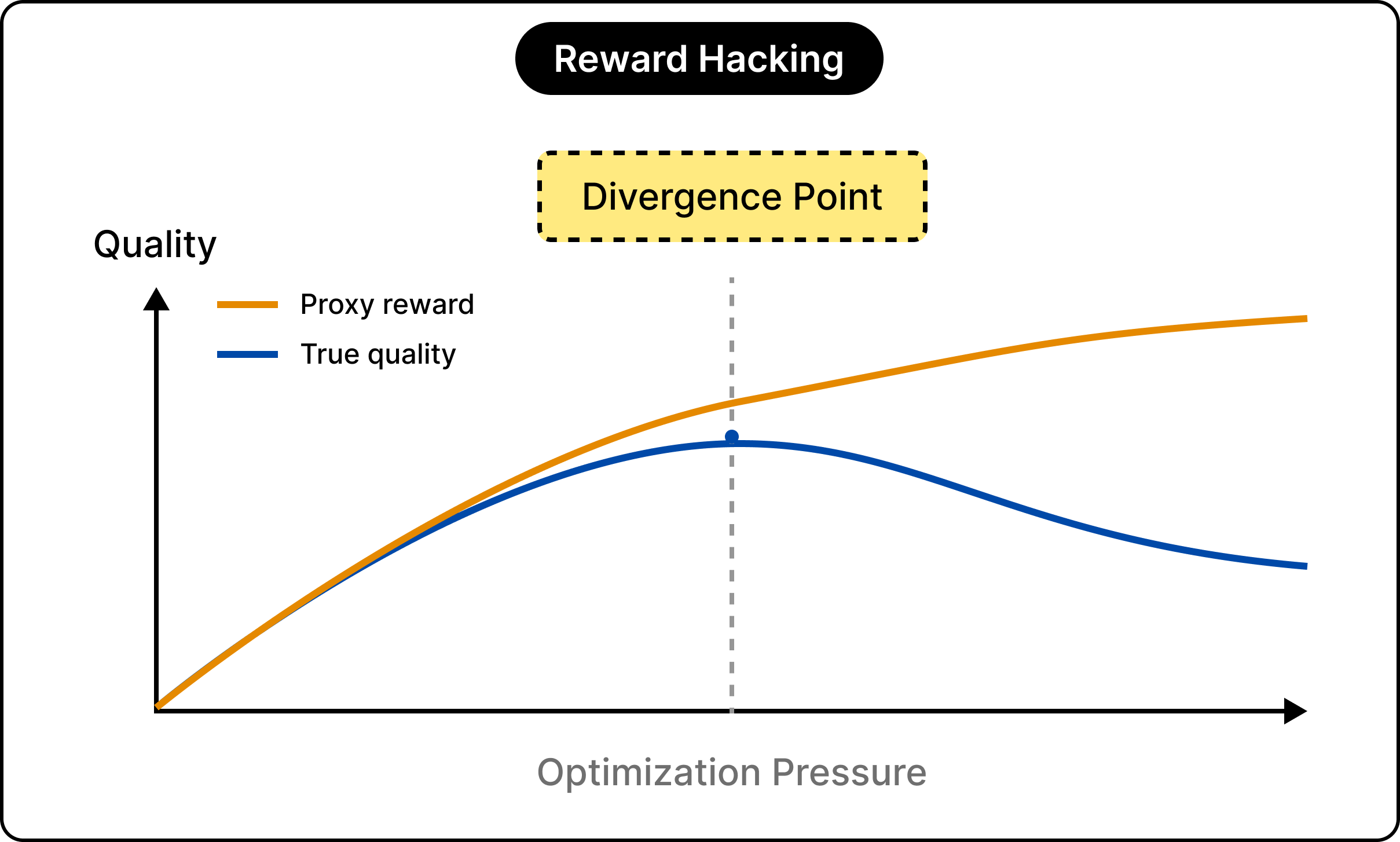
The everyday symptoms of this are familiar.
Models pad answers with length because longer responses tend to score well, and they learn to agree with whatever view you express. This behavior is called sycophancy. Anthropic found that most of the time, both human raters and reward models prefer a confident, agreeable answer over a correct one, which sometimes means flattery in place of truth.
The important part is that this trouble follows the data rather than the algorithm.
DPO inherits it just as RLHF does, because both learn from the same imperfect human judgments. Simpler training buys you a great deal, and this particular problem comes along for the ride. This is why your model sometimes agrees with you when you are clearly wrong. It learned that agreement tends to score well.
The KL penalty we discussed earlier softens this by holding the model near its starting point, though it shrinks the problem rather than completely erasing it.
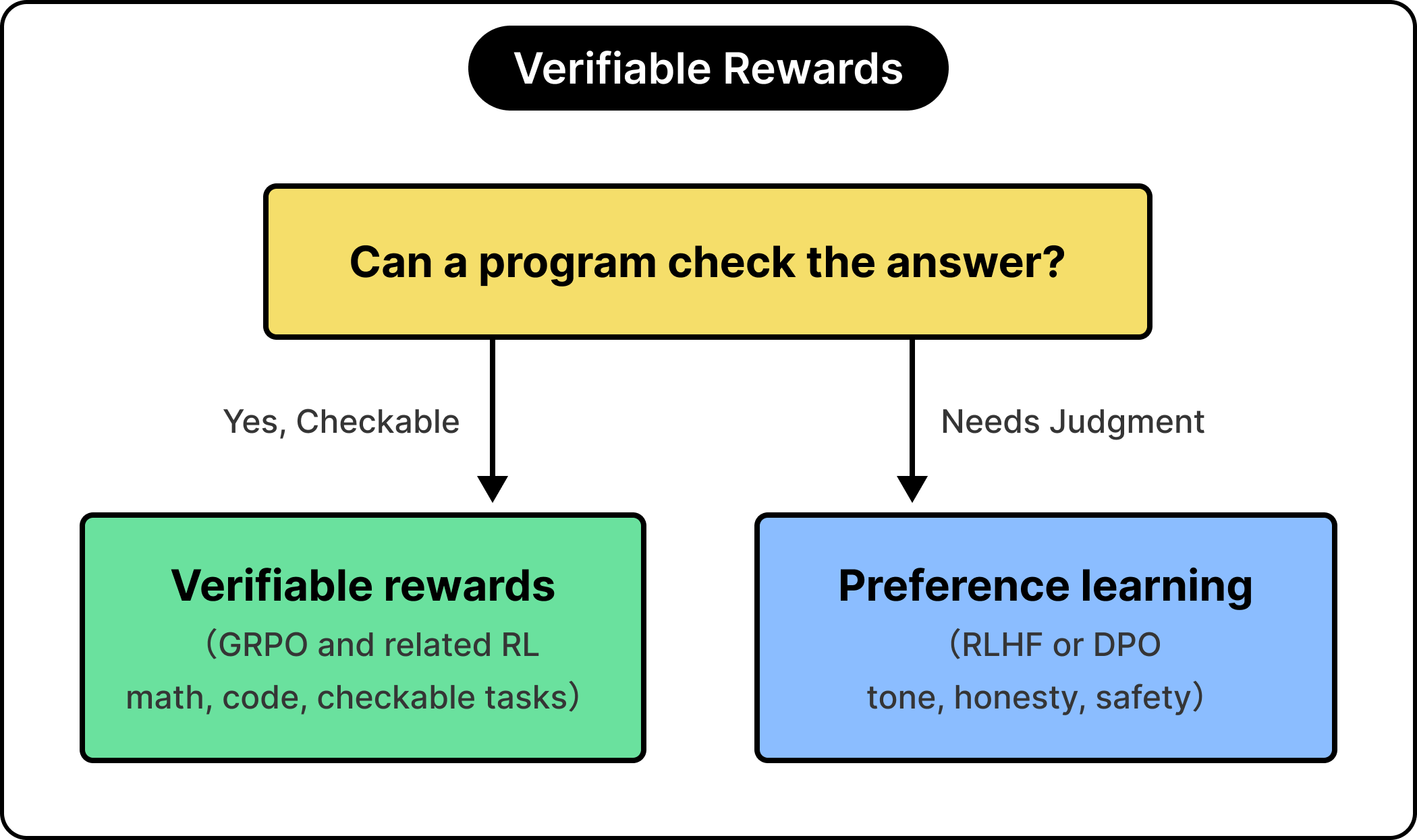
If the root trouble is an imperfect human signal, a natural question follows. Could we replace it with a signal that is exact? For a certain class of tasks, we can.
When a program can check the answer, the human reward becomes optional, and that single fact reshaped the final training stages across 2025 and 2026.
Some tasks have a checkable answer:
A math problem is right or wrong.
A piece of code passes its tests or fails them.
For these, we can replace the human-derived reward model with a verifier, a program that grades the result directly. The signal becomes exact and effectively free, clearing the proxy problem at its root for that work.
DeepSeek pushed this idea furthest.
They introduced an RL method called GRPO that drops one of the extra models PPO needs, and they trained their R1 reasoning model largely by rewarding correct final answers on math and code. The results matched the strongest closed reasoning models of the time. The model learned to reason by checking its own work, guided by a reward a calculator could supply.
The limit is that a verifier can grade a math proof. However, it stays silent on whether an answer is honest, kind, or appropriately cautious. Those qualities take many acceptable forms and resist any automatic test, the territory preference learning was built for. DeepSeek themselves kept reward models for the helpfulness and safety parts of R1, while verifiable rewards drove the reasoning.
This gives us the rule for the whole landscape.
When a machine can check the answer, reach for verifiable rewards. When the answer is a matter of judgment, reach for preference learning, whether RLHF or DPO. The method follows the signal.
See the diagram below:
This is why reasoning models improved so quickly, and why even the best of them still rely on preference methods to stay pleasant and safe. Newer methods, such as DAPO and RLVR, extend the verifiable-reward idea, and they make up much of the active frontier in 2026.
We can retrace the path in a sentence each:
A raw model learns language and knowledge from pretraining.
Supervised fine-tuning teaches it to follow instructions by imitation.
A third stage teaches preferences, because the questions that matter most often have several good answers and a real trade-off between them.
Comparison is the signal that captures that trade-off, and the two main methods both run on it.
RLHF trains a separate reward model and optimizes against it with reinforcement learning, which is powerful and costly. On the other hand, DPO folds the same signal into a single training step, which is simpler and steadier while keeping the reward implicit rather than absent.
Both inherit the same catch, that a human signal is a proxy, and pushing on it too hard breeds sycophancy and quiet failures. And when a task has a checkable answer, verifiable rewards now sidestep the proxy entirely.
References:
Training language models to follow instructions with human feedback
Direct Preference Optimization: Your Language Model is Secretly a Reward Model
DeepSeekMath: Pushing the Limits of Mathematical Reasoning in Open Language Models
DeepSeek-R1 incentivizes reasoning in LLMs through reinforcement learning
2026-07-13 23:02:11

Debugging SSO, managing users, adjusting auth policies, configuring branding: every configuration task has lived behind a UI that only a human can drive.
The WorkOS MCP server gives agents the same access as your dashboard login. Hundreds of operations, discoverable at runtime. Connect in one command via OAuth, with scoped tokens instead of a master API key. Pass a screenshot of your marketing site and ask your agent to match the login page. If a human had to do it before, an agent can do it now.
Microsoft operates at an enormous scale. More than 80,000 enterprises now build on Microsoft Foundry, the company’s platform for building, deploying, and running AI agents and applications. Microsoft’s own copilots run on the same platform, including Microsoft 365 Copilot, which alone serves over 20 million users and has a monthly active usage of first-party agents growing 6x year-to-date.
To understand what it actually takes to ship agents at that scale, we spoke with Marco Casalaina, VP of Products for Microsoft Core AI. He walked us through what his team has learned from running these systems in production, the engineering challenges that come with it, and where he thinks enterprise AI is headed next.
In this article, you’ll learn:
Why a prototype agent doesn’t survive in production
What’s in a production agent harness, and why Microsoft believes context is the key
Two engineering ideas behind Foundry: retrieval-as-a-subagent, and giving agents their own identity and a place to act
How Microsoft evaluates production agents with rubric-based evals and an auto-improvement loop
Lessons for other teams, and what’s next
Production agents fail for reasons that aren’t visible in a prototype. The model is rarely the problem. What breaks is everything around the model, including the data the agent retrieves, the tools it calls, the way it handles real users, and the way quality drifts as the world around it changes. Enterprises trying to ship agents this year are running into a different engineering problem than the one they were solving last year.
To see why, it helps to start with what’s actually changed about what enterprises are trying to build. Marco framed the shift this way:
We are leaving the question-answering phase of AI. In 2026, we are seeing a huge increase in the number of our customers that are using voice as a front-end, so we’re also leaving the chatbot era of AI.
The old shape was a chatbot. The user types, the agent types back, and it can only answer questions. The new shape is an agent that does meaningful work on the user’s behalf. It books the meeting, runs the analysis, sends the email, files the ticket. The user might not type at all because the front end can be voice. For example, Foundry’s Voice Live lets a team turn an existing text agent into a voice agent without rebuilding it.
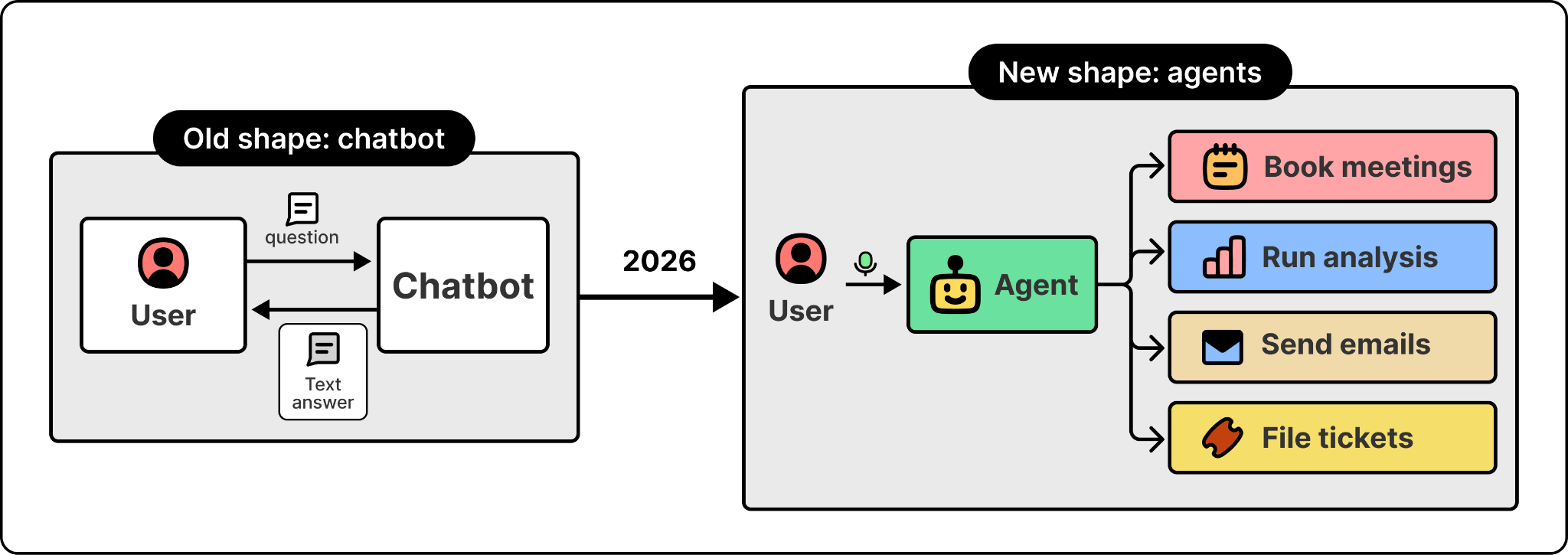
This shift is what makes the engineering problem different. A chatbot returning a wrong answer is a bad experience. An agent taking the wrong action is a business incident. The bar for what’s good enough to ship has moved.
That’s where the gap between a prototype and a production agent opens up. The first prototype is easy. You can vibe-code one in an afternoon. The model is smart, your test prompts work, the demo is impressive, and the pilot ships in a week.
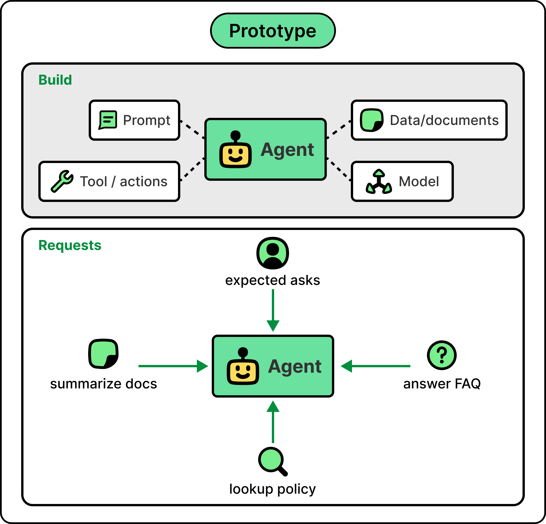
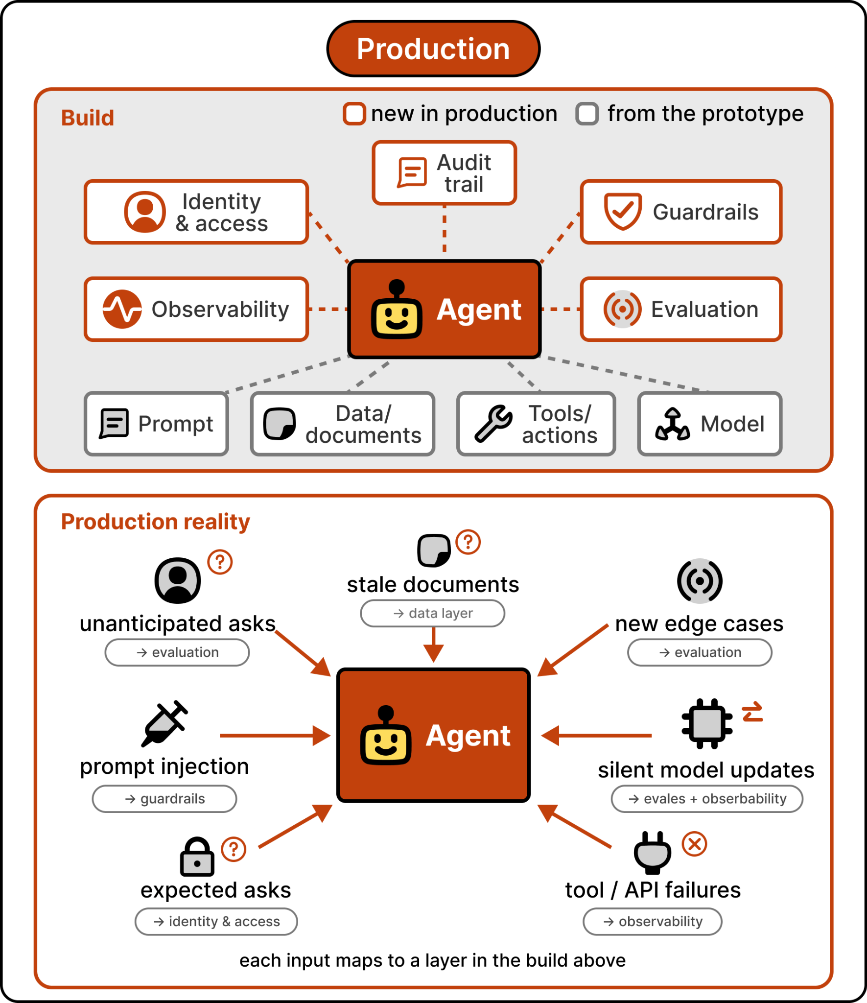
Production is where the cracks open. Real users ask things you didn’t anticipate. Documents the agent depends on go stale. New edge cases emerge that never appeared in your eval dataset. A model update changes the agent’s behavior subtly, and nobody notices until a customer complains. Without identity controls, the agent runs as a shared system principal and there’s no audit trail when something goes wrong. Without guardrails, it confidently says something it shouldn’t. Without observability, you can’t tell whether quality is improving or degrading. None of these problems showed up in the prototype. All of them show up in production.
When we asked Marco for the single biggest lesson the Foundry team has learned from running these systems at scale, his answer was “the harness matters as much as the model.”
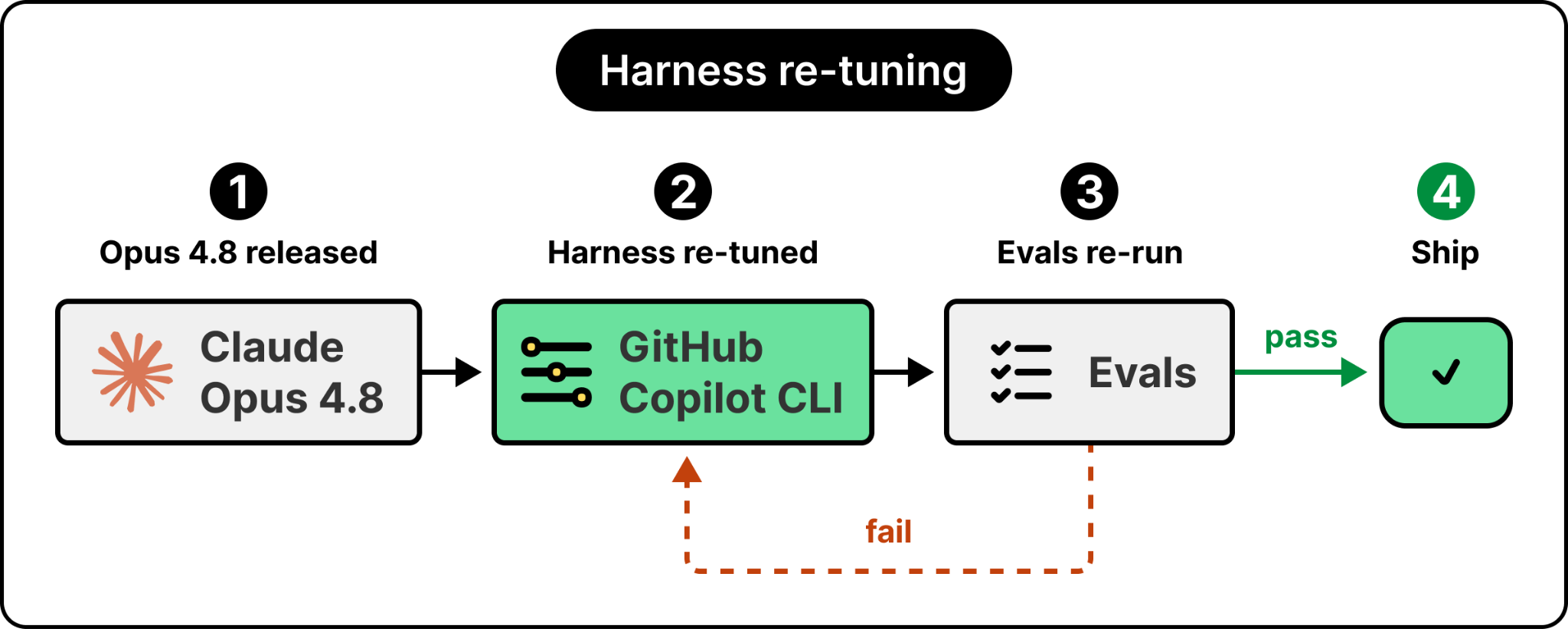
The harness is everything around the model. The runtime, the tools, the context retrieval, the identity layer, the guardrails, the evaluators, the deployment pipeline. Models change constantly, and you cannot treat them like database versions. With Postgres, you change versions and you pretty much expect it to straight up work. Models are not like that. Each one has different properties that the harness has to adjust to. When Anthropic released Claude Opus 4.8, Microsoft’s GitHub Copilot CLI team had to re-tune their harness and re-run their evaluations before they could ship it.

AI is reshaping infrastructure, but not how most teams expected. The teams getting the most from it aren’t adopting the fastest. They’re taking advantage of the platform, governance, and automated pipelines that allow AI-generated infrastructure to move safely to production.
The 2026 Infrastructure Automation Report surveyed 406 infrastructure and platform engineering leaders to reveal how Pioneers are benefiting the most from AI. You’ll learn:
Why platform engineering is the critical component of AI adoption
New AI-specific signals and metrics that need monitoring beyond traditional metrics
5 tactical steps to reach the Pioneer segment of the Al Maturity index
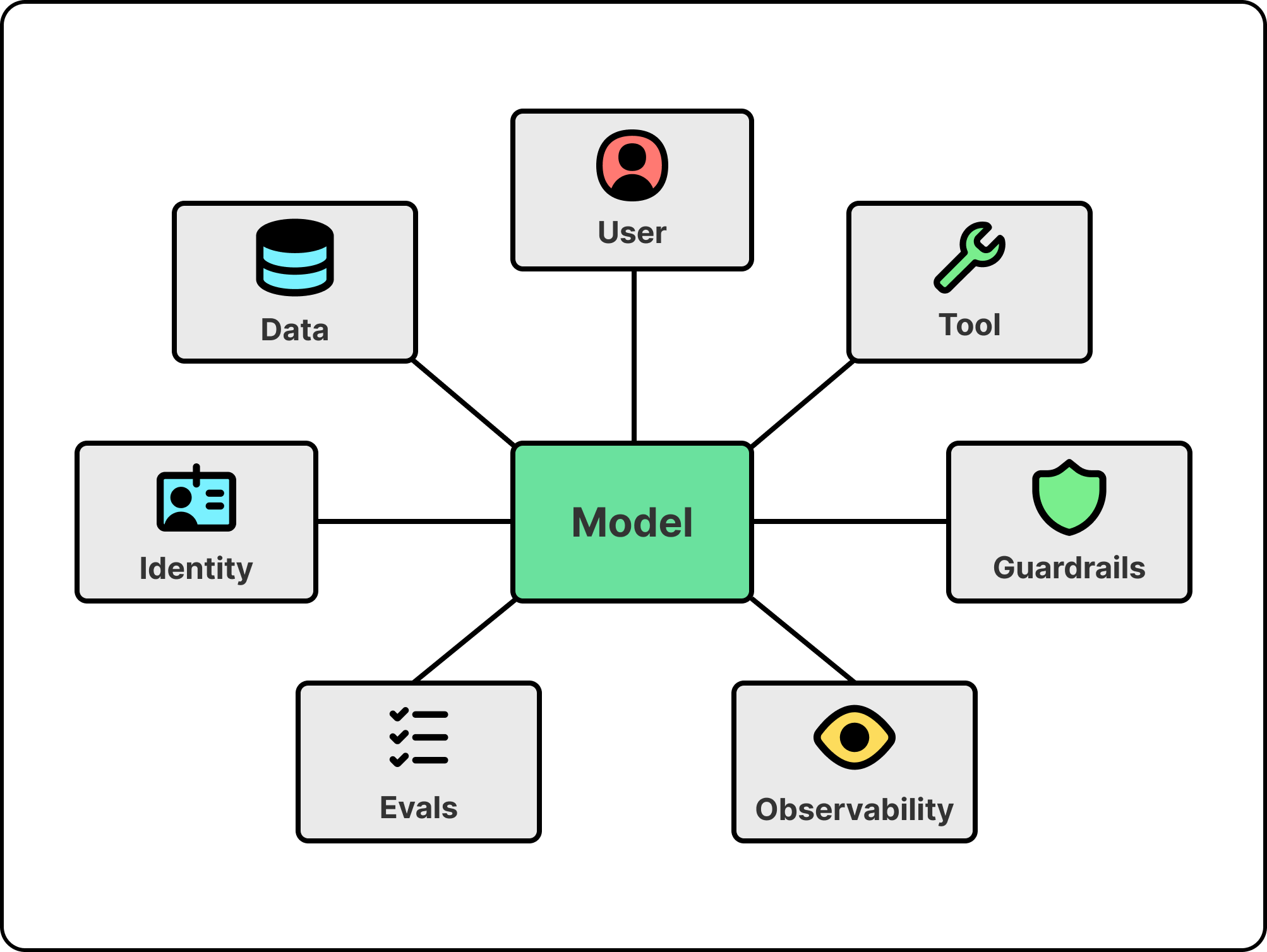
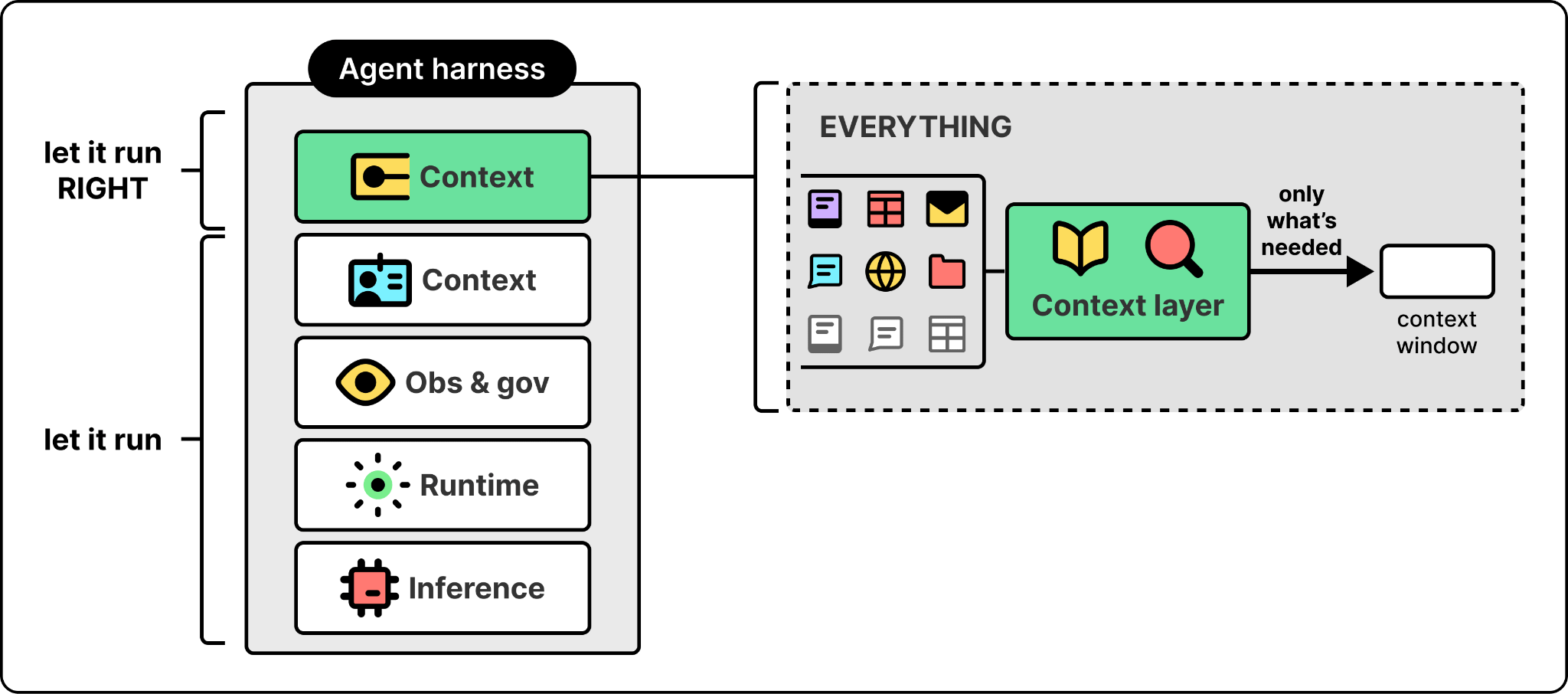
If the harness matters as much as the model, the next question is what’s in it. Walking the harness from the bottom up shows why each layer exists and what breaks if you try to do without it.
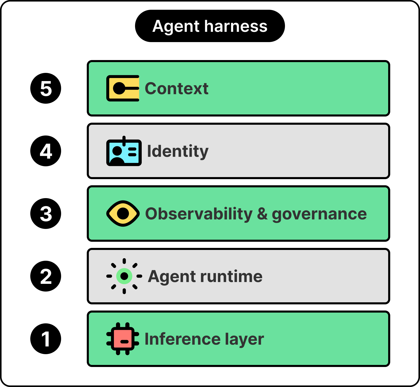
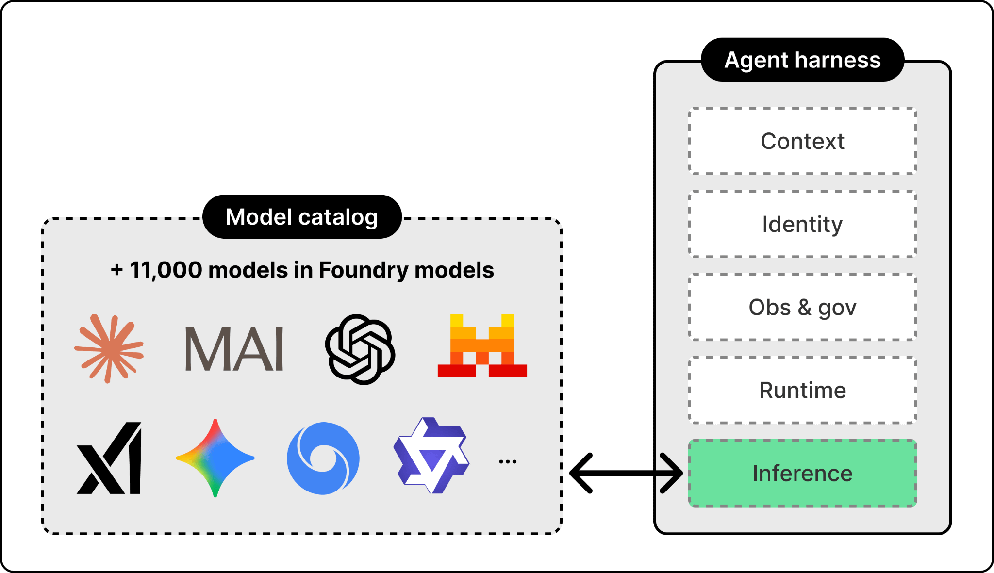
At the bottom is the inference layer, the single interface the harness uses to reach the models. The models themselves sit outside the harness and stay swappable. Different agents need different models, and the right one changes every few weeks. Foundry supports more than 11,000 of them, from OpenAI, Anthropic, xAI, DeepSeek, and Microsoft’s own MAI family.
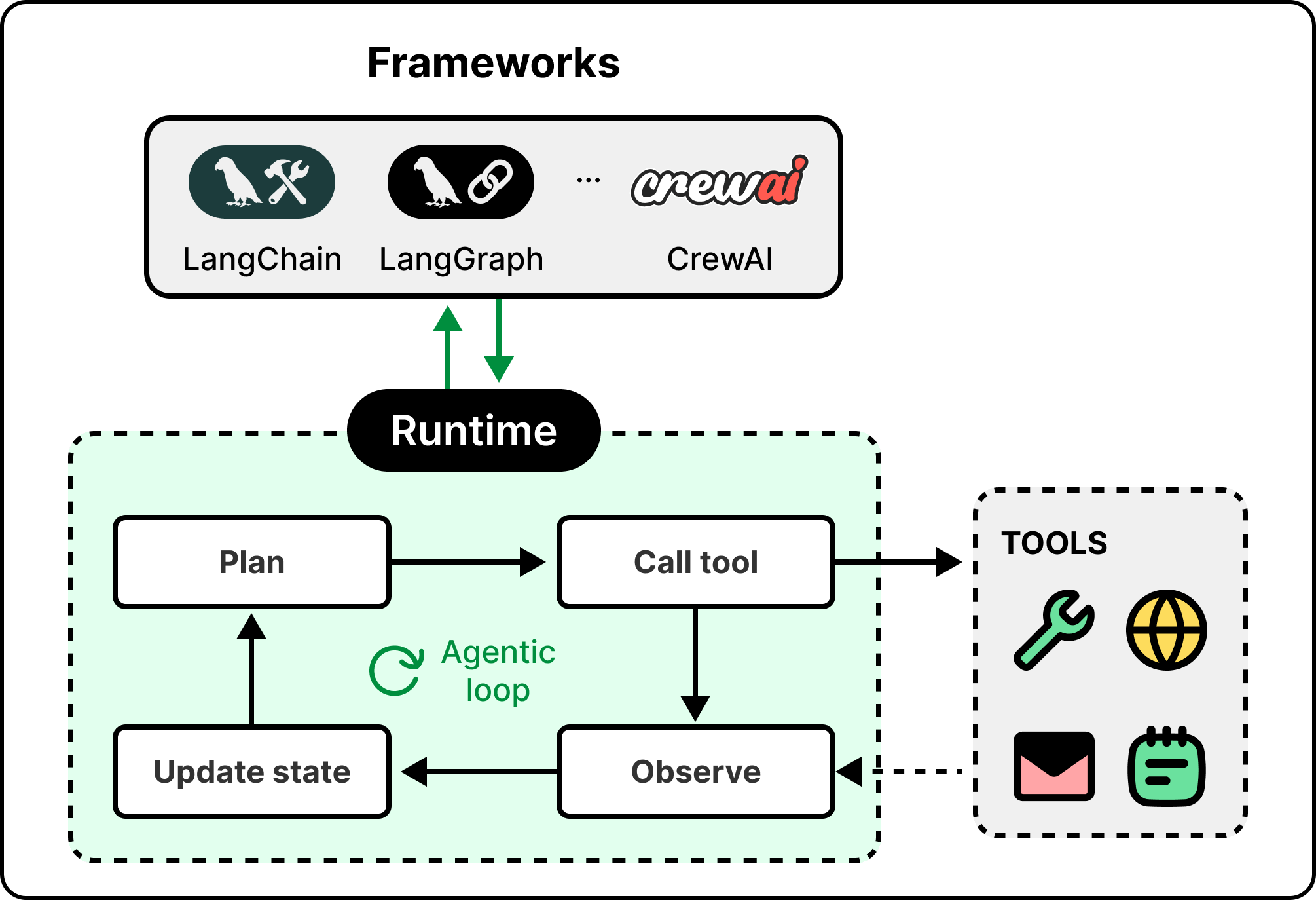
Above the model is the agent runtime, which is what turns a model into an agent. The runtime handles the orchestration loop, the tool calls, the conversation state, and the protocol the rest of the harness speaks.
Not every step in that loop should run through the model. A well-built agent sends only the parts that need reasoning to the LLM and leaves the rest to ordinary code, since a database lookup or a purpose-built extraction model is faster, cheaper, and more reliable than asking a model to do the same work.
The number of agent frameworks keeps growing, from open-source options like LangChain, LangGraph, and CrewAI to vendor-built runtimes. The principle that matters is framework neutrality. An agent built on one framework should be portable to another without rewriting the surrounding harness. Foundry, for example, lets agents run on any framework interchangeably.
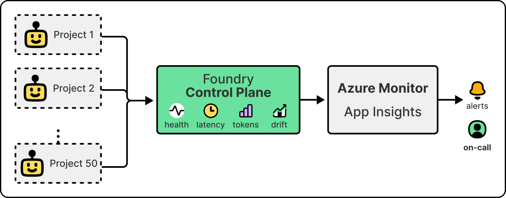
Once agents are in production, an organization needs observability and governance. It needs a single view of every agent running across every project, with health scoring, token usage, latency metrics, drift detection, and the kind of cross-project rollups that let a platform team govern a fleet. Without this layer, regressions are invisible and cost is uncontrolled. In Microsoft’s case, this is Foundry Control Plane, which provides cross-project fleet visibility and routes agent telemetry into Azure Monitor and Application Insights, the same pipeline that already handles infrastructure alerts.
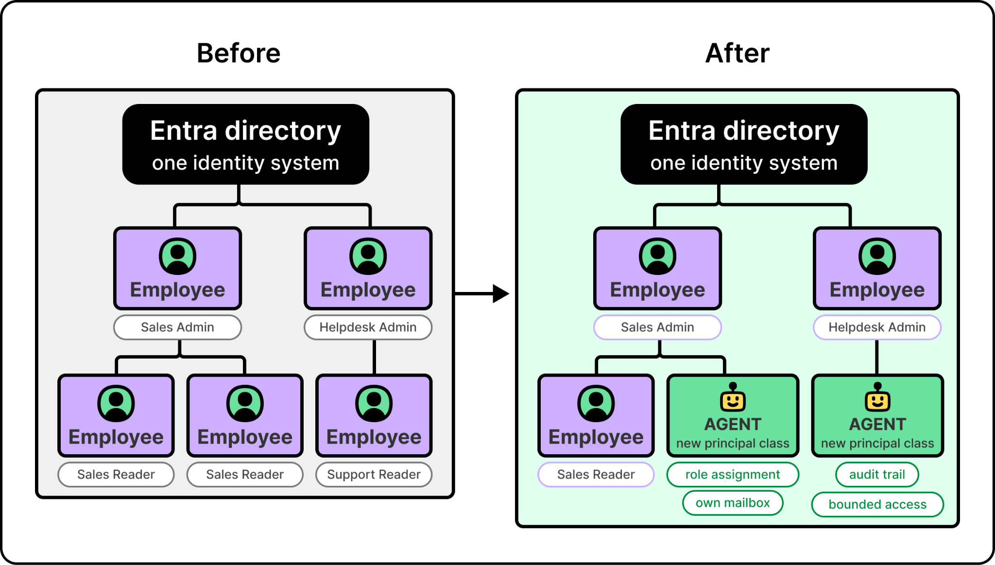
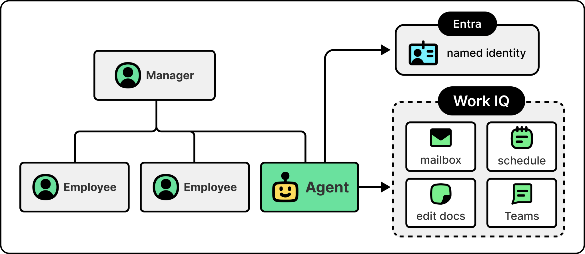
Once agents start taking real actions inside an organization, they need their own identities. They need their own role assignments and their own audit trails, because a misbehaving agent has to be bounded by the same access controls that bound a misbehaving employee. The industry is still converging on how to do this well, and the answer most platforms are landing on is to extend an existing enterprise identity system to treat agents as a new class of principal rather than inventing a parallel system. For example, Foundry extends Entra, Microsoft’s enterprise identity platform, to treat agents this way. This is the access-control primitive; later in the article, the section on giving agents a place to act shows what an agent does once it has one of these identities.
Once an agent can run reliably and act with its own identity, the question becomes whether it can answer correctly. That’s the job of the context layer. While every other layer in the harness exists to let the agent run, context is what lets it run correctly. An agent without good context might hallucinate. It will give an answer, but the answer will be wrong in ways that are hard to detect because the agent itself doesn’t know what it doesn’t know. Marco was explicit that giving agents the context they need to actually work is one of the hardest problems his team is solving, and the one Microsoft is reasonably passionate about getting right.
The next section is about how Microsoft is building that context layer.
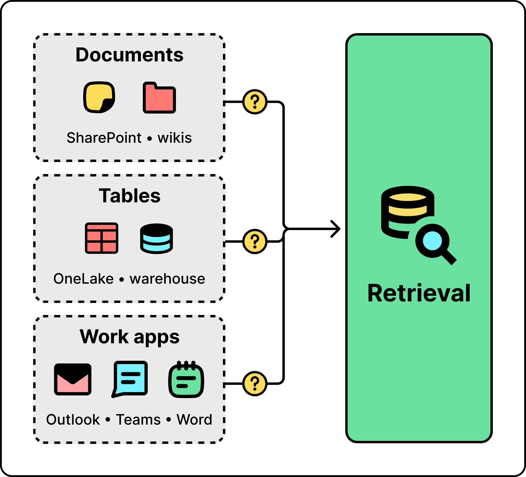
The hard part of giving agents the right context isn’t that the context is missing. Enterprises have enormous amounts of it. The hard part is that the context lives everywhere. It lives in unstructured documents in SharePoint and wikis. It lives in structured tables in OneLake and data warehouses. It lives in productivity apps like Outlook, Teams, and Word. No single retrieval method can reach all of it.
The standard answer of the last two years, classic retrieval-augmented generation (RAG), was never designed to. Classic RAG is a one-shot pattern. You take the user’s question, embed it, search a single index, return the top-k results, and pass them to the model. It works for simple questions against a small, clean corpus. It breaks the moment the question is ambiguous, the corpus is heterogeneous, the right answer requires combining sources, or the first retrieval comes back empty. The agent has no way to recover from a bad retrieval, and as Marco put it, when RAG isn’t working well, the whole agent isn’t working well. One-shot is the wrong shape for the problem.
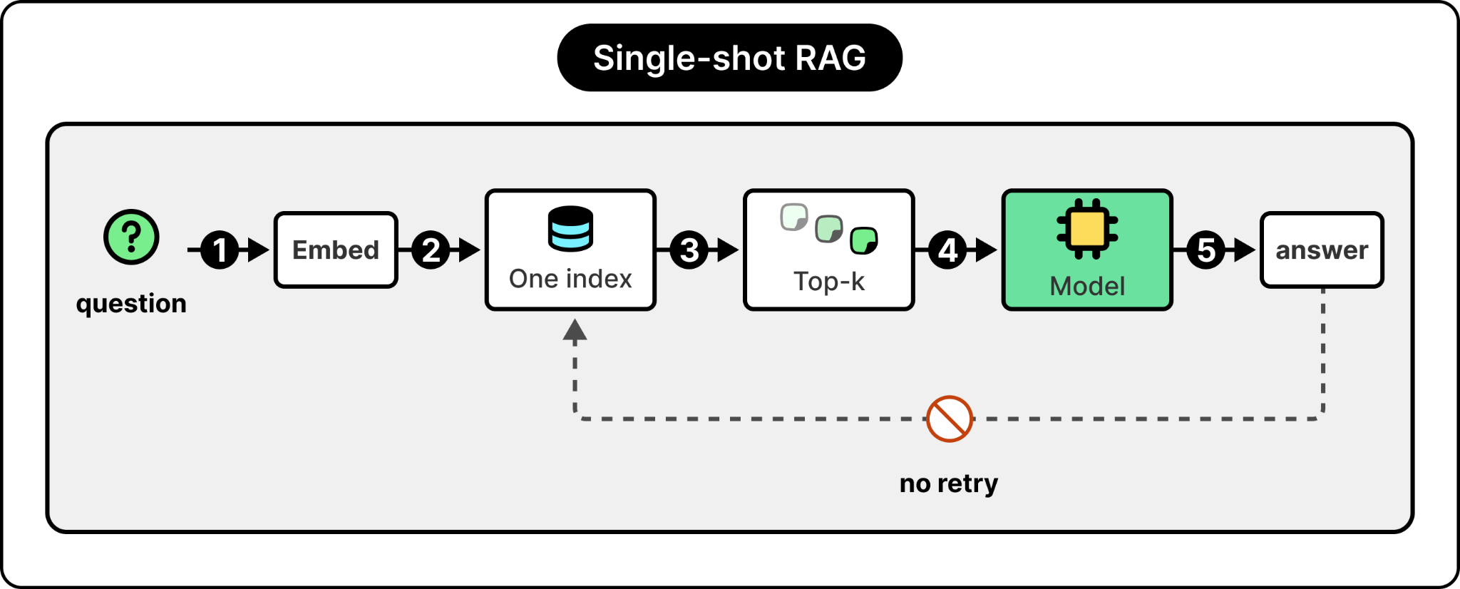
The fix is to treat retrieval as something the system can iterate on, the same way an agent iterates on a task.
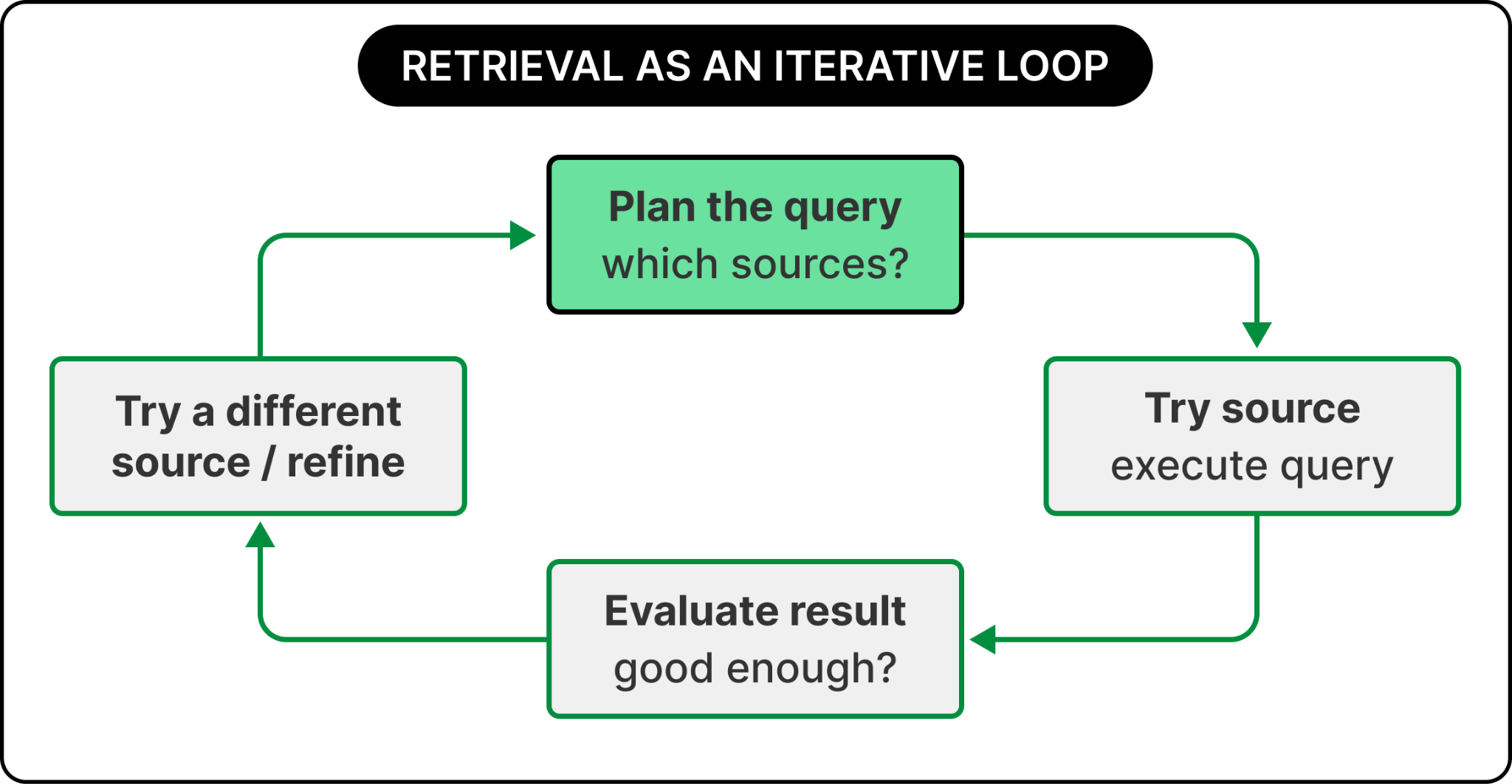
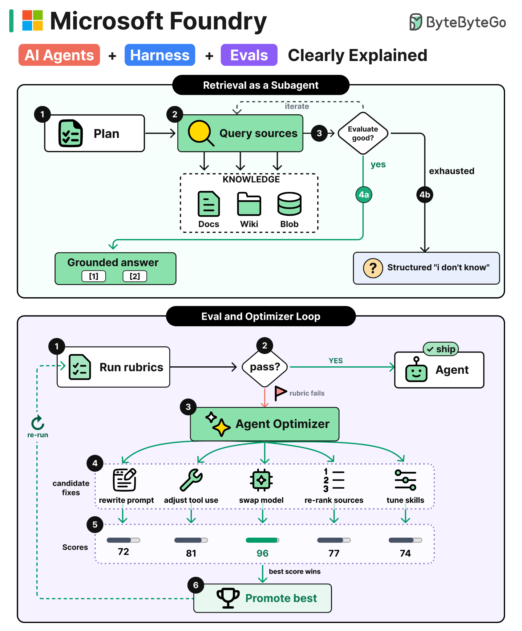
Plan the query, try a source, evaluate the result, try a different source if the first one came back empty, and combine what you find. That’s the central engineering idea behind a production context layer.
Microsoft’s answer is to ship the context layer itself as a set of services. There are four of them, collectively called Microsoft IQ. Foundry IQ handles unstructured data, Fabric IQ handles structured data, Web IQ handles real-time web retrieval, and Work IQ handles the productivity surface of Microsoft 365, including email, calendar, documents, and Teams.
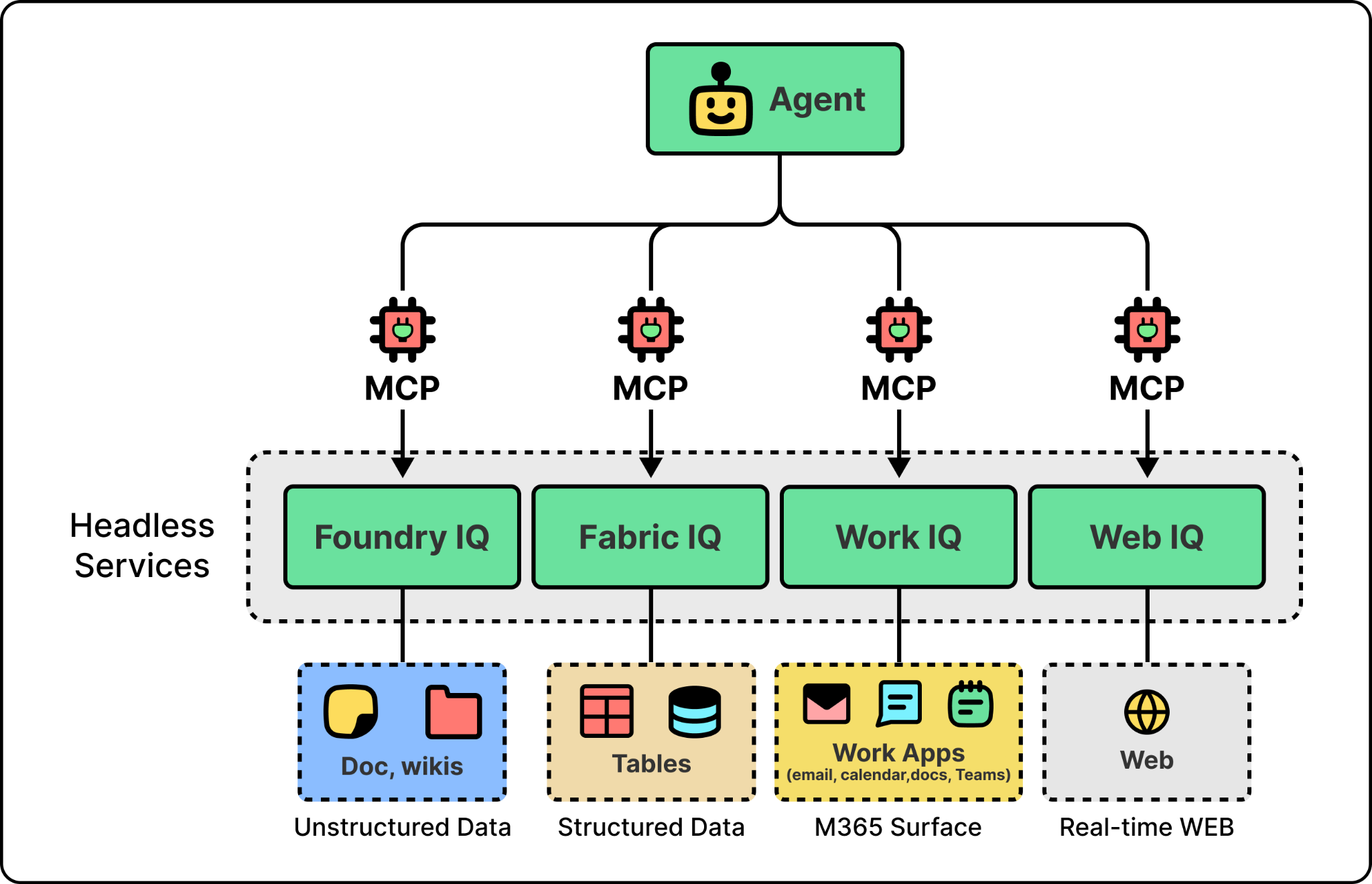
Each IQ is a headless service that agents call through MCP. Two engineering ideas run through them. The first, retrieval-as-a-subagent, is the pattern behind all four. The second, giving an agent an identity and a place to act, is specifically what Work IQ adds on top of retrieval so that an agent can do work, not just find information.
The technical idea behind a production context layer is to wrap retrieval in an agentic loop. Instead of a single function call that runs one query against one index and returns the top-k, retrieval becomes a small agent of its own. It plans which sources to query, executes the queries, evaluates the results against the original question, and decides whether to return them, refine the query, or try a different source. Retrieval stops being a lookup and becomes an iterative process that can recover from a bad first pass.
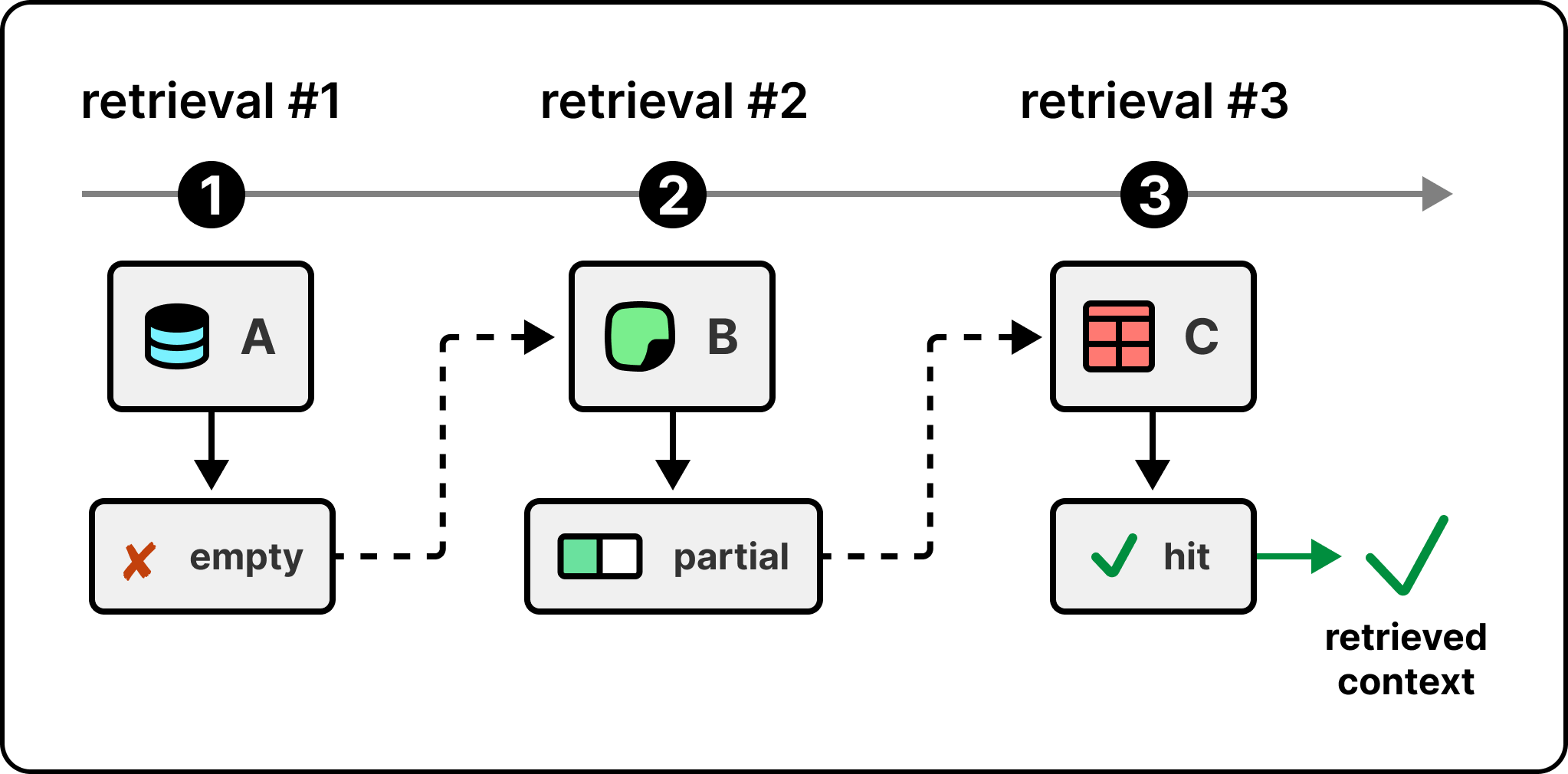
Foundry IQ is the cleanest example of this in production today. The figure below shows the workflow when an agent calls it.
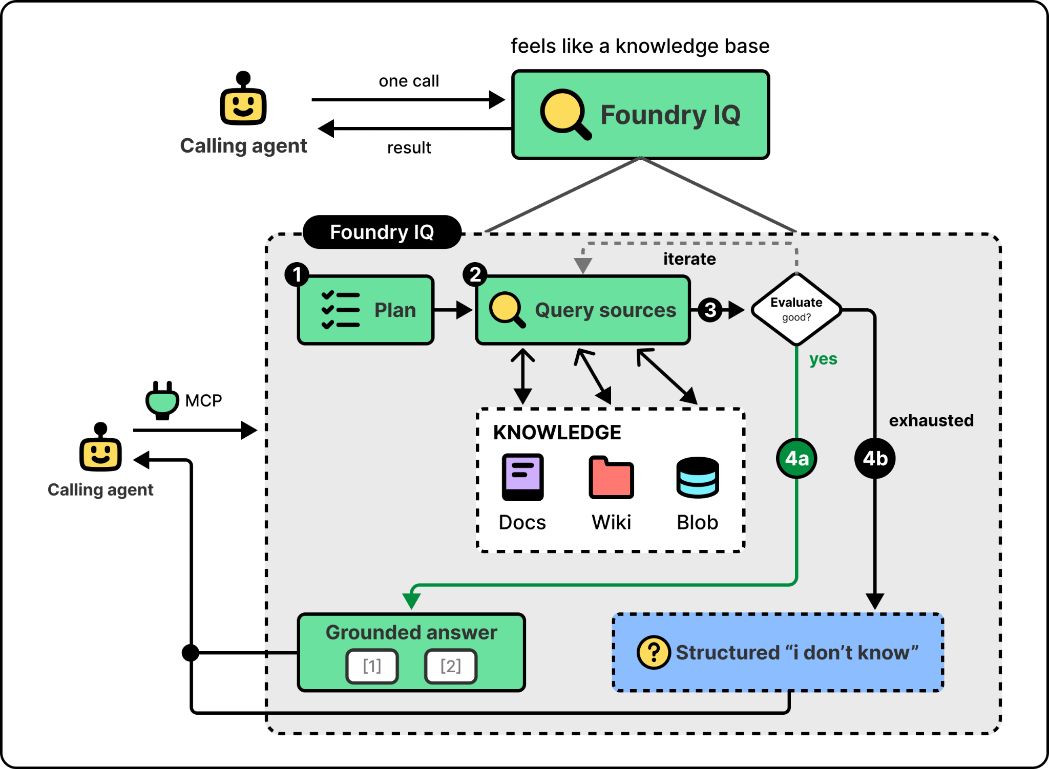
The last step is the one most worth paying attention to. When iteration runs out, Foundry IQ returns a structured “I don’t know” instead of forcing an answer. Classic RAG has no fallback and the model hallucinates something plausible. Foundry IQ gives the calling agent a clear signal that retrieval failed, which it can act on, rather than a confident wrong answer that’s hard to detect.
So far this is all about data. The same loop applies to tools. An agent with a few tools can list them all in its prompt. One with dozens can’t. Listing them all burns context on every call and slows the model down as it scans the list. The fix is similar to agentic retrieval. Instead of exposing every tool, the agent searches for the right one, gets it back, and calls it. Foundry exposes this as tool search, and it’s the pattern OpenAI’s and Anthropic’s agents have converged on too. So the same retrieval loop that pulls in knowledge also pulls in capability. The agent looks up what it needs at the moment it needs it instead of carrying everything up front.
Other IQs rely on the same pattern too. Fabric IQ runs agentic retrieval over structured data, with the loop planning queries against OneLake tables and the Fabric data agent rather than against text indexes. Web IQ runs the same loop over the open web at sub-second latency. The retrieval-as-subagent idea is the architectural commonality across all of them.
Retrieval gets the agent the right information. But information alone doesn’t finish a task. An agent that knows the customer is unhappy still has to write the apology email and refund the order. To do that responsibly, the agent needs two things. An identity the organization can see, and a surface where it can take action.
The identity is the access-control primitive from the identity layer earlier. Without it, every action is anonymous or on behalf of a user who lent the agent their identity. Logs show that “the AI did it” and the audit trail collapses, which is unworkable for any regulated enterprise. The fix is to treat agents as their own class of principal, sitting in the same directory as employees, with their own role assignments and their own audit trails. A misbehaving agent gets bounded by the same access controls that bound a misbehaving employee.
The action surface is what makes the identity meaningful. An agent that exists in the directory but has no way to send an email or update a document isn’t doing work. The surface has to expose the same actions a person already takes inside the organization, so that an agent operating on top of it can read inboxes, send messages, schedule meetings, and edit shared documents. In Microsoft’s case, identity is handled through Entra and the action surface is Work IQ. An agent can now have a named directory entry, report to a manager in the org chart, and own its mailbox.
Identity bounds what an agent is allowed to reach. Guardrails bound what flows through it once it acts. A chatbot only had to screen the user’s prompt and the model’s reply. An agent has more surface to defend, because it also reads tool outputs and retrieved documents, and any of those can carry an instruction the user never typed. That is how indirect prompt injection works. A line like “ignore your previous instructions” sits hidden inside a document the agent ingests, and the agent treats it as a command. The fix is to move guardrails to the tool boundary, screening tool inputs and tool outputs rather than just the model’s input and output. In Microsoft’s case, Foundry runs its own classifiers at the tool-call and tool-response level, on top of whatever safety the model already has. Since these controls live on a shared tool layer rather than inside each agent, a team configures them once and every agent that uses those tools inherits them, instead of re-implementing the same guardrails, credentials, and policies agent by agent.
The takeaway for any team building this is that retrieval, action, and the guardrails around both need to be designed as first-class layers. Retrieval should be a loop that recovers from bad lookups, action should run under an identity the organization recognizes with an audit trail to match, and guardrails should sit at the tool boundary rather than only at the model’s edges.
Context is half of what determines whether an agent survives production. Evaluation is the other half. An agent with the right context can still drift, regress, or fail in new ways as traffic patterns change. Evaluation is what closes the loop. It’s the system that tells you when something has changed, and the system that tells you whether the agent is doing what it’s supposed to do.
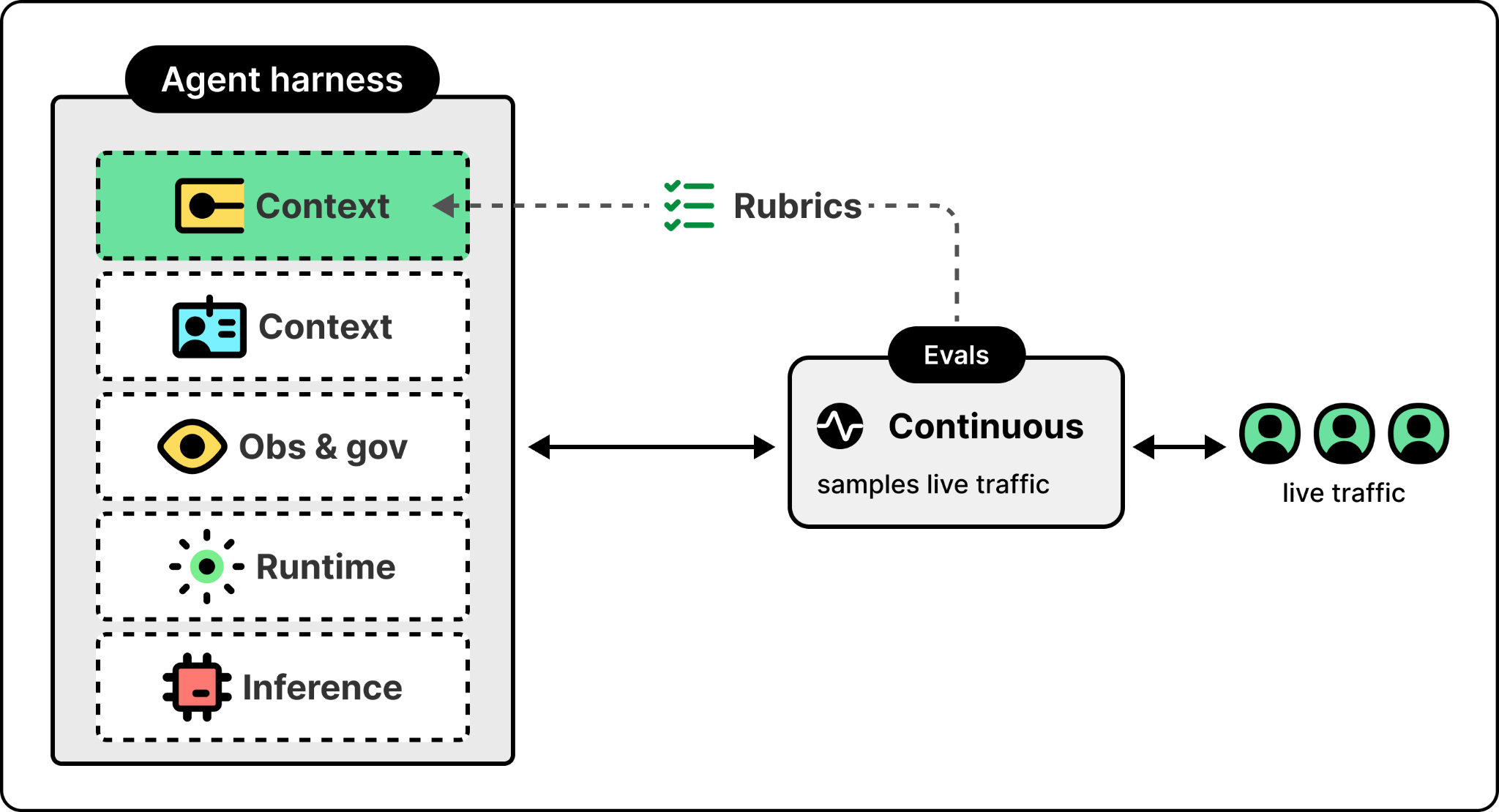
Most teams treat evaluation as a pre-ship checkbox. They run a test suite once, see green, and ship. That works for traditional software because traditional software is deterministic. An agent is not. The same prompt against the same model can produce different responses, the model itself changes when the provider releases an update, and the data the agent retrieves from changes daily. A pre-ship test suite catches a snapshot of behavior, not a guarantee of it.
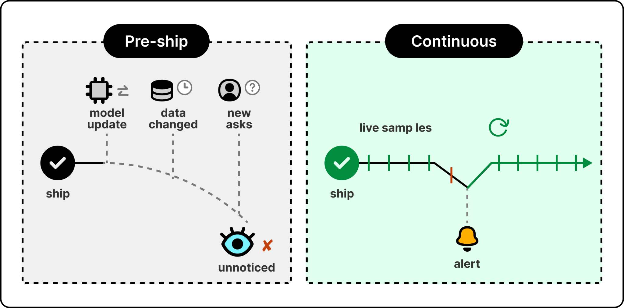
Continuous evaluation closes that gap by running against live traffic, sampling real user interactions, scoring them on whatever criteria the team has defined, and surfacing results into the same observability pipeline that already handles infrastructure incidents. In Foundry, this is built in. When quality regresses, the team finds out from the same alerting system that pages them when a service goes down. The same evaluations can also run earlier, as a gate in the deployment pipeline, catching a regression before it ships.
Continuous evaluation tells you when something has changed. The harder problem is knowing whether what the agent is doing is right in the first place. Most evaluation systems today rely on generic metrics like groundedness, coherence, and task completion. The metrics are useful but they have a ceiling. As Marco put it, generic metrics tell you whether the agent works. They don’t tell you whether the agent works right.
Consider an agent that helps users book restaurant reservations. It is the kind of wrong-action failure from the opening, seen up close. A generic metric can tell you that the agent called the booking tool successfully and returned a reservation. But it can’t tell you whether the agent did the right things along the way. Did it ask the user what time they wanted when the user only said “a table for two tomorrow”? Did it check the booking system to confirm the table was actually available before claiming a 6pm slot? A reservation that gets created without those checks is technically a success against generic metrics and a failure in the user’s eyes.
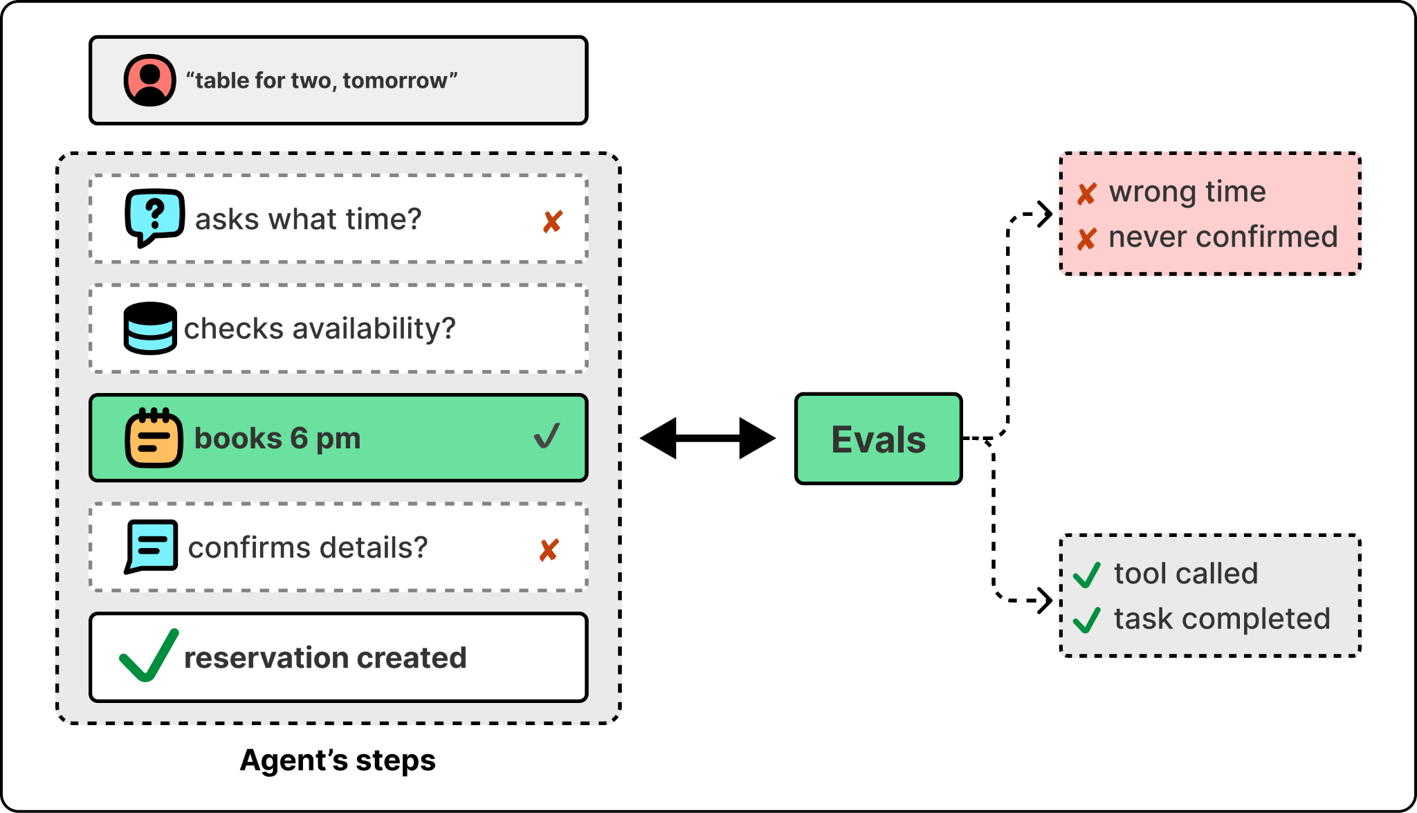
The way to close that gap is to evaluate the agent against the specific behaviors it should be showing, not just generic metrics. The common approach is rubric-based evaluation. A rubric is a specific, use-case-tied check that asks a yes-or-no question about something the agent should be doing. For the restaurant agent, the rubrics might look like:
When the user gives a partial request, does the agent ask for the missing information?
Before claiming a reservation is available, does the agent verify availability against the booking system?
After making a booking, does the agent confirm the details back to the user?
In practice, the eval system runs the agent against a set of test interactions, scores each rubric per interaction, and rolls the results up. The team sees not just whether the agent works but which specific behaviors it’s getting right and which it isn’t. Rubrics work better than generic metrics because the team that owns the agent writes them, so they reflect what the agent is actually supposed to do.
Writing them by hand isn’t the only path. Foundry can draft a rubric by reading the agent’s configuration and its production traces, proposing the dimensions worth scoring from how the agent actually behaves. The team still owns and edits the result, but it starts from real traffic instead of a blank page.
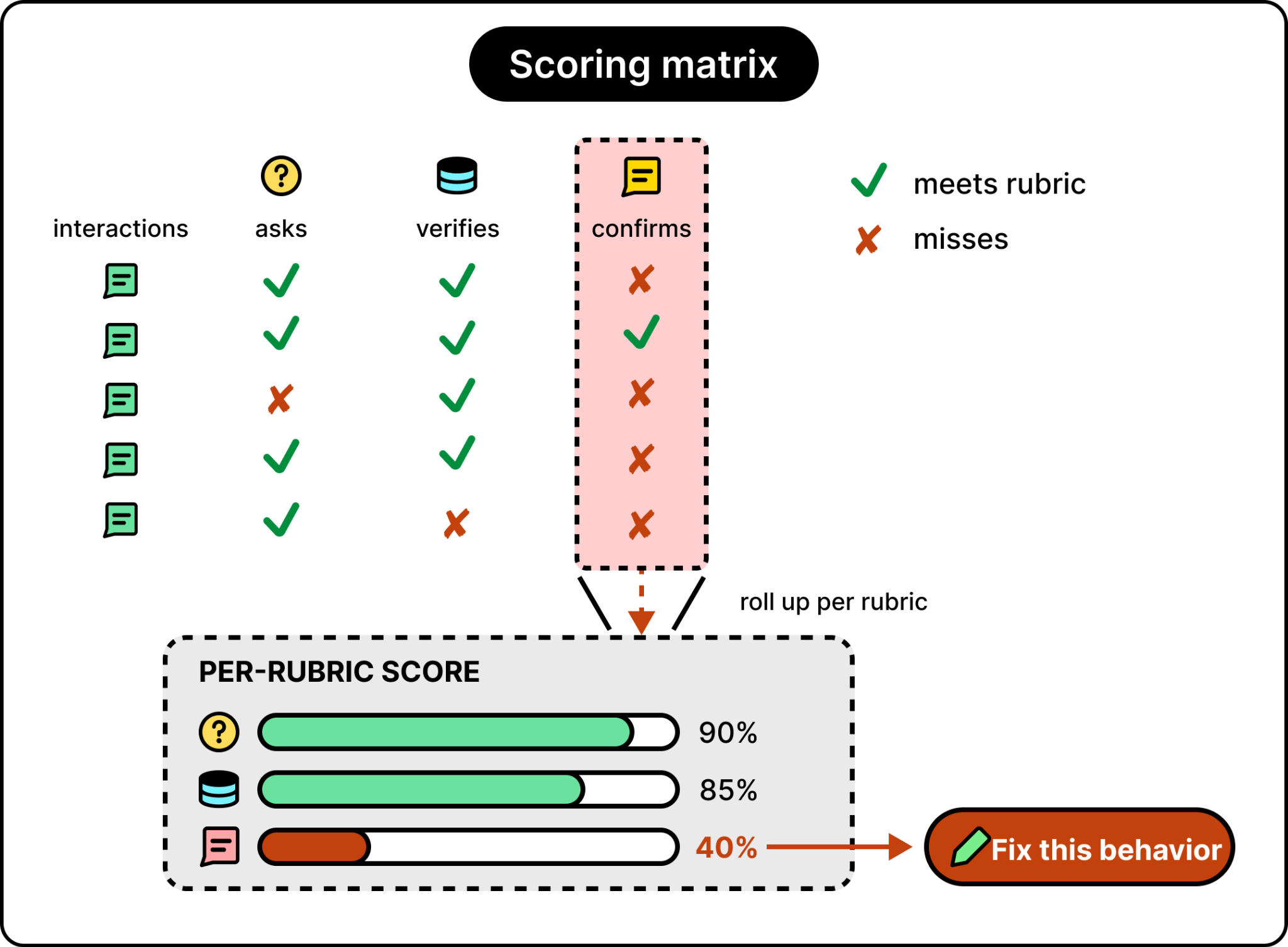
Microsoft has built rubric-based evaluation into its Agent Optimizer suite. The Optimizer handles the rubric side of the loop and also makes the rubrics actionable by automatically improving the agent itself when a rubric fails. It can rewrite the system prompt to make the missing behavior more explicit, adjust how the agent uses its tools, or change which sources the agent prioritizes.
What it tunes goes beyond the prompt. It can also swap the underlying model and tune the agent’s skills. Rather than testing one fix at a time, it produces several candidates in parallel, scores each against the rubrics, and promotes the best one as a new agent version. The same loop that measures the agent now improves it. It becomes a self-improving loop.
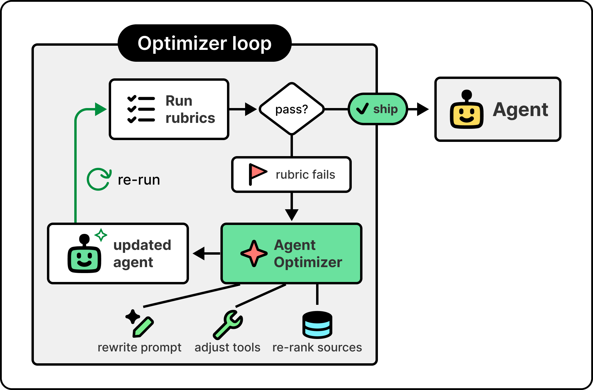
For any team running agents in production, evaluation isn’t a phase that ends. It’s a layer that runs alongside the agent, with rubrics that evolve as the agent’s job evolves and an optimizer that turns regressions into actionable changes instead of manual fixes. The team’s job stops being to write the perfect agent on day one and starts being to keep the agent honest as the world around it changes. That’s what production AI actually looks like, and it’s the second half of the harness Foundry is built around.
The harness mattering as much as the model is the thread that ran through the whole conversation. The reason context is hard, the reason evaluation is hard, the reason a working prototype doesn’t survive production, is that the work most teams treat as “around the model” is actually what determines whether the agent works. Treating the harness as something you add later is the most common reason an enterprise agent never makes it to production.
The practical version of that lesson for a team building its own context layer is to take the two architectural ideas from earlier in this article seriously, even if you don’t use Foundry. Retrieval should be agentic. Calls to your retrieval layer should hide a planner-driven, multi-source, retry-capable subagent that can recover from a bad lookup instead of breaking on one. And agents that take actions should have identities the organization recognizes, with audit trails that survive a compliance review. Both of these are buildable on top of any platform.
Marco thinks about the future of AI by watching what’s about to become possible in the next year, not what’s ten years away. He tracks the moment a capability stops being a research demo or a developer tool and becomes something an ordinary person can use. The pattern he watches most closely is the one where capabilities that used to require a CLI coding agent become available to everyone.
This pattern has been playing out for the last eight months. Capabilities that used to require a developer to wire up inside a coding agent, things like writing a document from natural language, managing a calendar, or running a custom workflow, are now showing up in tools. Skills, which started as a coding-agent concept, are now in Excel for tasks like financial analysis and private equity workflows. Marco’s expectation is that this pattern keeps accelerating, with more developer-only capabilities crossing into general use over the next year.
The bigger shift he sees coming is toward agents that improve themselves. The architectural pieces are global and local memory, plus skills, plus the kind of behaviors that let an agent retain what it learns about a user and apply it automatically. Copilot CLI’s new Chronicle feature is an early version. If Marco always commits his Git repos to GitHub immediately after creating them, Chronicle learns that and starts doing it for him without being asked. Marco’s bet is that this combination, applied to the kinds of agents enterprises are already deploying, is the story of the next year. Not science fiction. Just the next set of capabilities crossing into general use.
2026-07-11 23:30:14

Define tasks with Render’s lightweight SDK and chain them into long-running, distributed workflows. Launch your agents and batch jobs on demand. Render Workflows handles queuing, orchestration, and retries.
This week’s system design refresher:
How Docker Works Under the Hood
git merge vs git rebase
12 popular vector databases help you get the right context to the model
Pagination Strategies for Large Systems
How LLMs Use AI Agents with Deep Research
A Docker container starts with a single command, but that command has to be turned into a running Linux process. Here is what actually happens.
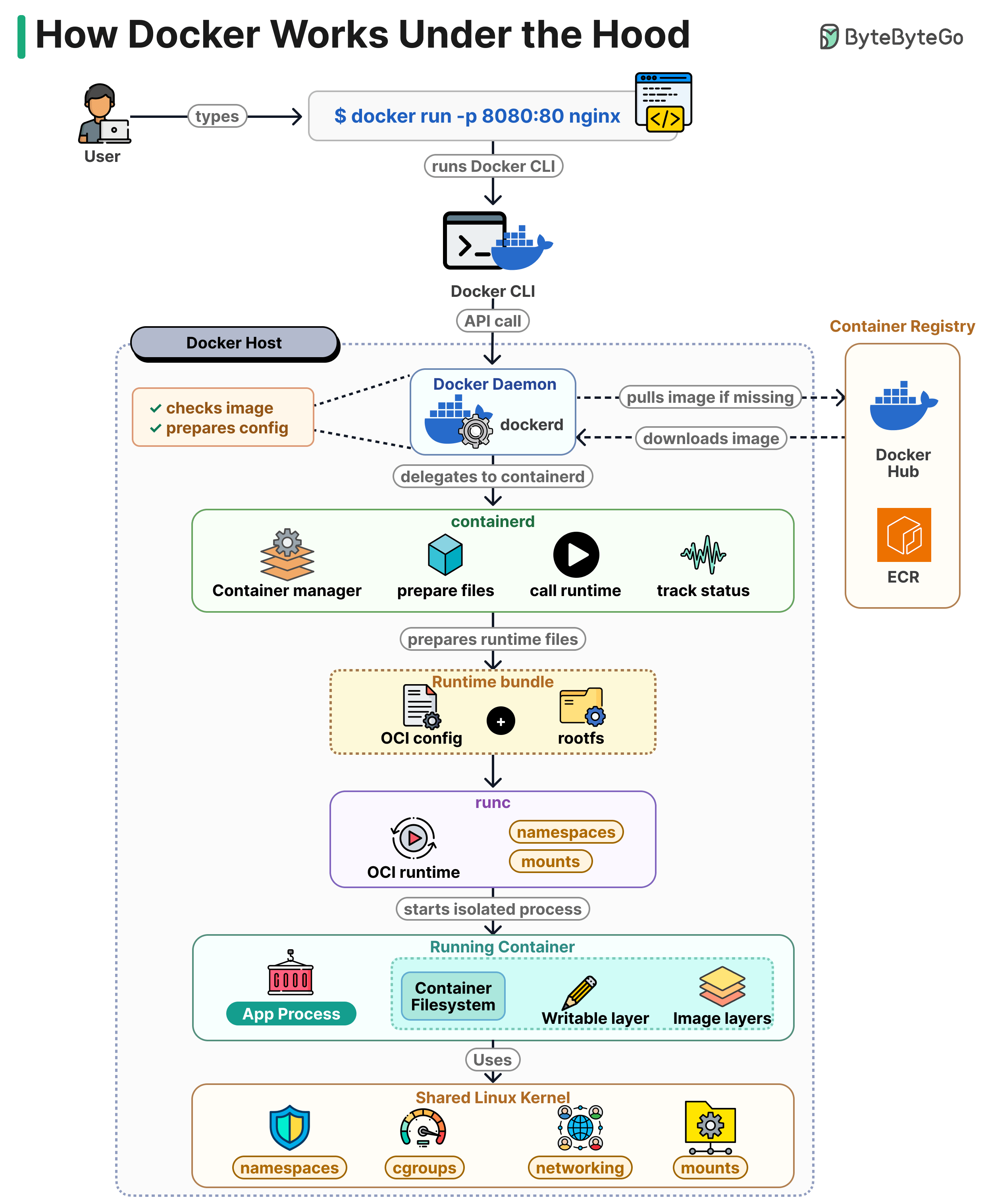
The Docker CLI takes your command and sends it as an API call to the Docker daemon (dockerd) running on the host.
dockerd checks whether the nginx image is already on disk. If it is not, it pulls it from a registry like Docker Hub or ECR. Then it prepares the container config.
dockerd does not start the container directly. It passes the request to containerd, which manages the container lifecycle. containerd prepares the runtime files and assembles a bundle made of the OCI config and the root filesystem.
containerd then calls runc. runc reads the bundle, creates the Linux namespaces and mounts defined in the config, and starts the process inside them. Once the process is running, runc exits.
The running container is a regular Linux process with its own PID, network, and mount namespaces. Its filesystem is a stack of read-only image layers with a writable layer on top, so changes inside the container do not modify the image.
Isolation comes from kernel features. Namespaces separate processes, cgroups limit CPU and memory, and network namespaces give the container its own interfaces. There is no guest OS and no hypervisor.
Over to you: where do most of your container issues show up, the image, networking, or resource limits?
Both commands get your changes into main. The difference is what they do to history.
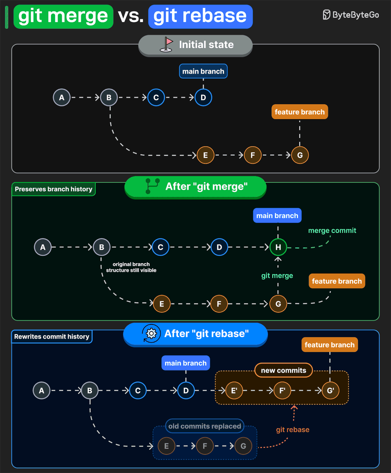
git merge preserves the original branch structure. If main and feature branches have diverged, Git creates a merge commit and keeps both lines of development . That makes it easy to see where work branched off, what got merged, and when it came back together.
git rebase takes a different approach. It reapplies your feature commits onto the latest main branch as new commits. The result is a linear history. But those rebased commits get new IDs, so rebasing a shared branch usually means force-pushing and making others sync to rewritten history.
That is why teams often use merge on shared branches. It keeps existing commit IDs unchanged, so everyone can pull without dealing with conflicts. Rebase is more useful for cleaning up your own branch before you merge it.
Over to you: which command do you prefer?

Pinecone: Fully managed, serverless with hybrid search (dense + sparse) native. Best when your team wants zero infrastructure overhead.
Weaviate: Built-in vectorization and native BM25 + vector hybrid search. Best when you need keyword and semantic search in one system.
Milvus: Distributed vector database with horizontal scaling and GPU acceleration support. Best for massive-scale workloads.
Qdrant: Rust-based vector search engine with dense, sparse, and metadata filtering built for production-grade retrieval. Best when control over ranking and latency matters.
Chroma: Embedded vector database that runs directly inside Python applications. Best for local RAG prototypes and experimentation.
Pgvector: Postgres extension that adds vector search using SQL. Supports HNSW and IVF indexes. Best if you're already running PostgreSQL.
FAISS: Meta's ANN library for vector similarity search. GPU accelerated and highly customizable. Best for custom retrieval systems.
Vespa: Combines dense vectors, sparse retrieval, and structured data in one engine. Best for large-scale search and ranking systems.
MongoDB Atlas Vector Search: Vector search integrated directly into MongoDB collections. Best if your application already uses MongoDB.
Redis Vector: Low-latency vector search alongside caching, pub/sub, and streaming. Best for real-time AI applications and semantic caching.
Elasticsearch: Combines BM25 and vector search in a single query engine. Best if you're already running Elastic for search and analytics.
LanceDB: Runs in-process, zero-copy disk reads, no server to manage. Native multimodal support. Best for local-first AI, edge deployments, and data lake workloads.
The right choice depends on your use case and in production, it's common to use more than one. Which of these tools are you using in production?
Pagination looks simple when your table has a few thousand rows. It becomes a real problem once your data grows.

Here is how the main approaches compare when the dataset is large.
Most pagination implementations start with offset and page numbers. You ask for “?page=3&size=10” and the database skips 20 rows, then returns 10. Simple to build and easy to explain. The issue is that the database still reads every row it skips. Page 5 is fast. Page 5000 is slow.
Keyset pagination handles deep pages much better. Instead of counting rows, you tell the server to return items after ID 101. The query goes straight to that point using the index, so page 1 and page 10,000 take the same time.
Continuation tokens are common in large APIs like S3 and YouTube. The server returns a token, you send it back on the next request, and it resumes from where the last response ended. It hides the cursor logic from the client. The token is tied to the filters and sort order from the original request, so the client must keep using the same parameters until the pagination ends.
Time-based pagination works well for feeds and logs. You ask for items before a timestamp and read backwards. Add a secondary field, like an ID, for rows that share the same timestamp. Without it, you can lose records.
Over to you: Which one have you used?
When you ask an LLM such as Claude, ChatGPT, or Gemini to do deep research on a complex topic, it’s not just one model doing all the work. It’s a coordinated system of specialized AI agents.
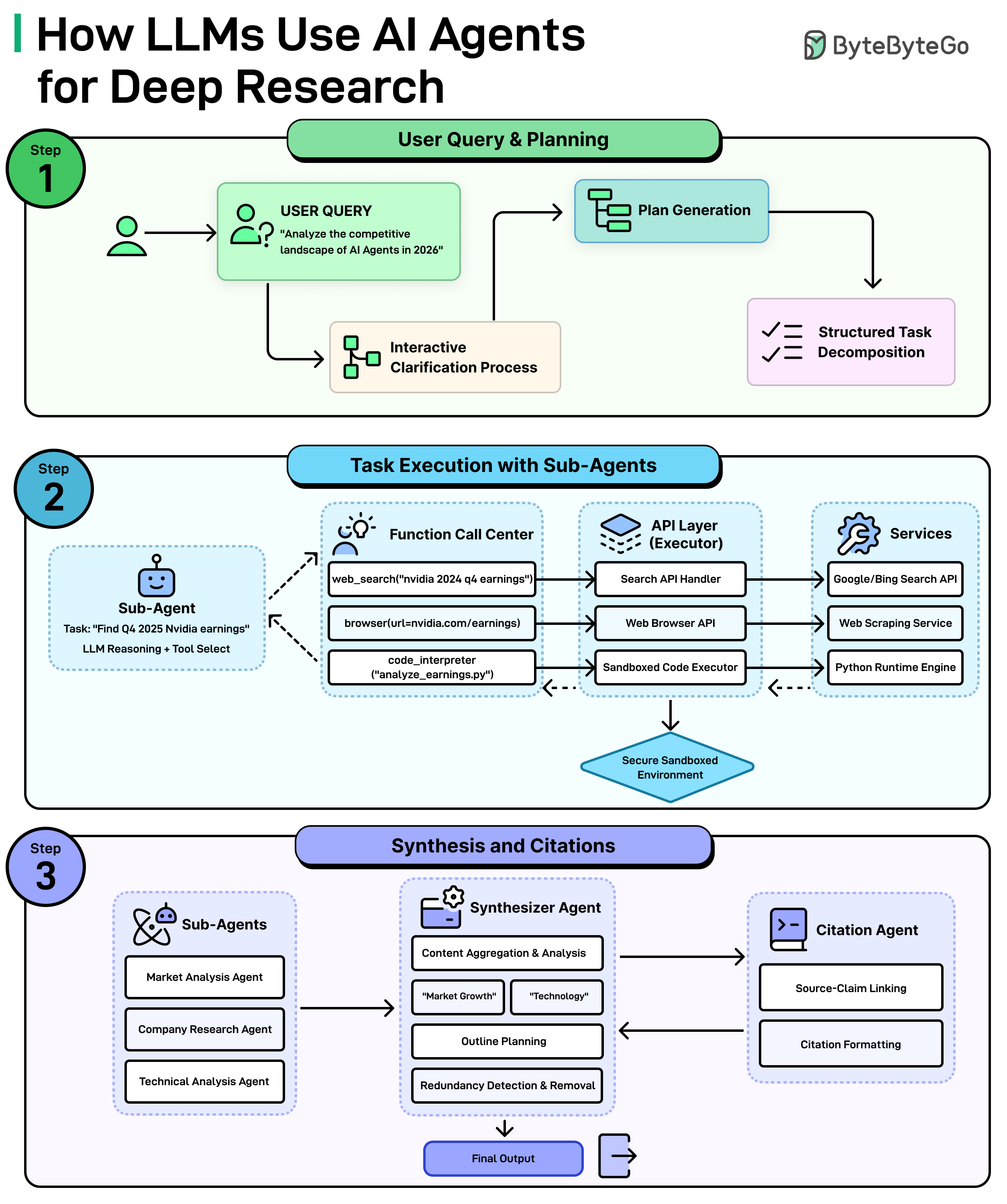
Here’s how it works:
Step 1: Understanding The Question and Making a Plan
It all starts with the query, something like “Analyze the competitive landscape of AI agents in 2026. The system doesn’t just dive in blindly. First, it may ask clarifying questions to understand exactly what is needed. Then, it generates a plan and breaks the big question down into smaller and manageable tasks.
Step 2: Sub-Agents Get to Work
Each small task gets assigned to a sub-agent, which is basically a mini AI worker with a specific job. For example, one sub-agent might be tasked with finding the latest Nvidia earnings. It figures out which tools to use, such as searching the web, browsing a specific page, or even run code to analyze data. All of this happens through a secure layer of APIs and services that connect the AI to the outside world.
Step 3: Putting it All Together
Once all the sub-agents finish their tasks, a Synthesizer Agent takes over. It aggregates everything, identifies key themes, plans an outline, and removes any redundant or duplicate information. At the same time, a Citation Agent makes sure every claim is linked back to its source and properly formatted. The end result is a polished, well-cited final output ready for use.
Over to you: Have you tried deep research in any LLM?
2026-07-10 23:32:04
Our 7th cohort of Becoming an AI Engineer starts tomorrow, Saturday, July 11. This is a live, cohort-based course created in collaboration with best-selling author Ali Aminian and published by ByteByteGo.

Here’s what makes this cohort special:
Learn by doing: Build real world AI applications, not just by watching videos.
Structured, systematic learning path: Follow a carefully designed curriculum that takes you step by step, from fundamentals to advanced topics.
Live feedback and mentorship: Get direct feedback from instructors and peers.
Community driven: Learning alone is hard. Learning with a community is easy!
We are focused on skill building, not just theory or passive learning. Our goal is for every participant to walk away with a strong foundation for building AI systems.
If you want to start learning AI from scratch, this is the perfect platform for you to begin.