2025-07-13 06:05:00
![]() See this visualization first on the Voronoi app.
See this visualization first on the Voronoi app.
This was originally posted on our Voronoi app. Download the app for free on iOS or Android and discover incredible data-driven charts from a variety of trusted sources.
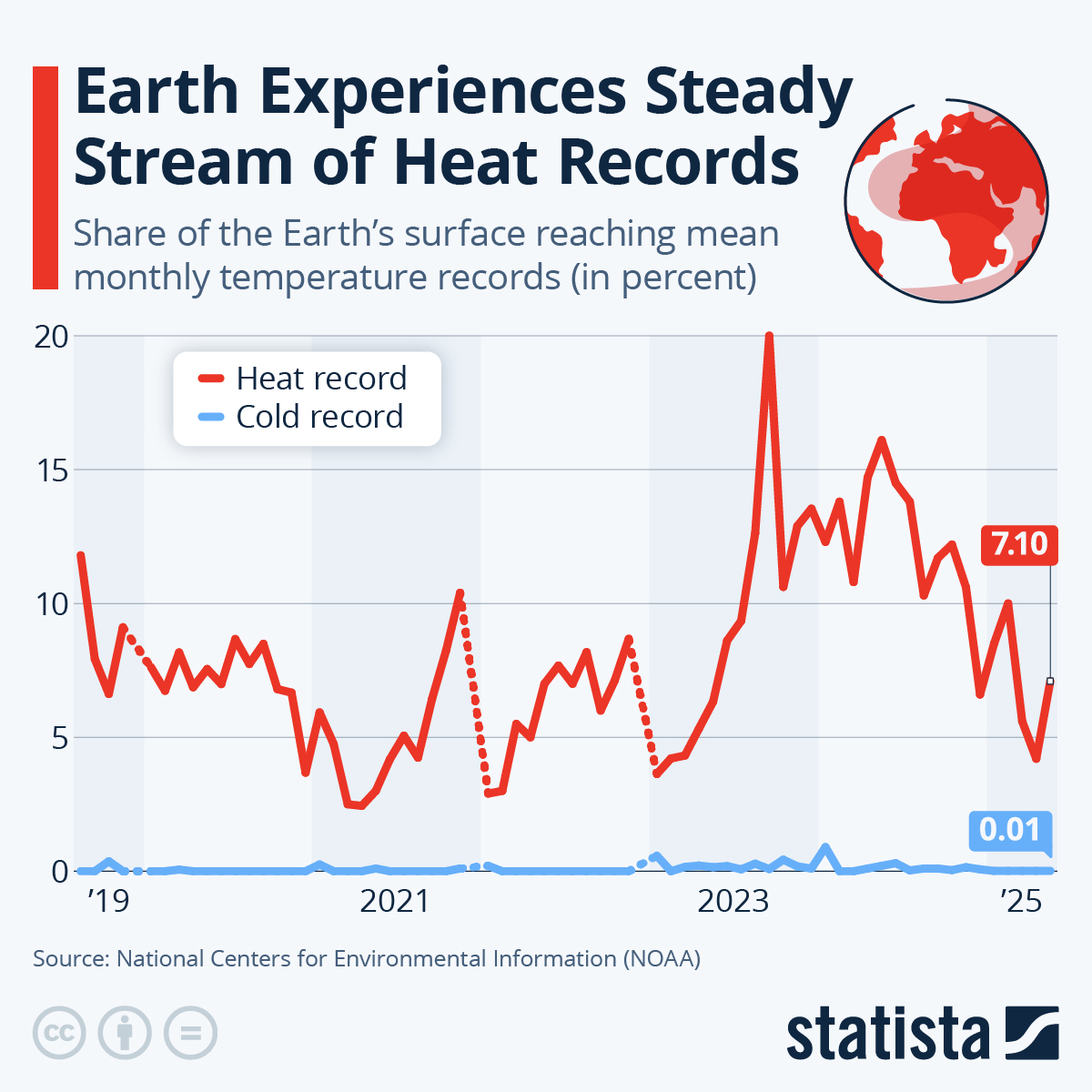
As temperature records shatter across Europe, the latest NOAA data shows a steady, global pattern of rising temperatures.
The chart above highlights how much of Earth’s surface hit new mean monthly temperature records in May 2025.
The data for this visualization comes from NOAA’s National Centers for Environmental Information and is visualized by Statista.
Over the past two decades, the frequency of new heat records has surged. In May 2025, about 7% of the planet’s surface broke local temperature records, a level that would have been extraordinary just a few decades ago.
By contrast, new cold records have become rare. For example, in January 2024, less than 1% of Earth’s surface set new cold records, highlighting the imbalance in climate extremes.
The record heat was not evenly distributed.
Oceans saw nearly 8% of their area reach new highs, while about 5.5% of land surfaces did the same. Hotspots included parts of the Arctic, Canada, West Antarctica, the Middle East, and Asia. However, some regions, such as India and Eastern Europe, experienced cooler-than-average conditions, showing that local weather can still buck the global trend.
Looking back, the balance between heat and cold records has flipped. In the mid-20th century, new cold records were more common, but since the 2000s, heat records have dominated nearly every month. The May 2025 result continues this trend, with the past three years seeing multiple months where 14–20% of the globe set new heat records.
This long-term context shows just how unusual today’s climate is compared to years past.
Climate change is just one of the 28 biggest risks facing the world, according to the United Nations. See the full ranking here.
2025-07-13 02:35:31
This was originally posted on our Voronoi app. Download the app for free on iOS or Android and discover incredible data-driven charts from a variety of trusted sources.
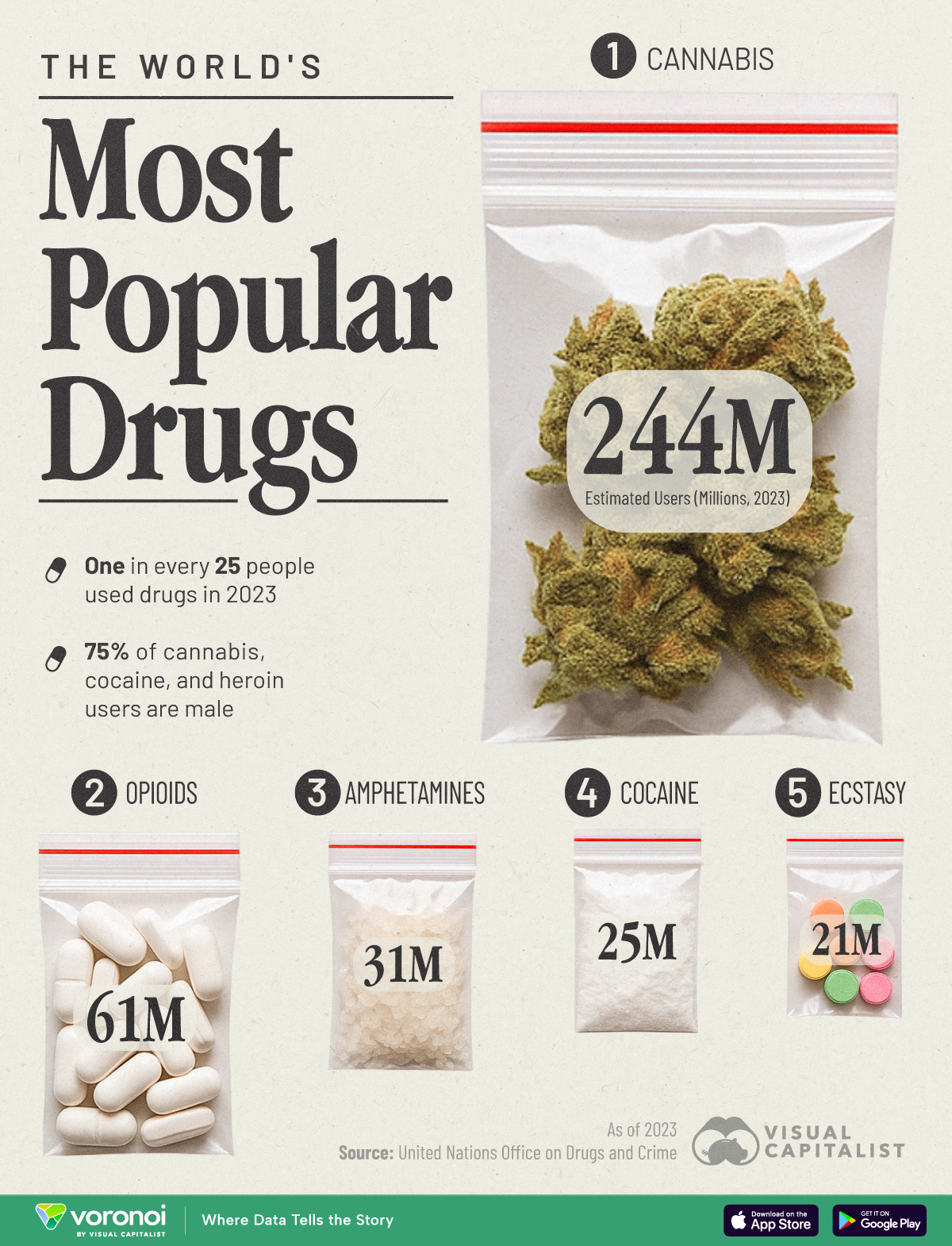
Each year, hundreds of millions of people around the world use psychoactive substances. This chart breaks down the most widely used drugs globally, based on estimated users in 2023. The data shines a light on both the prevalence of use and the stark gender differences in drug-related harm.
The data for this visualization comes from the United Nations. It estimates the number of people worldwide who used selected drugs in the 12 months leading up to 2023.
With 244 million users globally, cannabis continues to dominate as the most commonly used drug. That’s nearly 80% of all drug users surveyed. The growing legalization movement in North America and parts of Europe may be driving its widespread use. According to Pew Research, support for legalization has surged, especially among younger generations.
| Drug | Estimated Users (Millions, 2023) |
|---|---|
| Cannabis | 244 |
| Opioids | 61 |
| Amphetamines | 31 |
| Cocaine | 25 |
| Ecstasy | 21 |
| Total | 316 |
Opioids account for 61 million users—far fewer than cannabis—but are linked to significantly higher health risks and overdose deaths. Their addictive potential and impact on public health systems make them a critical focus. As WHO highlights, opioid-related deaths have been rising, especially in high-income countries where prescription abuse is prevalent.
Roughly three-quarters of users of cannabis, cocaine, or heroin are men. Yet once women initiate drug use, they are more susceptible to severe health outcomes.
According to the UN, women in general initiate drug use later in life than men, but once they do they tend to increase their consumption of different substances at a more rapid rate than men. Women also progress to drug use disorders at a more accelerated rate than men. In addition, women have a relatively higher risk of acquiring HIV and hepatitis C if they inject drugs.
If you enjoyed today’s post, check out The Most Prescribed Drugs in the U.S. on Voronoi, the new app from Visual Capitalist.
2025-07-12 23:22:10
This was originally posted on our Voronoi app. Download the app for free on iOS or Android and discover incredible data-driven charts from a variety of trusted sources.
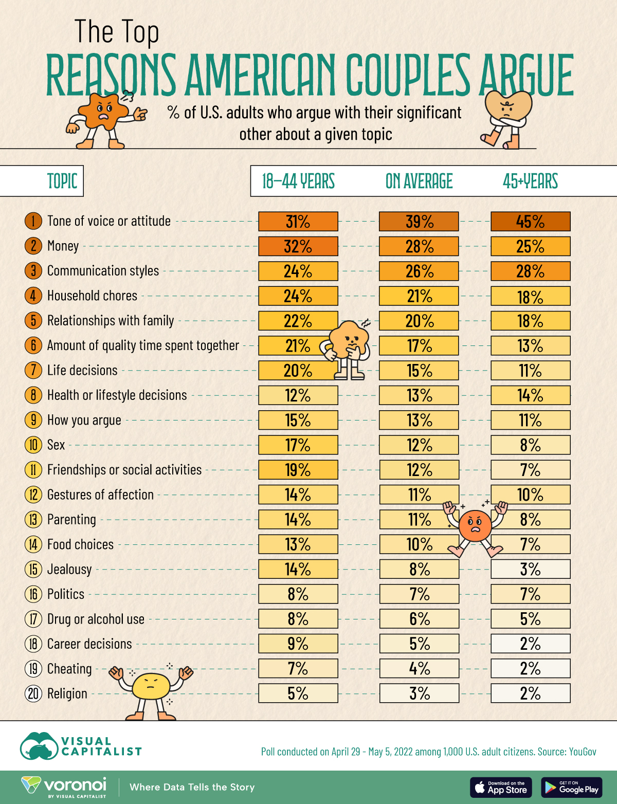
Arguments are a natural part of any relationship, but the reasons behind them can reveal deeper trends in how couples communicate.
This visualization explores why couples argue, using survey data segmented by age group. From tone of voice to finances, the chart highlights which topics create the most friction—and how priorities shift as couples grow older.
The data for this visualization comes from YouGov. It captures how frequently couples argue about 19 different topics, segmented into three categories: younger adults (18–44), older adults (45+), and the overall average.
| Topic | 18-44 yrs | Average | 45+ yrs |
|---|---|---|---|
 Tone of voice or attitude Tone of voice or attitude |
31% | 39% | 45% |
 Money Money |
32% | 28% | 25% |
 Communication styles Communication styles |
24% | 26% | 28% |
 Household chores Household chores |
24% | 21% | 18% |
 Relationships with family Relationships with family |
22% | 20% | 18% |
 Amount of quality time spent together Amount of quality time spent together |
21% | 17% | 13% |
 Life decisions Life decisions |
20% | 15% | 11% |
 Health or lifestyle decisions Health or lifestyle decisions |
12% | 13% | 14% |
 How you argue How you argue |
15% | 13% | 11% |
 Sex Sex |
17% | 12% | 8% |
 Friendships or social activities Friendships or social activities |
19% | 12% | 7% |
 Gestures of affection Gestures of affection |
14% | 11% | 10% |
 Parenting Parenting |
14% | 11% | 8% |
 Food choices Food choices |
13% | 10% | 7% |
 Jealousy Jealousy |
14% | 8% | 3% |
 Politics Politics |
8% | 7% | 7% |
 Drug or alcohol use Drug or alcohol use |
8% | 6% | 5% |
 Career decisions Career decisions |
9% | 5% | 2% |
 Cheating Cheating |
7% | 4% | 2% |
 Religion Religion |
5% | 3% | 2% |
Across all age groups, tone of voice or attitude is the most common reason why couples argue, cited by 39% of all respondents. It’s especially pronounced among those aged 45 and older, with nearly half reporting it as a recurring issue. This suggests that how something is said often carries more weight than what is actually said.
For those aged 18–44, money (32%) and communication styles (24%) are top friction points. These couples are more likely to face financial uncertainty as they progress through career and life milestones.
Household chores (24%) and quality time (21%) are also common reasons for young couples, but these issues are reported less often by older couples (18% and 13% respectively).
If you enjoyed today’s post, check out The Most Common Reasons For Not Having Children on Voronoi, the new app from Visual Capitalist.
2025-07-12 20:14:00
This was originally posted on our Voronoi app. Download the app for free on iOS or Android and discover incredible data-driven charts from a variety of trusted sources.
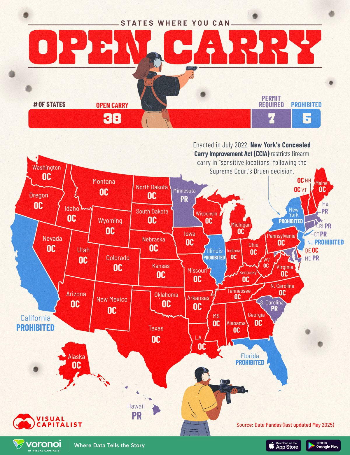
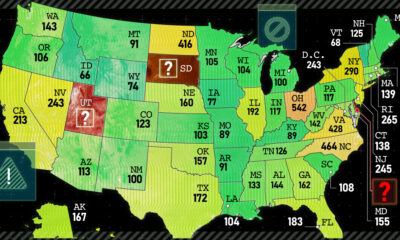
Whether you support or oppose open carry rights, understanding these laws is crucial for navigating gun policy discussions.
To see how the rules differ across the country, we’ve categorized each U.S. state by whether it allows the open carry of firearms, requires a permit, or prohibits it outright.
The data for this visualization comes from Data Pandas. It outlines how each U.S. state handles the open carry of firearms in public spaces, showing whether the practice is allowed, requires a permit, or is prohibited.
| State | Open Carry Status |
|---|---|
| Alabama | Allowed |
| Alaska | Allowed |
| Arizona | Allowed |
| Arkansas | Allowed |
| Colorado | Allowed |
| Delaware | Allowed |
| Georgia | Allowed |
| Idaho | Allowed |
| Indiana | Allowed |
| Iowa | Allowed |
| Kansas | Allowed |
| Kentucky | Allowed |
| Louisiana | Allowed |
| Maine | Allowed |
| Michigan | Allowed |
| Mississippi | Allowed |
| Missouri | Allowed |
| Montana | Allowed |
| Nebraska | Allowed |
| Nevada | Allowed |
| New Hampshire | Allowed |
| New Mexico | Allowed |
| North Carolina | Allowed |
| North Dakota | Allowed |
| Ohio | Allowed |
| Oklahoma | Allowed |
| Oregon | Allowed |
| Pennsylvania | Allowed |
| South Dakota | Allowed |
| Tennessee | Allowed |
| Texas | Allowed |
| Utah | Allowed |
| Vermont | Allowed |
| Virginia | Allowed |
| Washington | Allowed |
| West Virginia | Allowed |
| Wisconsin | Allowed |
| Wyoming | Allowed |
| Connecticut | Permit Required |
| Hawaii | Permit Required |
| Maryland | Permit Required |
| Massachusetts | Permit Required |
| Minnesota | Permit Required |
| Rhode Island | Permit Required |
| South Carolina | Permit Required |
| California | Prohibited |
| Florida | Prohibited |
| Illinois | Prohibited |
| New Jersey | Prohibited |
| New York | Prohibited |
A majority of U.S. states—36 in total—allow individuals to openly carry firearms without a special permit. This includes states like Montana, Wyoming, and Arkansas, which have some of the highest gun ownership rates in the country.
This also aligns with broader trends in Second Amendment support and state-level efforts to expand gun rights.
According to Data Pandas, seven states allow open carry but require a permit to do so. This approach provides a regulatory middle ground between unrestricted carry and full prohibition. These laws often include background checks, safety training, and may limit who is eligible to carry openly.
Note that open carry laws may change over time. Check your local laws and official government websites for the most up-to-date information.
If you enjoyed today’s post, check out Firearm Deaths by State on Voronoi, the new app from Visual Capitalist.
2025-07-12 14:57:00

As technology—especially AI—becomes more widespread, fraud and financial crime are evolving just as rapidly. So, what are the key threats shaping the risk landscape in 2025?
This graphic, created in partnership with Inigo Insurance, highlights six major fraud trends to watch in the year ahead.
Criminals are bypassing technical barriers by targeting people directly. Social engineering, which is a form of manipulation where fraudsters trick people into giving up confidential information, now accounts for 23% of banking fraud. This highlights the need for better awareness and training.
AI is fueling a new wave of fraud as it enables perpetrators to orchestrate more sophisticated scams. Over 40% of attempts now use tools like deepfakes, phishing, and forged documents to deceive victims and systems alike.
Stolen personal data is being exploited to open or misuse credit accounts, making identity theft a persistent and growing challenge for financial institutions.
Real-time payments and automation make it easier for fraudsters to spread fake content quickly—posing a $91 billion risk by 2028 if left unchecked.
As regulators crack down on high-tech schemes, fraudsters are reviving old-school methods like check fraud that can still slip through the cracks.
Cyberattacks—often backed by foreign actors—are becoming more severe, as seen in major incidents like the $1.5 billion crypto theft from Bybit. As geopolitical tensions escalate around the world, this threat is one to watch in 2025.
As financial crime grows more sophisticated—combining emerging technologies with old-school scams—the need for a dynamic, up-to-date approach has never been greater. Inigo’s experts bring the data-driven insights needed to uncover hidden risks and help organizations stay one step ahead in an ever-shifting fraud landscape.
Visit Inigo for a data-driven view of risk.


Some of the largest digital heists didn’t rely on brute-force hacking, they exploited the weakest link in security: human trust.


As cybersecurity threats escalate, which financial crimes are causing the most harm? The FBI has the data.

Suspicious activity has been rising in the U.S., but is it spread evenly throughout all 50 states? Certainly not.
2025-07-12 03:22:49
This was originally posted on our Voronoi app. Download the app for free on iOS or Android and discover incredible data-driven charts from a variety of trusted sources.
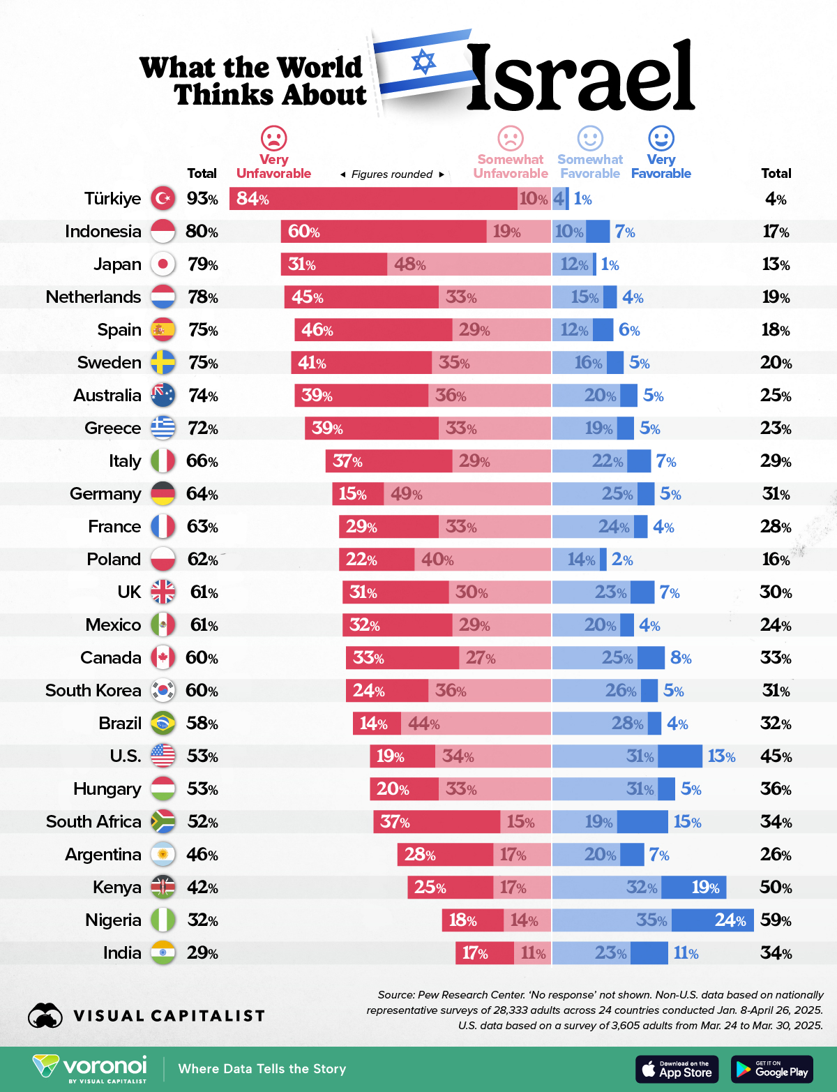
In a world increasingly shaped by shifting alliances and global conflict, public opinion is a useful measure of diplomatic standing.
In this graphic, we visualize international views on Israel based on a 24 country survey conducted in 2025. The data suggests that Israel faces disapproval across many parts of the globe, with only a handful of nations offering more positive than negative perceptions.
The data for this visualization comes from the Pew Research Center.
It explores attitudes toward Israel across 24 countries, measuring both unfavorable and favorable responses. Median averages show that 62% hold an unfavorable view of Israel, with only 29% expressing favorable opinions. Note that those who did not answer were not shown.
| Country | Very Unfavorable (%) | Somewhat Unfavorable (%) |
Somewhat Favorable (%) |
Very Favorable (%) |
|---|---|---|---|---|
 Turkey Turkey |
84 | 10 | 4 | 1 |
 Indonesia Indonesia |
60 | 19 | 10 | 7 |
 Japan Japan |
31 | 48 | 12 | 1 |
 Netherlands Netherlands |
45 | 33 | 15 | 4 |
 Spain Spain |
46 | 29 | 12 | 6 |
 Sweden Sweden |
41 | 35 | 16 | 5 |
 Australia Australia |
39 | 36 | 20 | 5 |
 Greece Greece |
39 | 33 | 19 | 5 |
 Italy Italy |
37 | 29 | 22 | 7 |
 Germany Germany |
15 | 49 | 25 | 5 |
 France France |
29 | 33 | 24 | 4 |
 Poland Poland |
22 | 40 | 14 | 2 |
 24-country median 24-country median |
— | — | — | — |
 United Kingdom United Kingdom |
31 | 30 | 23 | 7 |
 Mexico Mexico |
32 | 29 | 20 | 4 |
 Canada Canada |
33 | 27 | 25 | 8 |
 South Korea South Korea |
24 | 36 | 26 | 5 |
 Brazil Brazil |
14 | 44 | 28 | 4 |
 United States United States |
19 | 34 | 31 | 13 |
 Hungary Hungary |
20 | 33 | 31 | 5 |
 South Africa South Africa |
37 | 15 | 19 | 15 |
 Argentina Argentina |
28 | 17 | 20 | 7 |
 Kenya Kenya |
25 | 17 | 32 | 19 |
 Nigeria Nigeria |
18 | 14 | 35 | 24 |
 India India |
17 | 11 | 23 | 11 |
Türkiye reported the highest share of negative views, with 93% of respondents holding an unfavorable opinion of Israel. This includes a decisive 84% who said they view Israel “very unfavorably.”
International views of Israel are also quite negative throughout most of Europe and Asia, particularly in Indonesia (80% total unfavorable) and Japan (79% total unfavorable).
Reasons for these results likely include support for Palestine, anti-war attitudes, and religious solidarity. Indonesia, for example, has the world’s largest Muslim population in the world.
Only three countries from this survey had a majority of respondents expressing favorable opinions: Nigeria (59%), Kenya (50%), and India (34% favorable vs. 29% unfavorable). These nations stand out as outliers, possibly due to different geopolitical alignments or media narratives. Note that India has the highest share of non-responses, at 37%.
If you enjoyed today’s post, check out The World’s Most Popular Religions on Voronoi, the new app from Visual Capitalist.