2026-07-27 19:00:00
TLDR: You can play three daily puzzles at nonogame.app right now!
Here is one I didn't see coming…
In the mid-2000s, around the time Sudoku was getting popular here in the US, another game came on my radar around the same time, nonograms. Nonograms were similar to Sudoku in that they gave you a grid and asked you to use process of elimination logic to fill it out in a very particular way, and it scratched the same itch as Sudoku for me.
I got back into playing this game in the past month, and while I found a really good app on the iPhone, I hadn't found a web interface that I actually enjoy using. And well, that sounded like a fun weekend project, so I took some time this weekend and put together nonogame.
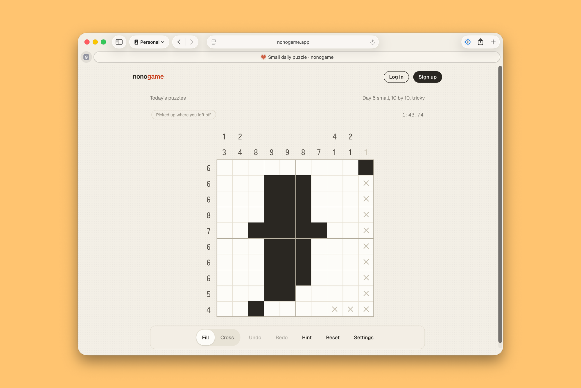
I won't get into all the details here. You should just go play it if you want to get an idea for how it works, but it is a desktop optimized way to play nonograms, and for my money, it is the best UI for doing this on the web.
Anyway, the concept here is that you can come to the site every day and there are three puzzles for you to solve: a small, a medium, and a large. They follow the newspaper puzzle format of being easiest on Monday and getting harder through the week until you get the most difficult ones on Sunday.
I also wanted to explore having a really nice flow from anonymous to logged in to paid users. Anyone can go to the site and play today's daily games. Nothing carries over till tomorrow or anything, but you can play them and enjoy them for 5 to 30 minutes, depending on how difficult they are. If you create a free account, which is of course password free and relies on welcome emails and passkeys, you can still play those daily games, but you can also save your progress and build up streaks and play across different devices. Finally, if you pay for the service, you'll get to go back in time and play previous days puzzles. And there are dozens of collections and over a thousand other puzzles you can play on demand.
Last but not least, I'm pleased with the favicon I made for this, which evokes the Quick Reviews heart. ❤️
2026-07-27 06:30:23
2026-07-24 20:00:00
I'm happy to announce that Chapterize 2 is out today, and I think it is an essential tool for anyone who has a podcast. The app is free to try and has a one-time $20 unlock for unlimited use. If you've previously purchased the app, this is a free upgrade. Chaperize is available for Mac, iPad, and iPhone.
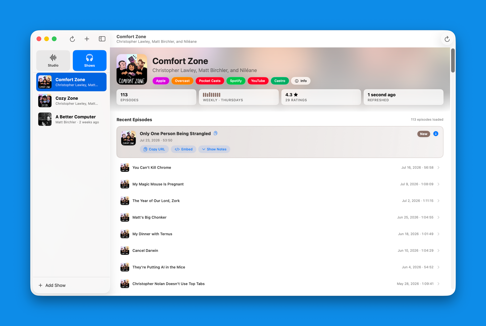
Version 2 adds an entirely new section to the app, which provides podcast hosts to more easily access important data about their show with ease. Switch over to the new "shows" tab and you can add as many podcasts as you'd like. I've added my three podcasts, and what this allows me to do is at a moment's notice, review my show information and see my recent episodes.
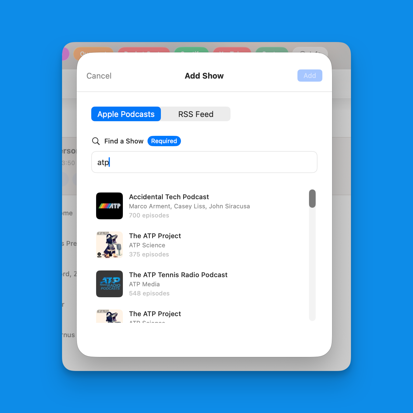
Adding a show is dead simple. You can search the Apple Podcasts directory, paste in the Apple Podcasts show link, or add the RSS feed, whichever is most convenient for you. When you go the Apple Podcasts route, the app will automatically find your Overcast and Pocket Casts sites, and if you want quick access to the YouTube channel, Spotify, or Castro, you can manually add those links as well. If you don't have them immediately, no worries, you can add them later.
One of the things I have to do every week for MacStories is to get the episode links, show notes, and embed code for our latest Comfort Zone episode. This was a bit of a pain before, but I've been using this app for a few months to do this and it's completely changed the game for me. What took like 5 minutes before takes less than a minute now.
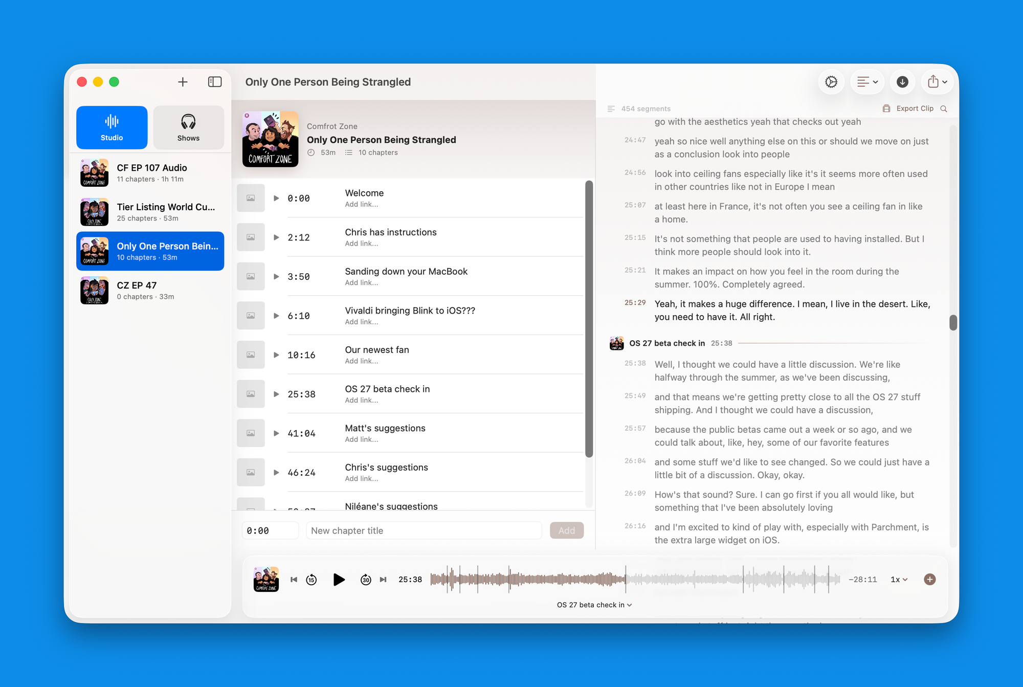
I think the killer feature in Chapterize is its ability to let you add and edit your chapter timings from the transcript. This has enabled me to hugely accelerate how quickly I can get my chapters into episodes over the past year.
In version 2, I'm not messing with the formula too much, but there is a critical change that I think levels up this experience even further. The previous UI had a toggle that lets you switch between the chapter list and the transcript view (if you're on an iPhone or a narrower window on an iPad or Mac, you'll still get that). But if you're on an iPad or Mac with enough space, you'll get both views side by side. It just makes it much easier to do everything. All the quality of life things around keyboard navigation and shortcuts work the same as they did before, but having this dual pane view really makes the experience easier.
I should say that if this isn't your thing, then your experience doesn't change at all. If you're not using transcripts in the app, then the UI is going to remain exactly how it was previously, and you can keep using it how you always have.
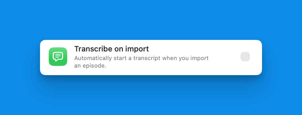
To encourage use of this feature, I've also added a setting that is off by default, but you can enable to automatically start transcribing files when you drag them into the app. I've also made it so that if you already have a transcript for an episode in the app, you can now override it with your own. So, for example, if you tend to use the automatic transcription I just talked about, but this time you have your own SRT or VTT file you'd like to use instead, you can drag it into the window, and it will replace what was there before.
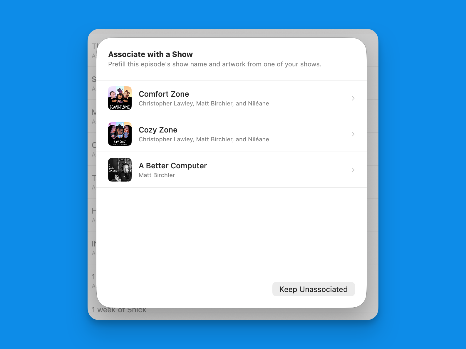
And because the app now knows what podcasts you work on, when you drag a new episode in, you'll be prompted with which show it belongs to, and all the appropriate metadata, including the Hallmark, will automatically be added. Alternatively, if you're on the shows view and you drag a new audio file onto one of the shows in the list, it will assign it to that show.
I recently created a CLI for Quick Subtitles, and that was a great unlock for me personally in automating my podcast workflow. I was able to watch a folder that Chris would put a new Comfort Zone episode in and then kick off a job that generated a transcription and cleaned up that transcription. However, then I just had a couple of files at that point. What I really wanted to do was get that episode into Chapterize at the end.
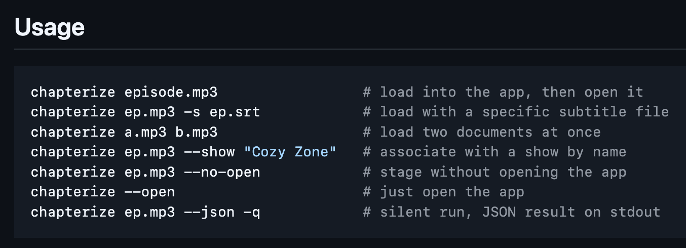
Well, with the Chapterize CLI, you can now do that. The most basic use case would be to use this to pass in an audio file into the app, but you can do a bit more.
You can have the app launch once this job is completed or not, you can simultaneously pass in a subtitles file, and you have the ability to indicate which show this episode is associated with.
There isn't a command line interface to start adding your chapters or working in the app, the UI is definitely still the place to go for that, but this was the last step in the work that I felt I could automate quite well.
This has let me round out my script for Comfort Zone so that once the transcript is created and cleaned up, it automatically adds those to Chapterize, associates it with the correct show, and I can get to adding chapters from there.
Run brew install mattbirchler/tap/chapterize to install Chapterize on your Mac. Please be aware this CLI does nothing if you don't also have the Mac app installed.
If you host a podcast and you put chapters in your episodes, and let's be real, that should be most of us, you really should check out Chapterize. It's a tool I built for myself and it is the tool I would be using even if I didn't make it.
2026-07-24 07:02:18
An early preview of the big app updates I have coming the rest of the summer.
2026-07-23 04:22:56

Last week I solved my own problem by releasing the quicksubs CLI, which allows you to generate transcripts easily from the command line on your Mac. I've used this a bunch myself already, it's been a great addition to my workflow, and I've heard from others that they're using it already as well.
Of course, once I started using it, for production use cases myself, a few things became clear: this needed to have all the transcription models and it needed to have the benchmark mode from the app available here as well. This is in the 1.5.0 release out now. Run brew upgrade to upgrade to it, or brew install mattbirchler/tap/quicksubs to install it for the first time.
The desktop app supports Apple's speech engine as well as Parakeet and Whisper. Now, all three models are available from the CLI, and it will default to Apple's model unless you tell it to use something else.
I've done some mildly clever work to have the CLI check to see if you've already installed one of the third-party models in the app, and if so, it will use that version of the model. If you haven't downloaded it in the app or you don't use the app at all, then it will download the model the first time you try to use it. and then it will just be there going forward.
To use this, pass --engine with apple, parakeet, or whisper as the value.
One of the things I realized quickly after making the app originally was that it was really good at testing performance and thermal throttling of devices. Audio transcription is a taxing job and you can just run the same transcription on a file over and over and over again. to see not only how fast it can do the work, but how how much it will throttle itself down once it starts to get warm. The CLI is a great place to have this functionality as people who review products for a living can create scripts that use this as part of their testing suite.
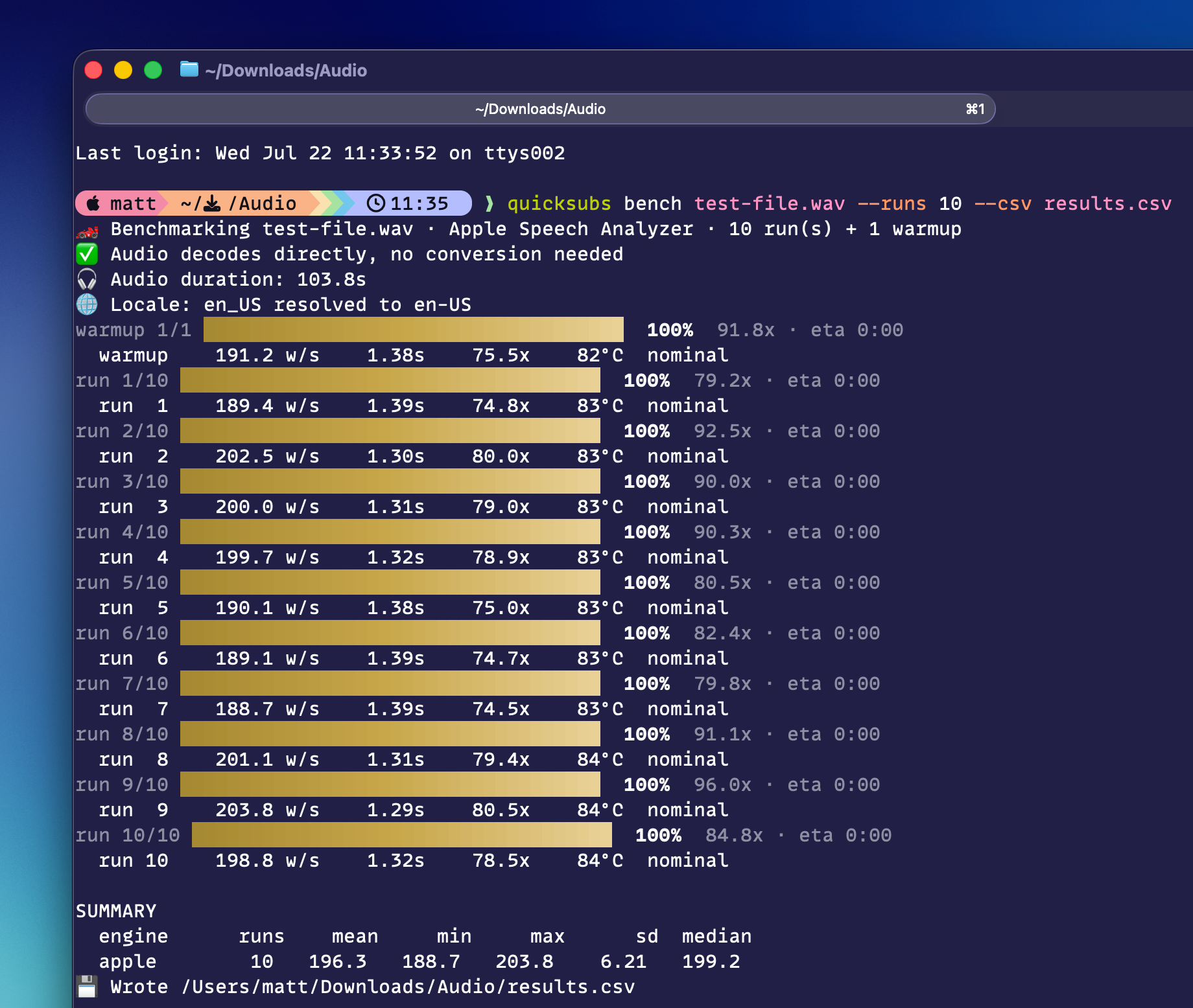
Now, you can run quicksubs bench on a file and the process will run a benchmark with 1 warm up run (to make sure the model is fully ready, which can skew results sometimes), and then 5 runs on the file. There are arguments you can provide to change the number of runs, what engine you want to use, and if you want to save the results to a CSV.
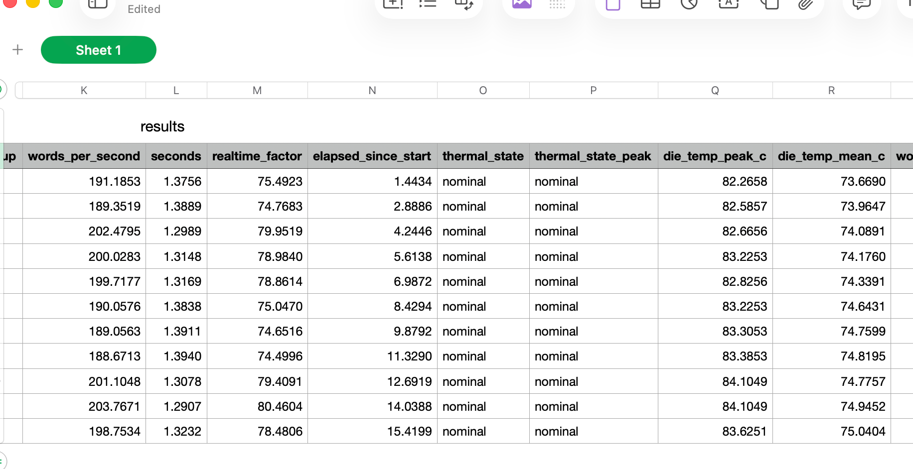
The CSV layout is intentionally built to let you easily run on multiple devices and merge them in the end to easily parse and build charts comparing devices with run-level data on performance. And because this doesn't have to run through the Mac App Store, I'm also able to collect internal temperature data and include that in the report as well.
Not new in this update, but I wanted to stress that an added unlock in a CLI version of Quick Subtitles is that your agents can use this as well. Sure, ChatGPT's Computer Use feature can click around your Mac if you want it to, but this is way faster, and accessible to all agents, even the most basic ones out there. Agents love a CLI, so if you're into that sort of thing and find yourself needing to transcribe things sometimes, quicksubs is a great tool to add to your tool belt.
But it's not just agents. If you want to automate some process on your Mac, scripts are a great way to do this, and with the CLI with clear output, you can add this to your automation as well (AI agent or not). I'll be sharing my new podcasting workflow for this shortly (as soon as Apple approves my next Chapterize update).
2026-07-22 08:45:31
The small brained, big bigoted people on this subreddit are convinced that Rotten Tomatoes is lying to you. It's not that most people liked The Odyssey, actually a ton of people hated it! It's woke! People hate it!
Their evidence isn't on the page. No, that would be too easy. You need to exercise that hacker skill of viewing page source. Then look at the raw JSON data for the audience score, and that's where you see the data THEY DON'T WANT YOU TO SEE. See, Rotten Tomatoes has verified and unverified reviews. Basically, if you bought a ticket on Fandango (who owns Rotten Tomatoes), you can review the movie in Fandango after you see it and that review contributes to the audience score on Rotten Tomatoes. These reviews are labeled as "verified" since Fandango knows you bought a ticket to the movie. Meanwhile, anyone with a Rotten Tomatoes account can leave a review, whether they've seen the movie or not.
Look, I've got my beef with the audience score, but the reason they've done this is to prevent review bombing.
Getting back to the original Reddit post, they found that the verified reviews (aka people who definitely bought tickets and probably saw it) had a 97% score, but if you look only at the unverified reviews, it's actually lower (60%) at the time of writing this post. See!?
But let me break this down:
This number relies on you agreeing that you only care about 12% of all the reviews (throwing out 10,700 of the 12,200 reviews). In fact, the only reviews you don't trust are people who definitely actually watched it. Even if you count all the unverified reviews equally, the overall score is 92%, which is still pretty great. I'm not saying that every single unverified review is some bigot grinding an axe, but I am saying you need to do some real mental gymnastics to make this work.
Another notable thing in the data is how many people left a rating vs how many also wrote a review. Of the verified reviews, 13% of people also wrote a full review. Meanwhile, 70% of unverified users wrote a review. That's a pretty stark difference, and I'm just saying most people don't leave reviews generally (even a movie fanatic site like Letterboxd has about a 50% written review rate for this film), so a 70% written review rate is insanely high. Almost like it's likely people who came to the site to review bomb something…
Anyway, the movie made a quarter billion dollars in its opening weekend, people generally seem to love it, and I would sure love to stop thinking about people who find reason after reason to be made about people of color in media.