2025-06-27 01:23:37
What if you could just get the best of your Mastodon feed without scrolling forever?
2025-06-27 00:00:00
![]()
I’m old enough to remember when people in the Apple enthusiast crowd were disgusted by the new Finder icon. No, not the one released 2 weeks ago, the one released in macOS Yosemite in 2014. That icon was too bright, too “friendly”, and it didn’t respect the heritage of the icon that had existed for many years. That icon was created to put a new and distinct spin on a classic icon to match the new aesthetic of Apple’s software. I think it was brilliantly done and that Finder icon is now iconic.
In 2025 we find ourselves in a very similar situation, but admittedly with more pushback than I remember in 2014. Apple has a new design system for the Mac, that system has a new standard for icon design, and there’s a new Finder icon that’s ruffling feathers.
To be super clear, just because one design in the past ruffled feathers and turned out to be a winner doesn’t mean every icon that ruffles feathers is automatically a winner. I’m just bringing up the parallel as the past is often instructive to understanding the present.
Cards on the table, I’m a weirdo who actually liked the Finder icon in Tahoe developer beta 1. I think it looked great and was a proper reimagining of the icon I’d been staring at in my dock for the past few decades for the new design system in Tahoe. The layers of glass floating on top of a solid background match the rest of the system apps. Yes, the white and blue “switched sides” but I guess I wasn’t as bothered by that as some others were. I’m not saying I’m right or they’re right, I just think it was nice and made sense in the new system. Honestly, I didn't even think anything of the icon until I went online and saw people were very upset about this.
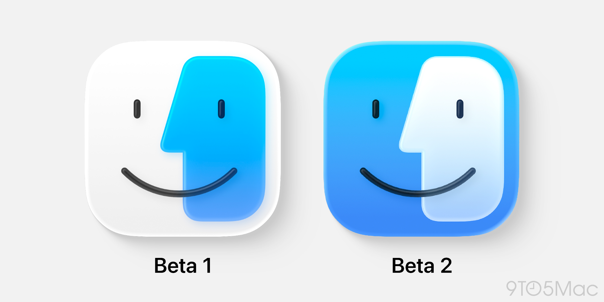
In beta 2, Apple clearly took the feedback and made a change which seems to have appeased a decent number of those who hated the first beta's icon. Personally, I think this new icon is good, but if I'm being totally honest I don't like it as much as the first one. The contrast is lower between the blue and white sides, something that's more noticeable when my dock is small rather than in large images like the one above. I'm not going to complain about it at length, and I think it's actually still pretty good, I just don't think it has the confidence of the last version.
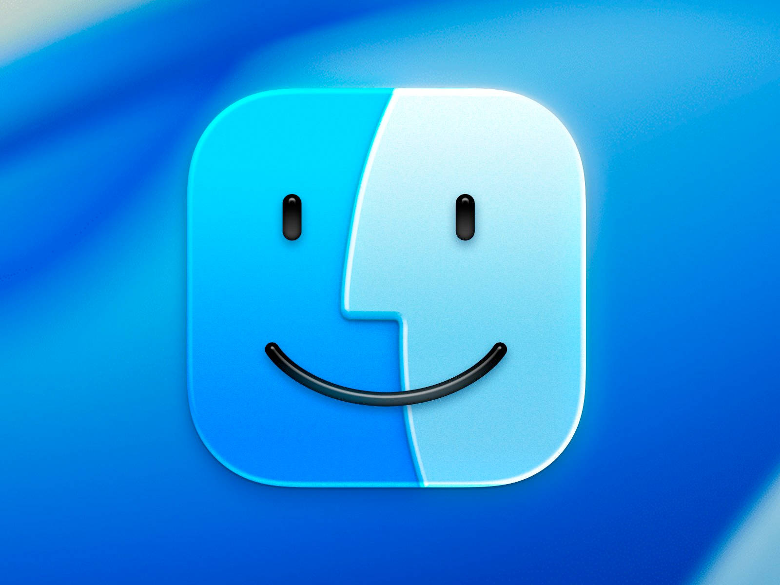
Then there's this mock up which has been floating around as the "clear solution" that Apple should just pay the creator Michael Flarup and use in macOS. I think this icon design is solid as well, but it really is a bit of a punt on trying anything new, it feels like just putting a glassy filter over the existing icon and calling it a day (again, recognizing this took more work than that to me, but that's what it looks like to me). It's also inconsistent with the design Apple is using for every other icon in the system on Tahoe, with no other icons featuring edge-to-edge glass layers like this. Maybe that's fine, and this will be more normal once we have more third party apps making icons using the new glass system, though!
Ultimately, I think all these icons are pretty good, and I'll be fine. I just wanted to give the beta 1 icon a bit of love before we likely never see it again. I know this opinion is straight up "wrong" to many people, but what’s the point in having a brain if you don't sometimes have different opinions, right?!
2025-06-25 07:15:28
Ash Parrish: Netflix is letting go of some of its best indie games | The Verge
Several titles like Braid, Katana Zero, and yes, Hades, were available exclusively on mobile via Netflix, meaning that when those games go, that’s potentially it for them on Android / iOS.
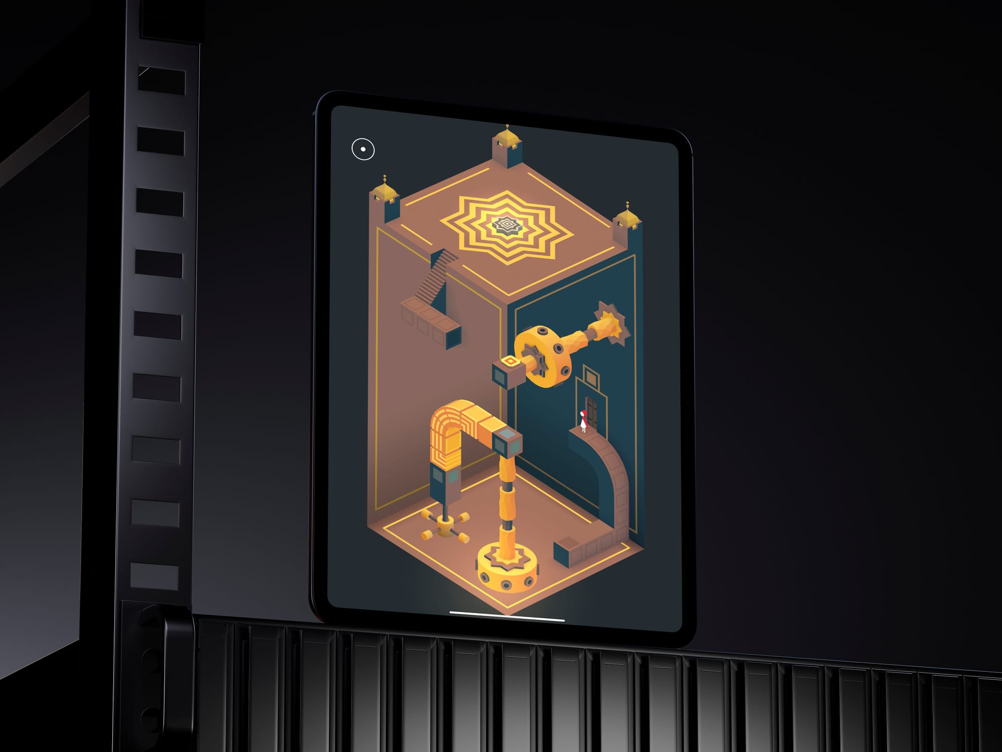
The latest gem in the Monument Valley series is a Netflix exclusive on mobile, so it's just vanishing for the time being on July 14. The only silver lining is that a few weeks ago it was announced that Monument Valley 3 was coming to consoles and PC on July 22, 2025.. The bad news is that if you wanted to play this on an iPhone or iPad, you've only got a few weeks to do it. You gotta think it'll be back on mobile sometime, but who knows when that'll be?
2025-06-23 21:00:35
Not everyone liked that Sarah McBride interview I linked to last week, so let's get into the other perspective.
2025-06-23 19:30:36
Corridor Digital with another "we don't think anyone's ever gotten this shot before, so we're going to try and get it" video, and it's amazing.
2025-06-23 07:00:00
There are Windows users out there who prefer or need Windows to do what they do with a computer, but they really like the look of Mac hardware. They like the speed, the reliability, the design, the battery life…they just can't get what they need software-wise, so they find a Windows device that suits their needs best.
Similarly, I love the look of iPad hardware and the convertible laptop form factor that iPad users get to enjoy. My RSI issues also enjoy being able to use my computer with touch rather than mice, trackpads, and keyboards, all of which cause pain with too much use. Sadly, iPadOS still doesn't do dozens of things I need my computer to do, so it's not a good fit for me. The new updates coming this fall look great, but they don't move the needle for me personally.
Since there's only one company who makes computers that run macOS, I'm stuck asking that one company to make the combination of hardware and software I want. It may not be what you want, but I'm here to advocate for myself and what I want from the computers in my life.
It doesn't even need to be a Mac, they could add enough features to iPadOS that I would be happy using that instead, they've just got a lot longer way to go to get all that into iPadOS than to go the other way around.