2025-07-15 03:00:00
Here’s Jony Ive talking to Patrick Collison about measurement and numbers:
People generally want to talk about product attributes that you can measure easily with a number…schedule, costs, speed, weight, anything where you can generally agree that six is a bigger number than two
He says he used to get mad at how often people around him focused on the numbers of the work over other attributes of the work.
But after giving it more thought, he now has a more generous interpretation of why we do this: because we want relate to each other, understand each other, and be inclusive of one another. There are many things we can’t agree on, but it’s likely we can agree that six is bigger than two. And so in this capacity, numbers become a tool for communicating with each other, albeit a kind of least common denominator — e.g. “I don’t agree with you at all, but I can’t argue that 134 is bigger than 87.”
This is conducive to a culture where we spend all our time talking about attributes we can easily measure (because then we can easily communicate and work together) and results in a belief that the only things that matter are those which can be measured.
People will give lip service to that not being the case, e.g. “We know there are things that can’t be measured that are important.” But the reality ends up being: only that which can be assigned a number gets managed, and that which gets managed is imbued with importance because it is allotted our time, attention, and care.
This reminds me of the story of the judgement of King Solomon, an archetypal story found in cultures around the world. Here’s the story as summarized on Wikipedia:
Solomon ruled between two women who both claimed to be the mother of a child. Solomon ordered the baby be cut in half, with each woman to receive one half. The first woman accepted the compromise as fair, but the second begged Solomon to give the baby to her rival, preferring the baby to live, even without her. Solomon ordered the baby given to the second woman, as her love was selfless, as opposed to the first woman's selfish disregard for the baby's actual well-being
In an attempt to resolve the friction between two individuals, an appeal was made to numbers as an arbiter. We can’t agree on who the mother is, so let’s make it a numbers problem. Reduce the baby to a number and we can agree!
But that doesn’t work very well, does it?
I think there is a level of existence where measurement and numbers are a sound guide, where two and two make four and two halves make a whole.
But, as humans, there is another level of existence where mathematical propositions don’t translate. A baby is not a quantity. A baby is an entity. Take a whole baby and divide it up by a sword and you do not half two halves of a baby.
I am not a number. I’m an individual. Indivisible.
What does this all have to do with software? Software is for us as humans, as individuals, and because of that I believe there is an aspect of its nature where metrics can’t take you.cIn fact, not only will numbers not guide you, they may actually misguide you.
I think Robin Rendle articulated this well in his piece “Trust the vibes”:
[numbers] are not representative of human experience or human behavior and can’t tell you anything about beauty or harmony or how to be funny or what to do next and then how to do it.
Wisdom is knowing when to use numbers and when to use something else.
2025-07-11 03:00:00
Exploring diagram.website, I came across The Computer is a Feeling by Tim Hwang and Omar Rizwan:
the modern internet exerts a tyranny over our imagination. The internet and its commercial power has sculpted the computer-device. It's become the terrain of flat, uniform, common platforms and protocols, not eccentric, local, idiosyncratic ones.
Before computers were connected together, they were primarily personal. Once connected, they became primarily social. The purpose of the computer shifted to become social over personal.
The triumph of the internet has also impoverished our sense of computers as a tool for private exploration rather than public expression. The pre-network computer has no utility except as a kind of personal notebook, the post-network computer demotes this to a secondary purpose.
Smartphones are indisputably the personal computer. And yet, while being so intimately personal, they’re also the largest distribution of behavior-modification devices the world has ever seen. We all willing carry around in our pockets a device whose content is largely designed to modify our behavior and extract our time and money.
Making “computer” mean computer-feelings and not computer-devices shifts the boundaries of what is captured by the word. It removes a great many things – smartphones, language models, “social” “media” – from the domain of the computational. It also welcomes a great many things – notebooks, papercraft, diary, kitchen – back into the domain of the computational.
I love the feeling of a personal computer, one whose purpose primarily resides in the domain of the individual and secondarily supports the social. It’s part of what I love about the some of the ideas embedded in local-first, which start from the principle of owning and prioritizing what you do on your computer first and foremost, and then secondarily syncing that to other computers for the use of others.
2025-07-08 03:00:00
After publishing my Analysis of Links From The White House’s “Wire” Website, Tina Nguyen, political correspondent at The Verge, reached out with some questions.
Her questions made me realize that the numbers in my analysis weren’t quite correct (I wasn’t de-depulicating links across days, so I fixed that problem).
More pointedly, she asked about the most popular domain the White House was linking to: YouTube. Specifically, were the links to YouTube 1) independent content creators, 2) the White House itself, or 3) a mix.
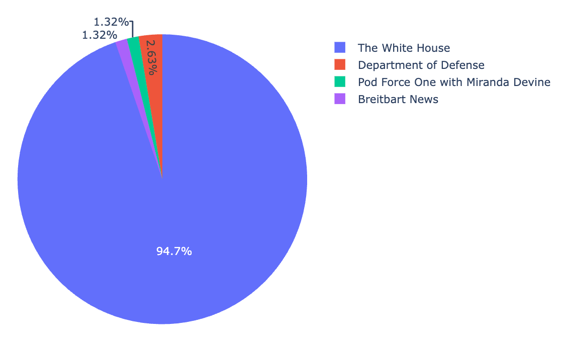
A great question. I didn’t know the answer but wanted to find out. A little JavaScript code in my spreadsheet and boom, I had all the YouTube links in one place.
![Screenshot of a table of data in a spreadsheet showing all the links to YouTube from wh[dot]gov/wire](https://cdn.jim-nielsen.com/blog/2025/whwire-followup-youtube-links.png)
I couldn’t really discern from the links themselves what I was looking at. A number of them were to the /live/ subpath, meaning I was looking at links to live streaming events. But most of the others were YouTube’s standard /watch?v=:id which leaves the content and channel behind the URL opaque. The only real way to know was to click through to each one.
I did a random sampling and found most of the ones I clicked on all went to The White House’s own YouTube channel. I told Tina as much, sent here the data I had, and she reported on it in an article at The Verge.
Tina’s question did get me wondering: precisely how many of those links are to the White House’s own YouTube channel vs. other content creators?
Once again, writing scripts that process data, talk to APIs, and put it all into 2-dimensional tables in a spreadsheet was super handy.
I looked at all the YouTube links, extracted the video ID, then queried the YouTube API for information about the video (like what channel it belongs to). Once I had the script working as expected for a single cell, it was easy to do the spreadsheet thing where you just “drag down” to autocomplete all the other cells with video IDs.
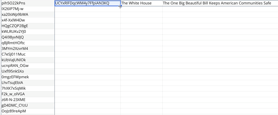
The result?
From May 8th to July 6th there were 78 links to YouTube from wh.gov/wire, which breaks down as follows:
2025-07-07 03:00:00
There’s a video on YouTube from “Technology Connections” — who I’ve never heard of or watched until now — called Algorithms are breaking how we think. I learned of this video from Gedeon Maheux of The Iconfactory fame. Speaking in the context of why they made Tapestry, he said the ideas in this video would be their manifesto.
So I gave it a watch.
Generally speaking, the video asks: Does anyone care to have a self-directed experience online, or with a computer more generally?
I'm not sure how infrequently we’re actually deciding for ourselves these days [how we decide what we want to see, watch, and do on the internet]
Ironically we spend more time than ever on computing devices, but less time than ever curating our own experiences with them.
Which — again ironically — is the inverse of many things in our lives.
Generally speaking, the more time we spend with something, the more we invest in making it our own — customizing it to our own idiosyncrasies.
But how much time do you spend curating, customizing, and personalizing your digital experience? (If you’re reading this in an RSS reader, high five!)
I’m not talking about “I liked that post, or saved that video, so the algorithm is personalizing things for me”.
Do you know what to get yourself more of?
Do you know where to find it?
Do you even ask yourself these questions?
“That sounds like too much work” you might say.
And you’re right, it is work. As the guy in the video says:
I'm one of those weirdos who think the most rewarding things in life take effort
Me too.
2025-07-03 03:00:00
After shipping my work transforming HTML with Netlify’s edge functions I realized I have a little bug: the order of the icons specified in the URL doesn’t match the order in which they are displayed on screen.
Why’s this happening?
I have a bunch of links in my HTML document, like this:
<icon-list>
  <a href="/1/">…</a>
  <a href="/2/">…</a>
  <a href="/3/">…</a>
  <!-- 2000+ more -->
</icon-list>
I use html-rewriter in my edge function to strip out the HTML for icons not specified in the URL. So for a request to:
/lookup?id=1&id=2
My HTML will be transformed like so:
<icon-list>
  <!-- Parser keeps these two -->
  <a href="/1/">…</a>
  <a href="/2/">…</a>

  <!-- But removes this one -->
  <a href="/3/">…</a>
</icon-list>
Resulting in less HTML over the wire to the client.
But what about the order of the IDs in the URL? What if the request is to:
/lookup?id=2&id=1
Instead of:
/lookup?id=1&id=2
In the source HTML document containing all the icons, they’re marked up in reverse chronological order. But the request for this page may specify a different order for icons in the URL. So how do I rewrite the HTML to match the URL’s ordering?
The problem is that html-rewriter doesn’t give me a fully-parsed DOM to work with. I can’t do things like “move this node to the top” or “move this node to position x”.
With html-rewriter, you only “see” each element as it streams past. Once it passes by, your chance at modifying it is gone. (It seems that’s just the way these edge function tools are designed to work, keeps them lean and performant and I can’t shoot myself in the foot).
So how do I change the icon’s display order to match what’s in the URL if I can’t modify the order of the elements in the HTML?
CSS to the rescue!
Because my markup is just a bunch of <a> tags inside a custom element and I’m using CSS grid for layout, I can use the order property in CSS!
All the IDs are in the URL, and their position as parameters has meaning, so I assign their ordering to each element as it passes by html-rewriter. Here’s some pseudo code:
// Get all the IDs in the URL
const ids = url.searchParams.getAll("id");

// Select all the icons in the HTML
rewriter.on("icon-list a", {
  element: (element) => {
    // Get the ID
    const id = element.getAttribute('id');

    // If it's in our list, set it's order
    // position from the URL
    if (ids.includes(id)) {
      const order = ids.indexOf(id);
      element.setAttribute(
        "style",
        `order: ${order}`
      );
    // Otherwise, remove it
    } else {
      element.remove();
    }
  },
});
Boom! I didn’t have to change the order in the source HTML document, but I can still get the displaying ordering to match what’s in the URL.
I love shifty little workarounds like this!
2025-07-01 03:00:00
A little while back I heard about the White House launching their version of a Drudge Report style website called White House Wire. According to Axios, a White House official said the site’s purpose was to serve as “a place for supporters of the president’s agenda to get the real news all in one place”.
So a link blog, if you will.
As a self-professed connoisseur of websites and link blogs, this got me thinking: “I wonder what kind of links they’re considering as ‘real news’ and what they’re linking to?”
So I decided to do quick analysis using Quadratic, a programmable spreadsheet where you can write code and return values to a 2d interface of rows and columns.
I wrote some JavaScript to:
whitehouse.gov/wire
In a few minutes I had a quick analysis of what kind of links were on the page:
This immediately sparked my curiosity to know more about the meta information around the links, like:
So I got to building.
Quadratic today doesn’t yet have the ability for your spreadsheet to run in the background on a schedule and append data. So I had to look elsewhere for a little extra functionality.
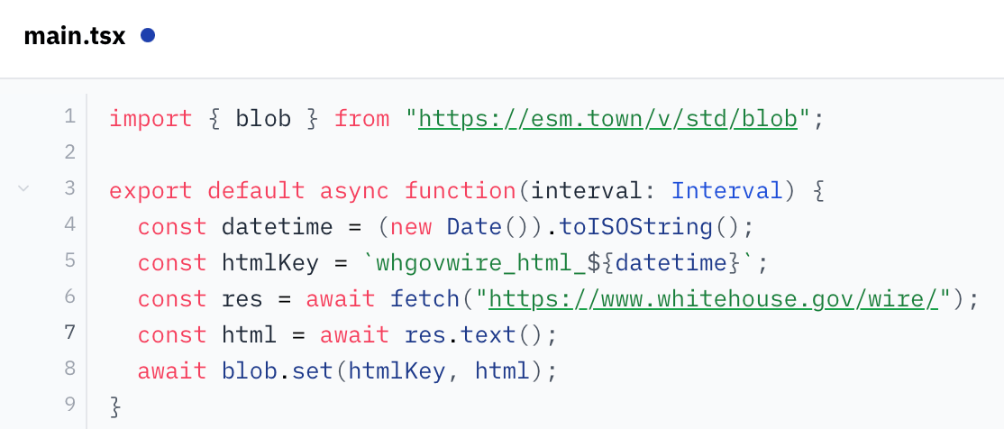
My mind went to val.town which lets you write little scripts that can 1) run on a schedule (cron), 2) store information (blobs), and 3) retrieve stored information via their API.
After a quick read of their docs, I figured out how to write a little script that’ll run once a day, scrape the site, and save the resulting HTML page in their key/value storage.
From there, I was back to Quadratic writing code to talk to val.town’s API and retrieve my HTML, parse it, and turn it into good, structured data. There were some things I had to do, like:
Selfish plug: Quadratic made this all super easy, as I could program in JavaScript and use third-party tools like tldts to do the analysis, all while visualizing my output on a 2d grid in real-time which made for a super fast feedback loop!
Once I got all that done, I just had to sit back and wait for the HTML snapshots to begin accumulating!
It’s been about a month and a half since I started this and I have about fifty days worth of data.
The results?
Here’s the top 10 domains that the White House Wire links to (by occurrence), from May 8 to June 24, 2025:
youtube.com (133)foxnews.com (72)thepostmillennial.com (67)foxbusiness.com (66)breitbart.com (64)x.com (63)reuters.com (51)truthsocial.com (48)nypost.com (47)dailywire.com (36)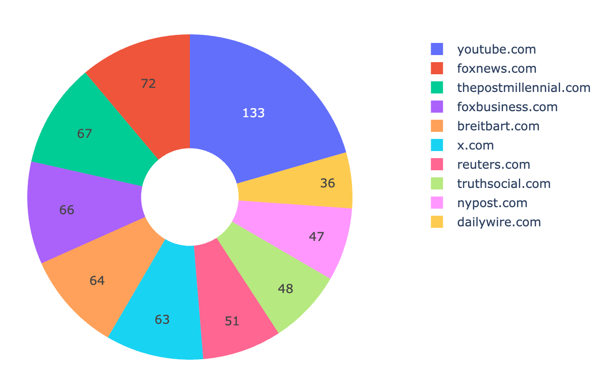
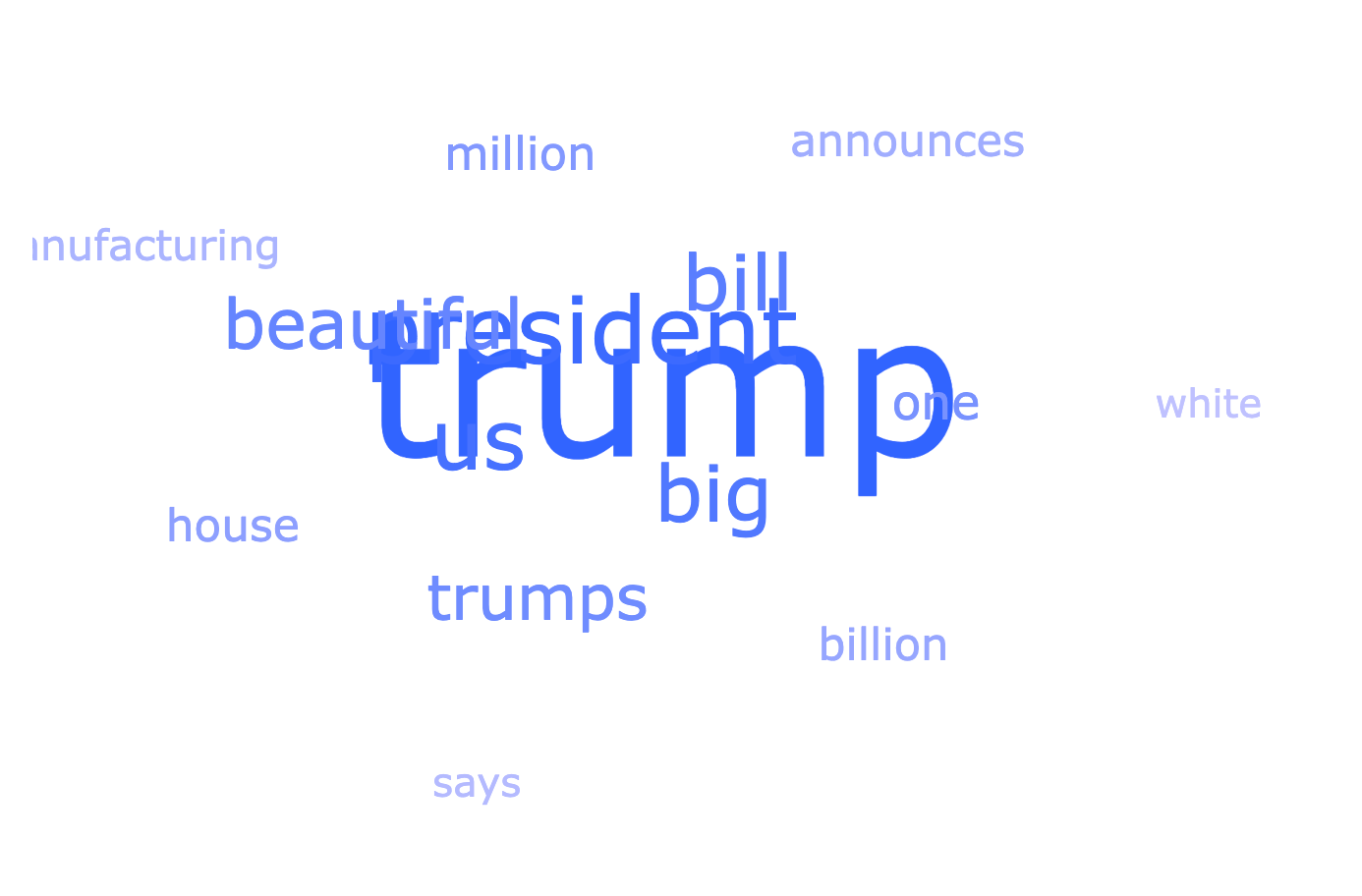
From the links, here’s a word cloud of the most commonly recurring words in the link headlines:
The data and these graphs are all in my spreadsheet, so I can open it up whenever I want to see the latest data and re-run my script to pull the latest from val.town. In response to the new data that comes in, the spreadsheet automatically parses it, turn it into links, and updates the graphs. Cool!
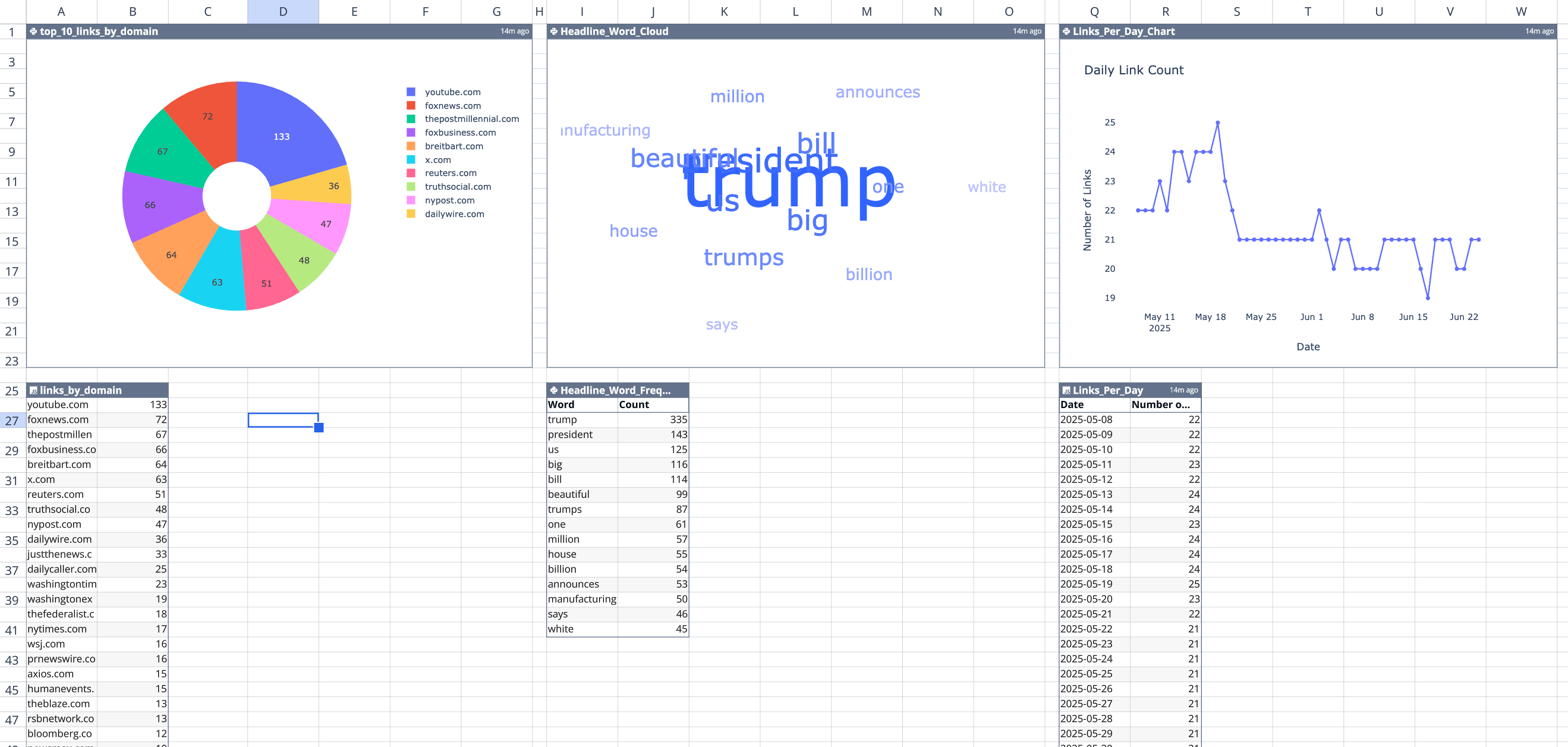
If you want to check out the spreadsheet — sorry! My API key for val.town is in it (“secrets management” is on the roadmap). But I created a duplicate where I inlined the data from the API (rather than the code which dynamically pulls it) which you can check out here at your convenience.
After publishing, I realized that I wasn’t de-duplicating links. Because this works by taking snapshots once a day of the website’s HTML, if the same link stayed up for multiple days, it was getting counted twice.
So I tweaked my analysis to de-duplicate links because I want a picture of all the links shared over time. It didn’t really change the proportions of which sites were shared most frequently, just lowered their occurrence because links now weren’t counted twice.
Given that, here’s an update of the “top 10 links by domain” from May 8th to July 3rd.
youtube.com (73)foxnews.com (36)x.com (31)breitbart.com (29)nypost.com (28)thepostmillennial.com (26)foxbusiness.com (22)truthsocial.com (20)washingtontimes.com (16)dailywire.com (15)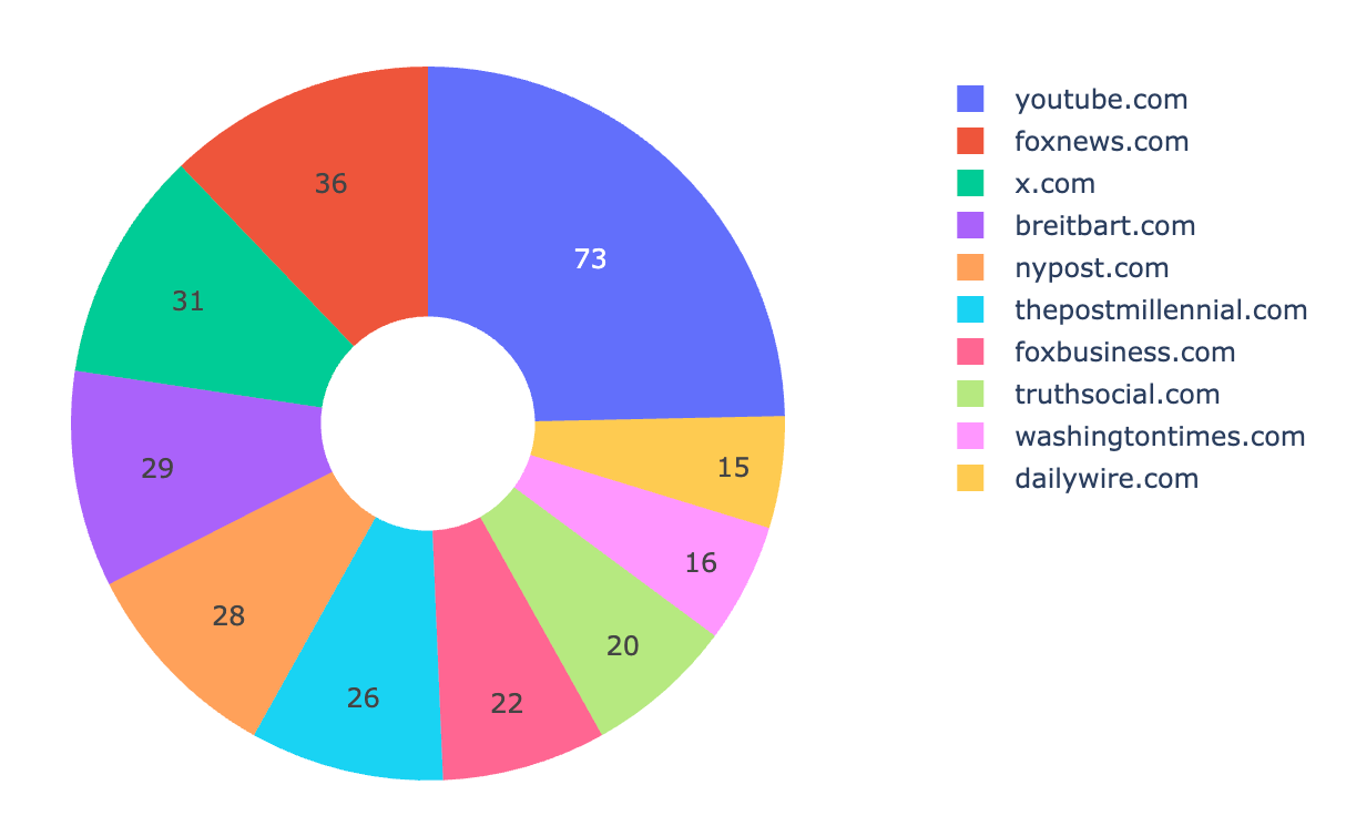
Reply via: Email · Mastodon · Bluesky
Related posts linking here: (2025) Follow Up: An Analysis of YouTube Links From The White House’s “Wire” Website