2026-04-18 08:00:00
These days, I am preoccupied with: 1) painting every day for plein airpril; 2) uh, that’s kind of it, actually, I thought there would be more to this list.
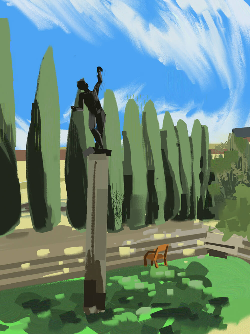
This is my third year of participating in PleinAirpril! It’s an art challenge to paint every day of the month. Despite the name, I am not actually painting en plein air but rather from photo reference, and am using this opportunity to focus on environments.
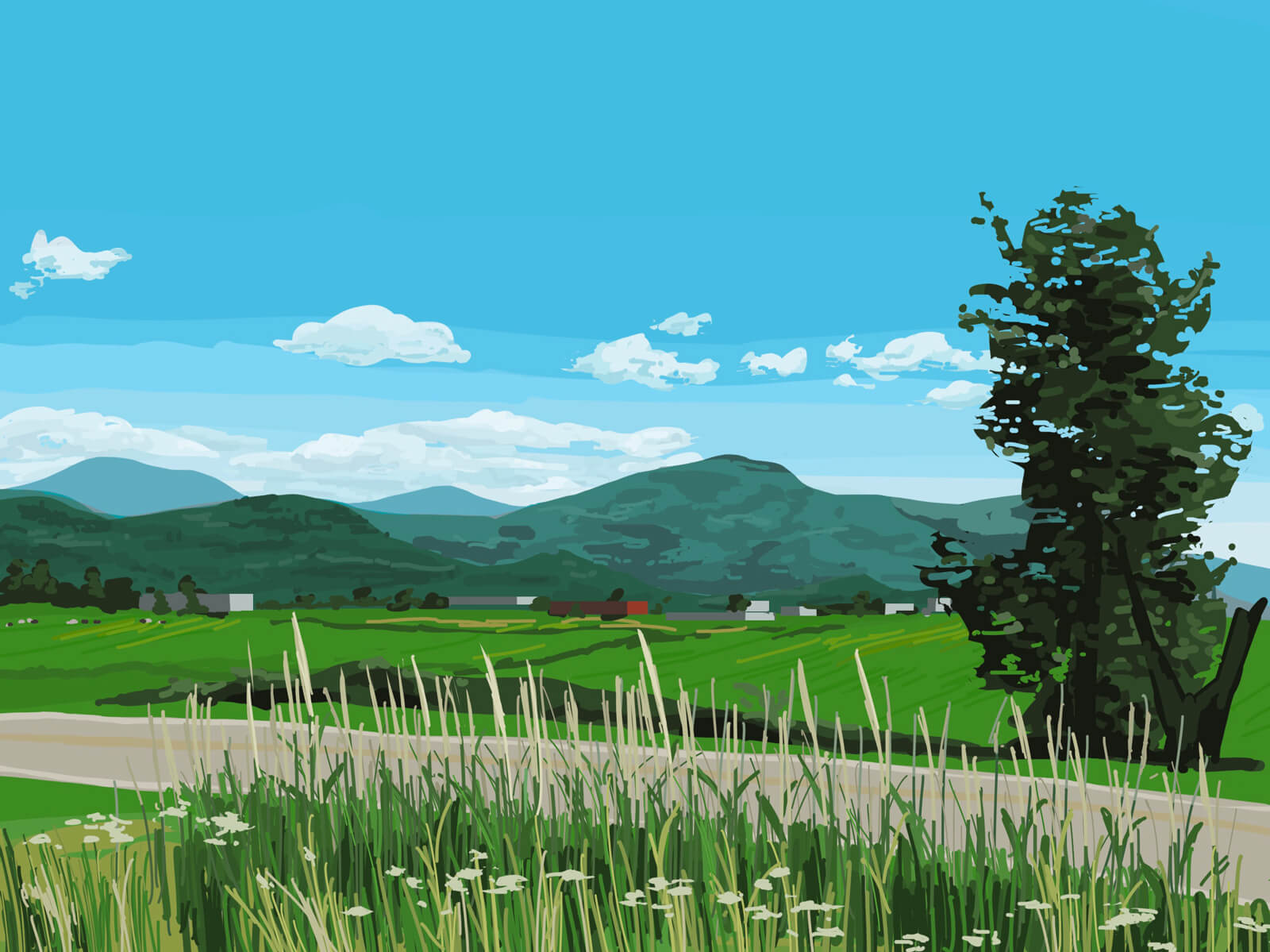
My goal this year is to paint 30/30 days. A 15 minute painting is better than nothing! I post all these in the sketchbook section of my website. Ideally, I would have an RSS feed for art, but alas. I’ll get around to it at some point.
I am lately reading some Japanese mysteries—the last three books I read were Strange Pictures, The Man Who Died Seven Times, and The Decagon House Murders. I have no brain for solving them, so I’m always in suspense. I need to read some more Agatha Christie.
The most recent:
I’m not watching any TV, though my pile of recommendations continues to grow as I continue ignoring it.
Turns out, not much! I haven’t been playing Marathon because it’s way too intense for me to simply hop in and out of it, though I have a little bit of FOMO because the endgame stuff seems cool.
I did boot up Hades II earlier though, because they just released a patch with new content, so I am back on the Icarus romance grind!!!
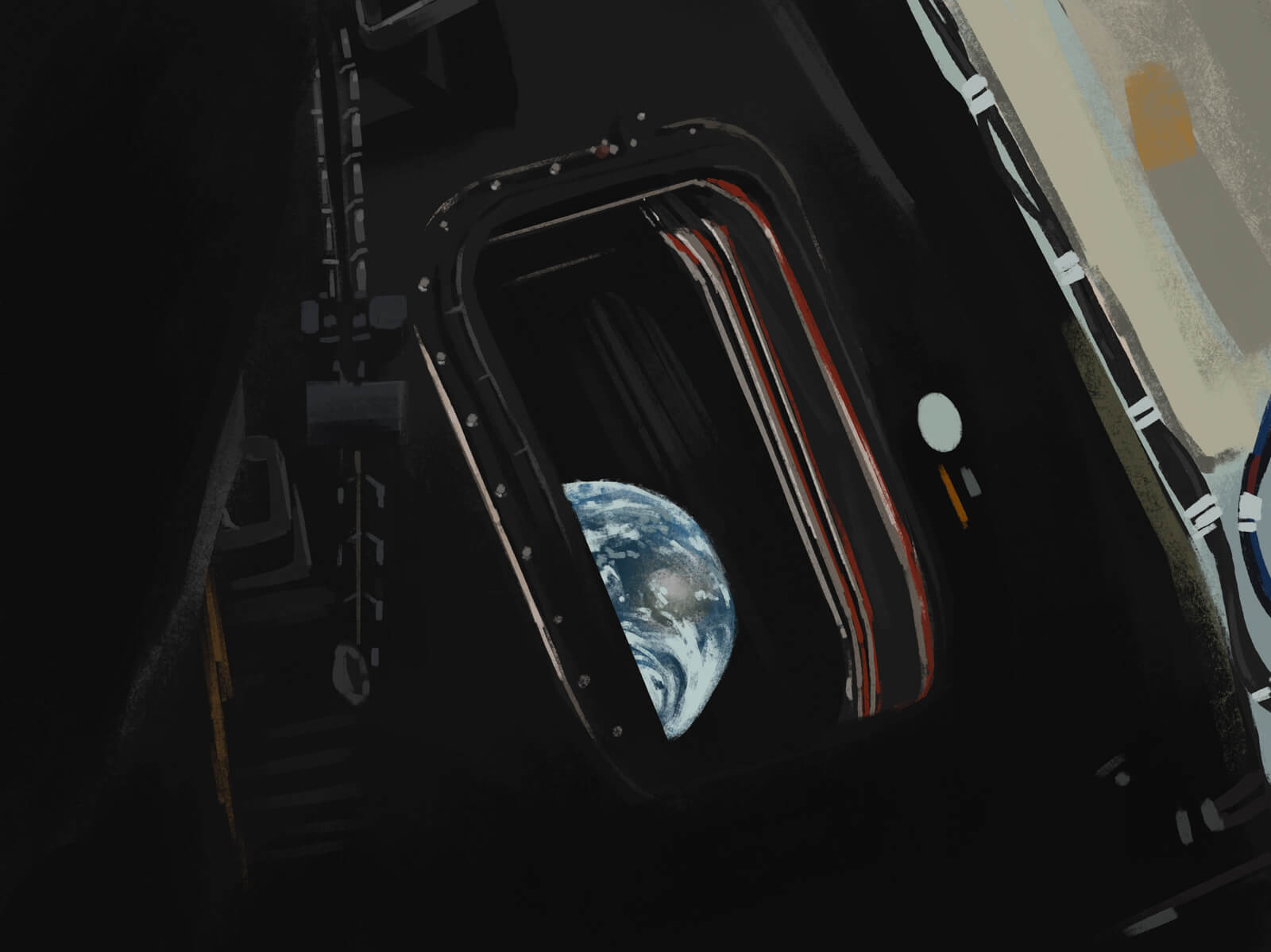
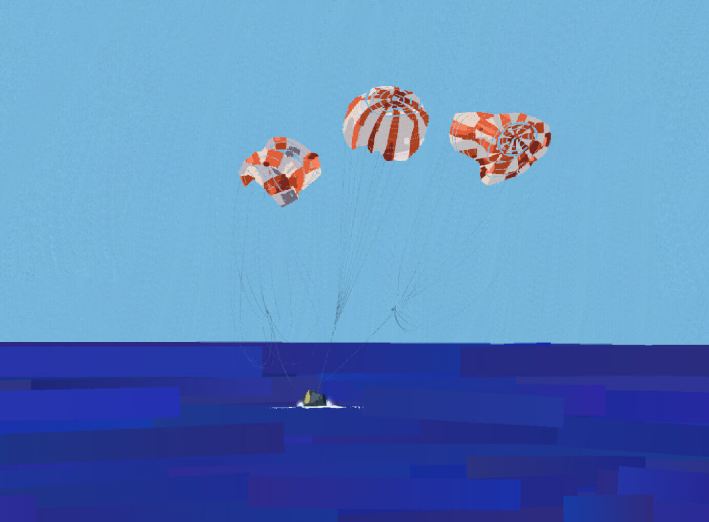
WOW, what an incredible thing to witness!!! Space is so cool. I love the moon.
I lied in the intro. I am also preoccupied with thinking about cute stickers and stationery every single minute of the day, etc. etc.
Next weeknote is the #40. Da big 4-0. I should do something for it.
2026-03-29 08:00:00
I visited the San Francisco Bay Area twice last year, and meant to write about my trips but never got around to it. I figure I’ll never write that post at this point, but I still would like to share the photos I took, so here they are.

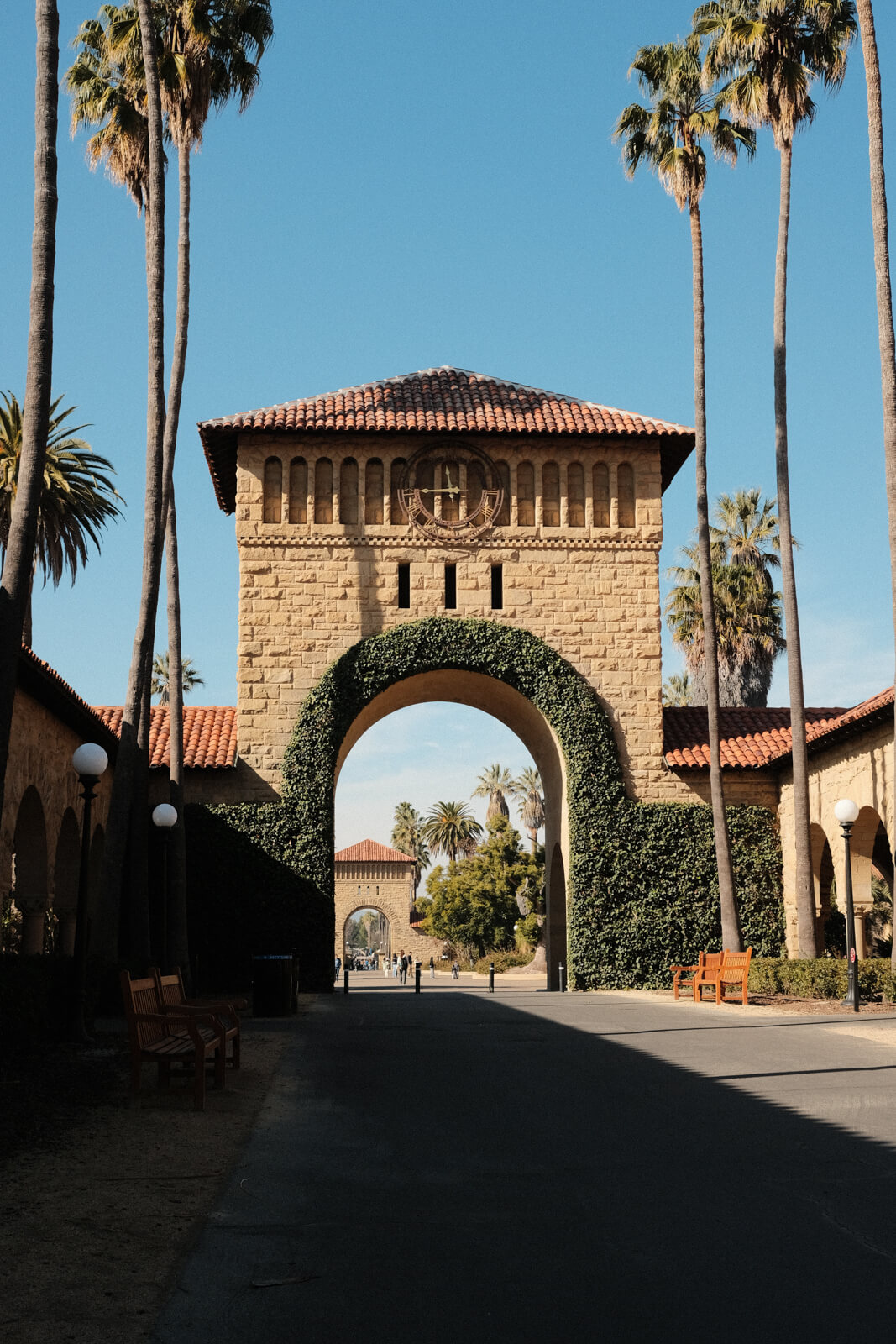
I took the Caltrain to Palo Alto station, which sits at the edge of campus; I then took a shuttle bus that dropped me off near the visitor centre.
I can see how visiting a beautiful university campus would make you want to enroll there. California in January is pretty unbelievable. This was like a good summer day in Vancouver.
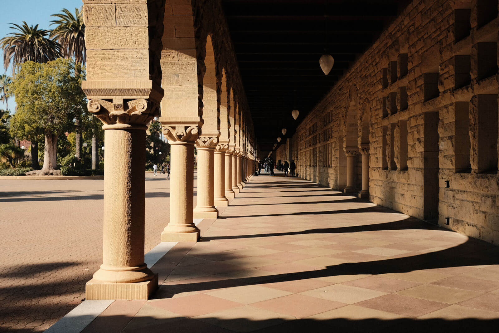
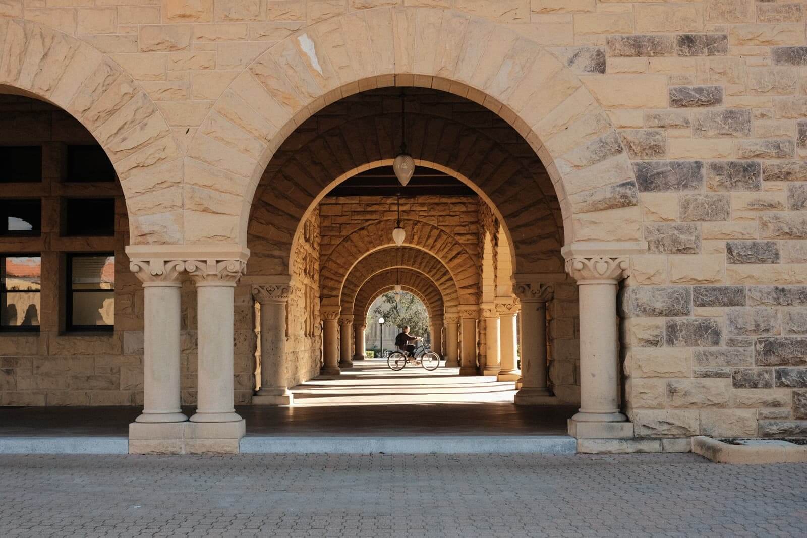
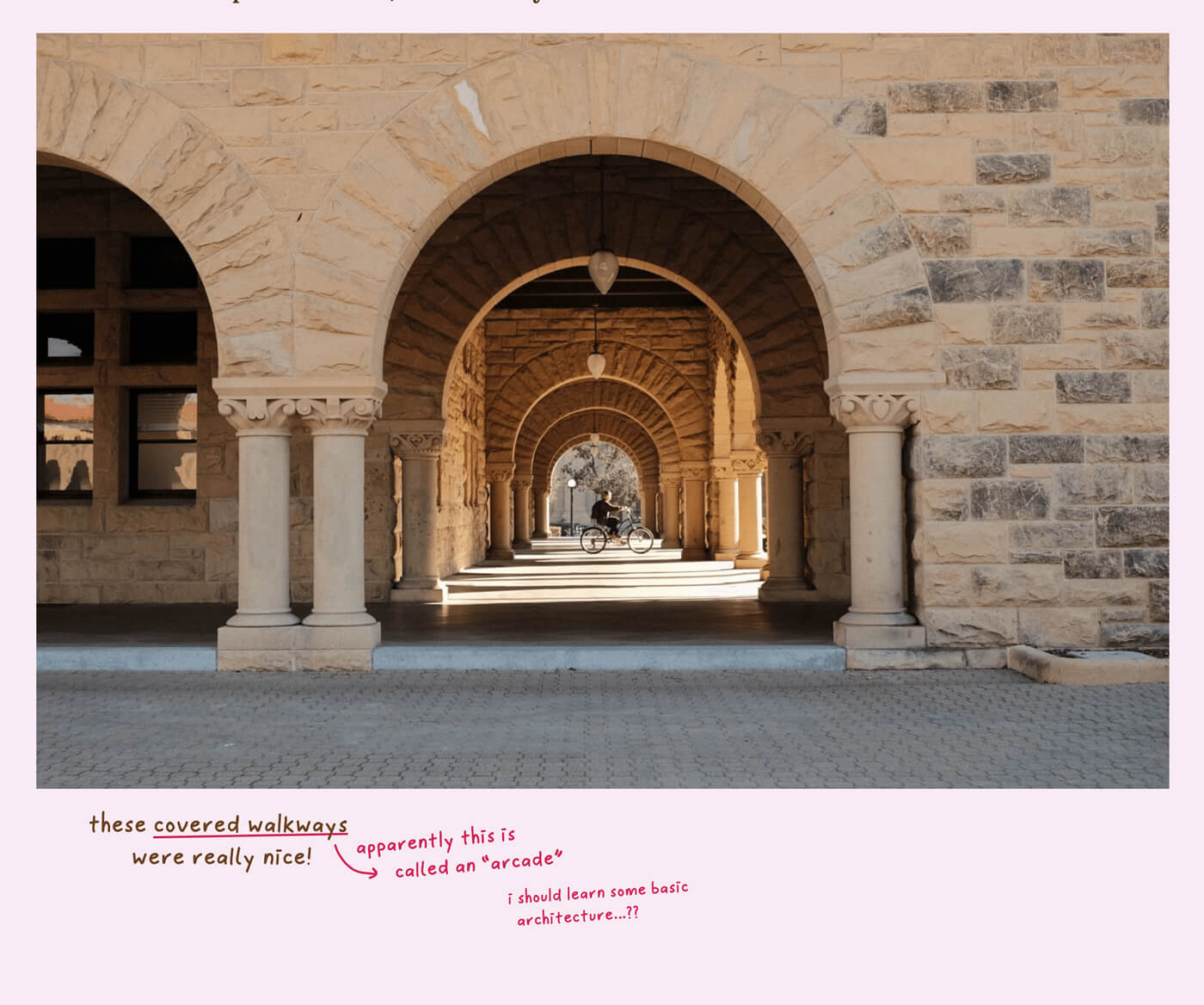
these covered walkways were really nice!
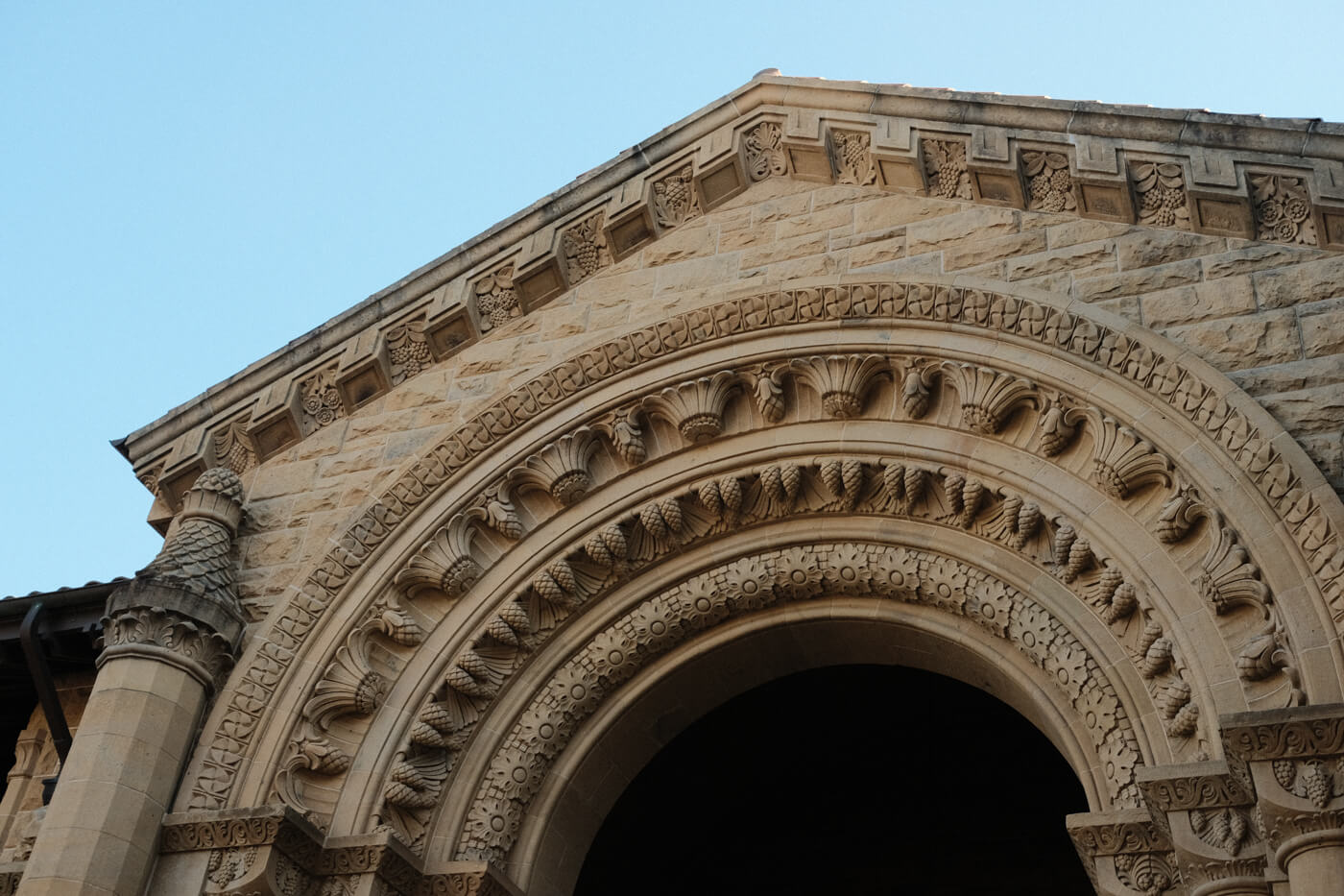
apparently this is called an “arcade”
i should learn some basic architecture…??
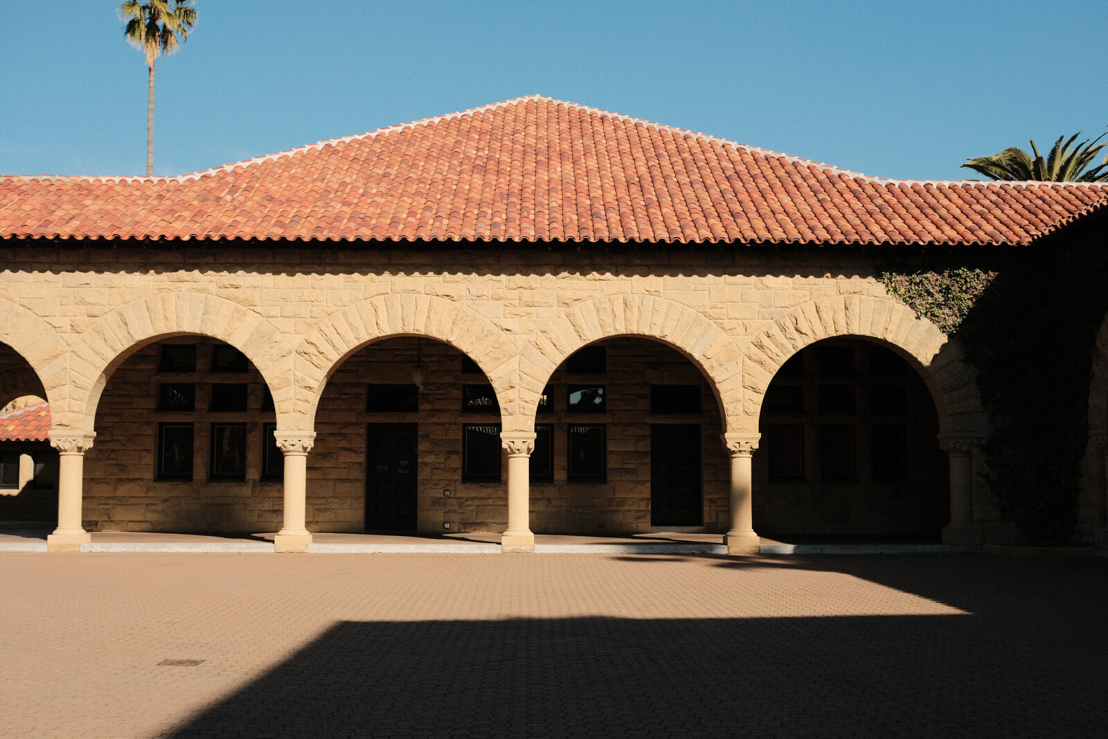
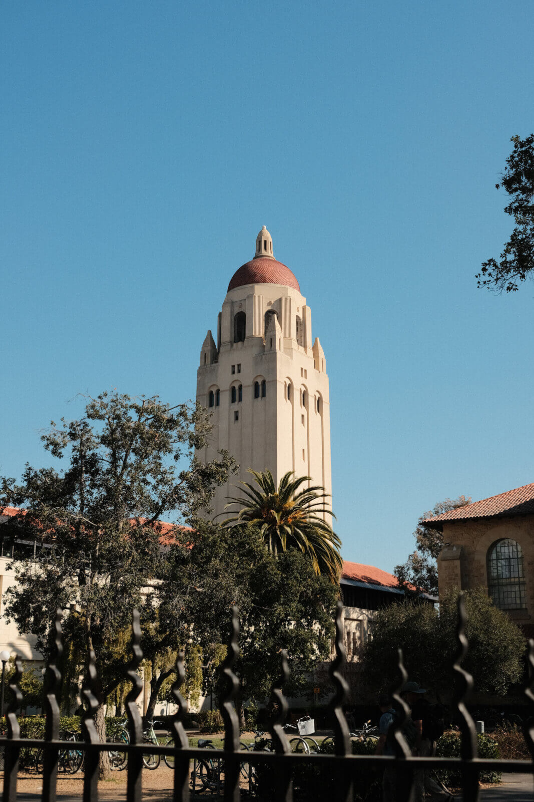
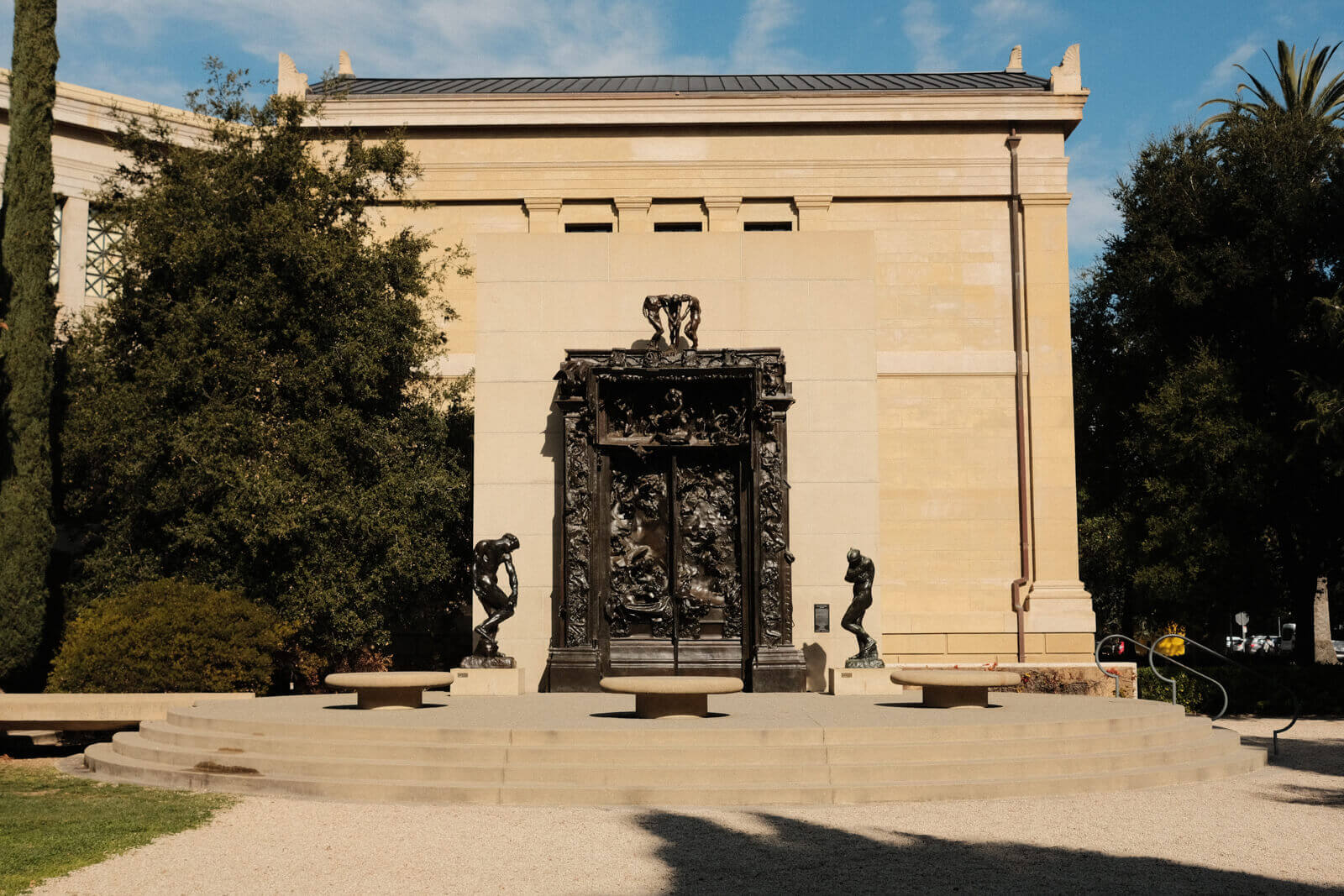
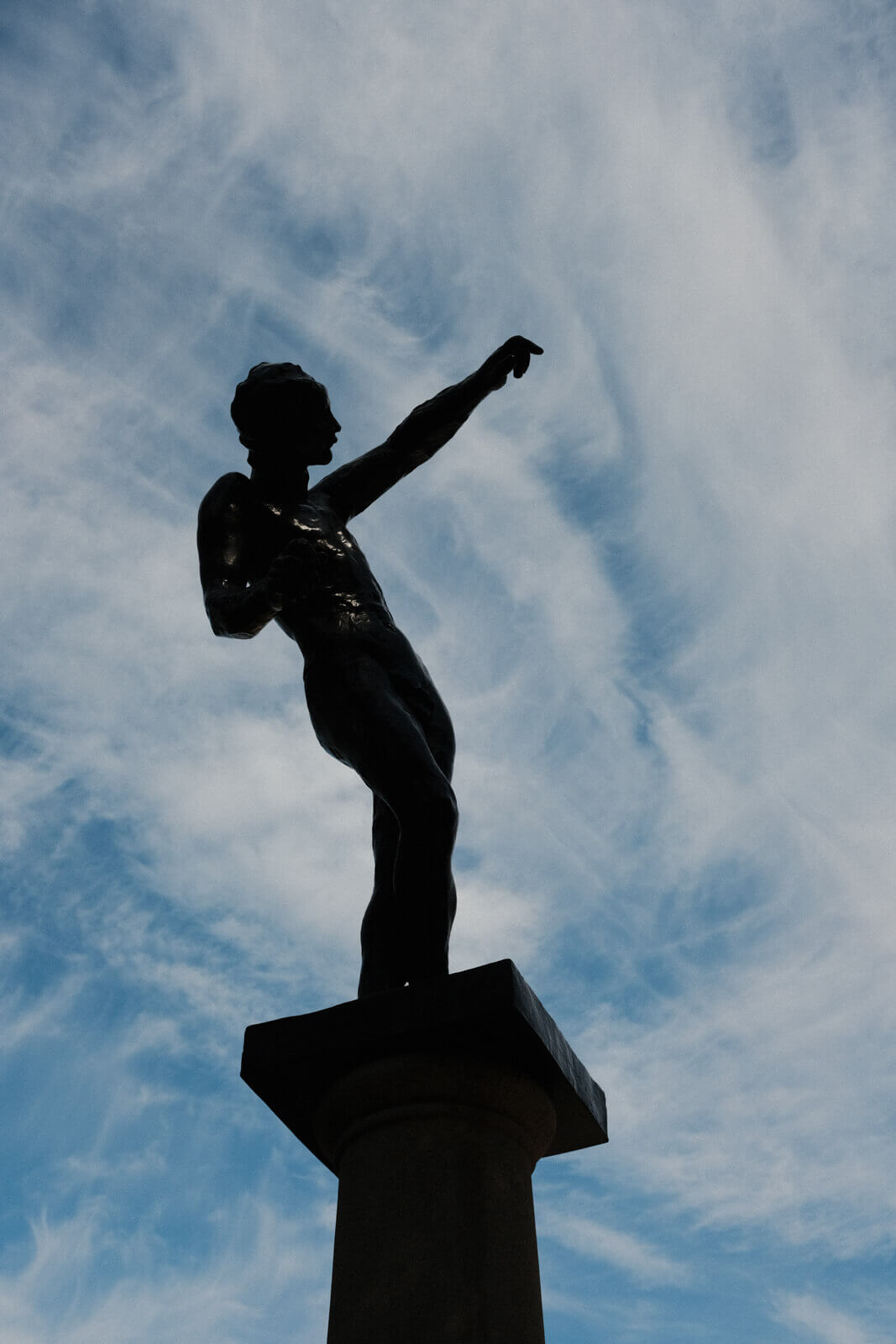
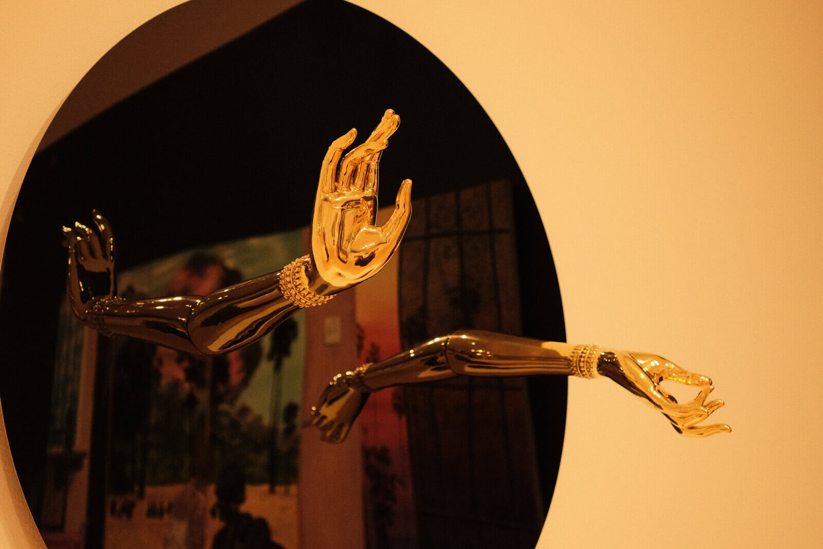
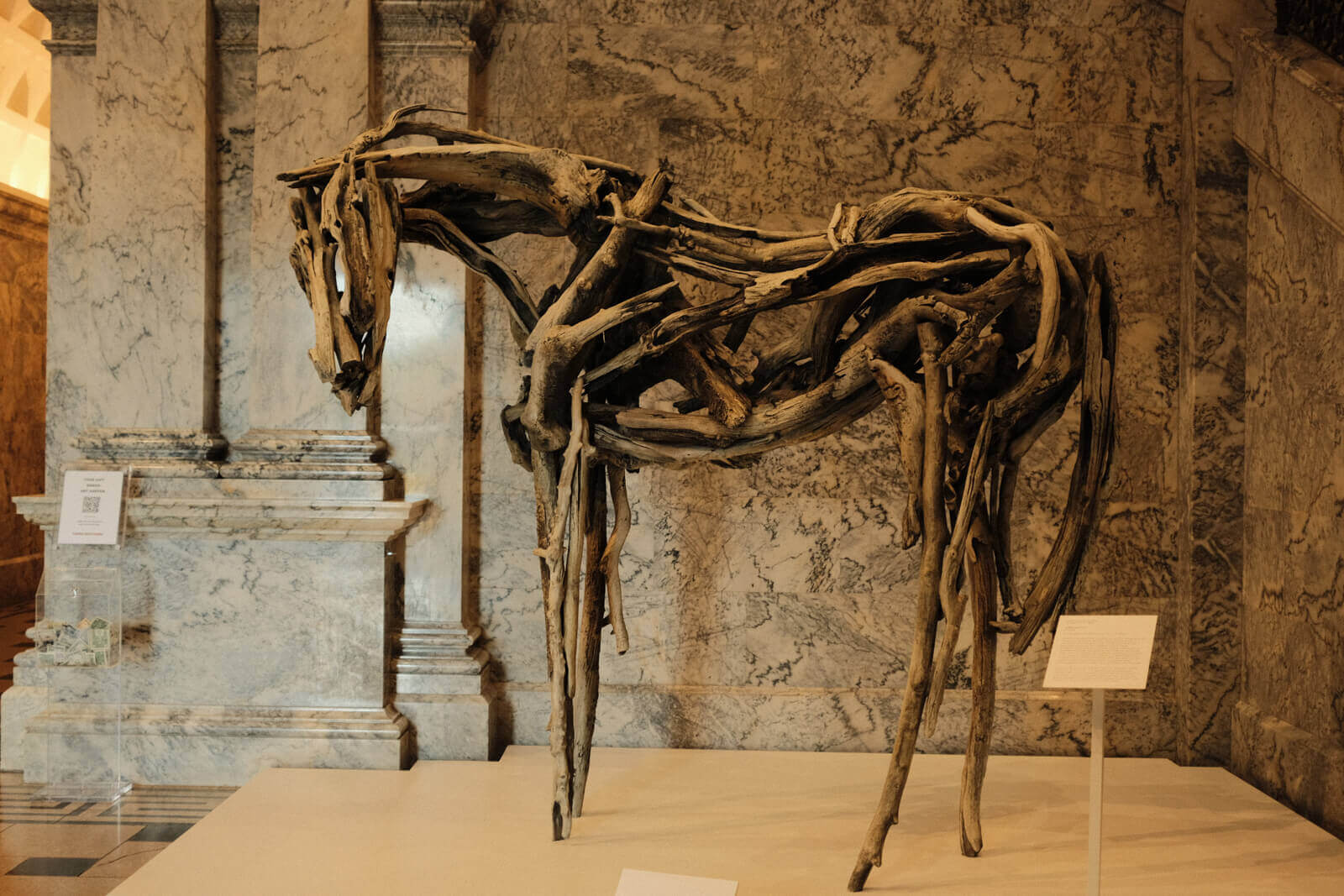
Can’t believe there’s a contemporary art museum on campus. I had to speedrun this.
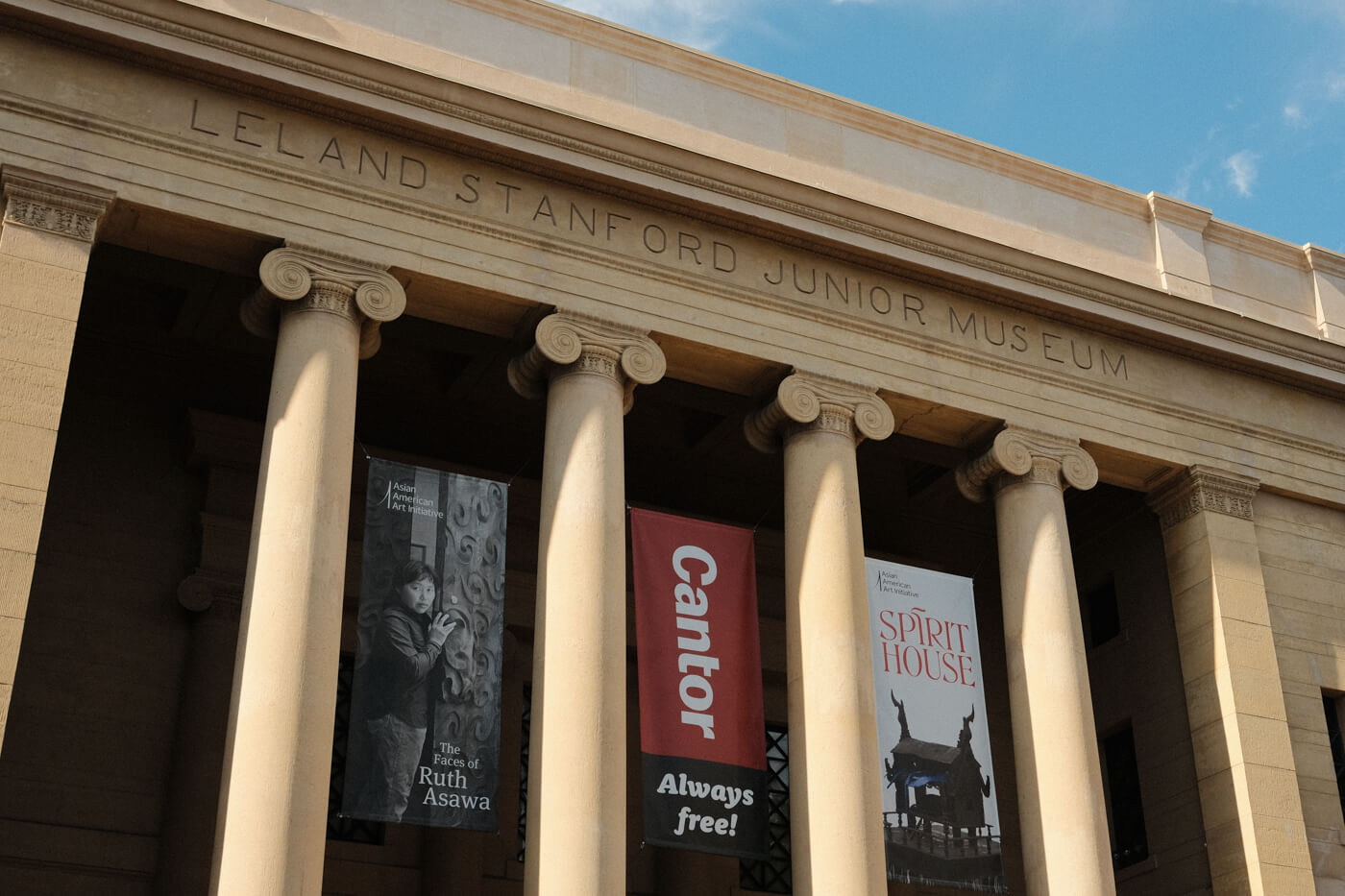
ok these are [checks notes] ionic columns right??
i tried to read more about the types of columns and what orders are but then got confused…
wikipedia: “an order in architecture is a certain assemblage of parts subject to uniform established proportions, regulated by the office that each part has to perform”
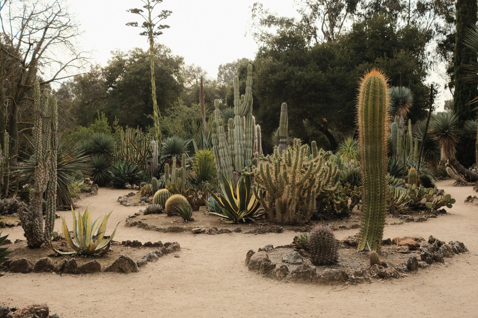
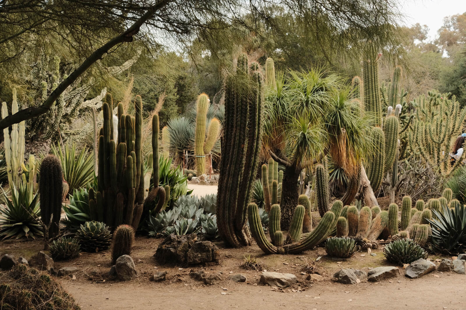
I walked over to the cactus garden, which was full of cacti. How nice!
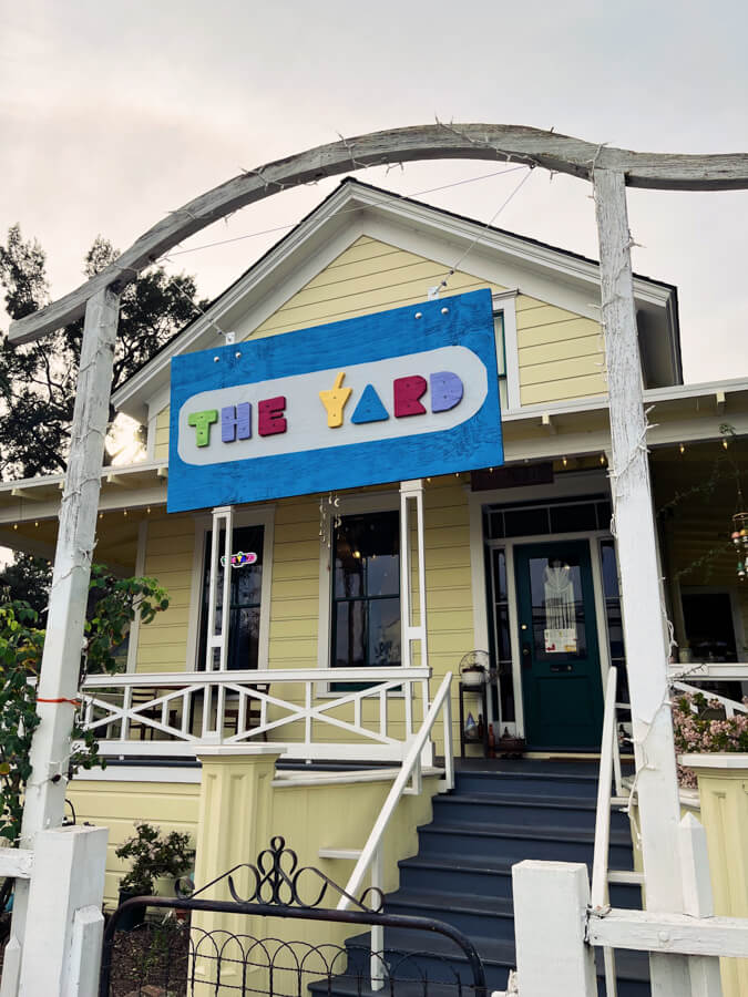
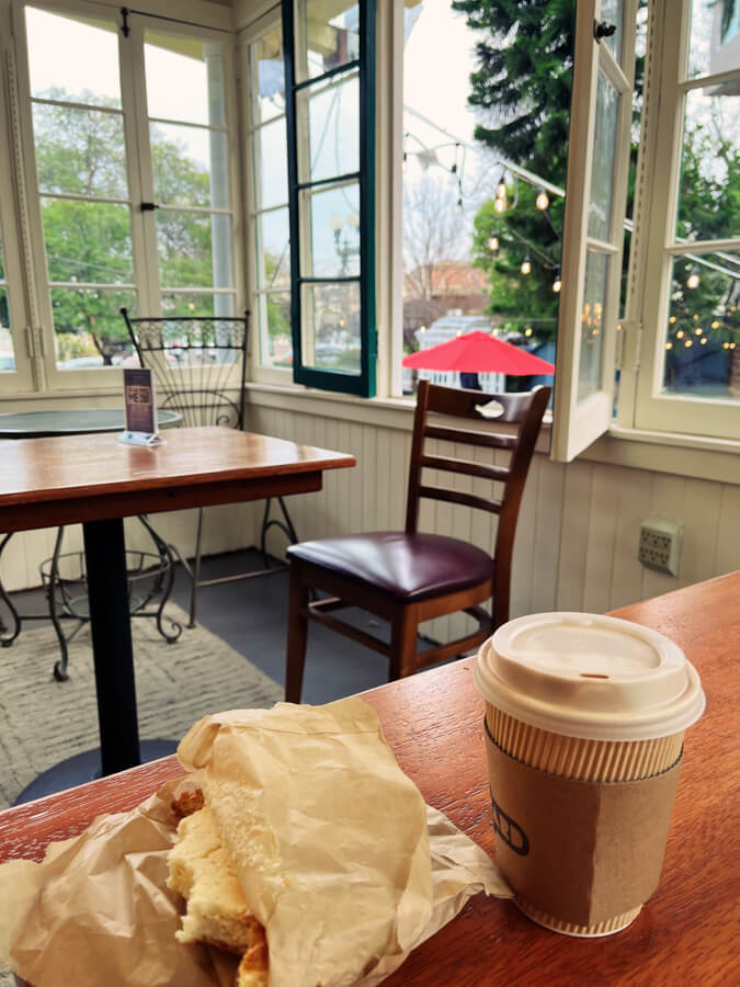
I took the train up to Redwood City to meet a friend. We hung out at a very cute cafe and doodled.
On my first trip, I only spent a day in the city itself, since I was staying farther out in the Bay Area.
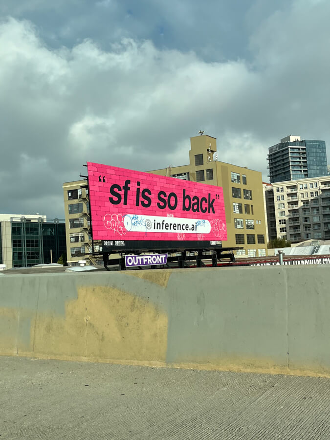
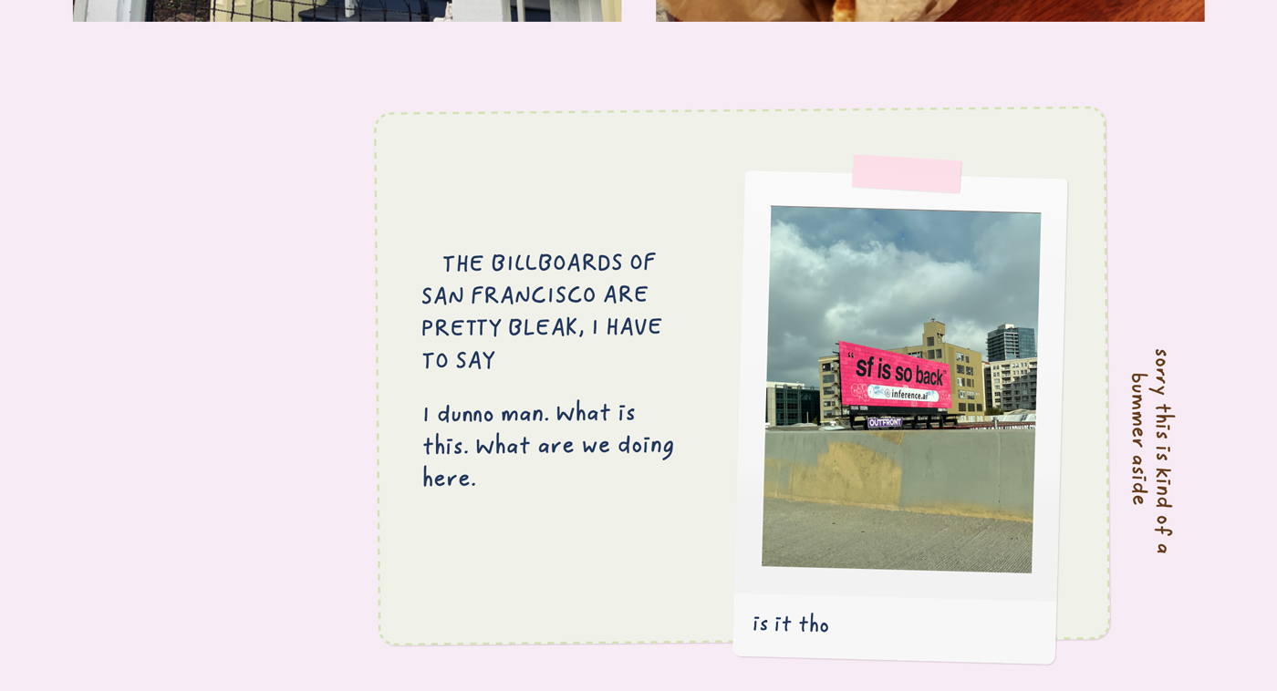
I dunno man. What is this. What are we doing here.
Apparently Legion of Honor is one half of the Fine Arts Museums of San Francisco—the other is the de Young Museum in Golden Gate Park, which I visited on my second trip.
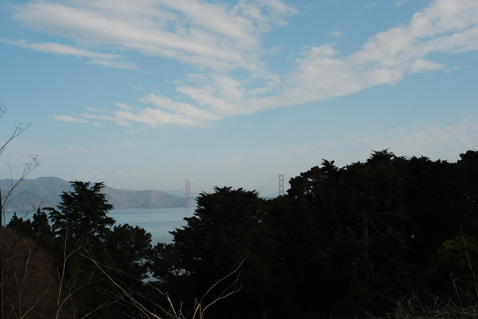
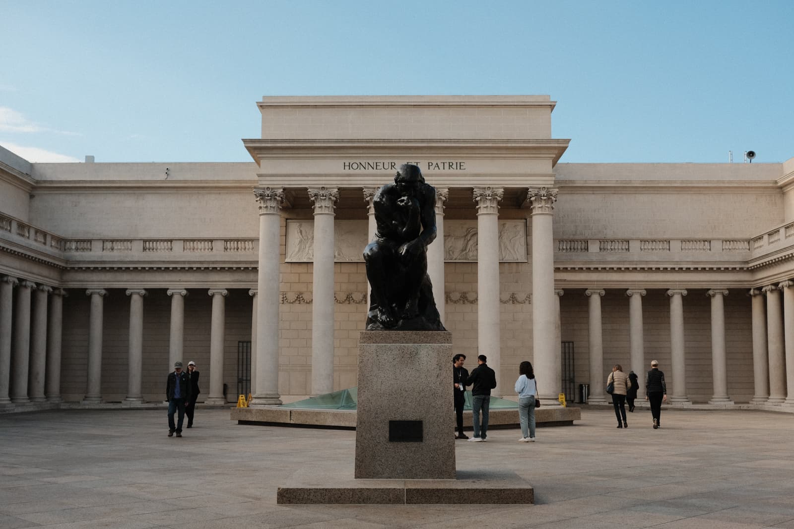
this architectural style is called “beaux-arts”
i’m learning so much while writing this blog post lol
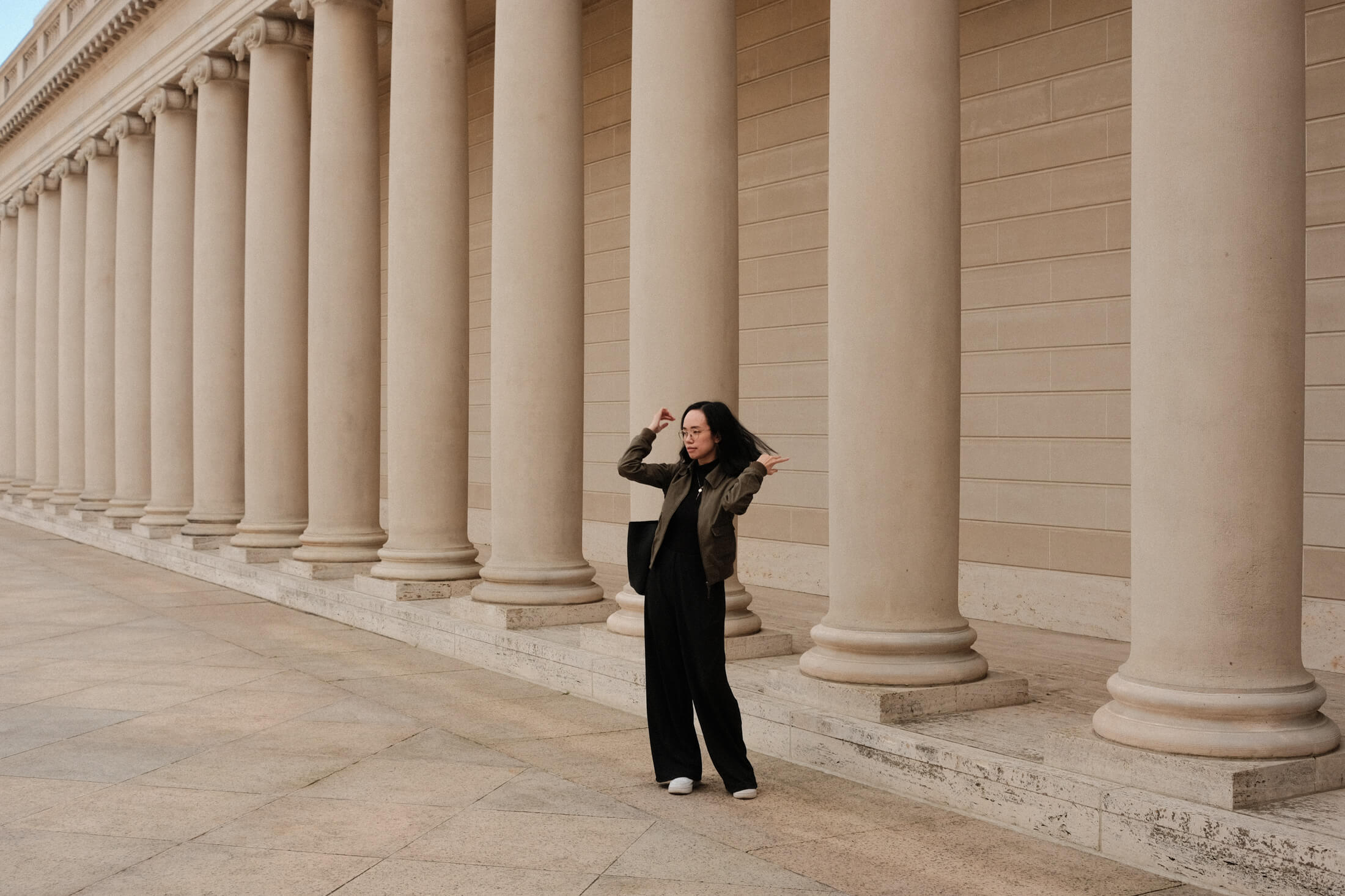
After the Legion of Honor, we went to the SF MOMA. I didn’t take many pictures, but I really enjoyed it. It was bigger than I expected and we had to rush through the last couple of floors.
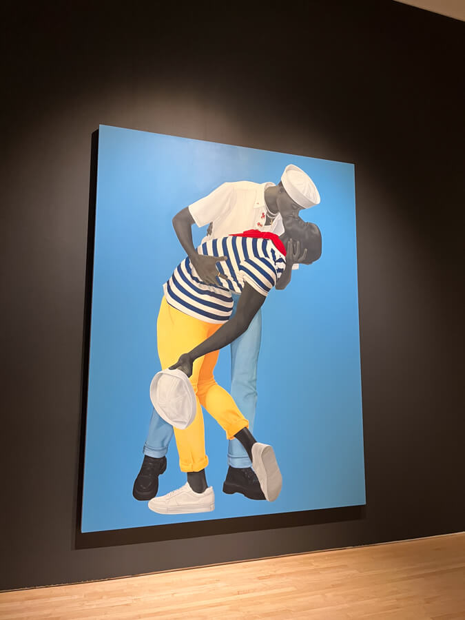
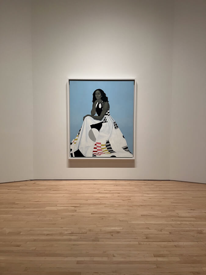
The highlight was the exhibition of Amy Sherald’s paintings:
Amy Sherald: American Sublime invites you to breathe. Come and be taken in by the colors, shapes, and forms painted by one of America’s defining contemporary portraitists.
This exhibition presents nearly 50 of Amy Sherald’s luminous paintings, including her iconic portraits of Michelle Obama and Breonna Taylor, poetic early works, and new works on view for the first time.
Sherald’s artworks convey the quiet power in everyday people and invite viewers to participate in a more complex debate about accepted notions of American identity.
— SF MOMA
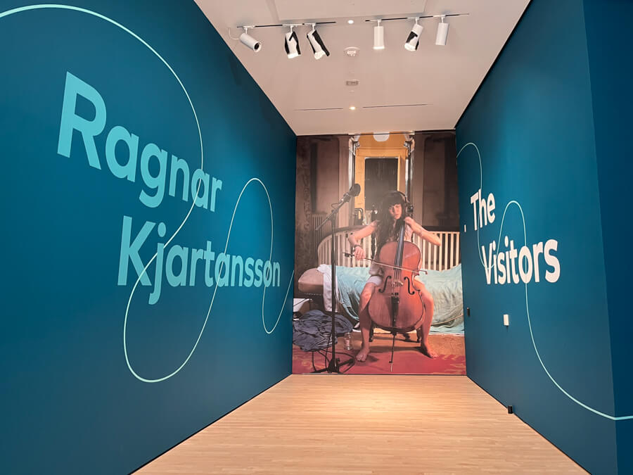
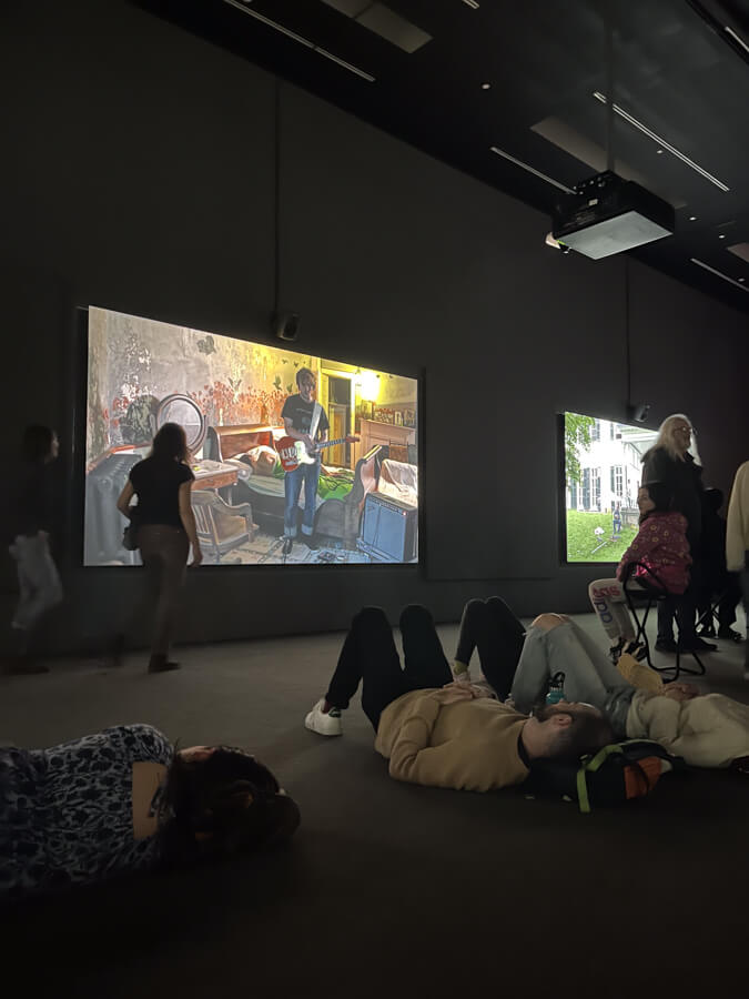
I also really enjoyed the installation The Visitors by Ragnar Kjartansson, where we sat for a little while and enjoyed the music and calm atmosphere. Here’s a YouTube video of it—really such a lovely experience.
“In this mesmerizing hour-long work projected across nine screens, viewers are transported once again to the serene setting of Rokeby in upstate New York as the Icelandic artist and his musician friends perform together in various rooms of this historic mansion.”
— SF MOMA
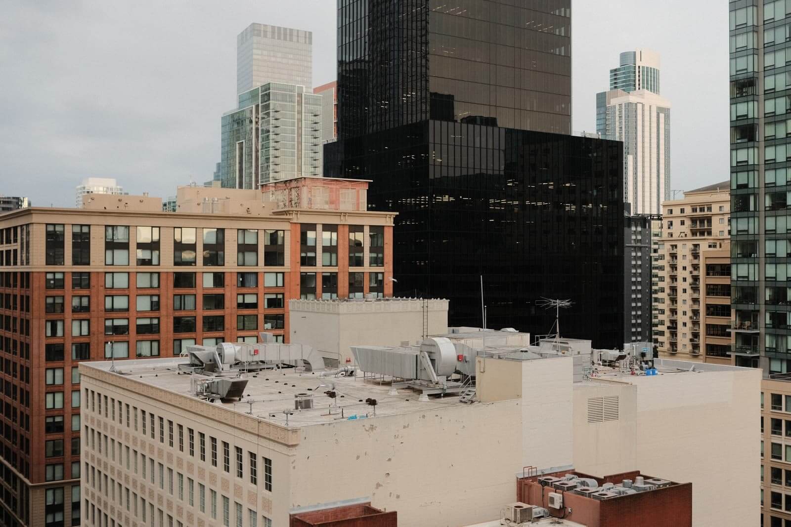
view from the balcony.
monolith…
My friend gave me a tour of the Netflix office, which was cool. I’d never been to a big tech office before, and I’ve only ever worked at smaller, scrappier companies. Everything is so fancy?
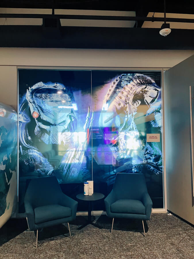
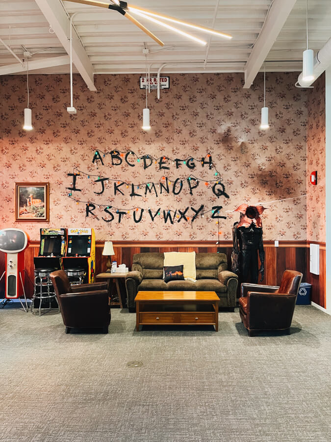
Here’s the start of trip #2 in October!
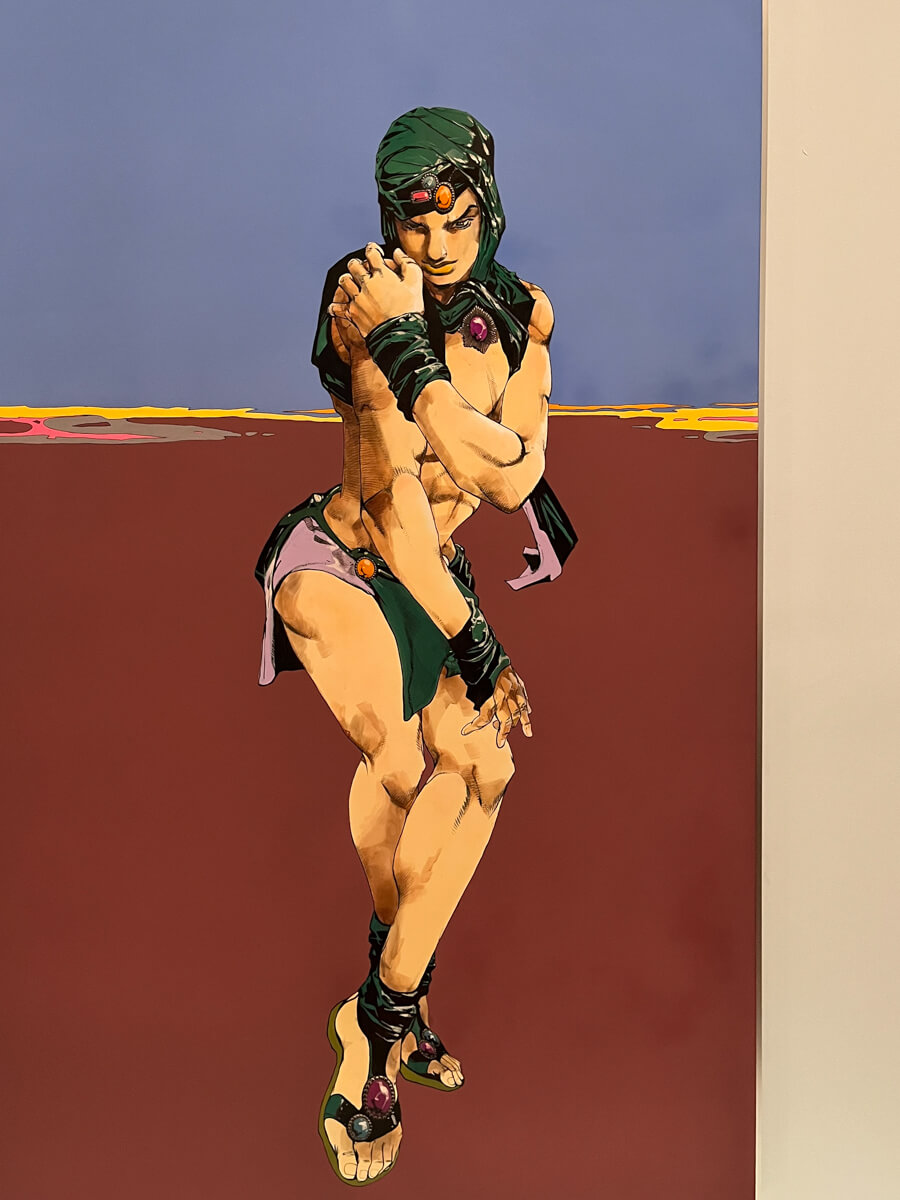
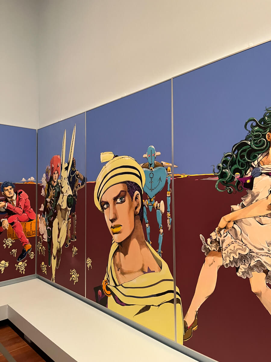
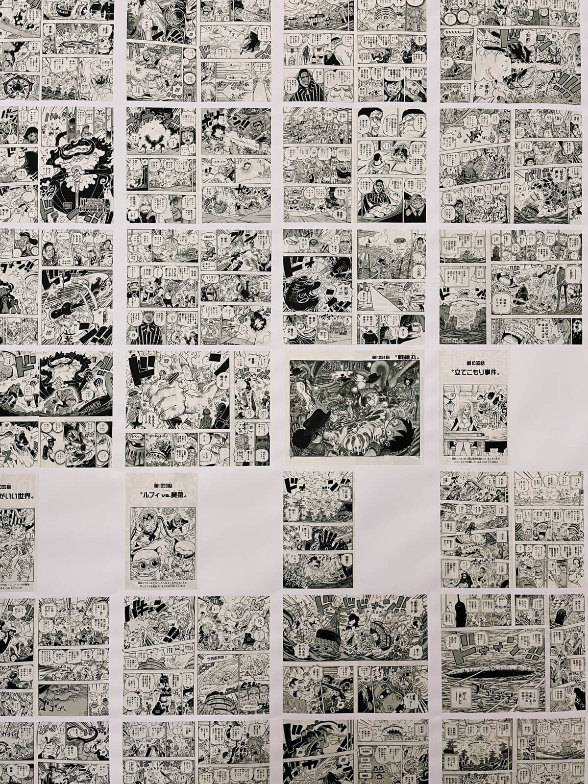
Of course, I loved the Art of Manga exhibit.
“Manga — Japanese comics and graphic novels — have become a global phenomenon. Featuring rarely presented original drawings by major artists, this exhibition showcases the world of manga from the 1970s to today. The exhibition explores manga as a powerful medium for visual storytelling, highlighting themes across genres, from friendship to sexuality to the human condition. Looking closely at each artist’s narrative worlds and creative processes, the exhibition also spotlights manga’s cultural impact today and possibilities for the future.”
— de young
There were so many different works and artists exhibited that I had never seen before. Examining all their different art styles up close was such a treat.
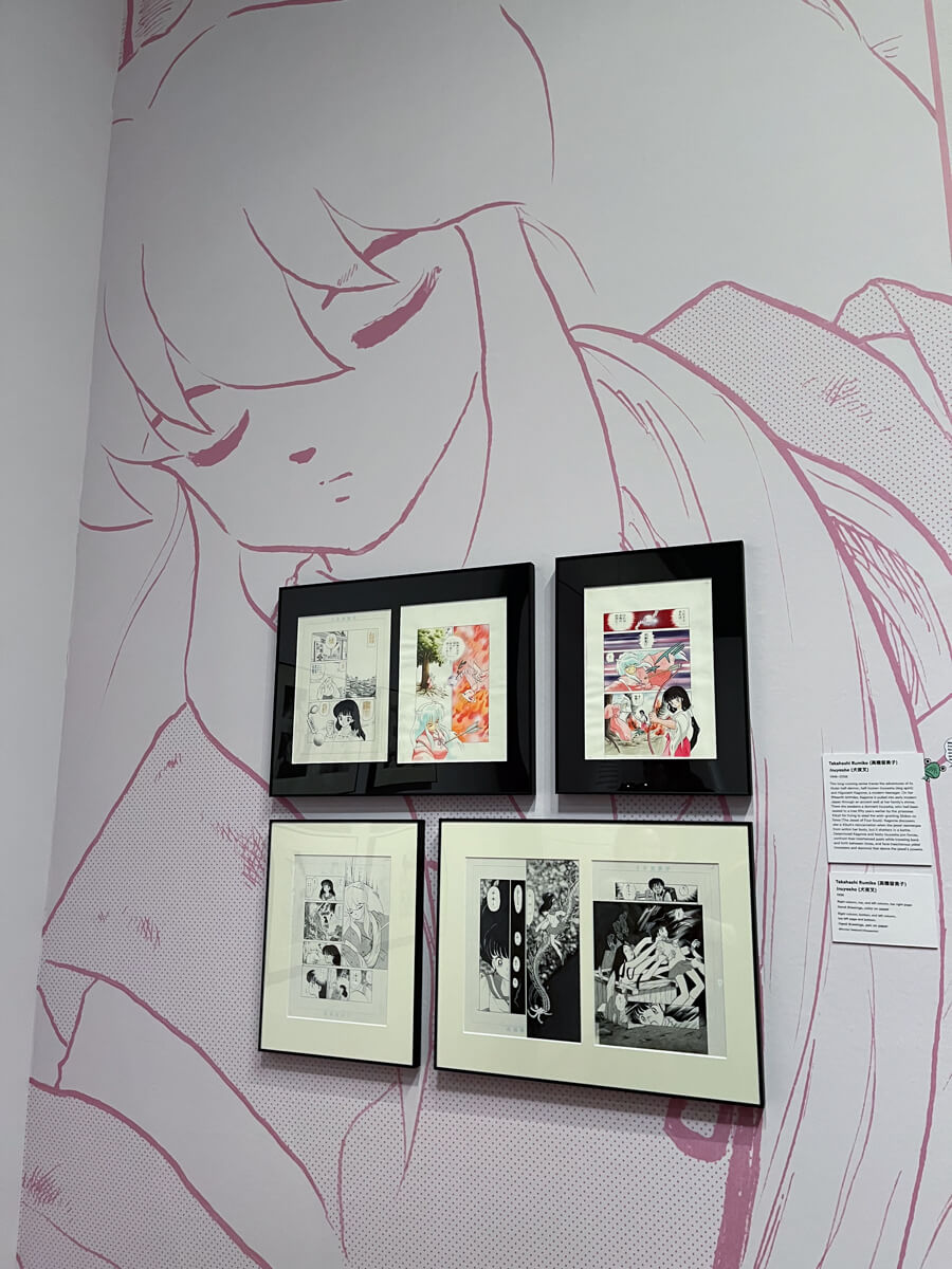
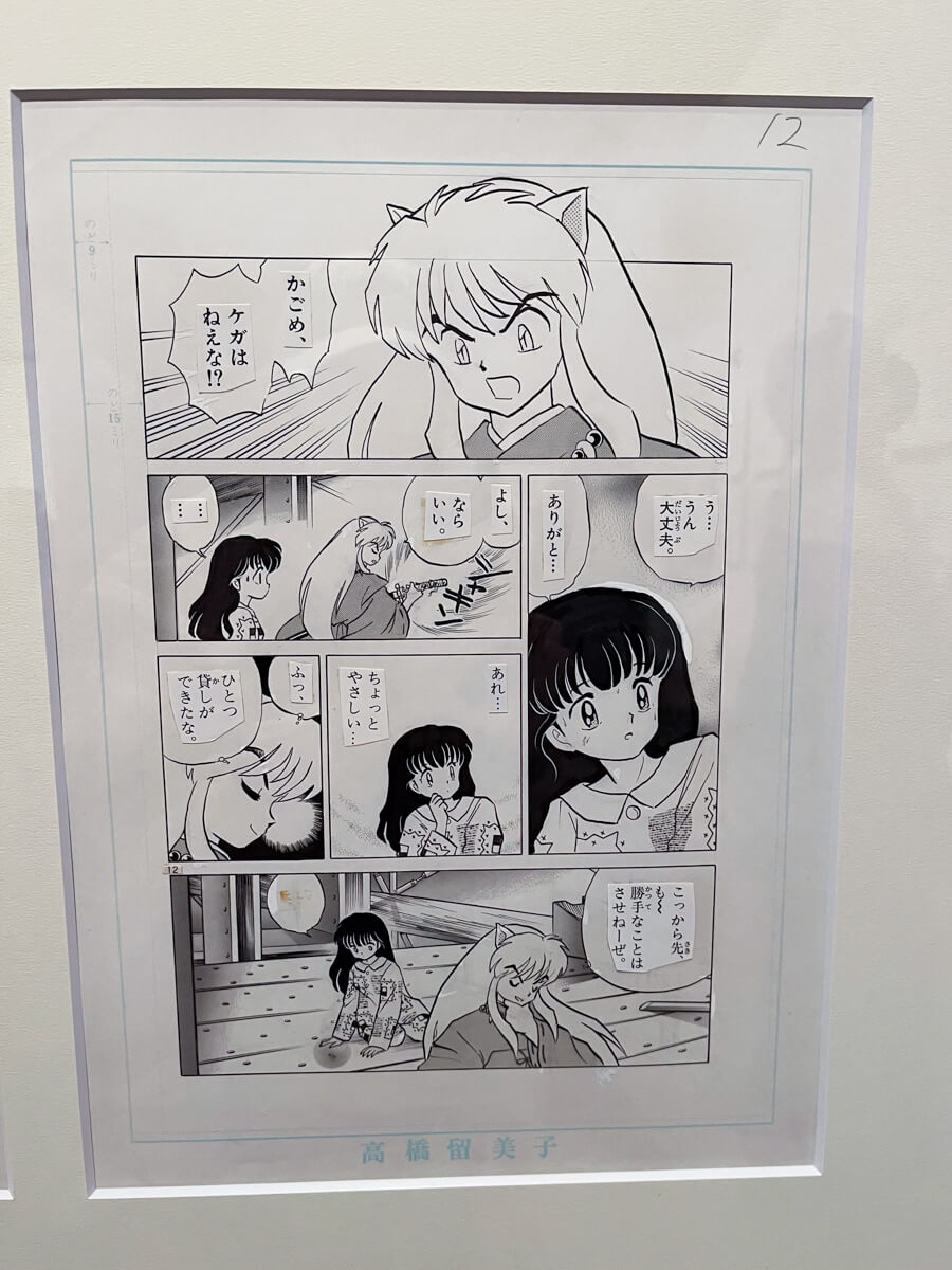
it was really cool to see the original manga pages, with the inking and screentones
ooo visible whiteout fixes!
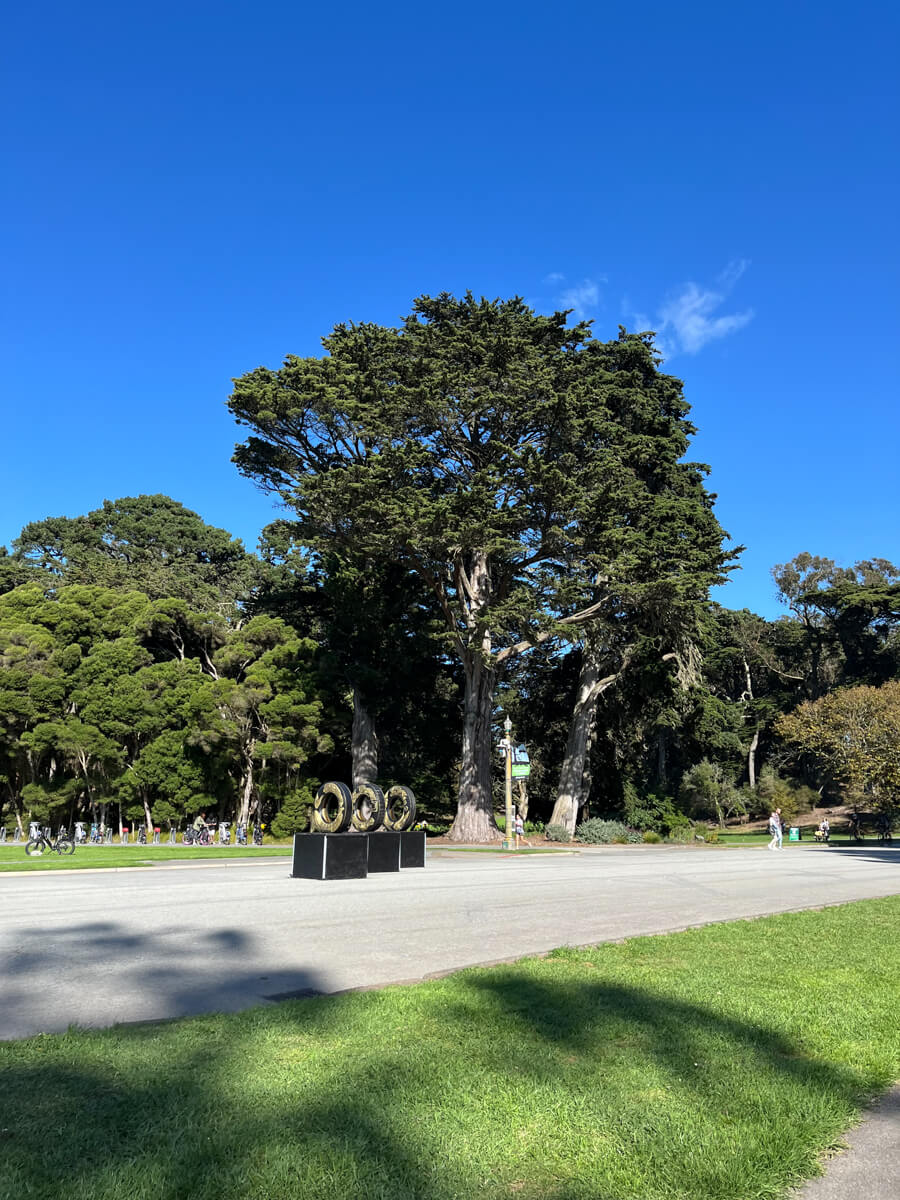
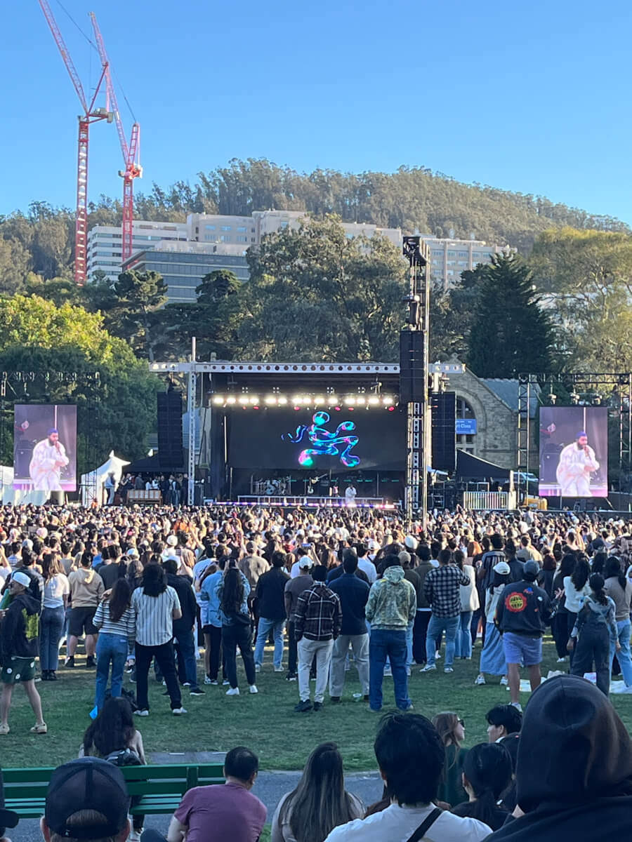
The other main attraction at Golden Gate Park that day was attending the Khalid concert (feat. Lauv + flowerovlove). It started at 3pm, ended around 6, and we were sitting on the grass the entire time, which is the ideal concert experience for me since I am old and decrepit and hate crowds.
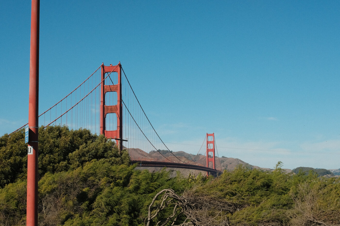
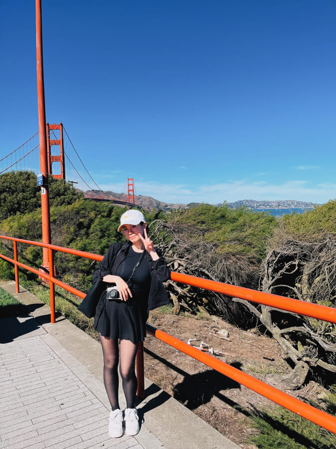
A cool structure north of the city. Apparently it was built for the 1915 Panama–Pacific International Exposition, but then completely rebuilt from 1964 to 1974.
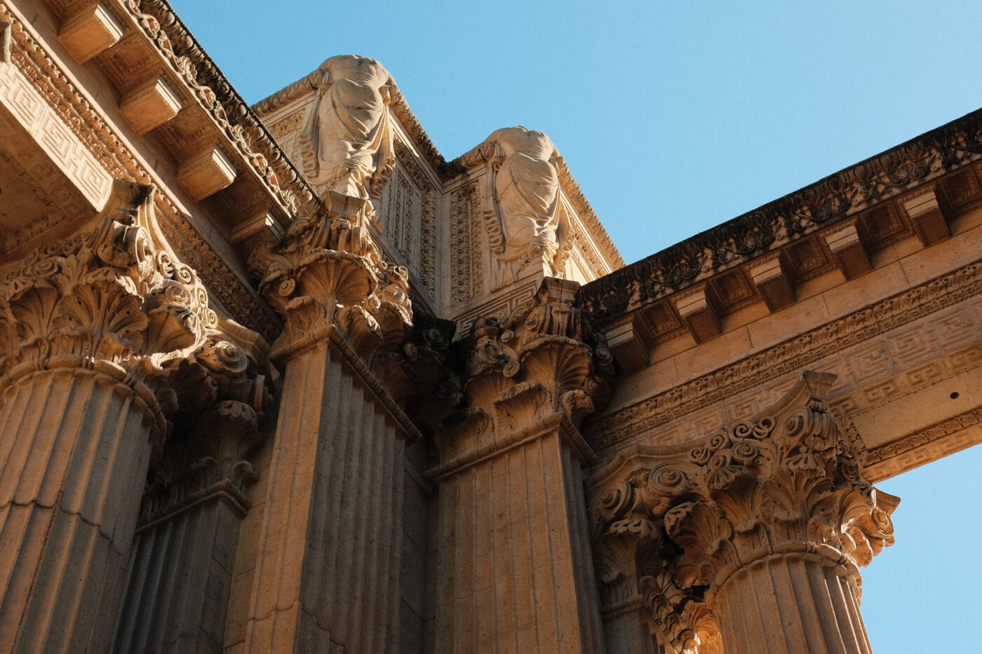
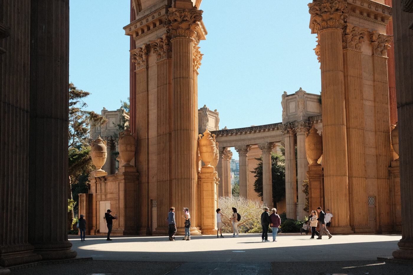
and THESE are corinthian columns
u can tell (apparently) by how Very Fancy they are
not me tho i looked at a website that says they are corinthian
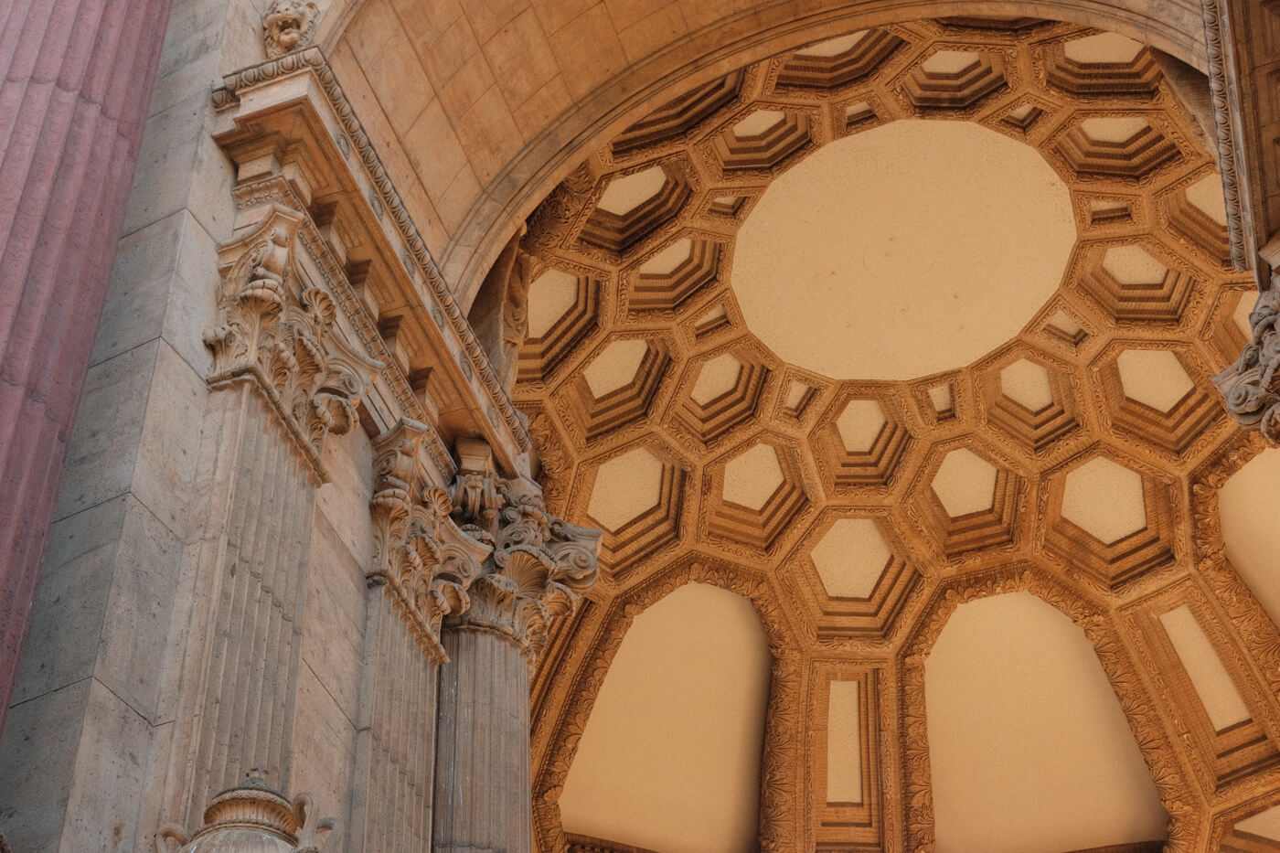
the rotunda. or, “da rotunda,” if you will, sorry

I spent a day walking around the city, which including memorable sights like a Salesforce conference (lol), AI ads (ew), and the Oakland Bay Bridge (nice).
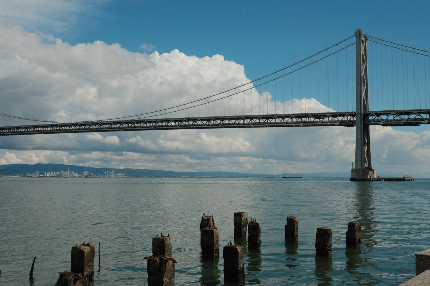
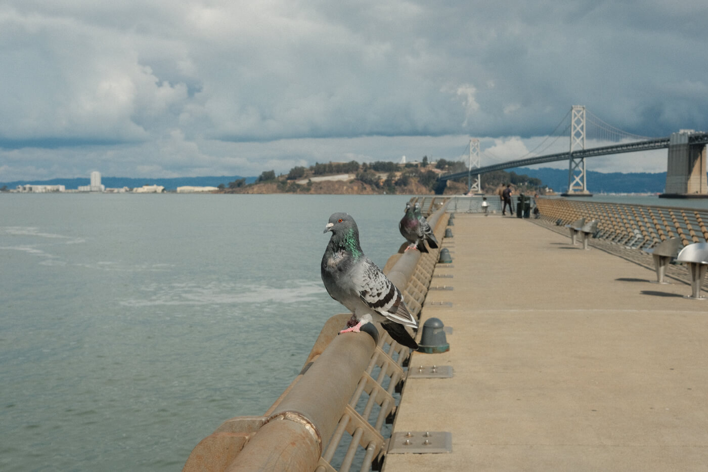
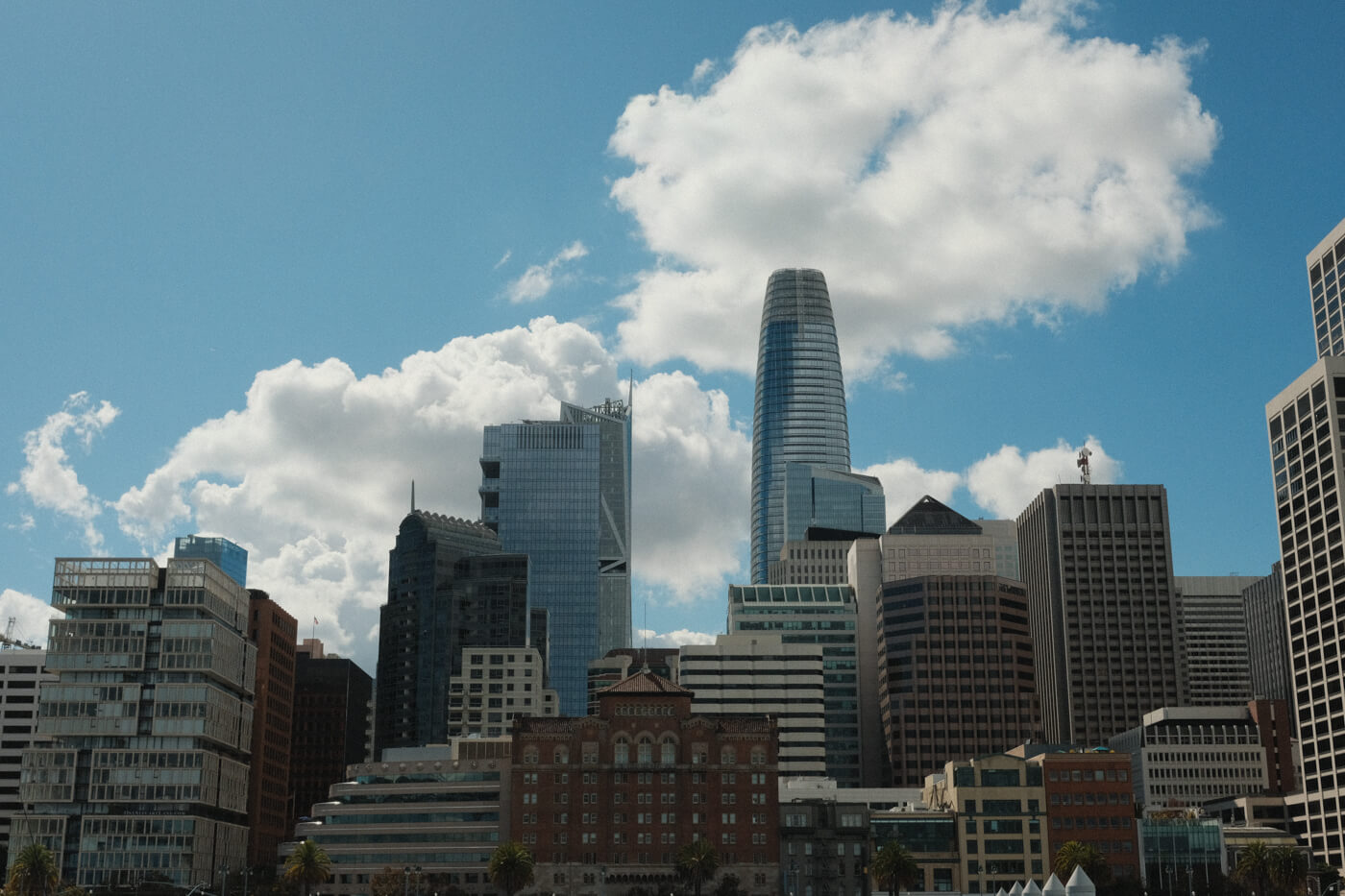
not pictured: the ferry building, which was pretty cute. I went to Blue Bottle Coffee for the first time.
Lastly: food!!! My friend had excellent recommendations and I ate a lot of delicious food.
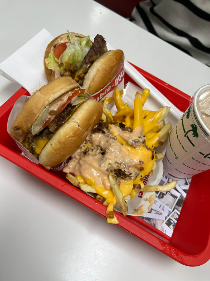
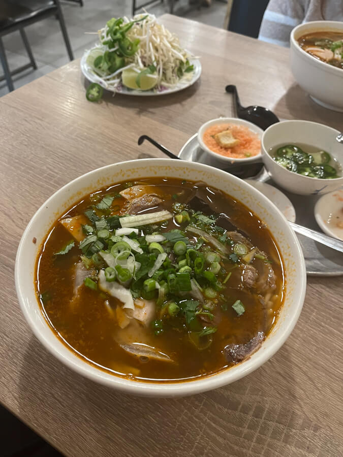
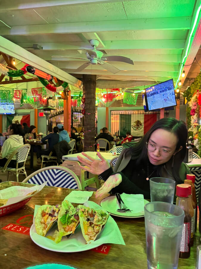
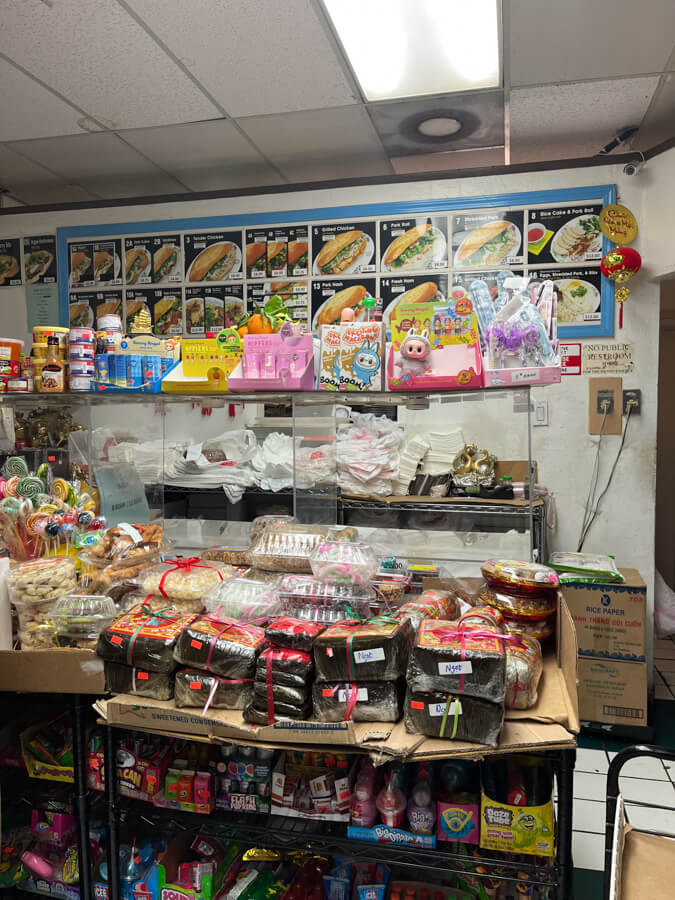
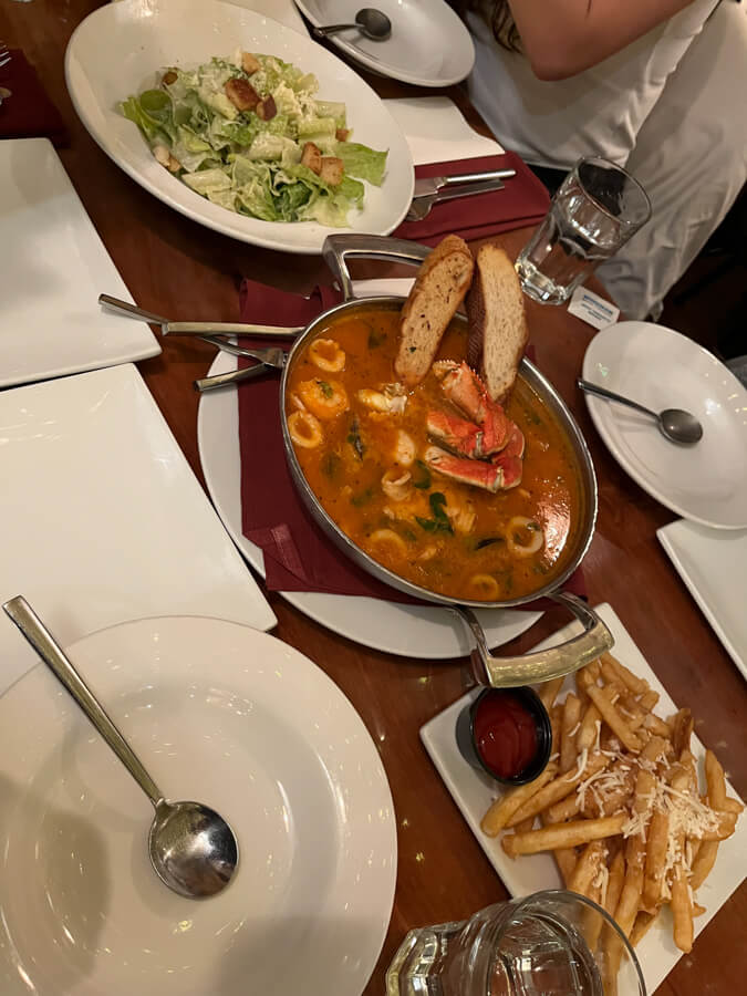
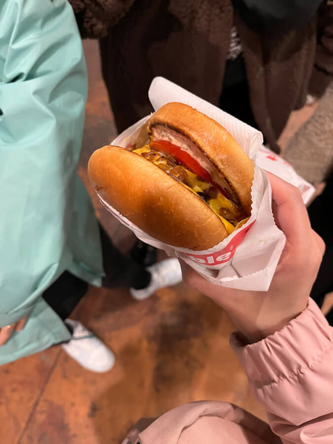
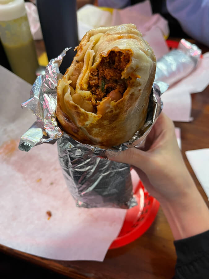
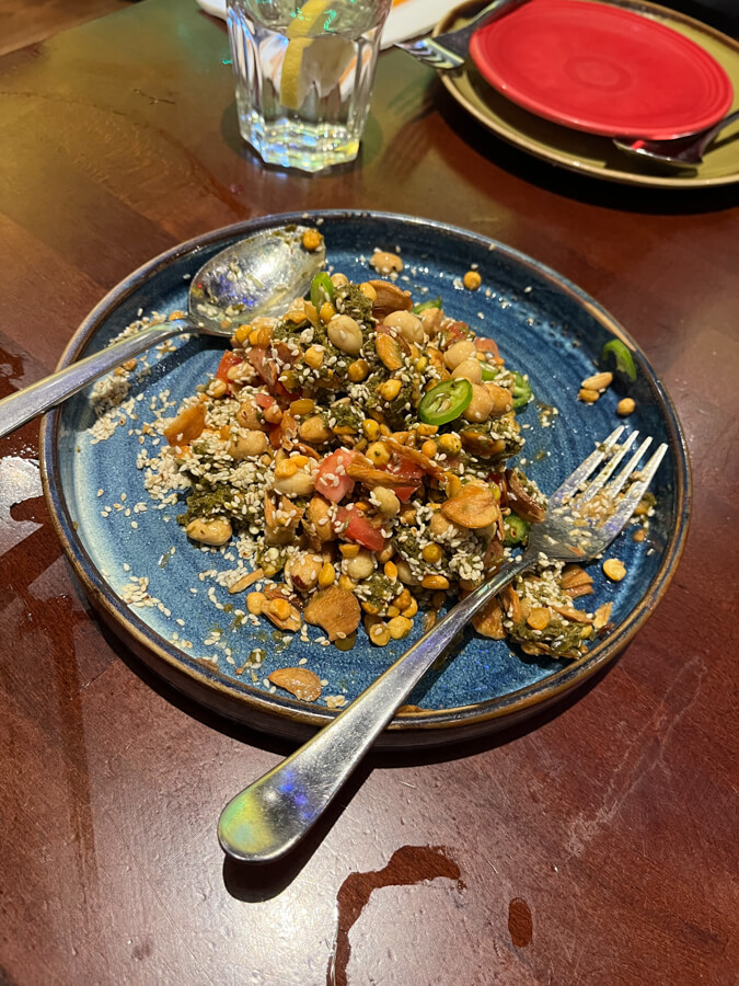
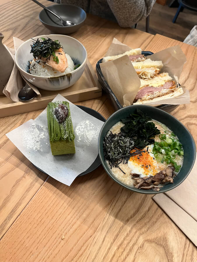
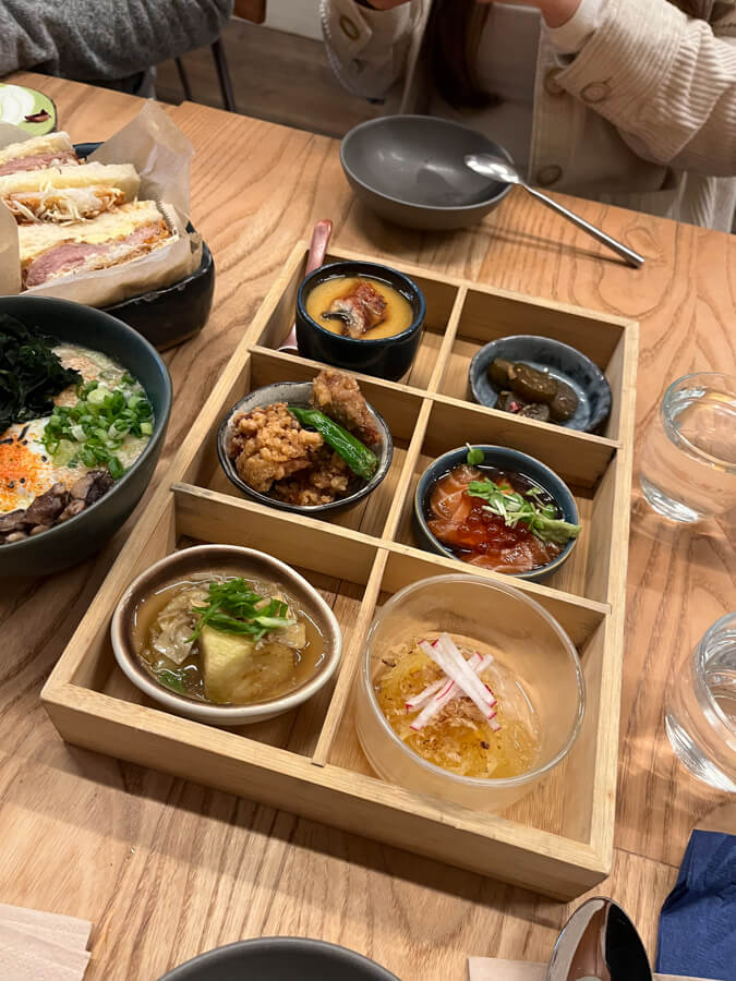
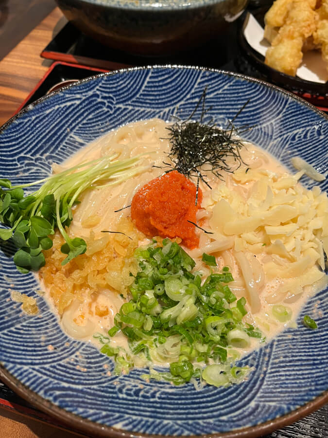
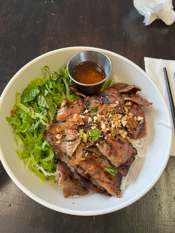
The highlights—aside from, of course, hanging with friends—were the museums, the Caltrain, and the weather. I also liked the beaux-arts architecture. I’m really glad I visited again in October and caught the Art of Manga exhibition.
2026-03-22 08:00:00
I was thinking the other week about how I should write weeknotes more often. Last year I wrote fewer, after getting tired of them and finding fulfillment elsewhere; now I’ve come back round to it. It may do me some good again to document such things. I suppose this cycle is natural.
I remain scatterbrained and useless, which manifests in working on many different things and completing none of them. We’ll get there!
Eli brought this back for a week this month, and I embarked upon it quite excited before getting crushed by the mundane realities of the work week: I got busy, was tired, spent time doing other things, etc. etc. I ended up documenting two days of progress on my homepage update.
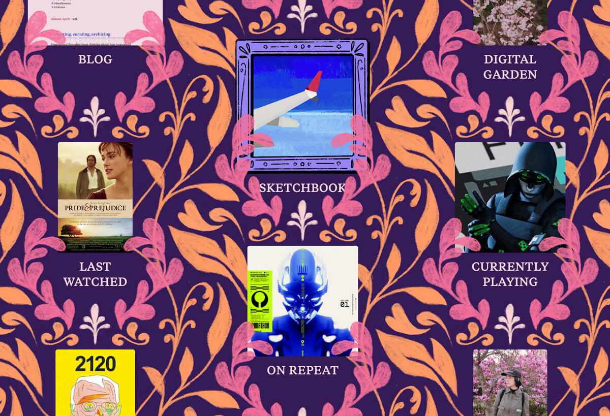
This continues to trudge along.
I’ve been reading(/listening) to books much more than usual this year, which is exciting not just because of Number Of Books Read Go Up but also because of the fun of the written word.
Most recently I’ve finished:
I continue to fall behind on The Count of Monte Cristo, but at least I’m making progress on other things in the meanwhile.
I’m playing Marathon! I am, uh, quite bad at it. But it’s okay! It’s fine! It’s fine when I lose all my stuff! I’m not sad…
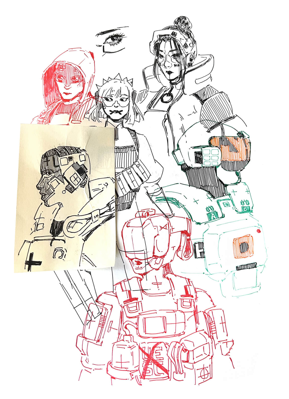
I am also drawing Marathon. The shell designs are cool.
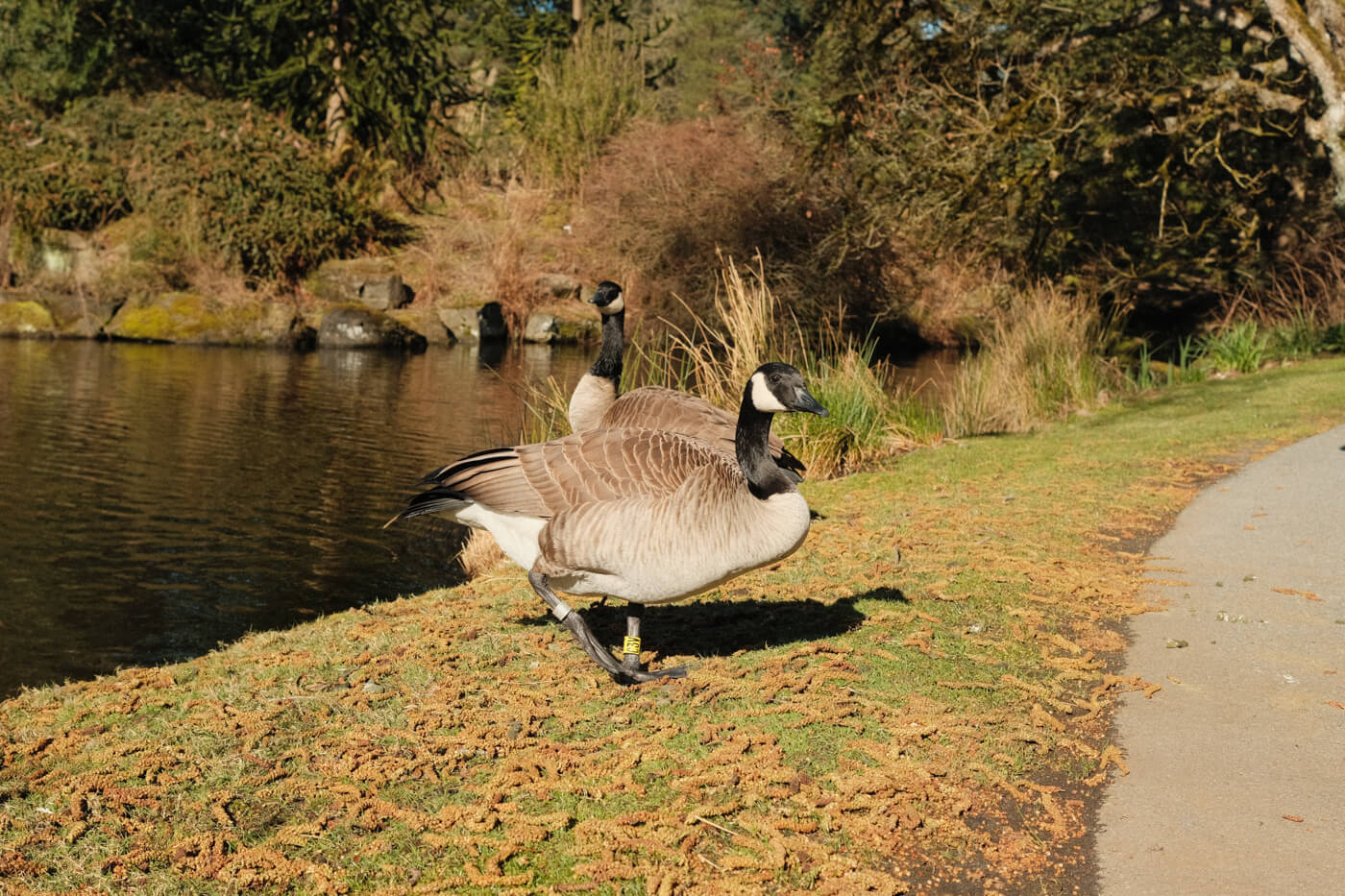
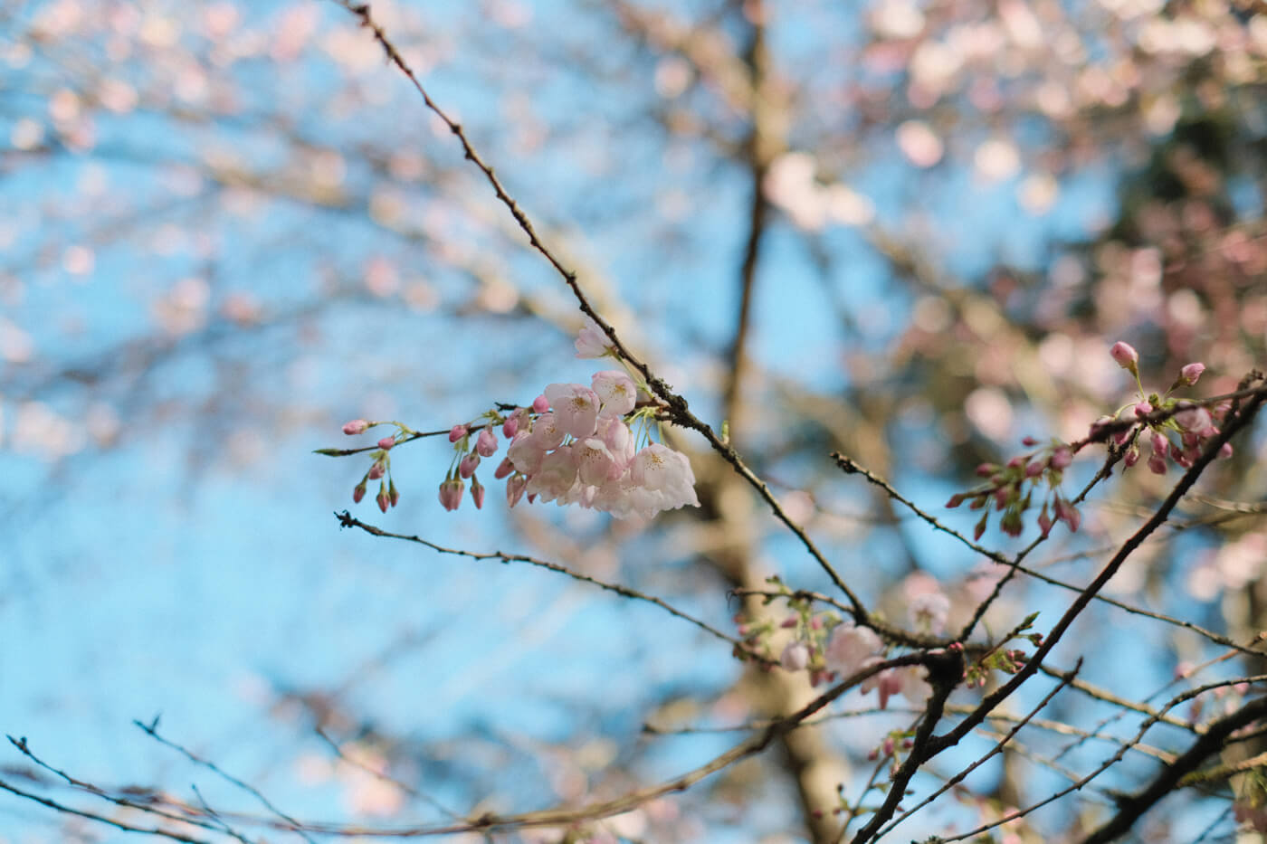
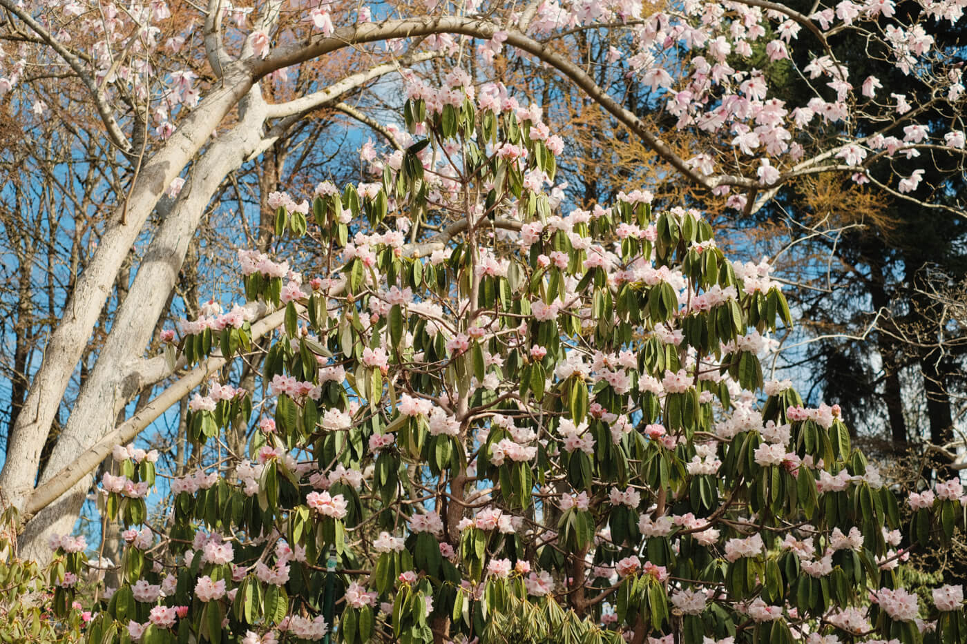
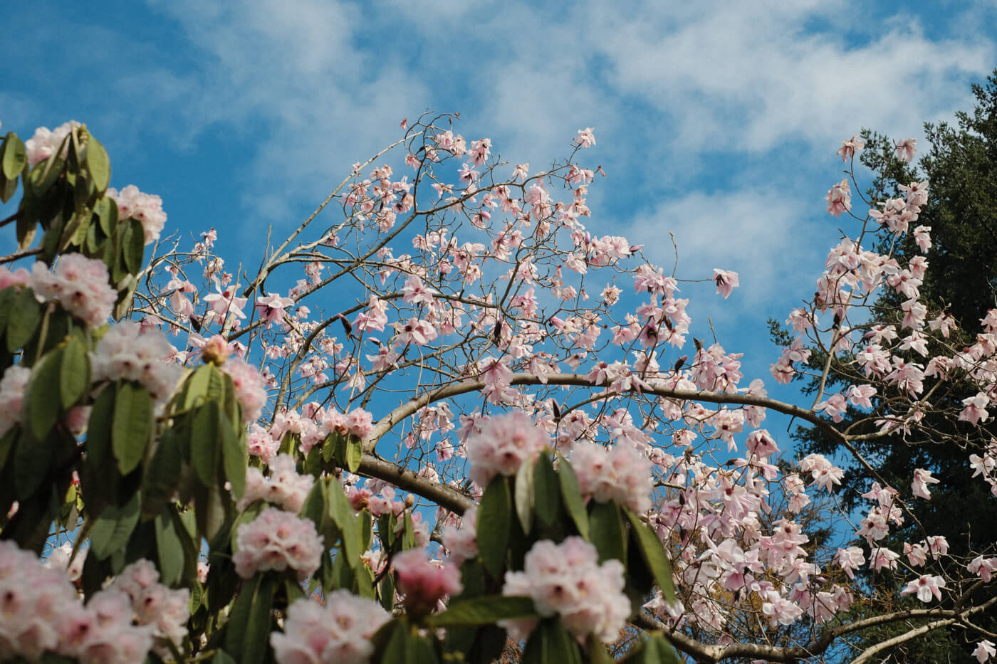
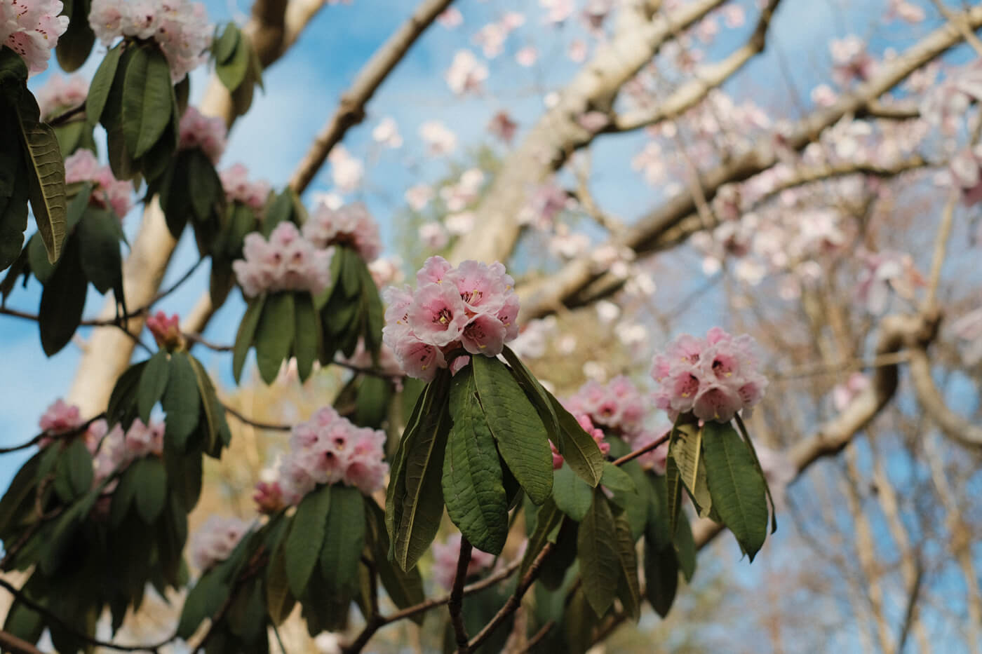
I visited the local botanical garden this weekend!
2026-02-23 08:00:00
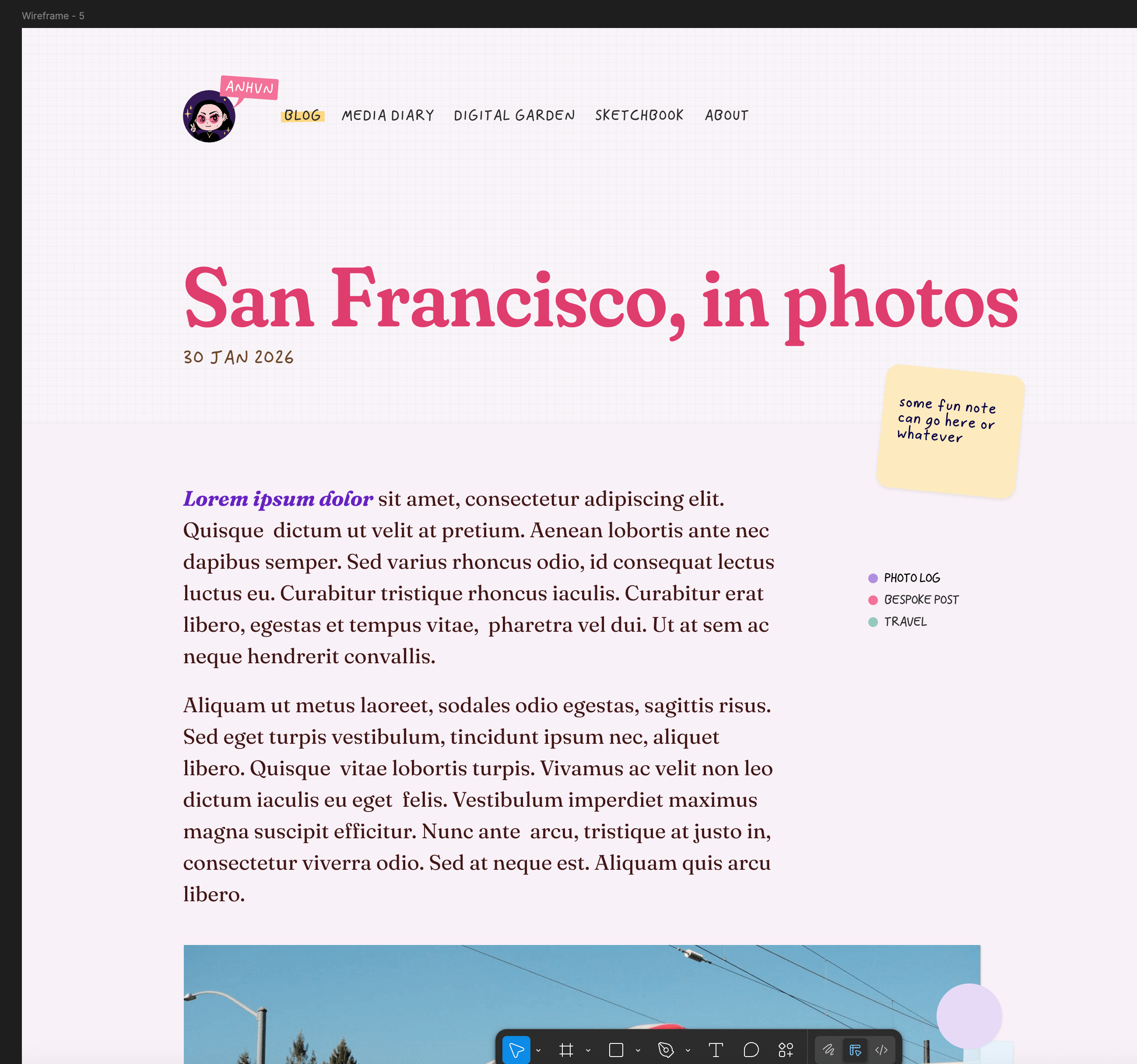
What is this? you ask. Well, it’s a tale as old as time. I had a vision, and then it was Sunday night and I hadn’t achieved it. As I result, I present you this: something that might be interesting, if I spent a few more days on it. As it is, I feel my interest flagging enough that I am yeeting it out the door prematurely. Let’s pretend it’s experimental.
Also filed under: stuff I posted about and then never finished, much like this post design.
Tentatively for: my San Francisco trip, though began as a weeknotes mockup. I just wanted to do something stationery-inspired.
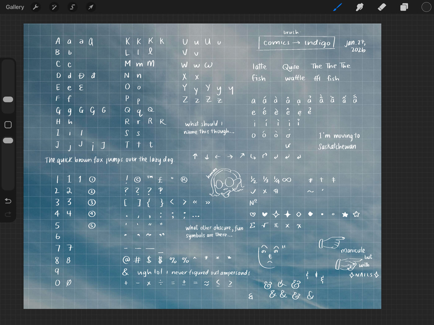
I will finish this this year or die trying
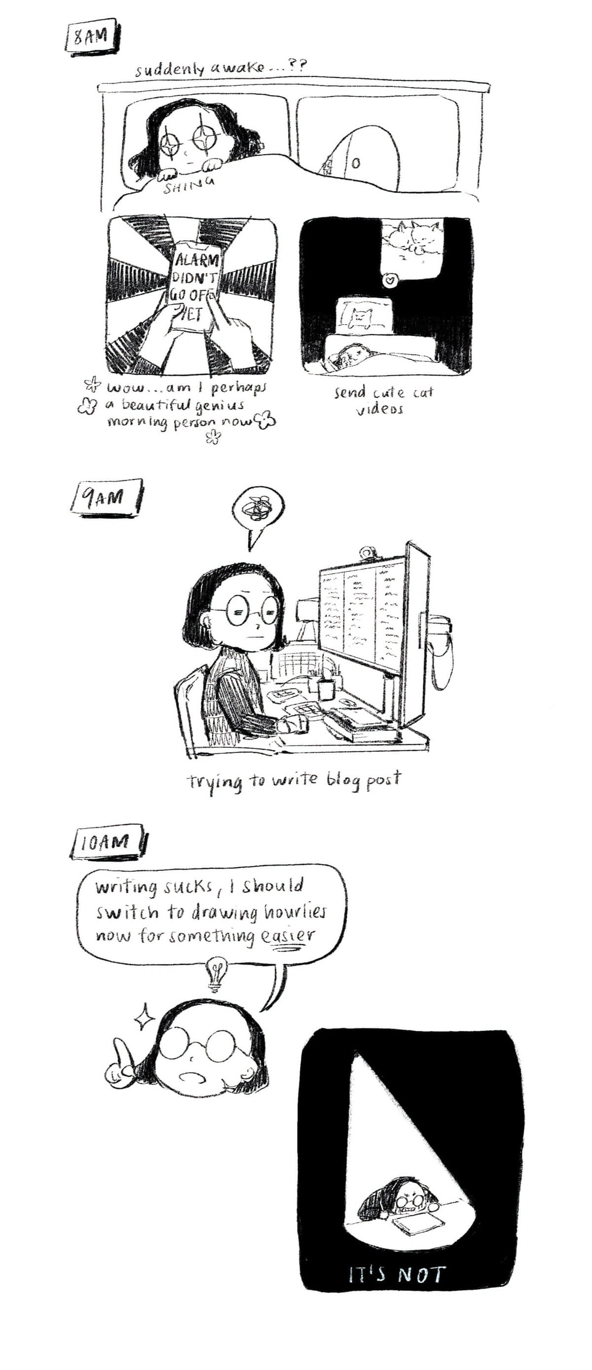
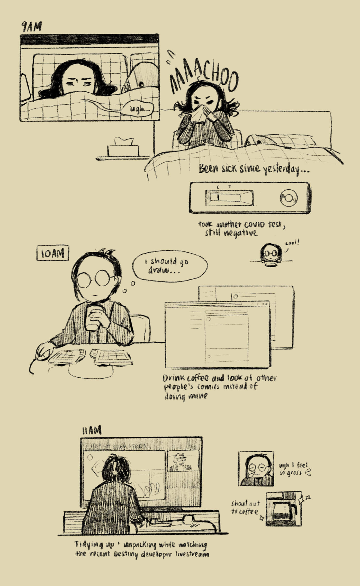
I did finish one thing I’m proud of: this year’s Hourly Comic Day features every hour I was awake. Usually I get tired by the evening and stop, but I managed to get through it all this year!
I’ve been making smaller tweaks on my site, like, which include adding a reading tile to my homepage, now that I’m actually reading more, and adding a list view to my watchlist and games list.
I’ve been rewatching a lot of movies lately, instead of watching new things, which is just another item in my long list of suboptimal life decisions. Why am I not maximizing every precious day I have by experiencing new things to become a more worldly, enlightened person?
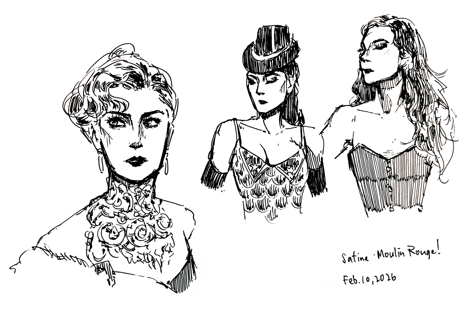
Anyway, notably, I rewatched Moulin Rouge! and Romeo + Juliet, both in theatres, which is a great way to experience them. The music! The fast cutting!
Against all odds (the odds being that I usually like to waste away instead of reading), I am also reading more.
I’m still not gaming these days, but this week I’ll be trying Marathon during its free play period (server slam) before official launch (and welcome to the jam).
Thanks for reading~ ༼ つ ◕_◕ ༽つ
2026-02-09 08:00:00
Don’t tell my boss, but I am thinking about vacation. I am thinking about spending creative energy making something that will not convert or have any business value whatsoever. I am thinking about running off into the metaphorical field of flowers and playing with toys.
The standard disclaimer: the job is fine. I think labouring for a company just becomes intolerable, no matter the company, after a period of time. Sometimes that time is very short, when the job is bad; in this case, it is probably a normal amount of time. This is perhaps the kind of thing a good reset can fix—like going on vacation, or doing something that doesn’t have to do with computers, or hitting my head against the wall—but we just had December. Isn’t it too soon to abscond.
I shan’t get into the worldly horrors that kind of make everything seem meaningless. I keep thinking that what will fix me is a cat, which I can pick up or even just look at every day, which will reaffirm that not everything sucks and is terrible and actually, I am being melodramatic. What’s job fatigue to a cat.
Some things I enjoyed recently:
You know, I really thought this list was going to be longer.
Things I fantasize about doing on vacation, by which I mean staycation:
Due to these traitorous vacation thoughts that would get me executed by firing squad (just kidding), I have built a very advanced (it is a boolean) new feature, just for this post, that I’m calling “stealth mode”; i.e. this post is suppressed on my website’s blog archive, though the permalink exists, and is mostly going to be read by you RSS sickos (affectionate) who actually subscribe to the blog feed. I hope this list includes absolutely zero of my professional colleagues. If so—sorry. Slack me.
To offset this post’s intense melodrama, may I offer you this: yesterday’s hourly comic day, where I try to be funny instead.
2026-01-10 08:00:00
Everyone wrote one of these and I wanted to too. A couple of weeks ago, I wrote about my incomplete projects, and then recently about my unproductive but joyful holiday break. And currently, I’m busy procrastinating on my media recap, which feels bad, and has felt bad for the past few weeks while it’s loomed over me.
I was scrolling through my sketchbook gallery and thinking—hm! I did draw quite a bit last year! So maybe I should record all the things I did accomplish, creatively speaking. (I already wrote about this briefly on Mastodon; here is the non-abridged version.)
I redesigned my website, and restructured it under the hood. I still need to write an updated Eleventy setup post about it, but I’m most pleased with how I fixed up my templates so that it’s easier for me to maintain all my custom pages now.
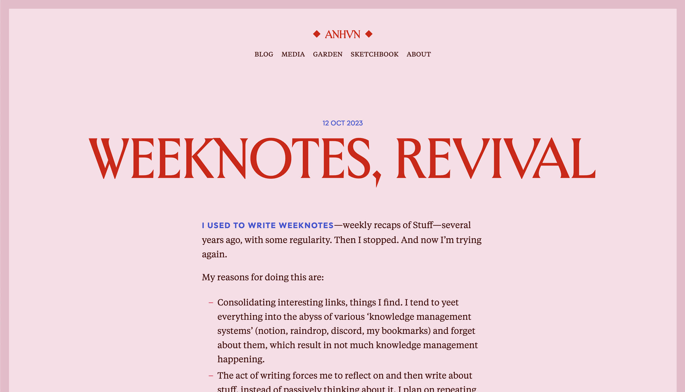
I’m still happy with how Version 7 is looking—love some pink, pointy letters, and Tiempos Text, especially how it renders nicely on MacOS. There is of course the usual laundry list of improvements I would like to make—dark mode! better mobile styling! sensible collections filtering!—but that can come later.
I updated my homepage to what I call “tiles.” It’s simple in concept and execution and I like it!
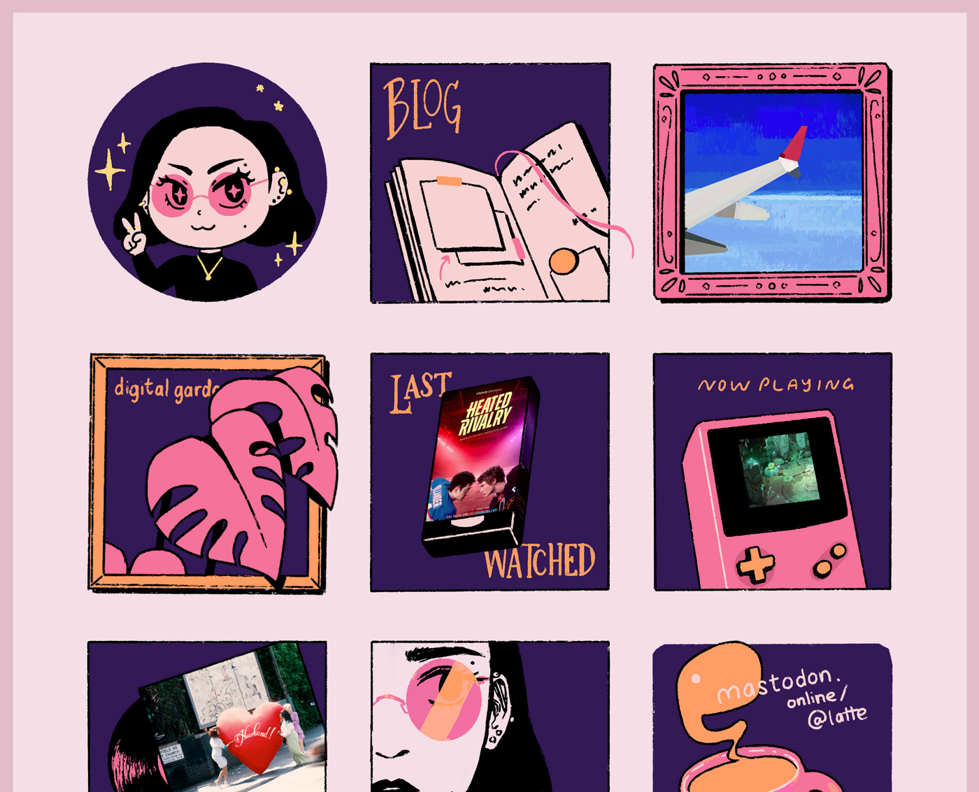
I had been tired of my previous homepage (“halloween”) for a while, but didn’t know how to update it. I’ve had comic homepages for the last couple of years now, and I wanted to continue that and was half-heartedly writing some scripts, but it was all very fuzzy.
At some point I started doodling little icons in my sketchbook, and then realized putting it into a bunch of orderly tiles would be easy to do.
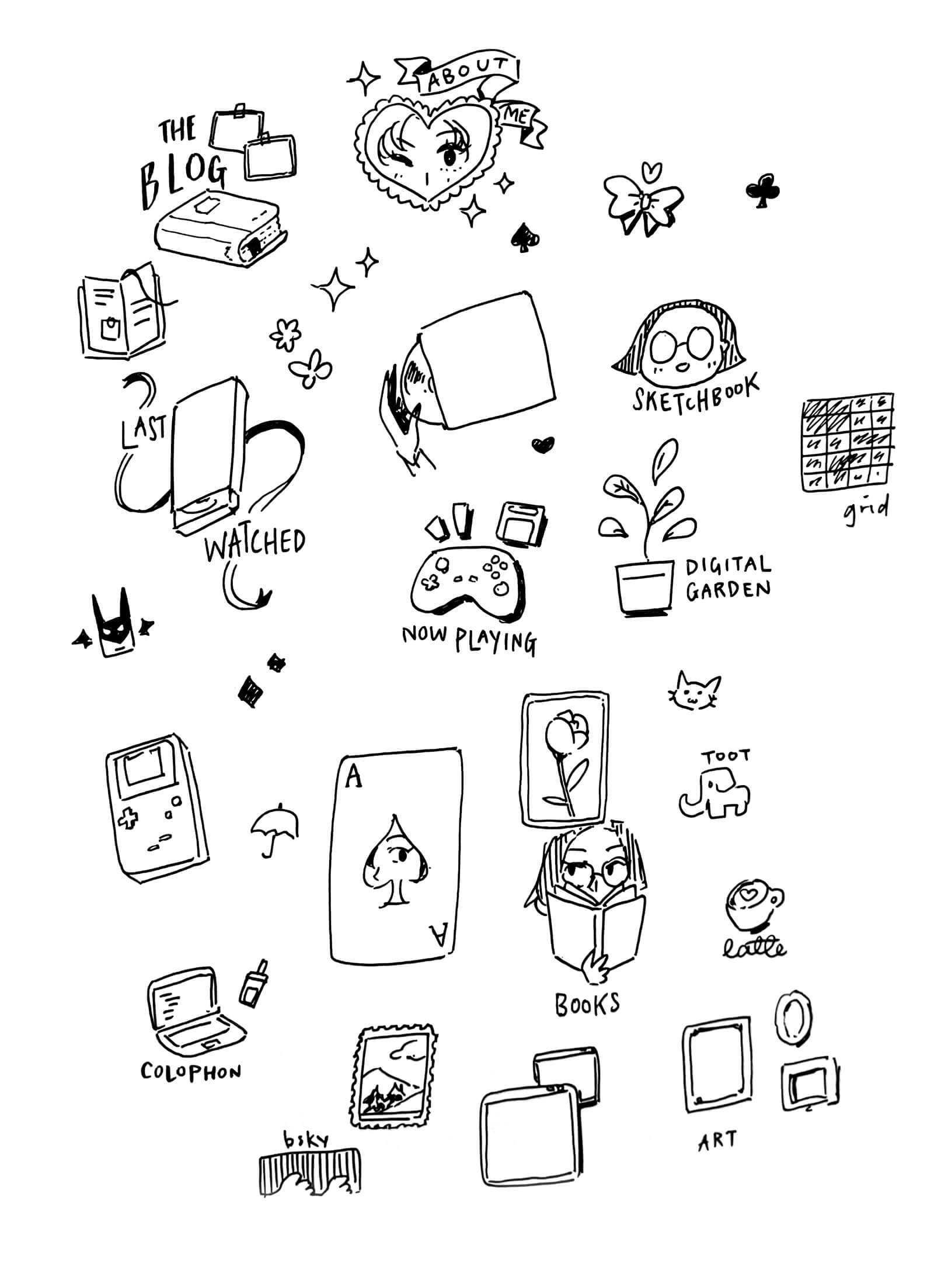
I think I threw it all together on a weekend. Simple drawings, simple CSS grid layout. The most complex bits may have been the little animated details, which weren’t really complicated at all.
I’m ultimately happy with it, and think it feels very me. I’m especially pleased that I finally was able to incorporate the dynamic media—the “last watched” VHS tape shows the newest entry in my watchlist; the “on repeat” vinyl shows my latest favourite song. And I’ve been wanting to do this kind of dynamic media on physical object kind of art for a long time. It sort of exists on my listening room page, but I think there’s a lot more room to take it further, artistically speaking. Contorting an image is easy with modern CSS; I need to draw an amazing frame for it. All of my latest watched movies should be VHS tapes, actually.
I designed two bespoke weeknotes posts this year, which is fewer than 2024, but I had also stopped writing weeknotes halfway through the year, so it’s not too surprising.
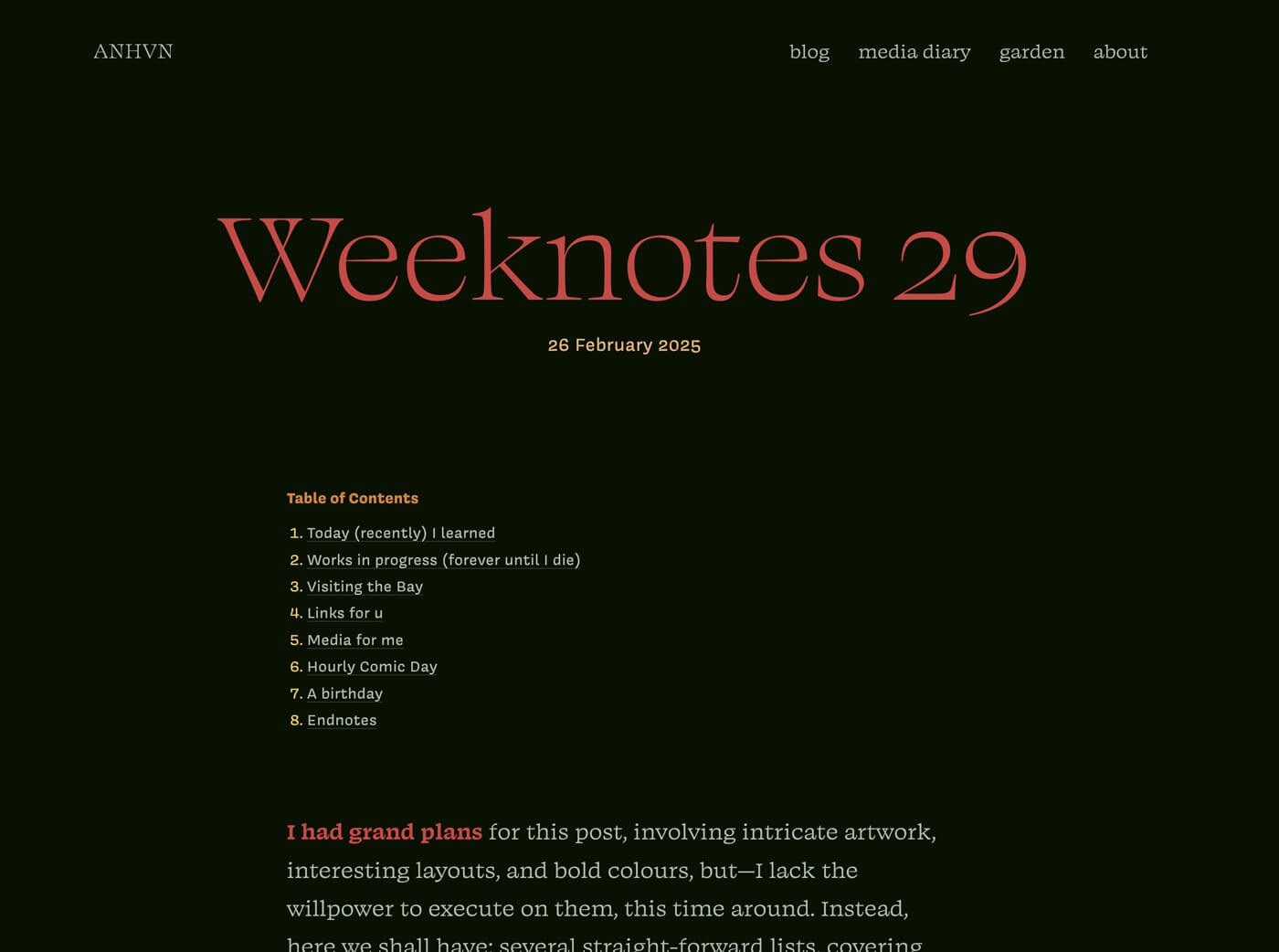
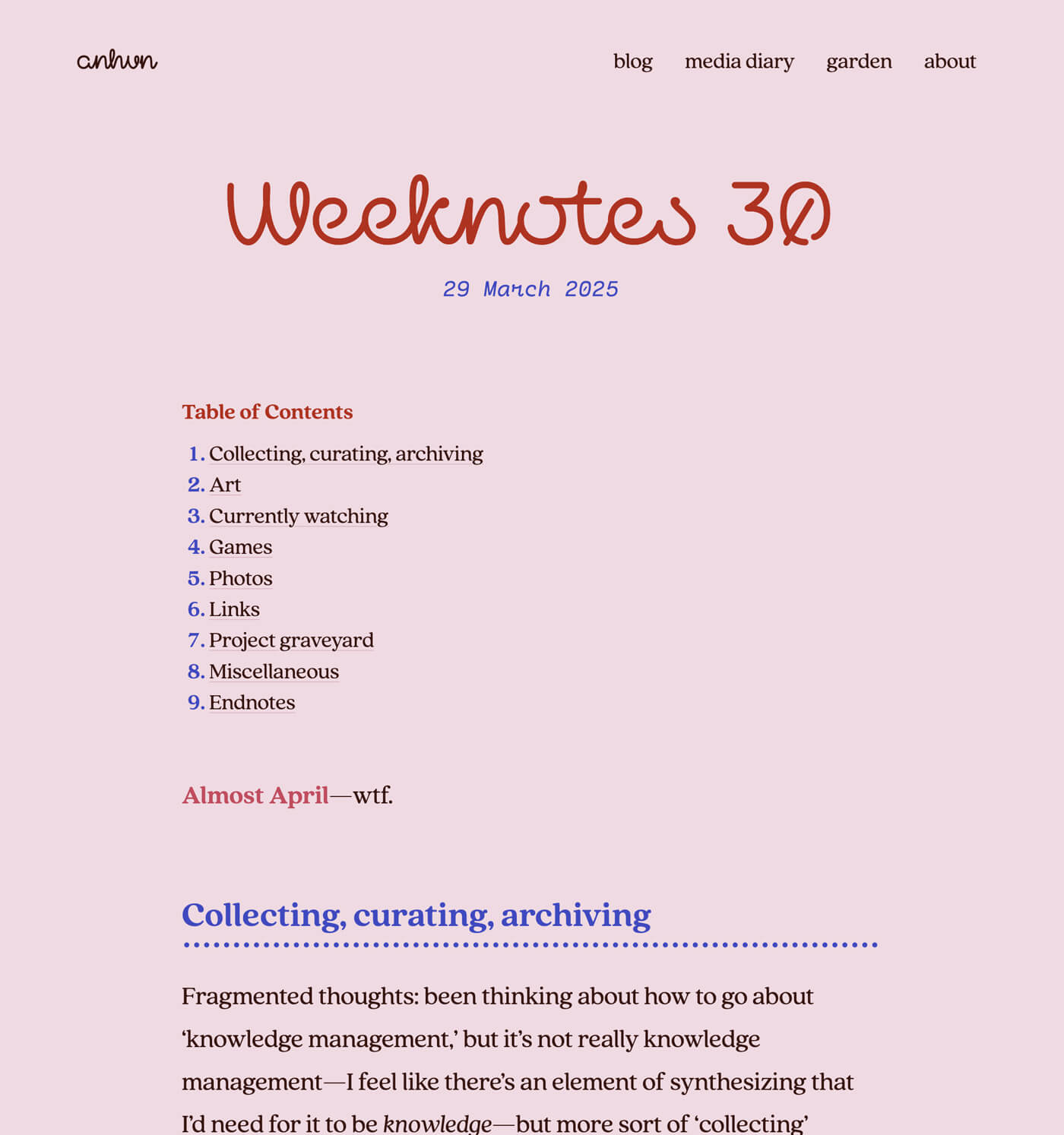
The colour palette of Weeknotes 30 formed the foundation for my redesign. I found that I liked the soft pink background and blurple text, and ended up redesigning my whole site to use it. That’s the nice thing about experimenting with smaller pages. If you try something and really like it, you can reapply it on a larger scale.
I was interviewed on Foofaraw and People & Blogs. This was exciting because I’ve never been interviewed before!
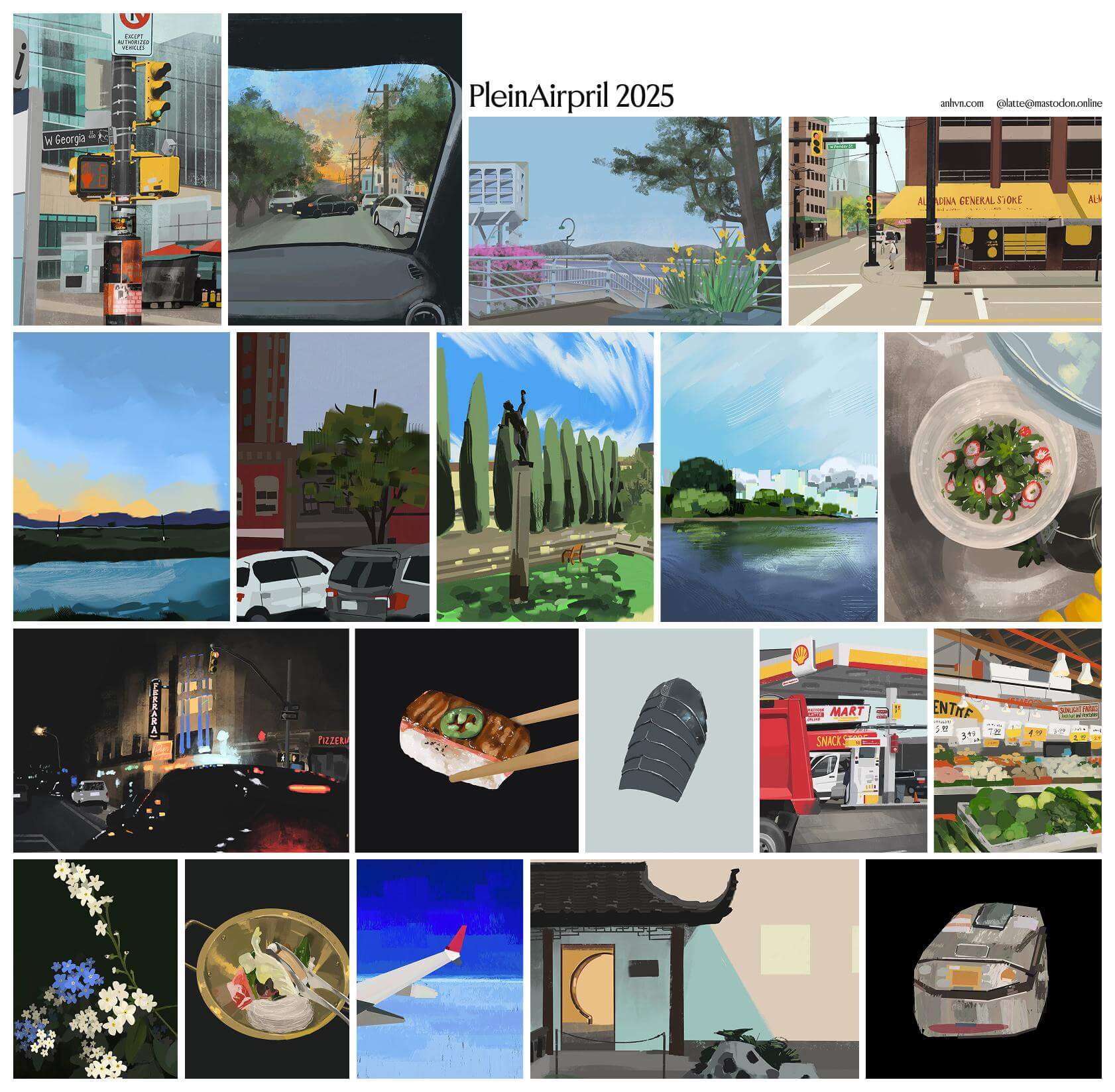
I did 19/30 paintings for Plein Airpril. I missed a chunk of days because I was on vacation (New Yawk Citayyyy babyyy) and then important life stuff; otherwise I committed time every day to painting. I’m proud of myself for the consistency! Some days were worse than others, and there are a couple I’m embarrassed about, but I shared them all anyway.
Speaking of New York City, I visited twice this year (exciting!) and sat in a few museums to draw. Reviewing them all now, I can see how my observational skills have improved since 2023, which is really cool.
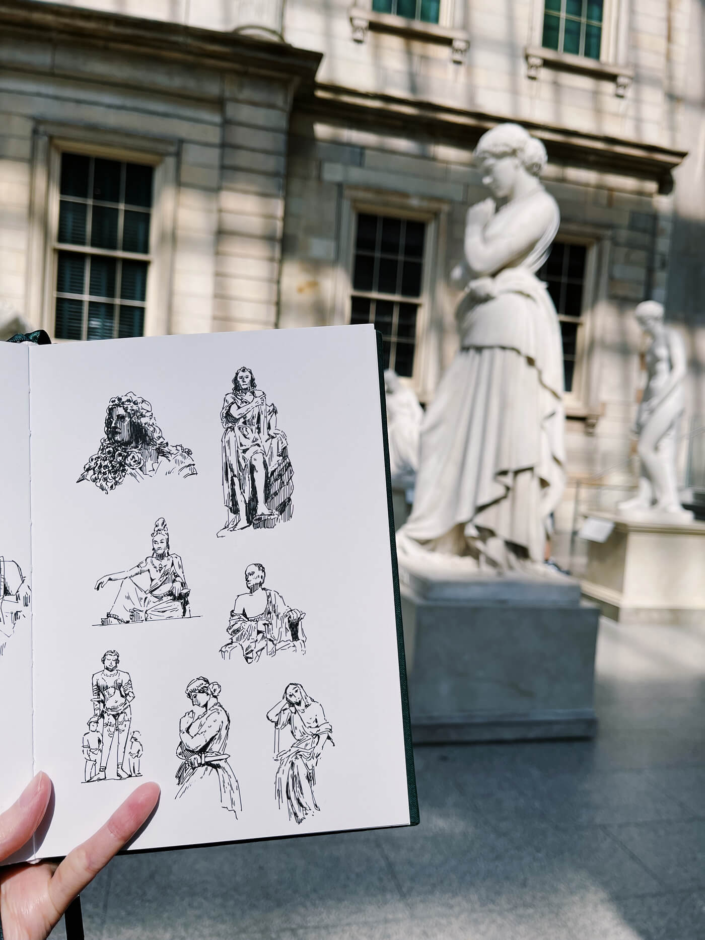
I’ve compiled them in my sketchbook. I don’t have plans to visit NYC again anytime soon, but I hope to find more opportunities to draw my surroundings this year.
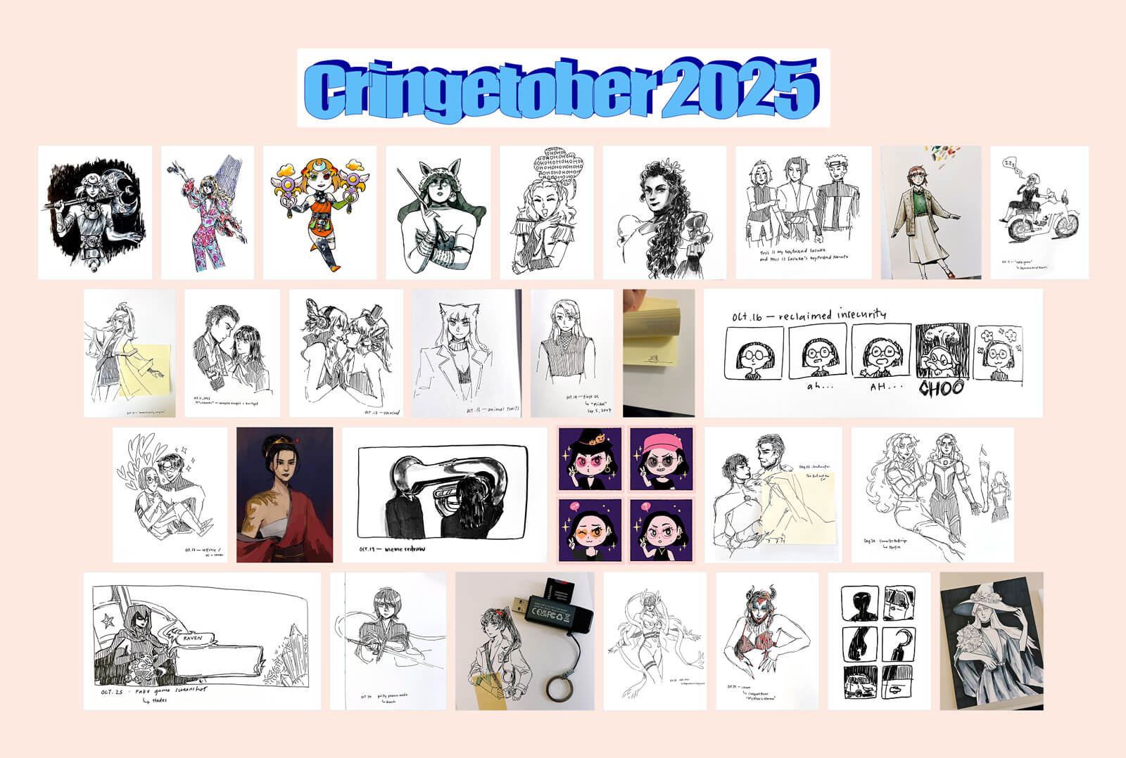
For my second art challenge of the year, I did Cringetober, and succeeded in drawing for 29/31 days! I have tried October drawing challenges before; my previous record may have been four or five days of Inktober, years ago. This year, while many days were still minimal effort days, I was consistent.
I’ve been doing Hourly Comic Day on February 1 every year for at least ten years, and 2025 may have been my most polished year yet. I’m proud of myself! This year’s is coming up in a few weeks and I’m looking forward to it. It falls on a Sunday, which means I can be leisurely about it.
I finished a sketchbook! I started it in February 2025 and it reached its last legs in December. I drew a few nice things, all inked and shaded properly; I drew a bunch of fanart; there’s a lot of cringetober stuff; I did my museum drawings in here. There is, of course, still less good stuff, but I think it’s proportionally less.

Something different this year that I had a lot more drawing than design work. My previous sketchbook was filled with website sketches and the like. I think one of the reasons is that this sketchbook had thicker paper meant to be used for artwork, while my previous sketchbook had thin paper that saw lots of ink ghosting and was thus much less suited for drawing. The presence of suitable paper probably spurred me to draw more.
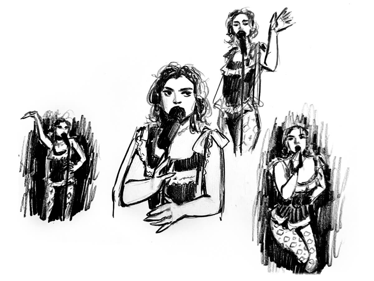
Another cool thing is that I think my general baseline quality of drawing is improving. I know beautiful, polished sketchbooks are popular to show off online, but that is absolutely not the case for me. Polished works are the exception. But with that said, I realized that I’m mostly happy with it, rough edges and all. A friend asked if they could flip through it, and I think I would have been too embarrassed to share previous sketchbooks, but this one could withstand a flipthrough.
(I am actually toying with the idea of recording a flipthrough—me! a notorious video hater! making a video!? blasphemy—because I like seeing people’s sketchbooks, especially if they’re imperfect. But first I would need some kind of phone mount, lmao. The logistical hurdles are too high, so I have not yet done it.)
My 2024 media recap was published on January 2, 2025, so I supposed it would still fit here. This remains my highest-effort blog post to date.
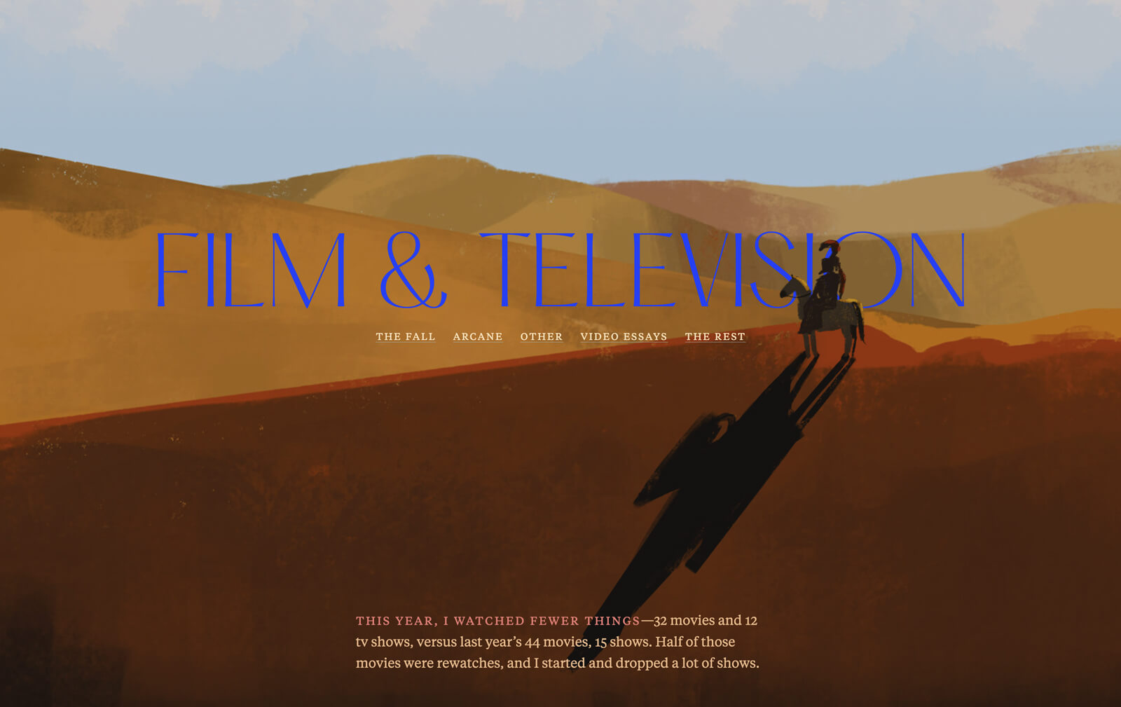
A year later, I can see all the flaws in it, but it’s still something I’m proud of. I worked hard on the art and design. I tried to be sincere in my reviews. I remember finishing it overnight in a strange, intense nine-hour sprint, went to bed around 8am, and woke up a couple of hours later for my first day back at work after the holidays. Not a great day, physically, but I felt quite fulfilled.
And then the day after, I started working on my site redesign. I think the creative energy from that project kept me moving forward.
I have mentioned repeatedly how I’m working on my 2025 recap, which I had hoped would be beautiful and amazing and completed by now. But it’s not! Not even close. Last year I had a much clearer vision, probably because I didn’t have big expectations for myself. This year I’m like, I need it to be EVEN BETTER!!! which is kind of unhelpful to think at this point in time. I’m getting ahead of myself. It’s a struggle, but I’m chipping away at it slowly.
I hope to continue to create things in 2026, try new things, experiment, make something weird, make something good, make something bad, make something no one but me likes, try really hard at something, and so on and so forth.