2026-07-13 15:14:51
Hi everyone, Alf here - I am back with another research piece for you.
As always, the idea is to share some of the frameworks I use to run my macro strategy.
If you want to be in touch with me:
I hereby present the Maradona theory of interest rates from Mervyn King (credit to my friend Mario Baronci):
This week, the Fed announced various nominees for the task forces Warsh has set up. Former BoE chief Mervyn King was chosen to lead the new ‘’communications task force’’.
Back when he was at the helm of the BoE, King proposed the Maradona approach to Central Bank communication: pretend to go right (be hawkish), pretend to go left (be dovish), and in the end get to your final objective without really moving much.
And given the output of the macro models I use to look at US growth, labor market and inflation the Maradona approach to interest rates could be the best fit.
What if Warsh says something hawkish now, something dovish later, and in the end Fed Funds just stay where they are for a while longer?
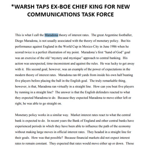
Consider the two charts below:
The top chart shows how US real consumer spending (blue) is running below its 10-year average, and US companies are not hiring workers in cyclical industries at a rapid pace (orange). The hiring plans for the foreseeable future are also pretty weak (black).
The bottom chart is a valuable, real-time proxy for nominal income growth coming from labor – US withheld income taxes are growing just in line with the last 10 years.
The two engines of core US growth – the labor market and consumer spending – are far from being hot.
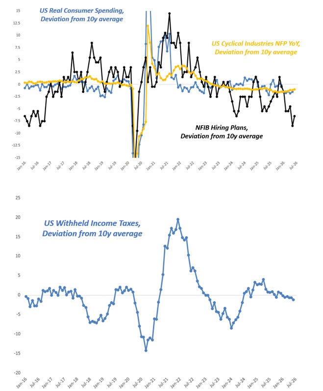
And when that’s the case, the odds of sticky inflationary pressures are also much lower:
The left chart shows how US core goods inflationary pressures have risen in line with our PCA-based prediction model – no major inflationary impulse left in the tank there, especially as the USD has stopped depreciating against major trade partners and hence imported core goods prices are set to slow down a bit.
The right chart shows how Zillow and the Cleveland NTRR tend to anticipate changes in Shelter CPI.
I didn’t even bother to fit a lead/lag timeline there as it’s quite obvious that official housing CPI in the US lags real-time rent measures due to the statistical methodology used to calculate shelter CPI.
And if anything, there should be some mild disinflationary pressures in the US housing market.
This leaves us with the following:
- The core engines of US real growth running at trend levels (~2% real annualized);
- A far from hot US labor market
- Real-time indicators of wage growth and nominal labor income growth being disinflationary;
- No major inflationary pressures in the pipeline;
- Pretty much Goldilocks!
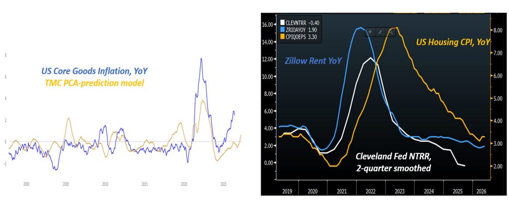
In the meantime, the option-implied distribution for Fed Funds in 12 months from now looks like this:
The median expectation remains for 2-3 hikes, but the biggest mispricing against the macro environment I just described sits in the hawkish tail of this distribution.
The market is pricing in a ~35% probability for 4+ hikes over the next 12 months. I think that’s wrong.
So, how to position for a world in which macro data justifies the Maradona theory of interest rates?
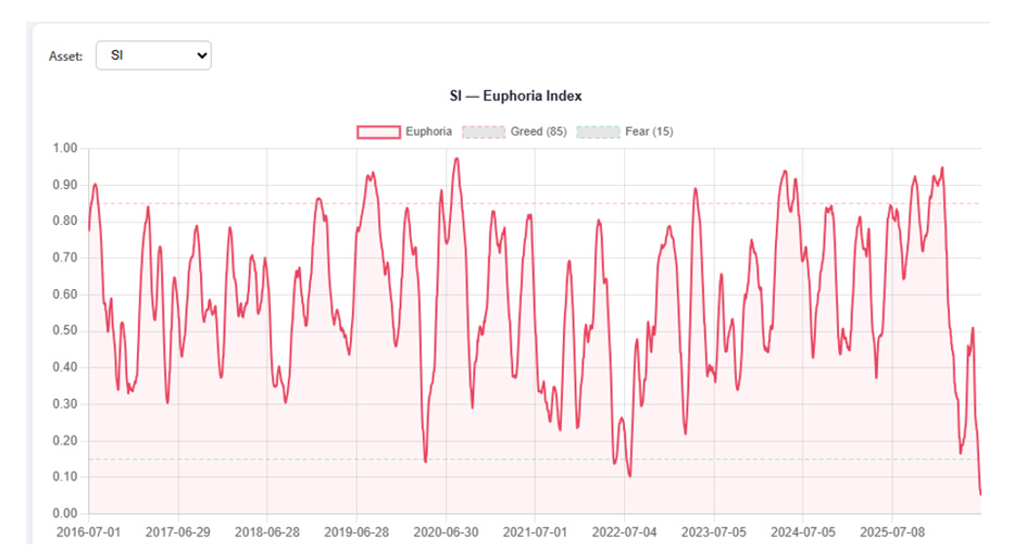
The most aggressive and convex approach would be to buy precious metals here.
The chart at page 4 shows my Euphoria/Greed index for Silver – it’s the average percentile for the call/put skew, RSI and the distance from the 50-day moving average.
If one systematically buys or sells the underlying asset when the index is above 90 or below 10, the 6-month forward returns are pretty solid and with a high win rate.
Buying gold or silver here seems to be a positive expected value idea if your time horizons are long enough.
But it also requires the Fed Fund distribution at page 4 to materially change – not only the very hawkish 4+ hikes tail doesn’t need to materialize, but to unlock convexity in this trade the Fed should remain on hold.
If you instead want to solely focus on fading the 4+ hikes hawkish tail, the best trades to do that remain EM FX and equity longs:
1) If the Fed ends up hiking once or twice over the next 12 months, there won’t be any macro surprises and interest rate differentials would still largely favor BRL, COP, ZAR, MXN etc;
2) 1-2 hikes in the face of US nominal growth at 5%+ are irrelevant for equities as they don’t materially affect financial conditions – no macro surprises unfold, so long equities in a world of steady growth.
The Maradona theory of interest rates is likely to materialize.
Perhaps in its full format (Fed on hold), or maybe Maradona-Warsh will actually move a tiny bit to the right (hike once or twice).
But in the grand scheme of things, the market seem to be pricing fat macro tails that are unlikely to occur.
This was it for today. As always, remain hungry for macro and humble in markets.
To be in touch with me:
2026-05-26 14:18:58
Hi nice people, this is Alf.
Sorry I disappeared from Substack for a good while but markets are crazy, the fund is growing nicely and it’s a huge amount of work.
But no worries - I am back with a healthy dose of macro analysis for you.
As an exception to the norm and to gain back brownie points with you guys, I am sharing the latest research piece reserved to the investors and The Macro Compass subscribers.
Here it goes!
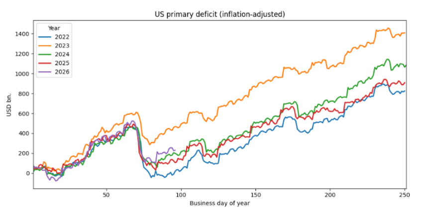
Forward-looking indicators suggest the US nominal growth cycle is picking up pace again. The inflation-adjusted primary US fiscal spending is higher than in 2024-2025 at this point of the year:
Global real-economy money printing is also growing at a strong pace, similar to 2025.
As a reminder, inflationary money is printed by governments (deficits) and via credit creation (banks, shadow banks etc). Concerted G20 fiscal deficits and the debt-funded AI capex cycle are the main contributors to the strong pace of global money printing in 2026:
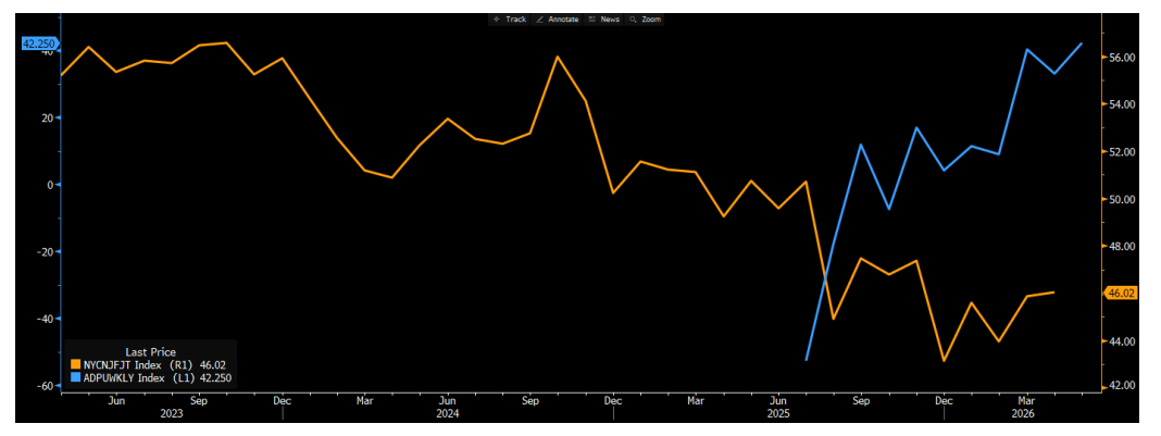
Leading indicators also suggest the US labor market has found a bottom.
The NY Fed probability of finding a job in the next 3 months (orange) has stabilized and the weekly ADP job creation series (blue) has moved from -50k in June 2025 to +42k today.
As a reminder, with the US labor force growth (e.g. supply side of labor market) estimated to be close to zero it doesn’t take much demand for labor to kickstart a virtuous cycle in the US job market:
A virtuous cycle in the US job market won’t necessarily mean runaway inflation, at least in the short term. While a tighter job market will heat up wages, the starting point for US wage growth is very modest:
The Fed’s dual mandate of a) not letting the job market fall apart and b) core inflation below 3% (yes, sorry, not going to pretend the Fed has a 2% target anymore) would now call for a different reaction function.
‘’Would’’ is the key word here.
The December Fed meeting is now priced at a robust probability the Fed will hike. Yet to hike rates, the FOMC needs a majority of voters to lean in.
There are 12 voters, and a 6-6 situation gives the FOMC Chair the power to break the tie.
And the new FOMC Chair was recently talking about shrinking the balance sheet as a cover to cut rates and moving the inflation benchmark from core PCE to trimmed mean PCE (you guessed it, trimmed mean PCE is lower than core PCE)…it’s safe to say Warsh would rather eat his hat than raise rates.
In other words, you’d need 7 FOMC members voting for a hike to actually get a hike.
Even assuming the 3 dissenters against the dovish language in May would outright vote for a hike, and Barr would join them (quite some assumptions already!), you need 4 more votes for a hike coming out of this group: Warsh, Williams, Powell, Cook, Bowman, Waller, Paulson, Jefferson.
Yes, the BoE-zation of the FOMC is upon us. But I don’t think the FOMC will have a majority ready to hike any time soon.
Now, let’s assume my analysis holds. We would then find ourselves in the following situation:
US money printing is accelerating, and global money printing remains strong;
Nominal growth is likely to pick up;
The US labor market seems to have found a bottom, and might accelerate soon;
On the margin, this would add to inflationary pressures (but no runaway inflation dynamics yet);
The standard reaction function from the Fed should be to move to hikes (and the market asking for it);
The Fed is unlikely to have a majority actually voting for hikes any time soon;
So the title of the movie might be: Run It Hot, Yet Again
In that macro setup, my 40-year backtest shows the best trades to own are:
High-beta equities (small cap, EM, value tilt)
High-beta commodities (silver, copper, but also gold)
Long cyclical and high-yielding FX, short defensive tilt FX (e.g. ZARJPY)
Curve steepeners, short long bonds
I was recently in London meeting 3 large macro pod shops, and when presenting this thesis the biggest pushback or complete lack of interest sits with a) gold b) small cap, value, EM equities.
And that’s either a function of the AI dominance in equities recently or the ‘’it’s going nowhere’’ factor in precious metals such as gold and silver.
Option market positioning shows the same lack of interest towards gold upside. For the first time in many many years, 25-delta gold calls are trading at a discount to 25-delta gold puts. Investors are more interested in protecting against another drop in gold rather than buying gold upside:
Yes, I know: Hormuz. All the above is irrelevant if you think we escalate the war or there is no fix for months.
But if we unlock energy flows, we will Run It Hot. And the market is not fully prepared for it.
Thanks for reading!
To be in touch with me: [email protected]
2026-02-10 18:04:53
Hi, this is Alf - welcome back to The Macro Compass!
Warsh is the new Fed Chair.
I find it hilarious that people are calling him a hawk based on what he did 10-15 years ago. This is like looking at old pics of me with a head full of hair (still have one of these on LinkedIn!). These times are long gone.
Jokes aside, I spent hours listening to the most recent interviews Warsh did (here and here, for example).
Here are the most consequential thoughts he shared:
1) Inflation is a choice, money creation drives it (as per Friedman, and that’s true in most cases);
2) Fed is backstop for banking system, but needs to get out when job is done (fair);
3) He believes inflationary money is created equally by Fed and the government (absolutely false: fiscal deficits create inflationary money, Fed monetary operations such as QE only create bank reserves);
4) He believes the Fed balance sheet being so big ‘’crowds out the private sector’‘ (absolutely false: the private sector uses another form of money i.e. bank deposits, there is no ‘’crowding out’’ of anything);
5) Need to get out of the ‘’fiscal and monetary’‘ mess inherited: a lot of talk about interest expense > defense spending (ok, so hear the plan now...);
6) ‘’If we would run the printing press a little quieter, we would have lower interest rates’’;
7) The plan is to shrink the Fed balance sheet, so we get lower rates, so private sector can thrive = higher economic growth (he is looking at the wrong printing press – Bessent has the key one, not the Fed);
8) Rates should also be lower because we are on the verge of a productivity boom (his opinion, fair enough);
9) The Fed should not be data dependent, data is revised all the time, why be? Best to have an opinion and stick to it. Also the Fed should not share economic forecasts, no dots. No forward guidance (uncertainty up).
It’s pretty clear Warsh – as many others, by the way – gets money creation wrong. But it still leads to some key consequences for markets:
Shrinking the balance sheet and following the AI productivity fairytale will be two convenient covers Warsh will use to push for cutting Fed Funds further;
Cutting front-end rates further will help the US Dollar remain weak;
Injecting instability in the repo market through a reduction of the balance sheet, cutting front-end rates proactively and slashing forward guidance tools = uncertainty up = steeper curves.
One key thing to consider is that if Warsh would manage to shrink the Fed balance sheet, this could have an impact on the repo market.
The chart below shows how bank reserves as % of total US nominal GDP have been shrinking and approaching the potentially dangerous 8-9% level – last time it breached that, we had a repo blowup in 2019.
This is because bank reserves are very unevenly distributed across US banks, and once they start becoming scarce the odds of interbank liquidity drying up for smaller banks increase:
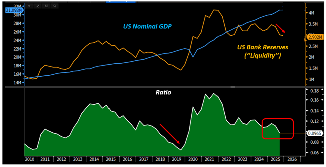
Do you know who put forward this ratio, by the way?
Waller! (Read his speech here).
Shrinking the balance sheet further here would put the stability of the repo market at risk, and by the way in December 2025 the Fed resumed purchases of T-Bills with the very intent to avoid such risks (here).
The odds of Warsh convincing his colleagues to shrink the balance sheet further here are low.
But now let’s assume that Warsh still manages to put through his lower balance sheet + AI productivity fairytale to convince his colleagues to cut rates a bit faster. And that forward guidance disappears.
Then the US yield curve would steepen, and that goes against what the US administration wants:
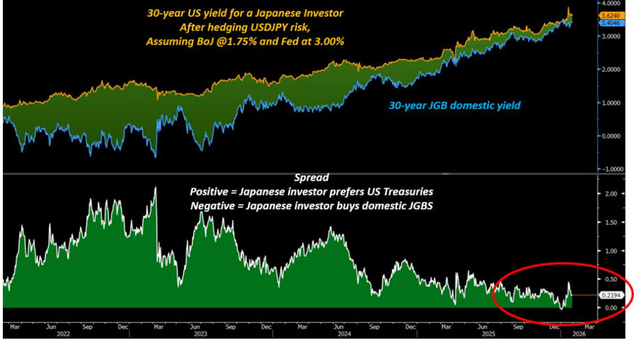
Wait, why am I showing you a chart of 30-year JGBs against 30-year US yields for Japanese investors?
Because this is a key chart for Bessent to push in the right direction, as it would achieve a great deal of positive outcomes for the US administration.
For years, Japanese investors have bought foreign bonds WITHOUT hedging the FX risk at all - and why?
Because the assumption was that the Yen was going to get weaker, and hence Japanese investors could:
1) Get a higher yield in foreign bond markets;
2) Benefit from the JPY weakness on top.
And it’s in the clear interest of the US administration to reverse this mechanism.
Getting Japanese investors to buy more JGBs would encourage repatriation of capital and help JPY appreciate, plus support the Japanese bond market and help global long-end bond yields stabilize.
Very soon, it might be that Japanese investors wouldn’t really have any advantage in buying 30-year US Treasuries (after FX hedging costs) rather than keeping money in Japanese bonds.
A steeper US curve would bring Japanese investors into the old habits, and that’s not what the US wants.
So, here we are trying to solve the puzzle.
We have Warsh likely using Fed balance sheet reductions and the AI productivity story to cut rates.
Unlikely to really succeed, but the bias will be for a dovish Fed (what a surprise!).
That helps the USD to weaken and equities to go up (two clear US admin objectives), but Warsh is a curve steepener – and if long-end bonds get out of hand, Bessent and Japan could be ready to intervene.
Bessent can tweak issuance further to the front-end, and Japan can backstop its own long-end bonds too.
This leaves us in a scenario where in the medium term:
We keep running the global economies hot via major fiscal spending programs worldwide;
The Fed maintains a dovish inclination;
Bond yields are flat or down;
The USD trades flat or down;
Commodities and equities maintain the most upside convexity
I believe the asset classes poised to deliver the best risk-adjusted returns over the next 3-6 months are:
International, value-oriented stock markets (e.g. Europe, Japan, Canada, specific Emerging Markets);
Precious metals and industrial commodities (e.g. Copper).
This was it for today. Thanks for reading.
Before you go: are you a hedge fund allocator and you want to receive updates about my macro fund Palinuro Capital?
2026-01-19 16:46:05
Hi everyone, and welcome back to The Macro Compass!
‘’I compile statistics on my traders. My best trader makes money only 63 percent of the time. Most traders make money only in the 50 to 55 percent range. That means you’re going to be wrong a lot. If that’s the case, you better be sure your losses are as small as they can be, and that your winners are bigger.’’ – Steve Cohen.
This is a hard truth to accept for many macro investors: we will be right only about 50-55% of the times.
If your win rate is much higher than this, I suggest you extend the sample of trades you are analyzing or assess whether you are not trading macro but rather just selling optionality – short vol/option strategies have win rates as high as 90%+, but they wipe you out completely when you are wrong.
In the last 10 years, I scored a 53% long-term win rate on my directional macro trades.
Once I realized that and given that the year-end P&L formula can be written as follows:
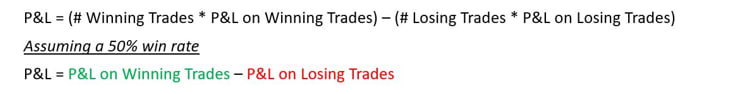
I knew I’d better make sure the size of my losses doesn’t get out of control.
This can be achieved in two ways: sizing trades correctly and designing a system that lets your winners run.
Here is what I go through for every tactical trade I set up:
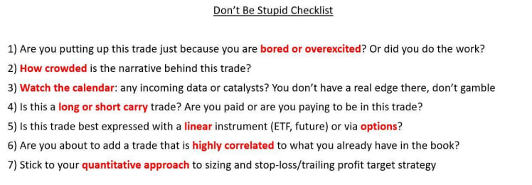
Points 1-3 keep my emotions in check and ground me to a more rational assessment of the trade.
Points 4-6 are about implementation.
A warning: short carry trades (and long options) are expensive to hold over time if nothing happens.
A reminder: in very choppy markets, you can get quickly stopped out with linear trades even if your thesis proves to be correct – consider whether the market regime favors linear or option implementations.
Don’t be stupid: check whether the trade you are about to add is not just another expression of a trade you already have on – I have seen people blow up as the 10 trades they were running were just…the same trade.
But it’s point 7 that sticks out: sizing and risk management define most of your P&L at year-end.
Here is how I approach them through a practical example.
Say you think that the S&P500 will keep marching higher over the next month: how many SPYs do you buy?
You could be in the right or left 50% of that distribution: when you pull the trigger, you don’t know that.
And because you don’t know that, you want to standardize your ex-ante sizing.
One effective way to standardize the sizing of each tactical trade so that they don’t excessively weigh on your year-end P&L is to do volatility-adjusted sizing: let’s go through the SPY example.
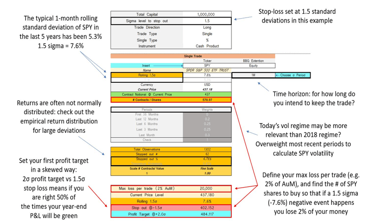
Let’s set our stop at 1.5 standard deviations, and our defined time horizon in this example will be 1 month.
For the SPY, using a 5-year lookback the typical 1.5x monthly negative sigma event would be a -7.6% decline.
You can play around with the lookback period if you want more history and/or assign different weight to more recent periods if you think today’s vol regime is more relevant (grey boxes).
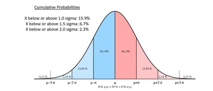
If returns are normally distributed, we will be stopped out 6.7% of the times in our defined time horizon.
But as returns often follow other distributions, it’s good practice to check the actual empirical probability of being stopped out against the theoretical 6.7% probability (orange boxes).
Finally, define what’s the fixed % of AuM you are willing to lose on any given macro trade.
A fictitious $1 million trading account willing to lose max $20k per trade which is bullish on SPY with a 1-month horizon would buy 571 SPY shares at $437 and be stopped out at $402 (-7.6% = 1.5x sigma event) hence losing $20k (= 2% of AuM).
Congratulations, you just applied volatility-adjusted position sizing!
What are the advantages of this approach?
1) You remain agnostic to ‘’volatility luck’’: if you size all positions the same, being right/wrong on the most volatile assets will make/break your P&L at year-end and that’s all about luck. Don’t gamble.
2) You remain agnostic to your ‘’conviction’’ level: the truth is that ex-ante you don’t know when you’ll be in the right or wrong 50%, so why would you over or under size a trade based on your ex-ante conviction levels? You shouldn’t.
3) This approach is really flexible: you can use it as a day trader or as a tactical macro investor, you can set stops looser/tighter depending on your approach etc.
Ok so now you have a data-driven macro approach, tools to help you digest action in global markets, and a ‘’don’t be stupid checklist’’ to help you push that 50% win rate higher plus a vol-adjusted position sizing system to avoid big losses by design.
How do you actually make money?
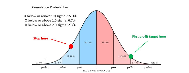
First, you place profit targets in an asymmetric way to your stop losses.
If your stop loss is at -1 standard deviation, your profit targets should be at over 1 sigma: if you are able to preserve a 50% win rate, that will help you making more money on winners than you lose on bad trades.
Most importantly though, you must have a system in place to let your winners run: the best hedge fund traders I know only score 2-3 outstanding trades per year which account for 80% of their yearly excellent P&L.
To improve the odds of achieving that, I use a trailing profit target strategy:
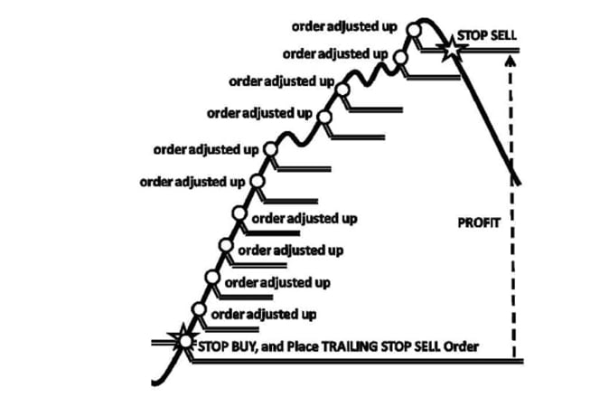
Say you set a stop at -1 sigma and first profit target at +1.5 sigma: when you hit the first target, you do not take profits – rather, you enter a trailing strategy.
Your new profit target becomes +2.5 sigma, and your new stop becomes 0.
You hit 2.5 sigma? Great!
Extend again: +3.5 sigma target, +1.5 sigma stop. And so on and so forth.In short, here is a sensible approach to tactical macro trading:
- You want to recognize you’ll be right only about 50-55% of the times;
- To skew the odds towards 55% you want to have a data-driven macro process, quantitative tools to screen markets and a ‘’don’t be stupid’’ checklist before pulling the trigger;
- You want to follow a volatility-adjusted sizing process as explained above;
- You want to religiously respect your stop losses and have a system in place to let your profits run.
This was it for today, thanks for reading.
If you appreciated this piece, please smash the like button and share it with friends!
2025-12-01 02:31:20
I am not long enough. You are not long enough.
The global real-economy money printer is going to run very hot in 2026.
The more spendable money global economies print, the higher the nominal growth impulse we are going to get.
Central Banks around the world are not going to fight it.
In some cases, they are going to apply loose monetary policy even in the face of sustained money printing.
The question is: what asset classes benefit the most in this macro setup?
We’ll cover that in a second, but first an important message.
Let’s take a step back together and look at the macro big picture ahead of us:
1) Money creation in 2026 will be through the roof: fiscal from US (OBBB), Germany, Japan, Korea etc + AI Capex will contribute to money printing;
2) Central Banks around the world will not be fighting this at all – if anything, they are net loose;
3) Housing disinflation will help US core inflation sit in the 2.5-3.0% area for a while longer;
4) The setup is: nominal growth at 5%+, Central Banks neutral or loose, ongoing global money printing;
In 2025, net fiscal deficits and private sector leverage (read: money printing) around the world added $8.1 trillion (!) of new inflationary money to global economies.
If we look at 2026, more fiscal stimulus and more debt-funded AI capex will take place.
The global real-economy money printer will continue to go BRRR.
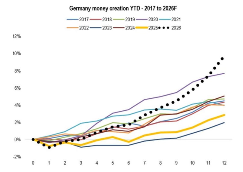
For your reference, here is our projection for the 2026 German money printing activities based on their large fiscal stimulus:
Global money printing correlates with nominal growth: the more aggressively we create new real-economy money, the more likely it is that nominal growth will pick up.
What about global Central Banks? Are they going to stay loose in the face of strong money printing?
The table below shows the Central Bank policy stance around the world - black if around neutral, red if tight, green if loose.
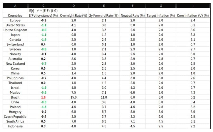
Take a look at the color scale: there is only one tight CB (Brazil), some neutral CBs (+/- 50 bps around neutral), and a big bunch of loose Central Banks around the world. In many cases, the loose policy stance comes from outright ignoring your inflation target.
In the US, Canada and Japan the terminal rate (‘‘2y forward rate’’) is around the neutral rate but there is nothing ‘‘neutral’’ about core inflation - which in all cases sits well above the Central Bank target.
A Central Bank applying neutral monetary policy in the face of core inflation well above their target and ongoing money printing…
…is a very loose Central Bank.
So, what happens to markets in such a macro setup?
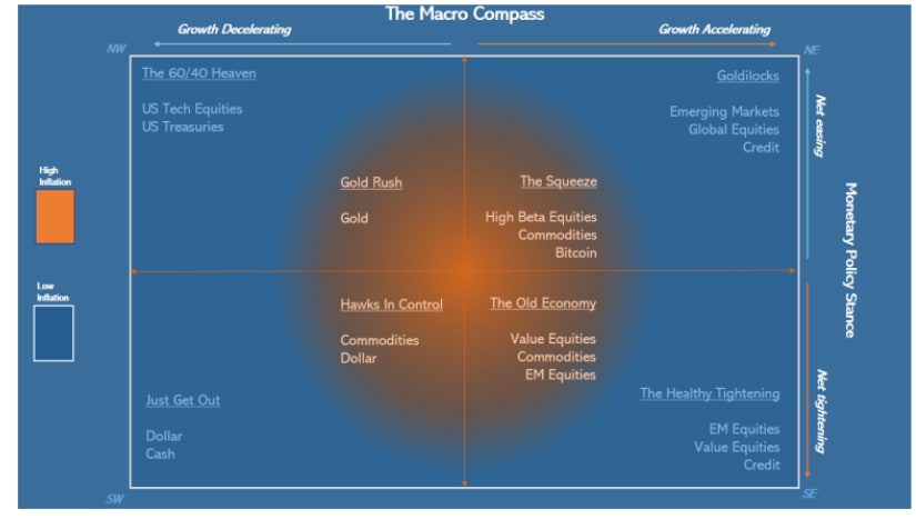
My TMC Asset Allocation model says we will be anywhere between ‘’The Squeeze’’ and ‘’Goldilocks’’ depending on inflation: do we sit with core around 2.5-2.8% or do we surpass 3%?
In general, these top-right quadrants are very very supportive for risk assets.
If you look back at previous episodes of sustained money printing plus loose Central Banks, the 2005-2006 period looks like a decent parallel.
Back then, the global CPI rate was around 3% (blue) and Central Banks were gradually raising rates from 4 to 5% (orange) on average around the world.
Today, we have global inflation around 3% and global CB rates around 5% as well.
If anything, today’s setup seems more sustainable because the money printer is now fueled by government deficits, not private sector debt as it was in 2005-2007:
In that period EMs, value-oriented stock markets and commodities did great.
And right now, these are the 3 most under-owned asset classes in institutional portfolios:
After a decade of US/tech dominance and scarse capital flows towards value, emerging markets and commodities the world is largley underallocated towards these asset classes.
I am not long enough these assets.
Are you?
2025-10-31 22:23:26
Warren Buffett once said that the most important investment you can make is in yourself. I can’t agree more.
The financial industry is full of jargon, opacity and ivory-tower attitude which prevents practicioners from scaling up their knowledge of markets fast.
When I started my research firm The Macro Compass, my main objective was education: breaking down financial concepts in plain English for you all.
I have recently stepped up that effort with my two macro courses:
The Bond Market Course
The Monetary Mechanics Course
Analysts and PMs from the top 10 hedge funds in the world went through it, and this is the feedback they are sharing with me:

But here is the kicker for you guys: this time, I am slashing prices down by 50% for the first 50 buyers!
Instead of paying EUR 998 for both courses, you’ll pay EUR 499 .
Buy one, get two courses!
The offer is valid for the next 48 hours, and only for the first 50 buyers.
Be quick and take advantage of this exclusive offer before it sells out.
Once purchased, the courses can be watched at any time and the supporting slides and material can be downloaded.
For more information on the courses, you can visit this dedicated page.
And now, to today’s macro research piece.
Nov 5th will be a key date for markets: the Supreme Court will start hearing arguments on Trump’s IEEPA tariffs.
And while markets don’t seem particularly focused on this event, I believe it’s crucial to be prepared for it.
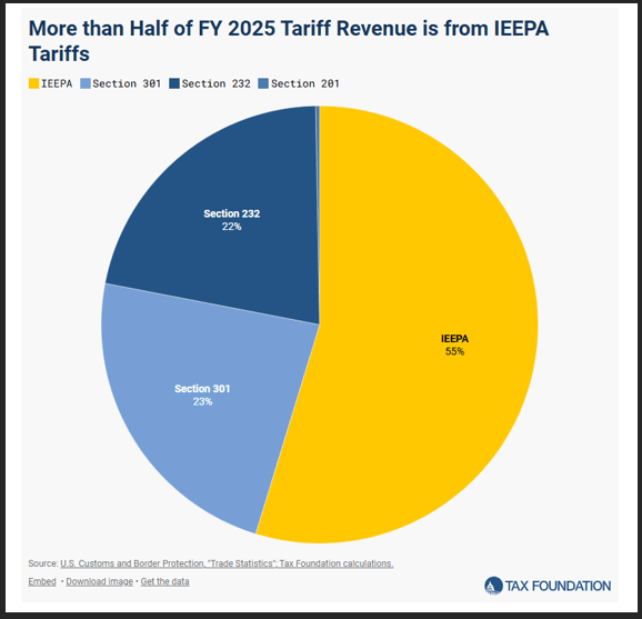
The pie chart above shows why the Supreme Court ruling will be crucial.
If the Supreme Court strikes down IEEPA tariffs as unconstitutional, around 55% of the US tariff income would be wiped out from the 2026 budget and US companies would be eligible for a refund for the 2025 tariffs paid under the IEEPA regime.
In numbers, we are talking about a $150-200bn annualized in tariff income lost for the US.
Now, you all know that from a strict monetary perspective US tariffs act like a tax.
Data is uncontroversial there: tariffs are being paid by US consumers and corporates (mostly corporates), which is akin to an increase in corporate tax rate that reduces companies’ margins.
If the Supreme Court undoes IEEPA tariffs, this would be the equivalent of a ~200bn fiscal stimulus:
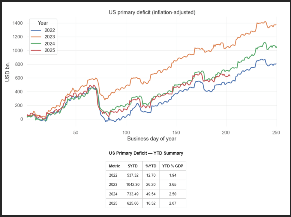
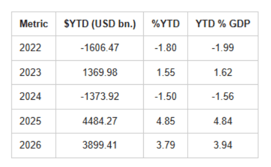
The chart above shows the inflation-adjusted primary deficit spending in the US (read: money printing).
In 2025, the US government has injected $626 billion in the US economy – this is a much lower pace than 2023-2024. The slowdown in US primary deficit spending is mostly due to tariffs.
Revert the IEEPA tariffs, and the US will be going back to the glorious money printing days of 2024 at least.
So, what are the odds that the Supreme Court will strike down Trump’s IEEPA tariffs?
Prediction platforms suggest 60-65% odds, although volumes are quite small:
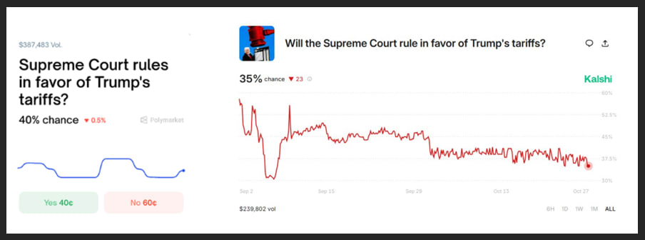
We can actually get an idea of the real market-implied odds by looking at another market: the newly set-up ‘’Tariff Refund Trade’’ that certain banks are allowing hedge funds to invest in.
According to Bloomberg:
‘’ Wall Street banks are arranging bets on President Donald Trump’s tariffs being struck down by the Supreme Court — long-shot trades that could pay off handsomely for hedge funds betting against the legality of the administration’s flagship policy.
Jefferies Financial Group Inc. and Oppenheimer & Co. are among firms brokering the deals, matching investors with companies that have paid tariffs to import goods into the US, according to people with knowledge of the matter and correspondence seen by Bloomberg News. …
In the trades, the importing companies essentially sell to investors any future rights to claim refunds on their tariff bills, which could come if the nation’s top court sides with an ongoing legal challenge to Trump’s tariffs. The companies sell at a discount to their expected refunds, meaning investors would reap the upside in a ruling favorable to them. The banks arranging the deals take a cut. …
For example, a hedge fund might pay somewhere between 20 to 40 cents for each dollar of claims they could get back in refunds, giving them an upside of several times their bet, according to the correspondence and some of the people, who asked not to be identified discussing potential terms. Most of the trades range in size from $2 million to $20 million, with few over $100 million, one of the people said.’’
It would seem like hedge funds are paying ~30% on average upfront for the trade, which would imply roughly the same probability that tariffs are deemed unconstitutional.
But companies are cashing in months in advance the US government refund that would come if IEEPA tariffs are shut down, so we need to make an adjustment for that.
This cross-check says the real market-implied odds of tariffs deemed unconstitutional are closer to the 40-45% area, while prediction platform sit around 60-65%.
Call it 50-50: a coin toss.
Now, let’s assume the Supreme Court strikes IEEPA tariffs down.
Can we say with 100% certainty that this will be akin to a ~200bn fiscal stimulus?
Not so fast.
Trump can also set tariffs under Section 232, 301 and 122.
Section 232 covers the sectorial tariffs under commerce authority, and Section 301 the ‘’fentanyl-like’’ tariffs under USTR authority – both fall under the executive (President) powers, not the Congress.
Section 122 also falls under Presidential powers, and it would allow Trump to go for global 15% tariffs for 150 days before Congress would have to approve.
I am saying this because while the Supreme Court might strike down IEEPA tariffs, the Trump administration has seven Section 232 sectoral investigations ending by January 2026 and could come up with more Section 301 or blanket Section 122 tariffs to offset the Supreme Court decision.
Nevertheless, we are going into a coin-flip decision and markets might find reasons to celebrate a Supreme Court decision to strike down IEEPA tariffs – but Trump has weapons to counter such decisions.
In general, bear in mind the following:
- The US will add $400bn in primary spending through the OBBB next year;
- Germany will kickstart a large fiscal spending program;
- The new Japanese PM Takaichi is working on an additional budget to increase fiscal spending;
- Korea, Canada, Sweden and Australia are expanding primary fiscal spending by 1% of GDP;
- Debt-funded AI capex might total $300bn next year
Regardless of the Supreme Court decision, the global money printing machine will accelerate.