2026-02-11 12:00:00
A few days ago I shared how OpenClaw has been helping me — it can truly take over the programmer role, freeing me from the grind of development tasks so I can think about project decisions, product design, and where the company is heading. I can finally act like a CEO of a one-person company, doing more of what a manager should do. That’s been a huge level-up for me.
But when I was about to ship a project the other day, I realized it still can’t replace me when it comes to DevOps:
Extremely high complexity: DevOps work is far more complex than programming. You’re operating command lines, logging into servers to check things, and you need to be incredibly careful — one mistake can have massive consequences.
Multi-dimensional interaction: You need to open various web UIs to manage cloud resources, copy-paste critical keys, deploy services, and operate cloud platform dashboards.
Constant context switching: You’re jumping between the terminal and web UIs, constantly verifying and handling edge cases. These operations go beyond what plain text can express.
While OpenClaw can already replace the programmer, no agent can truly handle DevOps yet. I think there’s a huge opportunity here. Maybe it’s time to build a real, autonomous DevOps Agent.
To show what DevOps difficulties actually look like, let me walk through my recent experience deploying Vocalflow — a voice input and transcription service I built.
First, I created a project on my self-hosted Dokploy instance and set up the app inside it. Then I manually clicked through the configuration to set the Docker image path pointing to GitHub’s container registry. Since the image is private, I had to dig up a GitHub PAT and paste it in.
Next, I wrote GitHub Actions for building the image — this was the one thing I had OpenClaw help with. Then I added another Action: once the image build completes, it calls the deployment platform’s API via curl to trigger auto-deployment. Since this step requires token authentication, I had to open the GitHub Actions settings page and add the Secret Value.
After all that, I pushed the code. The auto-deployment kicked in, but the app failed to start. I checked and found that better-sqlite3 couldn’t find its native Node extension. I had OpenClaw debug and search for a while:
Once I told OpenClaw, it added the file and pushed again. The project finally came alive.
Then came domain configuration. I had to go to the Cloudflare Dashboard, find my top-level domain, add a subdomain, and point it to the deployment server. After that, I went back to Dokploy to map the new domain to the service and configure automatic HTTPS via Let’s Encrypt. I also needed to get the port right — I asked OpenClaw which port the service was actually running on. Only then was everything set up. I then checked Docker’s runtime logs to verify whether auto-migration ran correctly. It didn’t. I notified OpenClaw to look into it, but since it couldn’t directly access the production logs, verifying the fix was hard. I went back and forth debugging several times. Once that was sorted, I started a new session and had it research and write a CLI tool for fetching Dokploy service logs — just to make life easier next time. https://github.com/reorx/scripts/blob/master/dokploy-logs
This is what DevOps work looks like — extremely tedious, fragmented, and unpredictable. There’s no universal approach to standardize it. Especially in the early stages of a project, entropy is incredibly high. Only after a project stabilizes can you start managing things through standardized text-based tools like Ansible or Terraform, forming SOPs.
In an era where development moves this fast and everyone is constantly building new projects, general-purpose Coding LLMs trained on existing data do have DevOps knowledge, but they can’t truly do the job. They can’t close the loop the way they can with development work. That’s the reality, and it’s the direction I believe future agents need to explore.
The core ideas behind such an agent:
This would complete the last missing piece, freeing developers and small companies from DevOps busywork and closing the entire loop from idea → development → launch.
2026-02-08 10:00:00
I want to share some thoughts on my recent experience with OpenClaw. Over the past year, I’ve been actively using Claude Code for development. Many people believed AI could already assist with programming—seemingly replacing programmers—but I never felt it brought any revolutionary change to the way I work.
Sure, agentic coding tools like Claude Code and Cursor have made writing code easier, but at the end of the day, I was still the one writing. It might look like the AI is doing the work, but “writing” is a broad term—writing is execution. As the person making code happen, I’m the one writing code. Whether I’m editing line by line, copy-pasting, or telling an AI what I want and letting it finish—it’s still me “writing.” My role as the programmer responsible for turning code into reality hasn’t changed.
My productivity did improve, but for any given task, I still had to jump into the project, set up the environment, open my editor and Claude Code terminal. I was still the operator; the only difference was that instead of typing code manually, I was typing intent into a chat box. That only changed one dimension. Testing, debugging—most of it still fell on me. There was some change, sure, but it wasn’t mature, and there was no fundamental shift. I still had to stay deeply involved and monitor everything. And it was exactly this deep involvement that kept me stuck in the role of code executor.
Then OpenClaw came along, and everything changed.
I once discussed with my wife: in the age of AI, should you aim to be a “super individual” or build a “super team”? My answer is: become a “super manager.” A super individual who can juggle multiple threads and coordinate numerous AI tools is essentially demonstrating great management skills. Being a super individual means using AI tools to lift yourself from a basic executor to a higher-level one, and eventually into a manager. So even if you’re going the super individual route, you need solid management awareness and methods to keep everything running smoothly.
OpenClaw gave me the chance to become that super manager. After a few rounds of practice, I found that I could completely step away from the programming environment and handle an entire project’s development, testing, deployment, launch, and usage—all through chatting on my phone. That’s something Claude Code simply can’t do, or rather, it was never designed to.
As a general-purpose agent, OpenClaw interacts through messaging apps via voice, accurately understands what I mean, works independently for extended periods, and has solid memory—it can persist the methods and rules it picks up during work, gradually evolving through use. These are the capabilities that make it the real turning point for replacing me as the code executor. The biggest change is this: I just need to express my intent, and it automatically creates the project, writes up a plan for me to review. I can discuss changes with it by voice, and then it executes—even directing Claude Code to do the actual coding.
It replaced the “me” that used to write code, truly stepping into the programmer role and freeing me to act as a manager. A manager shouldn’t get bogged down in the specifics—they should focus on the higher-level, abstract work. That’s what management really is. You could even flip it around: you’re only a true manager when you can get things done purely through communication. Before, Claude Code alone couldn’t get you there. But when you have a dedicated machine running 24/7, set up with all your tools, and an agent that understands your intent sitting at the computer writing and debugging code for you—that’s when things truly change. That’s when the revolution arrives.
This is the biggest shift OpenClaw has brought—it completely transformed my workflow. Whether it’s personal or commercial projects, I can step back and look at things from a management perspective. It’s like having a programmer who’s always on standby, ready to hop into meetings, discuss ideas, take on tasks, report back, and adjust course at any time. It can even juggle multiple roles, like having several programmers working on different projects simultaneously. Meanwhile, I can be the tech lead keeping tabs on specific project progress, or the project manager steering the overall schedule and direction.
This has truly freed up my productivity, letting me pursue so many ideas I couldn’t move forward on before. I feel like my life genuinely changed at this moment. I used to have way too many ideas but no way to build them all on my own—they just kept piling up. But now, everything is different.
It’s like I suddenly have a team, achieving the dream scenario I always imagined: owning a company, hiring people to bring my ideas to life, while I just focus on product design and planning. I’m closer than ever to that dream state. Before, that required serious capital. Without money, you can’t hire anyone, and you can’t just be the idea person. Unless you’re some trust fund kid doing it for fun, you’re stuck bouncing between “indie developer who wants to build multiple projects” and “solo hustler just trying to survive.”
But now, I can finally break out of that trap and move toward actually having a team. It keeps all my projects moving forward at any time. It’s not perfect yet, but I’ve taken the first step.
Thank you, OpenClaw. Thank you, AGI—for me, it’s already here. The gears of fate are turning in directions I never imagined.
2024-01-10 11:22:46
It all started with The Light Phone.
Living in a world full of technology and digital devices today, I constantly feel distracted, unfocused, and lost. The smartphone has become a part of our bodies, and we have already evolved into a new species - cyborgs. We no longer solely rely on our biological brains for looking and thinking; much of our important information is stored in our phones, our new “organ.” However, it is dumb in comparison because the only efficient way to interact with it is to use our fingers, which is much slower than other natural organs connected and controlled by neural networks. I want to get rid of it, but deep down I know I cannot live without it.
After discovering The Light Phone, I realized that we may not rely on apps and information as much as we think. However, despite initially being intrigued, I eventually found myself unable to resist returning to my iPhone 7. This begs the question: why did I make this decision?
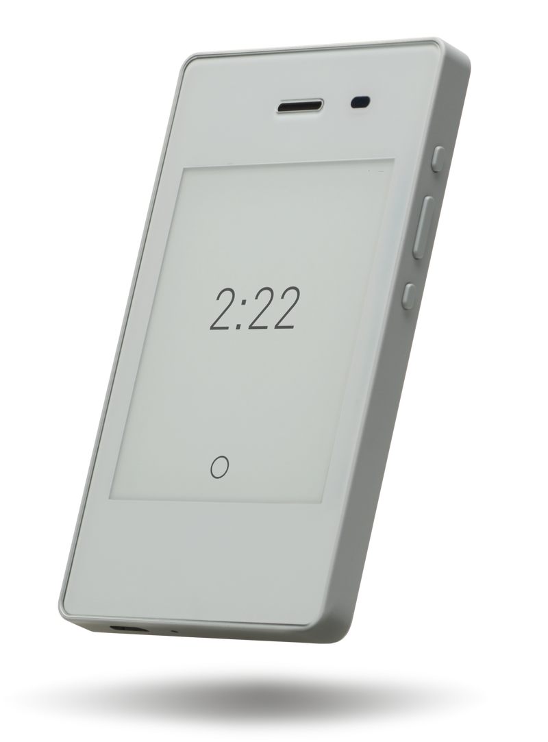
The Light Phone
It’s a downgrade of a person’s capabilities. I can no longer take photos wherever I find something interesting, listen to music whenever I feel like it, or call a taxi wherever I want to go.
It shouldn’t be this way when it comes to enhancing our lifestyle. From a young age, I have never held a high opinion of those individuals in history who chose to live in the wilderness as a means to find mental tranquility. I greatly admire those who can actively engage in society while maintaining a clear mind, living in a manner that brings them personal satisfaction.
Years passed, and it suddenly came to the era of LLMs. One day, I found AI Pin, a wearable device made by Humane with the power of OpenAI. My eyes lit up; I sensed a similar aesthetic and philosophy to the Light Phone. However, that was not enough. The AI Pin has no screen, meaning that I cannot interact with it through vision and touch, a significant loss of HCI technology of the past 60 years.
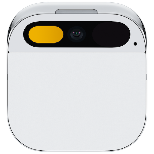
AI Pin
That being said, AI Pin is heading in the right direction, because what wastes our time and distracts us when using smartphones are the tedious and complex operations with apps. LLM excels at converting natural language into a sequence of machine-understandable commands, which is clearly the way to reduce the friction of using a digital device. I feel that the future is near, only a few steps away, but I didn’t expect it to arrive so quickly.
Today, Rabbit R1 has been released, and I view it as a milestone in the evolution of our digital organ.
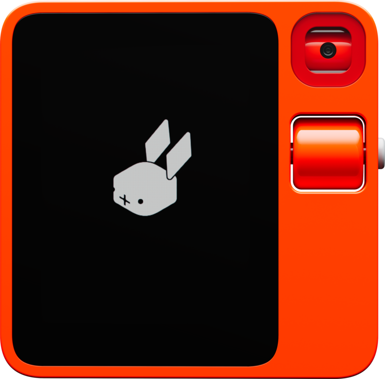
Rabbit R1
R1 is definitely an upgraded replacement for smartphones. It’s versatile and fulfills all everyday requirements, with an interaction style akin to talking to a human. Other devices, such as the Light Phone and AI Pin, though minimalist and distraction-free, fall short of enabling us to accomplish our daily tasks. The disadvantages outweigh the benefits in the ultimate goal of improving our lifestyle.
So, why is R1 great? In my opinion, it’s primarily due to the two new technologies it employs: Agent and LAM.
The concept of an Agent is simple: you instruct the AI what to do, and it will analyze your words to formulate a clear goal. Subsequently, it breaks this goal down into various tasks, orchestrates the completion of these tasks, and finally assembles the results to fulfill the goal. The Agent resolves the issue of LLM’s inefficiency at task completion. AutoGPT is the first proof-of-concept that has popularized the Agent. From a certain perspective, R1 can be perceived as a physical embodiment of an Agent.
The following is LAM, which I believe is the most impressive and exciting feature in R1’s presentation. LAM, or Large-Action-Model, possesses the capability to comprehend any user interfaces and act accordingly. Utilizing LAM, Rabbit has developed a framework. This endows R1 with its most potent tool - the ability to learn.
With the power of teaching mode, R1 can acquire a new skill simply through screen recording and voice instructions. In the presentation, Jesse showed how to instruct R1 to use Midjourney for creating images from user voice commands. This proves that R1 is not limited to what the developers built in; users can tweak it to tailor it to their own needs. There’s no compromise of losing capacities while maintaining a minimalist shape and intuitive use.
Someone once stated, the primary distinction between humans and robots is self-learning. While R1 cannot learn independently, it certainly serves as a commendable human companion.
Generally, I believe R1 has the potential to change the world. This is a thought that seldom comes to my mind, as I have seen numerous new technologies and inventions. However, R1 is different; it’s not just another device to please a certain niche. It’s meticulously designed to serve one significant goal for all people: to improve lifestyle in the digital world.
2023-12-21 20:23:46
Debounce 和 Throttle 是两种相似的频率限制手段。Debounce 顾名思义,去掉弹跳/抖动,能看出防止误操作的意味;Throttle 的意思是节流阀,更加直接了当。作为两种常见的设计模式,理解他们的工作原理和细微区别能够帮助我们写出更健壮的应用程序。
虽然是两个通用的概念,但它们的确主要在 JavaScript 中被提及和使用,究其原因,JavaScript 中常常出现连续发生的大量事件,如果不对调用频率做出限制,会产生严重的性能问题。且这些事件是可以舍弃的,一段时间内只需要产生一次有效调用即可。而在后端则很少出现这种情况,所有的事件都必须要处理,性能问题通常通过异步和分布式调用来解决。
下面是我对这两种设计模式的理解。
Debounce: 将间隔不超过设定时间的多次连续调用变成一次。
从工作原理上来讲,Debounce 会使目标函数变为延迟生效,当对其进行连续多次调用时,若前后两次调用的时间间隔不超过设定值,则前一次调用会被取消。直到某次调用后,在设定的时间内没有出现下一次调用,那么这次调用将不会被取消,从而最终被执行。
Throttle: 确保一个函数被连续多次调用时,在设定时间内最多只实际执行一次。
放在一起对比的话:
设想如下几个场景:
我们一起来看看每个场景分别应用 Debounce 和 Throttle 会有什么样的效果,并评判哪个是更加合适的频率控制方式。
用户按住鼠标不松一直改变窗口大小,使用 Debounce 的情况下,UI 在用户停顿或者松开鼠标时才会改变;使用 Throttle 的情况下,用户会观察到 UI 在拖拽窗口大小的过程中每隔一会改变一次,容易给人一种反应迟钝或卡住的错觉,因此 Debounce 是更好的选择。
用户持续向下滚动鼠标滑轮,使用 Debounce 的情况下,大纲的高亮只有当用户停止滚动时才会更新。所以当用户一次性滚动很长时,只能看到一次高亮的改变,中间仿佛跳过了一般;而使用 Throttle 的情况下,随着用户滚动,高亮会稳定地以设定的时间间隔更新,因此 Throttle 是更好的选择。
用户以较快地速度连续输入字符,使用 Debounce 的情况下,只有当用户停止输入时搜索提示才会更新;使用 Throttle 的情况下,搜索提示会稳定地以设定的时间间隔更新,但如果用户输入最后一个字符的时间,正好处于上一次调用后的间隔期,无法触发新的调用,那么用户所看到的提示就不是根据完整的输入内容做出的。Debounce 由于能够保证函数总是在用户停止输入时执行,是比 Throttle 更好的选择。
首选 lodash,因为它是一个非常流行且久经考验的库。但如果不想让整个 lodash 混入项目的构建结果,可以安装 lodash.throttle 和 lodash.debounce 两个独立的库。如果你使用的 bundler 支持 tree-shaking,也可以通过 lodash-es 来 import 这两个函数,最终构建结果中只会包含与之相关的代码。
npm 狂魔 sindresorhus 也维护了两个包,debounce 和 throttleit, 如果你想要更简洁的实现,可以考虑使用。
下面以 lodash.throttle 为例,展示其如何在一个 TypeScript 项目里安装和使用 :
npm i lodash.throttle
# 还需要额外安装 `@types/` 的类型定义
npm i -D @types/lodash.throttle
引入和调用:
import throttle from 'lodash/throttle';

const onScroll = () = {/* 实现细节 */}

// onScroll 执行的最高频率为每 100 毫秒一次
document.addEventListener('scroll', throttle(onScroll, 100));
这篇笔记来源于重构 GitHub TOC Sidebar 扩展时对场景 2 的思考,之前用的是自己手写的 Debounce,在滚动过程中经常看不到 ToC 的高亮变化,这次换成了 lodash.throttle,终于达到了预期的效果。其实这三个场景我都在过往的开发经历中遇到过,并且是在不了解这两个概念的情况下独立思考出了(简陋或丑陋的)解决方案,直到最近才重新审视,阅读了相关的文章,学习了更好的实现方式。这也是为什么我在关于状态机的短文中感叹基础知识的重要性,如果能更早地知道这两个概念,就能避免曾经在黑暗中摸索的痛苦。当然,因为自己琢磨过,当看到更系统更高级的实现时,就会有更深刻的理解,这大概是这位推友希望自己是通过 Vanilla JS 学习前端的原因。
一言以蔽之,开发遇到困难免不了自己琢磨,但在琢磨时多想想能否将问题定义出来,符合一个已有的概念,然后去参考现实世界中系统和标准的解决方案;如果没有也无所谓,未来某一刻这种思考过程会化作某种领悟,不会白费。
2023-04-04 11:46:57
最近又做了一个新的扩展——Window Opener,这篇文章介绍它的动机、开发过程和用法说明。
Window Opener - Chrome Web Store
我平时主屏的窗口布局一般是 Chrome 占 3/5 靠左,VSCode 占 1/2 靠右,交叠的部分一般不会影响两边的浏览。
最近关于 AI 的新闻几乎都从 Twitter 上获取,我很希望它以一个单独的窗口出现在主窗口的右侧,这样我在打开来自 Twitter 的链接时仍然可以继续向下滚动,得到更好的浏览体验。
我在 Moom 1 上添加了让窗口以 1/5 的屏幕大小靠 Chrome 右侧的布局,但仍然觉得很麻烦,因为我在专注工作时会关闭 Twitter,而每次打开时,都要走一遍 [打开新窗口] → [输入 twit 回车] → [快捷键唤出 Moom] → [快捷键应用布局] 的流程。于是我便想,要是能够一键把 Twitter 在当前窗口的侧边以特定大小打开就好了,既然没有这样的工具,何不自己做一个呢?
如果你对此不感兴趣,可以直接跳到下一个章节查看插件的功能和用法介绍
说干就干,我从自己的 webpack-chrome-boilerplate 脚手架中复制了 vanilla-ext 到新的项目,为它取了一个简单直接的名字 window-opener. 我的脚手架的 tech stack 为 TypeScript + Webpack,其中内置了一些常用的库比如用于 DOM 操作的 cash-dom 和用于记录日志的 loglevel,不过最重要的一个包是 @reorx/webpack-ext-reloader, 这是我维护的用于自动重载扩展的工具,能够减少开发时每次保存就要手动点击 reload extension 的心智负担。
为了快速实现一个 demo,我首先想到的是让扩展的图标点击就可以打开 Twitter。我在 manifest.json 里添加了下面的配置
  "action": {
    "default_title": "Open a window"
  },
这使得当扩展的图标被点击时可以触发一个事件,从而执行打开新窗口的操作。以下是 background.ts 的代码:
chrome.action.onClicked.addListener(async () => {
  const window = await chrome.windows.getCurrent()
  const context = {
    windowWidth: window.width ?? 0,
    windowHeight: window.height ?? 0,
    screenWidth: 2560,
    screenHeight: 1440,
    xOffset: 58,
  }

  const windowArgs = {
    left: context.windowWidth + context.xOffset,
    top: 0,
    width: context.screenWidth - context.windowWidth - context.xOffset,
    height: context.screenHeight,
  }

  chrome.windows.create({
    url: 'https://twitter.com',
    focused: true,
    ...windowArgs,
  })
})
一个简单的 Proof-of-Concept 便完成了,点击扩展,便会在当前窗口右侧打开高度和屏幕一致、宽度占满剩余空间的 Twitter 窗口。这里用到的最核心的 API 是 chrome.windows 2,实现了当前窗口大小的获取,和新窗口的大小、位置的控制。为了计算出相对于屏幕的空间,我将自己所用屏幕的大小赋值给了 screenWidth 和 screenHeight, 但这样做不具备通用性,我希望动态获取当前窗口所在屏幕的大小。讽刺的是,Chrome 扩展的 API 竟然无法实现3,经过各种尝试,最终我通过在扩展的设置页获取 window.screen 对象的方式得到了这些数值。(注意这里的 window 并非 chrome.windows.Window, 而是 DOM 的 window。)
核心功能完成后,我又为扩展增加了易于使用的界面。如果是非常简单的扩展 (比如 refgen,未来会写篇单独的文章介绍), 我会直接使用原生的 DOM 接口来实现页面交互,但这次我感觉到编辑界面有一定的复杂度,于是将脚手架换为 webpack-chrome-boilerplate 中的 react-ext,用 React 来增加代码的模块化和可维护性。
一直以来我一直都习惯用 Vanilla JS 来调用 Chrome 扩展接口,但引入 React 后不得不考虑状态管理,于是我找到了 use-chrome-storage,它能够以 hooks 的方式获取和保存扩展数据,使我免于用 useEffect 重新实现。下面是代码示例:
/* define settings store hook */

export interface Settings {
  iconAction: IconAction
  windows: WindowData[]
}

export const INITIAL_SETTINGS: Settings = {
  iconAction: IconAction.defaultWindow,
  windows: [],
}

export const useSettingsStore = createChromeStorageStateHookSync(STORAGE_KEY, INITIAL_SETTINGS);


/* use settings store hook */

const Popup = () => {
  const [settings, setSettings, isPersistent, error, isInitialStateResolved] = useSettingsStore();

  if (!isInitialStateResolved) {
    return (
      <div>loading</div>
    )
  }

  return (
    ...
  )
}
在 Options 页面中,我实现了一个窗口管理器组件 WindowsManager,它会循环渲染所有窗口的编辑界面,而每个窗口都需要用到 chrome.windows.Window 来计算。我不希望每个窗口都调用一次 chrome.windows.getCurrent,便想在整个页面初始化时获取 Window 对象,向下传递给子组件来使用。如果传递的层级很深,React 推荐的方式是使用 useContext4,但我觉得比较麻烦,而且不够灵活,于是引入了 zustand 来做全局状态的同步。下面是代码示例:
/* define app store hook */

export interface AppStore {
  chromeWindow: chrome.windows.Window|null
}

export const useStore = create<AppStore>()((set) => ({
  chromeWindow: null,
}))


/* use app store hook */

// options.tsx: update chromeWindow
chrome.windows.getCurrent().then(window => {
  useStore.setState({
    chromeWindow: window
  })
})

// WindowManager.tsx: get chromeWindow
const WindowItem = ({data, defaultId, onDataChanged, onDelete}: WindowItemProps) => {
  const chromeWindow = useStore(state => state.chromeWindow)
  const context = getContext(data.staticContext, chromeWindow!)
  ...
}
以上是一些开发中的心得和收获,如果你有更多兴趣,可以直接阅读源码。还有一些技巧不再赘述,以下是一个简单的列举:
chrome.action.setPopup 实现切换点击扩展按钮的行为(显示 popup 或触发 action click 事件) → code-0, code-1
chrome.windows.onBoundsChanged 监听窗口大小的改变,并控制事件的发生间隔 → code
eval → code
key 属性值的变化使得设置了 defaultValue 的 input 元素在 rerender 时仍可以改变数值 → code
在安装了 Window Opener 之后,首次点击扩展按钮,会打开设置页面:
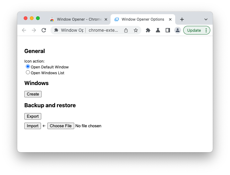
点击 Create 按钮,开始创建第一个窗口。下面的截图是我定义的用于满足最初需求的 Twitter 窗口。
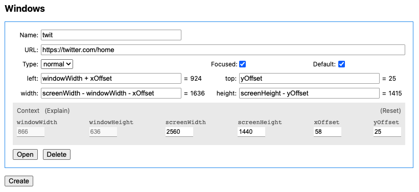
参数说明如下:
这里我希望 Twitter 在当前窗口的右侧,而我的屏幕将 Dock 放在左侧,因此新窗口距离屏幕左侧的距离 left 应该是 xOffset + windowWidth;与屏幕顶部的距离 top 可以简单设置为 0,Chrome 会考虑 menubar 所占用的空间,自动将窗口下移,也可以像我这样精确设置为 yOffset。宽度 width 要填满右侧可用空间,因此是 screenWidth - (windowWidth + xOffset);高度 height 则可以直接使用 screenHeight,与 top 同理,超出可用长度的部分会被自动处理,也可以填为精确计算的数值 screenHeight - yOffset。
Tips: 要实现一个宽 600px, 高 500px 的居中窗口,请参考以下参数
width=600, height=500, left=(screenWidth - 600) / 2, top=(screenHeight - 500) / 2
当 Icon action 设置为 Open Windows List 时,就可以打开 popup,界面如下:
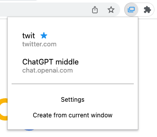
蓝色 ★ 表示默认窗口,鼠标点击窗口条目即可打开。
下方 Settings 是设置页的链接。点击 Create from current window 会基于当前窗口的 URL, left, top, width height 创建新的窗口。
目前 Popup 存在 accessibility 上的问题,应该使所有按钮可以通过 tab 键切换 focus,实现仅用键盘导航和打开窗口。
Window Opener 默认的快捷键是 ⌘ ⌃ T, 也可以在 chrome://extensions/shortcuts 进行自定义。
开发 Chrome 扩展越来越成为我的一大爱好。浏览器是我们在赛博世界赖以生存的基本工具,能让它变得更好用,意味着我可以用更短的时间做更多的事,并享受更好的体验。开一个新的 side project,可以让我短暂离开主线任务和生活中的琐事,专注在具体明确的目标上,不仅是精神上的放松,也是对开发技术的淬炼。
希望你能喜欢 Window Opener :)
Moom 是我使用多年的窗口管理工具 https://manytricks.com/moom/ ↩︎
https://developer.chrome.com/docs/extensions/reference/windows/ ↩︎
chrome.system.display 可以获得所有屏幕的数据,但无法知道当前窗口所在的是哪一个屏幕,而 Window Opener 需要在 background 中运行,此时是无法使用 DOM 的 window.screen 对象的,因此最终将 screenWidth, screenHeight 设计成了绑定在每个用户添加的 window 上的静态数值,但可以在编辑界面动态更新。 ↩︎
2023-03-11 11:44:35
前几天刷到一个 YouTube 视频,内容是斯坦福大学一位教授介绍它对 AI 的看法和 “AI Thinking” 思维观,感觉很有收获,于是就一如既往地想把我的所得分享到 Twitter 上。以往我都是自己来写推荐语,或许是受视频主题的影响,我便想到,要不要试试用 AI 来帮助我完成这次内容创作呢?
由于近期 ChatGPT 的火爆,我早已经安装尝试了许多基于 ChatGPT API 的工具,甚至自己开发了一些,因此也没有花功夫去寻找其他的,直接使用已有的工具来完成创作流程。
第一个也是最重要的工具是 Glarity,它是一个 Chrome 扩展,为许多网站提供使用 ChatGPT 提取摘要的功能,比如 Google、YouTube、GitHub 等,效果很好,非常实用。Glarity 支持 OpenAI API 和 ChatGPT Webapp 两种后端,前者需要用户自己提供 API key,后者只需要登录 ChatGPT 网页版即可使用,完全免费。Glarity 的开发者来自中国,近期他们在 Product Hunt 发布了产品,大家可以多多点赞支持。
Glarity 在 YouTube 播放器右侧注入了一个小组件,点击 “Ask ChatGPT to summarize” 即可用当前视频的字幕生成摘要,效果如下:
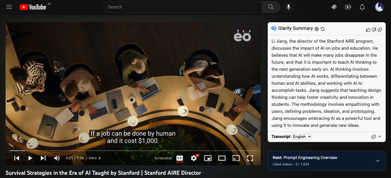
Use Glarity to summarize a YouTube video.
由于字幕是英文,因此总结内容也是英文,我使用 Bob 的 OpenAI Translator 插件将摘要翻译成了中文:
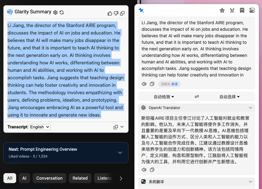
Use Bob to translate Glarity summary into Chinese.
看着效果还不错,读起来也很通顺,但是内容太长了,如果想发表到 Twitter 上,就要受到 280 个字符(140 个汉字)的限制,需要再精简一下。用我自己写的 Drafts 插件 ChatGPT Conversation,通过定义 system message 创建了一个专门用于生成社交媒体内容的笔记,让它基于上一步的翻译结果进行创作:
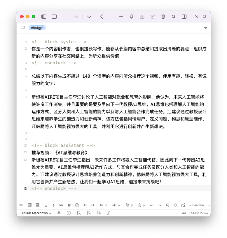
Use Drafts to generate social media content.
结果为:
斯坦福AIRE项目主任李江指出,未来许多工作将被人工智能代替,因此向下一代传授AI思维尤为重要。AI思维包括理解AI运作方式、与其合作完成任务及区分人类和人工智能的能力。江建议通过教授设计思维培养创造力和创新精神。他鼓励将人工智能视为强大工具,利用它创新并产生新想法。让我们一起学习AI思维,迎接未来挑战吧!
只需稍稍修改便是一个合格的文案了。不过其实我是自己把第二步的翻译结果进行了重编排,推文如下:
本文探索了使用 AI 技术将有趣的内容总结成文案后发布到社交网络上的流程。用到了以下工具:
虽然是一个简单的任务,但有 AI 的帮助确实加速了生产力,如果我从头看完视频 + 自己写,至少需要 30 分钟,AI 则可以将这个步骤压缩在 5 分钟内完成。
当然了,这对我来说只是一个实验,我并不想完全以这种方式来创作,一则我并非内容农场,我只创作我认为有价值的内容;二则使用 AI 生成并不能帮助我去思考或深入了解问题。写作是一个创造性的过程,我享受它所带来的成就感,甚至挫败感,它们都能使我得到成长。但我依然非常喜欢 GPT AI,因为它会持续优化我的生产力,帮助我分担非创造性劳作,让我能投入更多时间在创造性工作上。这又让我想起那句话,技术本身是无罪的,只看你怎样使用它。任何结果都是使用者的选择,而不能将原因归咎在完成这件事的工具上。