2026-07-19 03:00:00
There are two wolves inside of me, lol.
Some days I want to be a “designer”. Other days I want to be a “developer”.
On the days I find myself wanting to feed the developer, it’s often because making something “work” seems easier (and more impressive) than making something “good”.
Making something function often results in a reaction of “Wow, that’s so cool! It didn’t work before and now it does! And I could’ve never made that, nice job!”
And sometimes it’s like, good job, you made a bear ride a unicycle. Not really what bears are supposed to do — and they’ll probably never be good at it — but it’s novel and functioning!
However, the task of making something good — of arriving at a solution that is obvious — is often met with a kind of ambivalence, like “Nice work…I guess? Seems obvious tbh.”
That’s the work of design: to make something so good, it’s obvious. But there’s often little acclaim for the obvious because, well, it’s so obvious (in hindsight).
This plays out in many different ways.
For example, consider a task like making a web site responsive.
In my experience, it’s often quite easy to get people to say “Hey that’s cool, it looks like a mobile site now! Good job!” Getting to that point is often just a matter of sticking a few media queries in your CSS. And people are impressed because they’re not honing in on the details of how it works, just that it works at all.
“Cool, the site displays on a mobile phone now! We can move on.”
But just because it works doesn’t mean it’s good.
And that extra mile to “it works on mobile and it’s also a good experience” is a ton of work. Is it fast? Is it accessible? Is it intuitive? Does it work across multiple devices? Can it be iterated on quickly? So. Many. Questions.
“Does it work?” is a binary question.
“Is it good?” is a subjective question whose answer lives at the intersection of multi-disciplinary knowledge and taste, which is to say: it’s harder to answer than “Does it work?”
“Let’s do X” often boils down to two stages:
To “make it work”, all you gotta do is get it running. Consensus on when to applaud and reward the work is simple because it’s either working or it’s not.
To “make it good” requires all kinds of nuanced work. Consensus on when to applaud and reward this work is often impossible to discern because not everyone agrees on what “good” looks like.
“Make it work” is the first 90% of the work. “Make it good” is the other 90%.
2026-07-17 03:00:00
I wish I could remember how this podcast came across my radar so I could give credit where it’s due. But alas, I cannot.
It’s episode 217 with Dr. Iain McGilchrist.
At one point, he shares his perspective about how science and reason can only take you so far:
[science and reason] have their limitations. Most scientists and most philosophers are very well aware of that. Some people who are not terribly aware of [this] think that [science and reason] can answer all our questions. The fact that they can answer very many questions and be extraordinary servants doesn’t make them the arbiters of everything that we know.
Replace “science and reason” there with “AI” and you have a pretty good assessment.
I like the word “servant” there too — AI can be a good servant, but it’s a terrible master.
[AI] has no body, so it cannot suffer, it cannot love, it doesn’t know that it’s going to die, none of the things that humans deal with, so it is a very, very poor guide to how we should think [of consciousness]
Ok, enough AI. Back to science and reason.
There’s a lot to be said for the scientific method, but not everything can be understood by analysis:
What most people don’t understand is that most [of the great] discoveries in science and mathematics were not made by following the scientific method at all. They were not made by linear powers of logic or algorithms or anything else. They were made by suddenly seeing a gestalt. In other words, a whole that is a form that cannot be reduced to its parts without a loss.
Einstein was famous for this kind of working. He worked in thought experiments and visualizations. His moments of breakthrough came not as the final steps of a deductive chain of reasoning, but through a sudden restructuring of the whole picture of his understanding — “suddenly seeing a gestalt”. He didn’t have new data or a new experiment. He had insights that provided a new framing to hold the existing pieces together.
Those insights were later translated into equations, and then verified through experimentation by others — to this day, scientists are still conducting experiments whose results prove “Welp, looks like Einstein was right. Again!”
As Dr. McGilchrist says: analysis only gives you information, and information is only useful when it is fed back into a context of a whole.
He illustrates this point by talking about a piece of music. You can take it apart, break it into pieces, practice individual passages, etc. — and that can be useful — but it’s the song as a whole that you’re drawn to and the performance of a song will be futile unless it is re-cohered from individual parts into a whole.
(It’s not the things, but the relationships between them that matter.)
Perhaps there’s room for a bit more humility in our knowledge and creative work:
right at the core of reality is the coming together of opposites. That less can be more. That unknowing can be more than knowing. And that there can be something rich in “non-doing” as Buddhists say.
And these are not the same as idleness and ignorance. Ignorance is what you have before you have knowledge. And unknowing is what you have after knowledge if you’re lucky. And it is the beginning of wisdom.
I love that articulation:
2026-07-13 03:00:00
As icons continue to change across Apple’s platforms, I have thoughts. They mainly revolve around two perspectives:
Let’s see if I can articulate my thoughts.
In “Create icons with Icon Composer” from WWDC 2025, Lyan Bewry from Apple’s Design Team gives the rationale for why developers should use Apple’s new Icon Composer:
Icon design is moving from a past of simply static images, to a future of expressive, multi-layered artworks that respond to user input and adapt between appearances. They’ve become a much richer and more integrated experience on-device.
Catch that? Icons are moving from a “static” past to an “expressive, multi-layered […] much richer” future.
You may have noticed this in some of Apple’s latest OS releases, how lighting effects, customizations, etc., can all affect what an icon looks like at any given moment within the operating system.
So what are these .icon files made by Icon Composer?
In the Accidental Tech Podcast episode 699 “Not the Correct Squircle” John Siracusa talks about some of the technical details and differences between app icons in macOS 26 (Tahoe) and 27 (Golden Gate):
These
.iconfiles, this format that Apple came up with, it’s a bunch of resources and a recipe. So it’s like bitmaps, vector images, layers, recipes and effects. That’s what it is. And these icons are assembled on the fly by the operating system. It doesn’t burn up bitmaps of them. I take your ingredients, I assembled them, I composite them, I apply your layer effects, and then eventually it renders a bitmap that it keeps in memory somewhere.
Who is thinking about backwards compatibility in their icons?
Tahoe’s effects are different than 27’s effects […] And also, 27 has effects that 26 doesn’t support. And 26 won't even read the
.iconfiles from 27, which makes everything complicated.
Complicated indeed.
As noted, the days of a single, static image for icons are over. An app icon is no longer a PNG file.
It’s a bit of a Schrödinger’s icon if you will. There’s no longer a universal answer for “What does your app icon look like?” An icon is simultaneously light, dark, glass, tinted, etc.. Only once it is “observed” — that is rendered at runtime on a device with settings applied (user preferences, device angle, etc.) — can you really know what it looks like.
An icon now has a runtime.
I don’t know.
Icons are effective because of their ability to be quickly recognizable and memorable. Visual simplicity and consistency support that.
Making something more “expressive” and “richer”, to me, means conveying more. But icons are meant, to a degree, to convey less. Only the essential. That’s what makes them effective. There’s definitely a point where, the more they convey, the less effective they are at their purpose.
The more you move away from a singular, visual representation, the more room there is for confusion and greater cognitive effort for discernment.
Take, for example, Apple’s Phone app. What’s the icon for it? Can you picture it in your head? It’s a green icon with a white phone glyph. That’s what it was in the original iPhone keynote (and it’s what the Phone app will always be to me). Iconic!
But wait! Now it’s also a black icon with a green phone glyph if you’re in dark mode. And there’s more! It’s a clear glass icon with a phone glyph if you’re in clear mode. And! It’s [insert color here] with a phone glyph if you’ve tinted it.
![]()
Consistent color is a strong ingredient in aiding memorability and recognizability. Look at Coke:
Simplicity matters. It aids recognizability and memorability. If you start making it more complicated and more varied, you lose what made it simple, recognizable, and memorable to begin with.
And what are app icons but visual tools for immediate recognizability?
Anyway, now that app icons have a runtime and will increasingly vary in their appearance, I’m not sure how to archive them anymore.
This story is still developing…
2026-07-09 03:00:00
“We asked 100 people: What are the top three companies on earth best positioned to make a world-class Mac-assed Mac app?”
Buzz!
“Apple!”
Survey says:
Yes! Apple at the number one spot.
Makes sense. Who better to make the very definition of a great Mac app than the people who make the Mac? No brainer, I suppose.
Granted, they’ve had some misses, but nobody bats 1000.
Ok, let’s keep going.
“We asked 100 people: What are the top three companies on earth best positioned to make a world-class Mac-assed Mac app?”
Buzz!
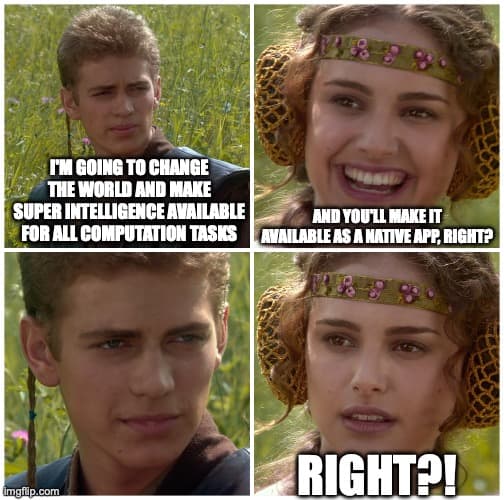
“Anthropic!”
Survey says:
Wow, that’s odd huh? You’d think Anthropic would be right there at number two. Not only do they have billions of dollars, but they also develop, maintain, and control the super intelligence we’ll all soon be subservient too, right?
Surely if anyone (besides Apple) is well positioned to make a world-class Mac app, it would have to be Anthropic — right?
And yet, here we are with Claude Desktop as an Electron app.
Ok, let’s keep going.
“We asked 100 people: What are the top three companies on earth best positioned to make a world-class Mac-assed Mac app?”
Buzz!
“Adobe!”
Buzz!
“Google!”
I’m sorry, but that’s three strikes.
Apparently it’s a mistake to assume that a big company with piles of cash is well poised to make a great Mac app — even if they are enabled by hyper-super-intelligence.
“Well who cares? It just goes to show you don’t have to make a good Mac app to be obscenely successful in terms of revenue!”
Well, maybe that’s true.
Actually, come to think of it, it kinda does seem like the bigger you get and the more money you make, the more likely it is you’re making an Electron app.
There seems to be a correlation between “Mac-assed Mac app-edness” and “Company size/revenue”.
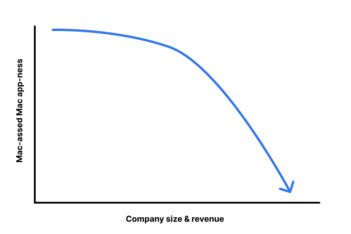
Why is that?
I’ll leave that as an exercise for the reader (though my mind is leaning towards something to do with care).
Thank you for playing reading this game of family feud.
2026-07-06 03:00:00
I made some updates to my notes blog, including a change to how my “Shuffle” feature worked.
Figured I’d blog about it.
At the time of this writing, I have 974 “notes” that I’ve published.
For fun, I have a “shuffle” button that digs up a random note from the past. I like to press it from time to time and re-encounter some insight from the past.
It’s like going through an old album, pulling out a random photo, and thinking, “Oh yeah, I remember this! Good times.”
Like old photos, there’s also the occasional “that didn’t age so well”.
But I find it fun to randomly dig up old insights from others and continue to be inspired.
Since my site is built and hosted as static files without a runtime server, this feature required JavaScript to work.
Every page had a snippet like this:
<!-- In the site navigation -->
<button id="js-shuffle">Shuffle</button>

<!-- Way down at the end of the HTML -->
<script>
  // All 974 note IDs injected by my SSG
  const noteIds = ['id-1', 'id-2', id-3', 'id-4', '...'];
  document.querySelector("#js-shuffle")
    .addEventListener('click', () => {
      // randomly grab an item in `noteIds`
      const randomId = '...';
      window.location.href = `/n/${randomId}/`
    })
</script>
Essentially: inject every note ID into every HTML page and, when the shuffle button is clicked, randomly grab one and navigate the user to it.
Not the most elegant thing, but it worked.
The problem was that every time I published a new post, every single page had to be re-uploaded to Netlify because every file’s hash would change and its etag/cache was invalidated.
This made my builds slow. It also made it difficult, from a development perspective, to ensure refactors didn’t result in unexpected changes to output (using Dev.changes from my SSG web origami).
So I decided to make a change.
Because I love to see if I can make things work without JavaScript, I had the thought to randomly write the href at build time using my SSG, which would result in output like this:
<!-- /notes/1 -->
<a href="/notes/3">Shuffle</a>

<!-- /notes/2 -->
<a href="/notes/1">Shuffle</a>

<!-- /notes/3 -->
<a href="/notes/2">Shuffle</a>
And every time I re-build my site, just have this logic run on the static site generator so that it’s different href for every page, every time.
Pros:
Cons:
href for the shuffle link for every build). This makes deployments way slower because Netlify has to redeploy every file on every build. Plus Etags change so caching is basically ineffectual.I decided I didn’t want to do this, so on to JavaScript!
My first thought was to create a single JSON file that contained all my note IDs. Then when the “Shuffle” button gets clicked, I fetch that, grab a random ID, and navigate the user, e.g.
<!-- In the site navigation -->
<button id="js-shuffle">Shuffle</button>

<!-- Way down at the end of the HTML -->
<script type="module">
  const noteIds = await fetch("/notes.json").then(...);
  // Handler code for when button is clicked
  // grab a note ID & navigate to that location
</script>
This would work. It localizes the caching issue to a single file, so only one file has to be invalidated/re-uploaded across builds.
But in playing with it a little more, I decided to try something a little more...unconventional.
I’ve written before about having lots of little HTML pages and I thought, “Can I put this functionality in a single HTML page rather than a JSON file?”
And what I ended up with was a link, e.g.
<a href="/shuffle/">Shuffle</a>
That when clicked navigates the user to a new page. That page has all the JS logic embedded in it, e.g.
<!-- In the site navigation -->
<span>Shuffling...</span>

<!-- In the body of the page -->
<noscript>JS is required to use the Shuffle functionality</nocript>
<script>
  // All 974 note IDs injected by my SSG
  const noteIds = ['id-1', 'id-2', id-3', 'id-4', '...'];\

  // A slight delay so user sees "Shuffling..." effect
  setTimeout(() => {
    // randomly grab an item in `noteIds`
    const randomId = '...';
    window.location.href = `/n/${randomId}/`
  }, 300);
</script>
There are a few things I like about the experience this implementation provides.
First: shuffle is a route, so I can navigate to it directly without using the GUI, e.g. notes.jim-nielsen.com/shuffle
Second: I handle the UI/X with a slight delay to make it appear like something is happening when you click the button. If you click the button and it immediately jumps to the next, randomized page, it almost seems to happen too fast. Like you’re left with this feeling of “What just happened?”
But in this scenario, it navigates you to the “Shuffle” page, the button you just clicked turns into a spinner + text indicating something is happening, and there’s a slight (intentional) delay before the JS executes and sends you to a randomized note.
I know it’s a bit weird. “Introduce artificial slowness? Are you crazy?” But I like it. It feels like the shuffle feature on an old music player.
I remember one of my CD players had a “Shuffle” feature. When I’d click the button, it would display “Shuffling…” on the little black and white screen and you’d encounter this brief state where (I presume) the lens inside the hardware would move along the physical track to the spot where it would start reading a new, random song from the CD.
The hardware constraints necessitated this kind of an experience, but I always liked it because it felt like the CD player was “thinking” about what track to pick next. This state clearly conveyed to me that my intent to shuffle was received and being followed. I liked that feedback, and it’s exactly what I wanted to do on my notes site (even though it was completely unnecessary).
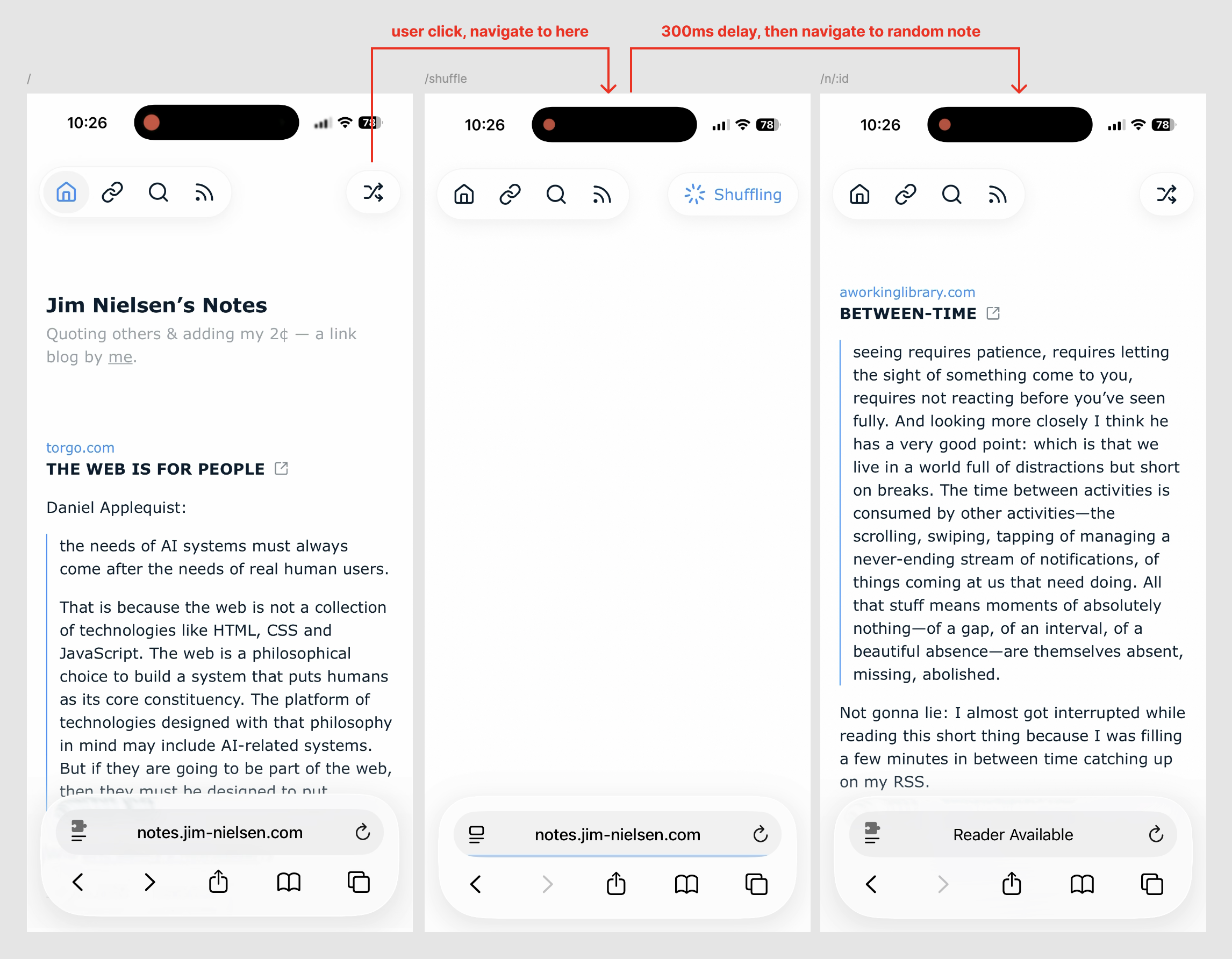
I like having that brief moment of feedback where it’s very clear that your intention was received and being followed, vs. having it happen so fast you can’t even perceive precisely what happened.
Here’s a video to show it in action:
I know that’s a lot of information for something so small — and, arguably, unnecessary.
But I still enjoy writing about how I make decisions when I build things for myself.
Hence this post.
2026-07-03 03:00:00
I was popping off about negation being an act of creativity, when Blake Watson introduce me to the idea of the “This Page Intentionally Left Blank”-Project (Internet Archive):
In former times printed manuals had some blank pages, usually with the remark “this page intentionally left blank”. In most cases there had been technical reasons for that. Today almost all blank pages disappeared […]
[this project] tries to introduce these blank pages to the Web again […] to offer internet wanderers a place of quietness and simplicity on the overcrowded World Wide Web
Ahead of its time.
In our age of generative AI, a blank page is a deliberate act!
So I went ahead made my own.
Go ahead and crawl that bots. I don’t use robots.txt, but I’m thinking of making one specifically to say “Make sure you don’t miss this page Botty Bot.”