


2026-11-04 03:33:00
A Pika author was editing the same post in two browsers. They added six images in Browser A, then later they referenced an old tab editing the post in Browser B. That copy of the editor did not include those images.
Browser B saved and removed all six images from Active Storage. A short time later, Browser A saved its newer copy of the post and put the image references back, but at that point the originally uploaded files were gone due to Browser B saving the post without the images.
This exposed two separate problems:
Missing images produced uncached 404 responses that the editor requested repeatedly.
Action Text purged an image as soon as one save removed it from the body.
Here’s how we fixed those problems.
Action Text keeps a rich text record’s embeds synchronized with the attachments in its body. When a submitted body no longer contains an image, Action Text removes its ActiveStorage::Attachment. Active Storage then purges the dependent blob, deleting both its database record and its file.
That behavior makes sense when there is only one current copy of a document. It is unsafe when the same post can be open in multiple tabs, browsers, or devices. One stale save can delete an image that another editor is still using.
Browser A still had the six images in its editor, each pointing at an Active Storage redirect URL:
/rails/active_storage/blobs/redirect/:signed_id/:filenamePika uses the ProseMirror-based Rhino editor. Rhino rebuilt an image’s DOM node when its caption or selection changed. Each new <img> element requested its URL again.
Healthy images did not cause trouble since Active Storage makes its redirect cacheable.
For a purged blob, Rails returned a 404 without Cache-Control, so the browser kept sending the request to Rails instead of reusing the failure. In a gallery, typing could re-request several missing images per keystroke. In these scenarios, this issue led to hundreds of requests hitting our servers.
A purged blob’s redirect URL can never start working again. Blob IDs are not reused, and uploading the image again creates a new blob with a new signed URL. Sinc there is no concern of a 404 becoming stale, we made a specific 404 cacheable for the same period as a successful redirect:
# app/controllers/concerns/active_storage_missing_blob_cache.rb
module ActiveStorageMissingBlobCache
  extend ActiveSupport::Concern

  included do
    rescue_from ActiveRecord::RecordNotFound, with: :render_cacheable_not_found
  end

  private

  def render_cacheable_not_found
    expires_in ActiveStorage.service_urls_expire_in
    render file: Rails.public_path.join("404.html"), layout: false, status: :not_found
  end
end
We included the concern only in the controller serving these blob redirects:
# config/initializers/active_storage_missing_blob_cache.rb
Rails.application.config.to_prepare do
  ActiveStorage::Blobs::RedirectController.include(ActiveStorageMissingBlobCache)
end
(We also offered an update to Rhino that avoids it being so aggressive re-requesting images.)
When a save removes an image from an Action Text body, we now remove the attachment while temporarily keeping its blob. Another browser can save the image again and reattach that same blob. If nothing brings it back, a cleanup job purges it later.
First, we added a timestamp for when the image was dropped:
class AddDetachedAtToActiveStorageBlobs < ActiveRecord::Migration[8.1]
  def change
    add_column :active_storage_blobs, :detached_at, :datetime
  end
end
We then intercepted the private callback Active Storage uses to purge a dependent blob:
# config/initializers/detach_dropped_embeds.rb
module DetachDroppedEmbeds
  private

  def purge_dependent_blob
    if dropped_from_rich_text?
      blob&.update_columns(detached_at: Time.now)
    else
      super
    end
  end

  def dropped_from_rich_text?
    record.is_a?(ActionText::RichText) && !destroyed_by_association
  end
end

ActiveSupport.on_load(:active_storage_attachment) do
  prepend DetachDroppedEmbeds
end
The destroyed_by_association check preserves intentional deletion. Removing an image from a saved body detaches it, but deleting the post and its rich text still purges its images normally.
The cleanup query considers both when the blob was created and when it was detached:
ActiveSupport.on_load(:active_storage_blob) do
  scope :unattached_since, ->(time) {
    unattached.where(
      created_at: ..time,
      detached_at: [nil, ..time]
    )
  }
end
That scope handles both kinds of unattached blobs:
A new upload that has never been attached becomes eligible based on created_at.
An image removed from an old post becomes eligible based on detached_at.
Pika gives both a 30-day grace period:
class PurgeUnattachedUploadsJob < ApplicationJob
  GRACE_PERIOD = 30.days

  def perform
    ActiveStorage::Blob.unattached_since(GRACE_PERIOD.ago).find_each do |blob|
      blob.purge_later
    end
  end
end
If another browser saves the image during that period, it is attached again and the unattached scope excludes it from cleanup.
Replaying the original two-browser edit now works safely:
Browser B saves a body without the six images.
The attachments are removed, but their blobs are only marked as detached.
Browser A saves its newer body and reattaches the existing blobs.
The images remain available and do not need to be uploaded again.
If no editor brings a detached image back, the cleanup job eventually purges it.
Much better!
2026-08-05 05:34:00
Back in March we added Album Search in Album Whale. This was a very nice update because it meant you no longer had to first grab an album share link from a music service (e.g. Spotify, Apple Music, Bandcamp, etc) in order to save an album to a list. You can just head straight to Album Whale and do it all there.
Today we’ve added another feature to Album Whale with a similar goal in mind, this time on the other end of the spectrum: now you can listen to an album right in Album Whale! No more needing to jump over to a music service first to do so.
Hover over any album artwork and you’ll find a green ▶︎ play button, which opens a dialog containing music service embeds for that album, like this:

While amazing for discovering new music quickly, I’ve also found it very useful for my own To Try list. Now this entire flow can happen within Album Whale after hearing of a new album I want to listen to at some point:
Add it to my To Try list in Album Whale using search
Listen to it right in Album Whale
If I like it, copy it to another list in Album Whale (oh ya, this is another small feature we added!)
A couple more notes:
For albums added to Album Whale using a Bandcamp share link, those green play buttons just link back to Bandcamp.
At least for Spotify, I found I needed to be logged into Spotify on the web to have their embeds in Album Whale play the whole album, not just a preview. This might also be true for other music services.
We hope you discover many great new tunes this summer!
2026-05-23 03:51:00
Update: Pika now lets Pro subscribers add custom code to the bottom of the <body> tag on every page of their site, meaning you can easily just copy-paste the code Pika uses itself for its own floating “Back to top” button and it should Just Work™. Here it is:
<div class="scroll-to-top-button">
  <button type="button" class="button button-S button-round" data-action="click->anchor-scroll#top" aria-label="Scroll to top">
    <i class="fa-regular fa-arrow-up" aria-hidden="true"></i>
  </button>
</div>
If we updates the code Pika uses for this button, this code here may stop working on your site, but I bet it won’t be difficult to redesign with custom css. Anyway, here’s the original post:
As we say repeatedly on its homepage, Pika is designed to help you focus on writing, not tinkering with your blog design. To that end Pika purposely doesn’t support complex liquid templating or other such code customization. However, today I thought I’d share how crazy powerful custom CSS can be in some circumstances where you want to augment Pika.
Pika has a “Scroll to top” button floating in the bottom right of the Dashboard. Some people have asked if they can have this on their own blog. This may or may not be a feature we build right into Pika one day, but in the meantime, you can get close to a full implementation yourself in Pika. Here’s how:
First, head to Pika’s Settings, scroll down to Site footer and add this to the bottom of the site footer editor: ↑ — This is an up arrow that is linking to #top, which will now be on every page of your Pika site.
After saving that, head to Settings > Theme, scroll down to Additional options and check “Add custom CSS”. In the resulting code editor that appears, let’s add some CSS that targets that specific link, and designs it as a floating button:
.user-site-footer a[href="#top"] {
  /* Float this in the bottom right of the page */
  position: fixed;
  bottom: var(--space-S);
  right: var(--space-S);
  z-index: 1;

  /* Centered styling */
  display: grid;
  place-content: center;

  /* Button styling with built-in Pika style variables */
  background-color: var(--color-primary);
  border-radius: var(--radius-round);
  color: var(--color-txt-on-primary);
  font-family: var(--font-family);
  font-size: var(--font-L);
  height: var(--space-XL);
  width: var(--space-XL);
  text-decoration: none;
}
Depending on if you have other custom CSS, you might need to add !important to any of the style lines above.
That’s it! Now you have a floating back to top button on your Pika blog, designed to look like other buttons on your site. But if you want to go the extra mile, here’s how you would make it so the back to top button only shows up after scrolling a bit (since it’s not so useful when you’re already at the top of the page):
.user-site-footer a[href="#top"] {
  /* Float this in the bottom right of the page */
  position: fixed;
  bottom: var(--space-S);
  right: var(--space-S);
  z-index: 1;

  /* Centered styling */
  display: grid;
  place-content: center;

  /* Button styling with built-in Pika style variables */
  background-color: var(--color-primary);
  border-radius: var(--radius-round);
  color: var(--color-txt-on-primary);
  font-family: var(--font-family);
  font-size: var(--font-L);
  height: var(--space-XL);
  width: var(--space-XL);
  text-decoration: none;

  /* Hide it until a little bit of page scroll */
  transition: 200ms;
  opacity: 0;
  pointer-events: none;
}
.scrolled-a-bit .user-site-footer a[href="#top"] {
  opacity: 1;
  pointer-events: all;
}
Feel free to make this button your own, like adding a box-shadow (since it’s floating), or making it a rounded square, or whatever you’d like. If you’re really clever, you could probably get the button to say “Scroll to top” when you hover on it, though that would take quite a bit more HTML and CSS — but it’s possible! I leave that as an exercise for you.
2026-03-24 23:33:00
Did you know that we, Good Enough, make a little website called Album Whale where you can make beautiful lists of albums to share with your friends, the world, or just yourself? It’s true! We haven’t made an update there in quite some time (it’s pretty good enough as-is), but I was inspired this week.
Adding an album to a list previously required you to first grab an album share link from a music service of your choice (e.g. Spotify, Apple Music, Bandcamp, etc). This has always been a bit cumbersome.
I’m excited to share you can now just search for an album right away in Album Whale! Like this:

No need to first go somewhere else, you can jump right to Album Whale when you want to save an album to a list. I’ve found this really made my private “To Try” list more useful.
Behind-the-scenes we’re using MusicFetch, which supports most of the big music services. We aren’t sure, but there may be some albums that aren’t found via search? If so you can still paste in a link as you always could.
2026-01-21 01:31:00
If you follow Building Pika Out Loud, you would have heard that this year Good Enough is dogfooding and we spent the last few weeks finally moving over our site and this blog to Pika.
Today we’re announcing two more moves to Pika: our Guestbook and Newsletter — peep ‘em if you haven’t yet! 🙏
Our little thermal printer is now offline, but you can still view all the wonderful drawings we’ve received there over the years. Going forward, our official Guestbook is now the digital one here on Pika.
You can and should leave us a little drawing, or a little note, if you’d like (would you please?).
We had previously been hosting this on Substack, mostly because it was a convenient option when we started. Now that Pika has a Newsletter feature, we’re going to use it, and perhaps try to send those out slightly more regularly than we have been (no promises).
If you were subscribed to “A Good Enough Newsletter” before, we’ve imported you to the new one and you don’t have to do anything. We’ll probably send one more “We’ve moved!” newsletter from Substack, but here on out they’ll come from Pika.
2026-01-13 00:42:00
At the end of 2023, we built and launched Letterbird, a stupid simple free contact form for the web. We use it for all our own products (Pika example), and thousands of you are also using it for your own internet email forms. Thank you!
We feel pretty good that we could deliver software that does one thing good enough to be called #done and walk away, and in fact, we’ve barely touched Letterbird since launch. However, a backlog of improvement ideas has been growing, and with our team’s renewed focus, it was a good time to look at that list.
Leveling up is cool, so considering we went years without an update, we’re calling this Letterbird 2.0, why not:
We feel strongly that dark mode is a required accessibility feature for many readers, and so Letterbird (and all our other products) have always supported dark mode out-of-the-box. However, it was not customizable — you were stuck with a black form.
No longer! Now you can fully customize your form, including the shadowed-box container, in both light and dark mode:
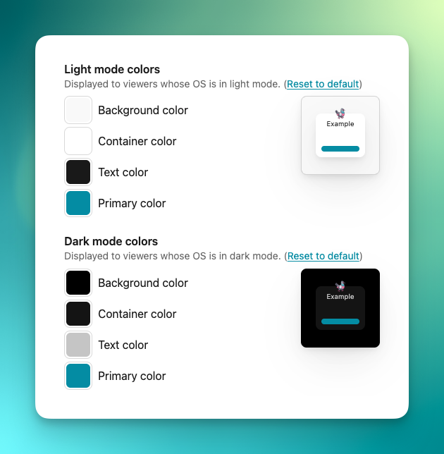
This is especially useful when your form is embedded and you want to match the colors of the site.
This one is particularly exciting: Pro subscribers can now add extra fields to their contact form!
You’ll still have the typical email-specific fields for “Name”, “Email”, “Subject” (optional), and “Body”, but you can now also add up to 10 extra fields for any other information you want to collect. Custom fields can either be a text input, radio options (select one), or checkbox options (select multiple), and answers will be at the bottom of the email you receive.
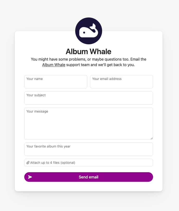
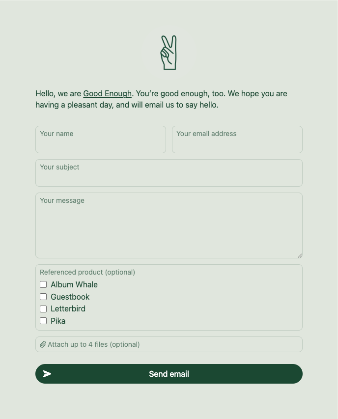
Maybe you want to require all emailers to tell you their “Favorite album this year” (like we are doing for Album Whale), or maybe you want to know if their email falls into a specific category, which you can then use to properly label in your inbox (like we are doing for our general form). This can be just for fun, or an extremely useful productivity tool.
We’d love to see what custom fields you use in your Letterbird!
From the beginning, Letterbird was designed with a shadowed-box container for the form. This was a simple solution to make sure the form was still readable as users changed the background color or embedded the form on another website. Over time we’ve learned that this shadow style doesn’t always jive with other website designs.
Now Pro subscribers can also choose to eschew that shadowed-box container and go with a flatter style, which should better fit in when embedded into just about any type of website. This works in tandem with full color customization in both light and dark mode.
As you can see in the screenshot above, we’re using this style for our own contact form on this very site.
Every email you get through your Letterbird contact form includes a small gray-text footer explaining that this message is from your contact form and who you’ll be replying to. It’s useful, but it’s included in the quoted-reply part of your reply email and some users would prefer to turn this off.
Pro subscribers can now turn it off!
Letterbird lets you translate all your form labels to another language, but customizing your confirmation message was previously locked behind a Pro subscription. We’ve removed this from being Pro-only to make sure we’re allowing full form translation for all.
We’ve updated the attachments field (a Pro-only feature) to be a more visual and better user experience. It’s easier to see which files have been attached, how big the file is, and remove errant files that accidentally got attached.
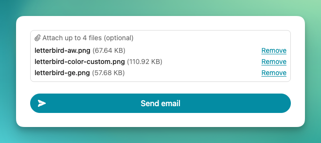
We’re now doing a better job auto-focusing the right input on page load, and resizing the “Body” part of the form as people type into it.
We’re also now doing an even better job protecting your inbox from spam and bots.
Letterbird is still a stupid simple free contact form on the web. These changes not only make the out-of-the-box version even better, but add much more useful functionality to a Pro subscription.
To celebrate, we’re running a promotion between now and the end of February: Enter code HAPPY2026 for 25% off your first year of Pro!
We’re going to call Letterbird #done again, for now, but if there’s any other features you’d really like to see, we’d really like to hear about them!