2026-06-03 04:51:43
I’ve started a new Cool Infographics video series on YouTube. In each episode, my co-host Jarred Romley and I will discuss an infographics design and cover the pros and cons of the design, how to make it better, the design tools used, and finish with some Cool Picks each time.
Over the course of my career I’ve learned that every design could be improved and teach us lessons. We’re going to review and critique some the the best and the worst infographics. Communicating with infographics requires a special set of skills, and we can learn a lot by looking at the designs, the tools they used, how they were published, and how audiences responded.
Cool Infographics VideosLike and Subscribe on YouTube
YouTube algorithm depends on Subscribes, Likes, and Comments.
Share with your co-workers and friends
Each episode has a few easily shareable shorts. You can find them on YouTube Shorts, Facebook Reels or LinkedIn Videos. Help spread the word by liking and sharing the short clips.
Submit your ideas
Send us links to data visualizations and infographics you think we should discuss. You can add comments on the videos or reply to this email. I read them all.
2026-03-18 01:29:39
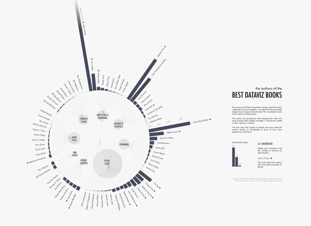
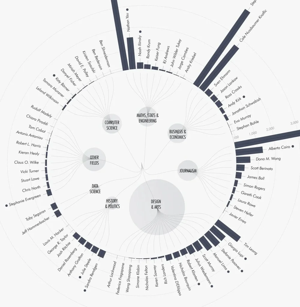
Evelina’s chart of The Authors of the Best Dataviz Books, combines the dataviz community’s published book authors to show which field everyone has come from. A good example of showing how diverse communities can utilize and benefit from data visualization. I made the chart under the Math, Stats, & Engineering section. Do you see other names you know?
Since you're reading this newsletter, you likely work with data visualisation and storytelling. But how did you get here? What's your background?
Probably only a handful of you can say you have a formal education in data visualisation—maybe even a bachelor's or master's degree. Most of us have taken a more winding path of study and work experiences that brought us to where we are today. I worked with data analytics, public speaking, nonprofits, and event management, before all these experiences led me to data storytelling.
At the very beginning of my visualisation journey, I was curious about everyone else’s paths. So I created a chart (very meta, I know!) about the diverse fields that people in our community come from. While it’s somewhat biased—based on published book authors—it gives you an idea of how many different disciplines can lead to dataviz.
Found on The Plot by Evelina Parrou
2025-12-13 01:51:50
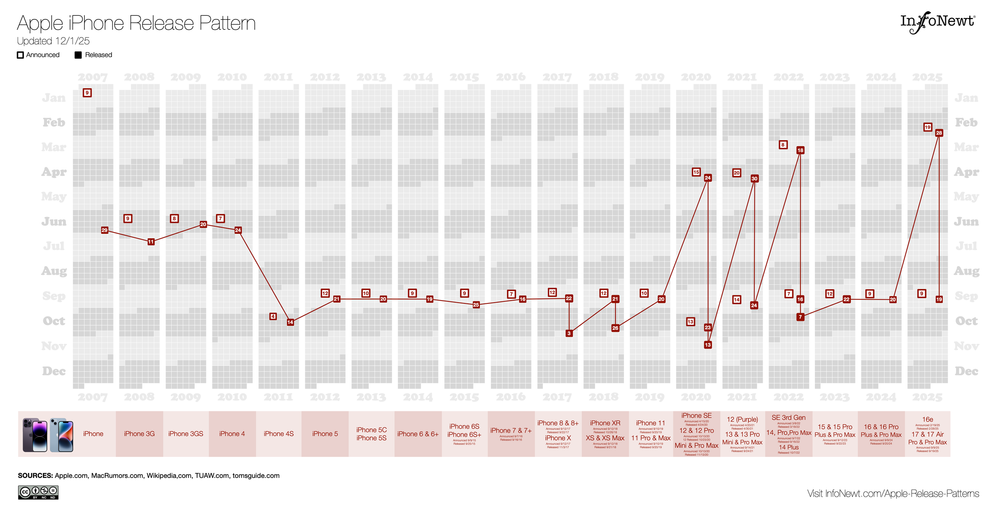
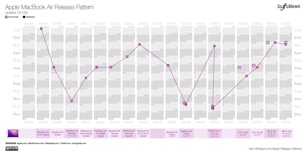
Can I predict the Apple product releases coming out in March based on their history of product releases? I think so. Based on my Apple Release Pattern charts, I predict Apple will release new iPads, iPhone 17e, MacBook Airs, and it’s a long shot for an updated Mac Studio and/or MacBook Pros.
Apple traditionally doesn't release any products during December, so all of my Apple Release Patterns infographics are complete and up-to-date for 2025. You can see them all on the InfoNewt site, and that’s where I continue to maintain them and post updates as Apple releases new products and updates.
You can see that some products, like the iPhone, follow a fairly regular and predictable release schedule. Other products, like the MacBook Air, are much more unpredictable.
2025-10-30 09:55:53
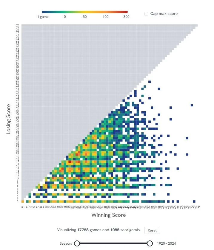
Scorigami: Visualize Every NFL Score Ever is a fun interactive infographic were you can see every final NFL score in history and how often each score occurs. PerThirtySix took the inspiration from Jon Bois coined term “scorigami” and is updated weekly.
You can view all team or use the controls to narrow down the visualization to just the teams and years you want to see. It’s fun to play with.
A scorigami is a final score that has never happened before in the history of the NFL. The term was coined by Jon Bois and narrated in a 2017 video called Every NFL Score Ever (highly recommended, Jon Bois is one of best storytellers out there!). Since then, scorigami has entered the football lexicon and has become a fun way to track the history of the NFL.
Found on PerThirtySix
2025-10-15 02:42:28

The Planetary Society has a great collection of infographics and data visualizations about NASA and the U.S. Space Program.
Founded in 1980 by Carl Sagan, Louis Friedman, and Bruce Murray, The Planetary Society is the world’s largest and most influential non-profit space organization. With a global community of more than 2 million space enthusiasts, they promote their mission to “Empower the world’s citizens to advance space science and exploration.”

2025-10-07 03:12:59

For all of my fellow book authors, you can now positively determine if pirated copies of your book(s) were illegally used in the training of AI models. Use the search tool here: https://secure.anthropiccopyrightsettlement.com/lookup
Doing a quick check, I confirmed that the Cool Infographics book is included, as well as many of the other data visualization and infographics books that I have in my library. A quick check of many other popular dataviz authors confirms that pirated books by Alberto Cairo, Steve Wexler, Cole Nussbaumer Knaflic, Nathan Yau, Edward Tufte, Stephen Few, Garr Reynolds, Jonathan Schwabish, RJ Andrews, Manuel Lima, Andy Kirk, Noah Iliinsky, Scott Berinato, Ben Jones, Naomi Robbins, and David McCandless are all included in the training database.
The double-edged sword is that the inclusion of these books makes the AI models really good at giving advice about data visualizations, charts, and infographics. The models learned from the best. The downside is no compensation or credit is given to any of these authors who spent years of work building their knowledge and writing comprehensive books.
As part of the class action Anthropic Settlement from Bartz v. Anthropic in September 2025, an online searchable Works List of all books included in the lawsuit is now available. Authors can search the database to positively determine which of their book(s) were used to train the Anthropic models. Of course, not just dataviz books, but thousands of fiction and non-fiction books.
Historically, there hasn’t been an absolute list of pirated books used to train the major AI platforms. Allegedly, the BOOKS3 and LIBGEN databases online were lists of pirated books used by chatGPT, Meta and others to train their AI models. However, there was never any official confirmation by any of the AI companies about which specific pirated books they used.
This new development from the Anthropic settlement, is that they have made public a searchable database of the books covered under the lawsuit that were used in the training of their AI models. The lawsuit settlement forced them to be specific about which books were used. Although the search tool is convenient, it falls short of actually publishing the full list.
As an author, if you wish to be included in the settlement, you can file a claim on the settlement website: https://www.anthropiccopyrightsettlement.com