2026-07-25 04:37:44
Lil Finder Guy. Born: 2026.04.11. Height: One Apple Tall.
It’s been several months since Apple launched the MacBook Neo and the ad campaign that gave birth to “Lil’ Finder Guy,” the adorable Finder-faced mascot that stole my heart and quickly took over parts of the internet.
Since their debut, we’ve learned a little more about the mascot through posts shared by Apple employees, including a look at the campaign’s appearance at the Cannes Lions festival and, most recently, some of the early sketches and design details that helped bring Lil’ Finder Guy to life.
And so, in an follow-up to my previous post about Lil’ Finder Guy, I wanted to collect all this updated bit of information and compile it into a single entry.
Apple’s Neo submission at Cannes Lions. Photo originally by Rachel Karten but the image has been adjusted.
I learned about Apple’s submission of its MacBook Neo campaign to Cannes Lions, an annual festival in France celebrating creativity in advertising, marketing, and design, during Episode 610 of Connected. The gang shared a link to a post by Joe Burger, an Associate Creative Director at Apple, who had posted about the campaign’s submission to the festival. The poster reads:
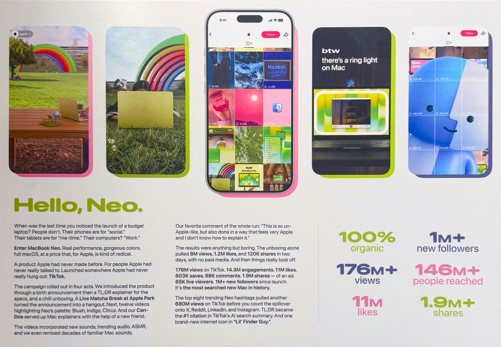
“When was the last time you noticed the launch of a budget laptop? People don't. Their phones are for "social." Their tablets are for "me-time." Their computers? "Work."
Enter MacBook Neo. Real performance, gorgeous colors, full macOS, at a price that, for Apple, is kind of radical.
A product Apple had never made before. For people Apple had never really talked to. Launched somewhere Apple had never really hung out: TikTok.
The campaign rolled out in four acts. We introduced the product through a birth announcement then a TL;DR explainer for the specs, and a chill unboxing. A Live Matcha Break at Apple Park turned the announcement into a hangout. Next, twelve videos highlighting Neo's palette: Blush, Indigo, Citrus. And our Can-Dos served up Mac explainers with the help of a new friend.
The videos incorporated new sounds, trending audio, ASMR, and we even remixed decades of familiar Mac sounds.
Our favorite comment of the whole run: "This is so un-Apple-like, but also done in a way that feels very Apple and I don't know how to explain it."
The results were anything but boring. The unboxing alone pulled 8M views, 1.2M likes, and 120K shares in two days, with no paid media. And then things really took off.
176M views on TikTok. 14.3M engagements. 11M likes. 603K saves. 98K comments. 1.9M shares — of an ad. 65K live viewers. 1M+ new followers since launch. It's the most searched new Mac in history.
The top eight trending Neo hashtags pulled another 680M views on TikTok before you count the spillover onto X, Reddit, Linkedin, and Instagram. TL;DR became the #1 citation in TikTok's Al search summary. And one brand-new internet icon in 'Lil' Finder Guy.'“

Lil Finder Guy Pin. Source: Tyler Stalman
Lil’ Finder Guy made their next appearance at WWDC, when attendees began posting photos of Lil’ Finder Guy pins included as part of their swag for attending the event. The pins were very limited, and unfortunately, incredibly elusive to find resellers online, with the few listings that have appeared asking anywhere from hundreds to more than a thousand dollars.
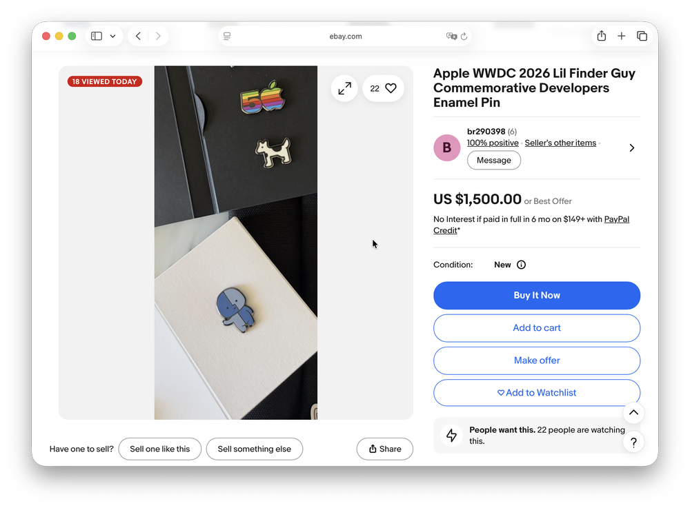
Rare listings for the Lil Finder Pin are unhinged.
The pin also gave us our first proper look at a flatter, two-dimensional version of Lil’ Finder Guy. Up until this point, most of the images we’d seen depicted them as a more three-dimensional character.

Lil Finder Guy based on the enamel pin gifted to attendees at WWDC.
But that wasn’t their only appearance at WWDC. Lil’ Finder Guy also made an incredibly quick and understated cameo behind Stacey Ford, VP of OS Program Management, during the opening moments of the WWDC keynote, tucked away behind one of the laptops on screen.

Look behind the MacBook to the left of Stacey at the 06:28 mark and you’ll see a little Finder Guy peeking out. Source: Apple

The decapitated head and body of Lil Finder Guy, posted by Sofia Coelho on LinkedIn (post since removed).
Our next drop of information came through another LinkedIn post in late July, this time in the form of a “BELATED BIRTHDAY ANNOUNCEMENT” from Apple art director Sofia Coelho, who wrote:
"BELATED BIRTHDAY ANNOUNCEMENT: On March 4th at 11:00 a.m., measuring exactly one apple tall, a mascot, charmingly coined by the internet as Lil' Finder Guy, was born!
Getting to lead the visual design and concept for this character and then watching it take off as a full-blown ‘internet icon’ (internet's words, not mine!) was a dream design project.
This lil fella is part of the larger MacBook Neo launch on TikTok, which I had the pleasure of working on with an insanely talented team. Thank you to everyone who brought this project to life.
You can check it all out on Apple's TikTok profile!”
Can we all just appreciate for a moment how adorable it is that Lil' Finder Guy is measured in units of apples?
In addition to the announcement, the post also shared a model of Lil' Finder Guy (albeit decapitated), and a few sketches showing the early prototyping phase of its creation.

Early sketches of Lil Finder Guy, posted by Sofia Coelho on LinkedIn (post since removed)
Thankfully, Apple’s tiny Finder-faced mascot hasn’t disappeared just yet. Since their debut, we’ve gotten a few more glimpses behind the scenes, including Apple’s Cannes Lions submission, an incredibly elusive WWDC pin, a tiny keynote cameo, and even some early sketches showing how Lil’ Finder Guy came to life. I hope we continue to see more of Apple’s adorable mascot in the days to come.
If you can’t get enough of this little mascot, I have made a small collection of merch including stickers, an enamel pin (note: shipping may be higher because tariffs, customs, and fuel surcharges), shirts & hoodies (version 1 | version 2), beanies, and hats (version 1 | version 2)
2026-07-14 04:32:38
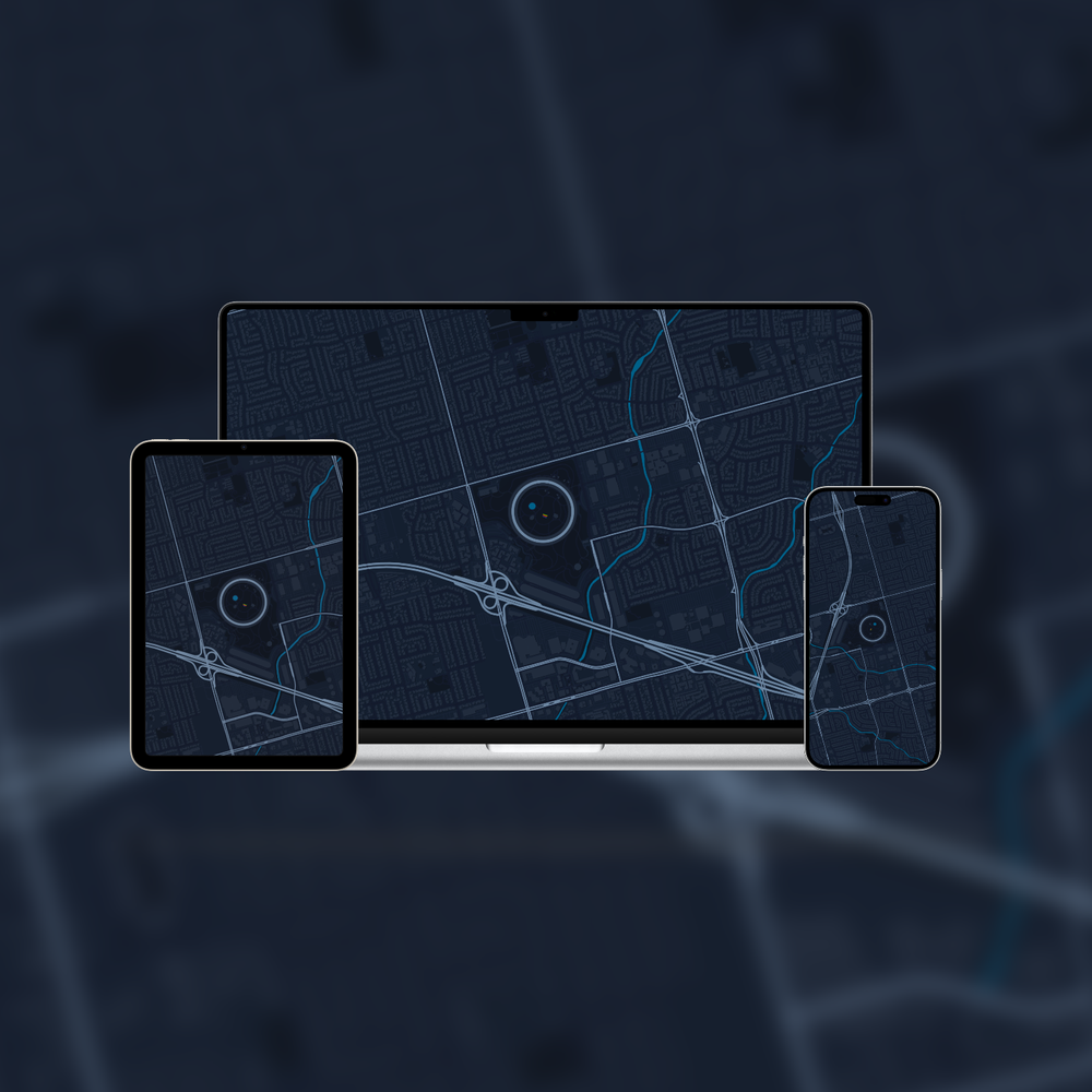
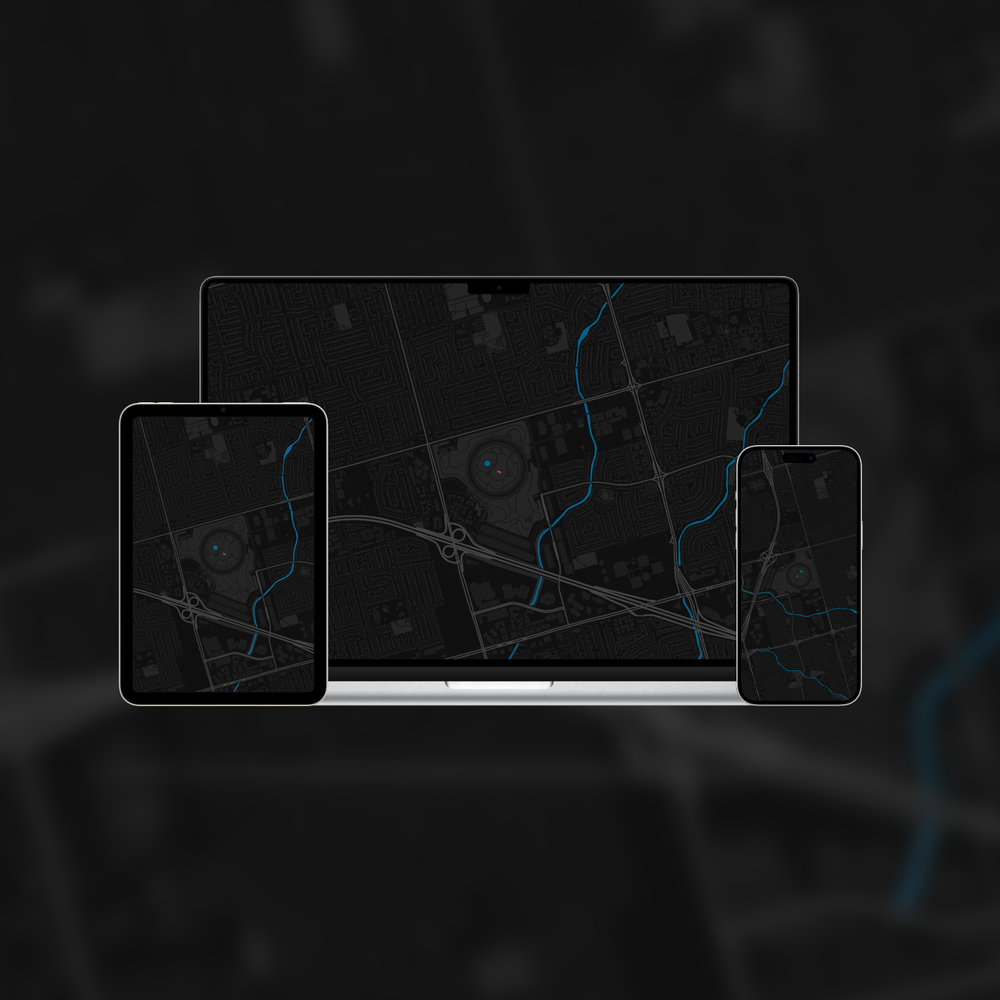
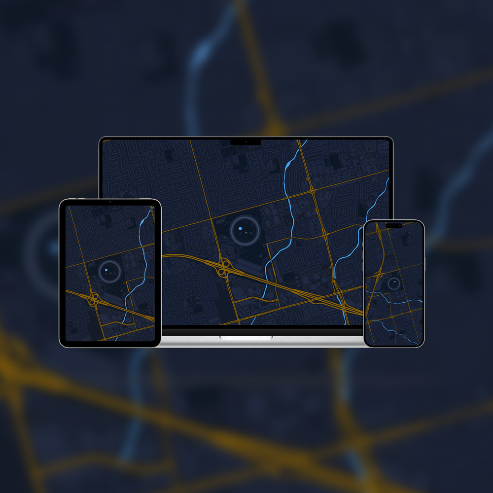
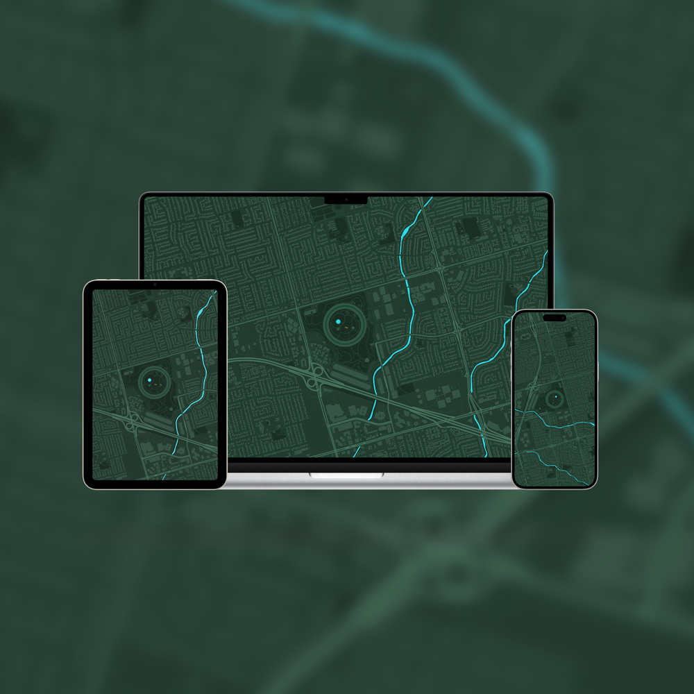
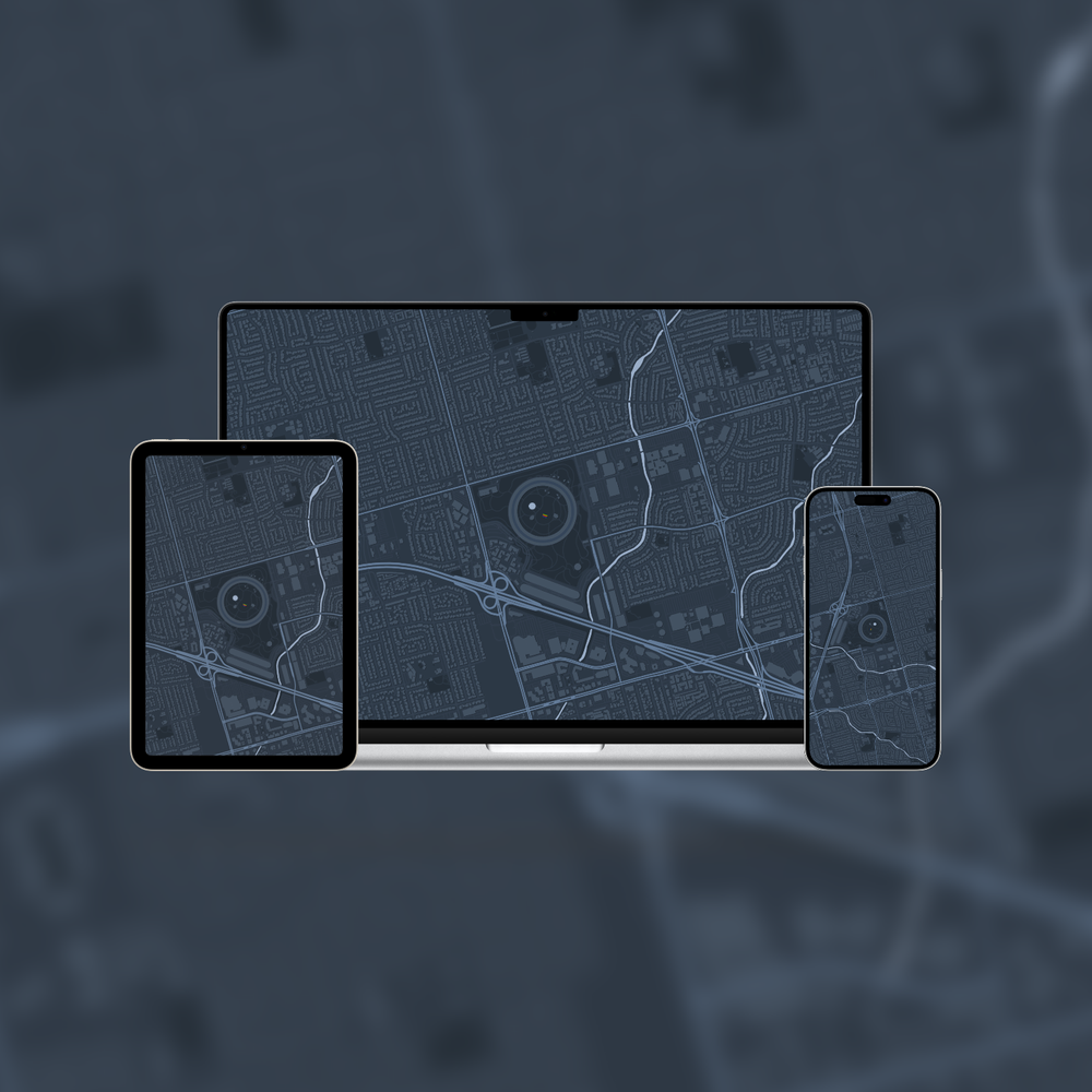
Introducing Atlas Apple Park, a new collection of topographic wallpapers of the Cupertino area and the Apple Park campus.![]()
Over half a decade ago, I created a collection of topographic Apple Park wallpapers, and today I’m revisiting it.
The collection features a range of colourful and more subdued designs showing the Cupertino area, with Apple’s sprawling 175-acre campus at the centre.
You can see Apple’s enormous spaceship building, which measures 4,805 feet (1,465 m) around, along with the fountain and rainbow arch inside the 30-acre courtyard. Just south of the main campus sits the Steve Jobs Theater, and if you look west of Apple’s current headquarters, you’ll also spot its former home at Infinite Loop.
To create the wallpapers in this series, I started with Terraink, a website developed by Yousif Amanuel that uses open-source map data from OpenStreetMap to generate colourful topographic maps. After downloading the SVG files, I brought them into Sketch and Pixelmator Pro to refine the colours and create a collection of wallpapers for all your Apple devices.
And if none of my designs are quite to your taste, Terraink makes it incredibly easy to customize the colours and map details so you can create something that looks exactly the way you want. Enjoy!

2026-07-04 11:49:52
RAMmaggedon comes for Apple, leaving price increases of up to 67% in its wake.![]()
On Friday, June 26, 2026, Apple took down their retail store. Usually a signal of new products about to drop, you’d be forgiven for getting excited. But when the store came back online, we saw the inevitable outcome of what Apple, and the rest of the tech industry, has been battling for the better part of the past year: the significant skyrocketing of memory and storage prices.
Apple had increased their prices. And by a lot!
When the store came back online, the cost of nearly every Apple product, save for the Apple Watch, iPhone, and polishing cloth (for now), had gone up by 6–67%.
Just over a week prior to the increase, Tim Cook gave an interview to the WSJ where he hinted at the inevitable price increase to come:
“Unfortunately, price increases are unavoidable... We’re doing our best to mitigate the huge increases that are being passed to us, and we’ve been trying to shield our customers from the increases, but the situation has become unsustainable.”
And since the move affects all sorts of chips, memory and storage alike, the more memory and storage you configure into your build, the steeper your price increase will be.
For example, if you got a base M5 MacBook Air with a 10-core CPU, 8-core GPU, 16GB of memory, and 512GB of storage, the price increased from $1,099 to $1,299, an 18.2% increase.
But if you went with a top-specced MacBook Air with 32GB of memory and a 4TB SSD, the price jumped from $2,699 to $3,499, a 29.6% increase.
Below you’ll find a bunch of charts chronicling the current state of RAMmaggedon, the global memory-chip crisis we currently find ourselves in. Prices listed are in USD and current as of July, 2026.
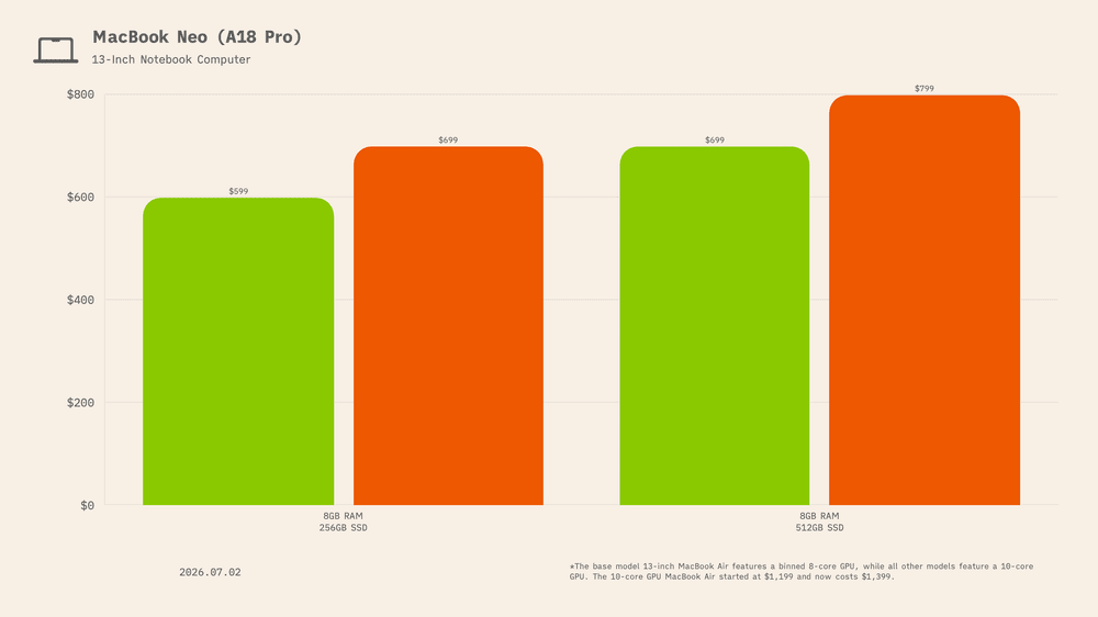
Not even Apple’s recently released MacBook Neo escaped unscathed. Released only four months ago, the MacBook Neo started at just $599, or $499 for Education.
But RAMmaggedon doesn’t discriminate, and the base 8GB memory / 256GB storage configuration increased from $599 to $699, a $100 jump, or 16.7%. The Neo with 512GB of storage increased from $699 to $799, another $100 increase, or 14.3%.
Education prices have increased as well, now starting at $599 and $699 depending on configuration.
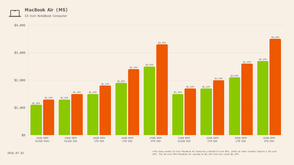
For the 13-inch M5 MacBook Air, the base 16GB memory / 512GB storage configuration increased from $1,099 to $1,299, a $200 jump, or 18.2%. The base model 13-inch MacBook Air features a binned 8-core GPU, while all other models feature a 10-core GPU. The 10-core GPU MacBook Air started at $1,199 and now costs $1,399 (16.7% increase)
Moving up to 24GB of memory, the 512GB model increased from $1,299 to $1,499, a $200 increase, or 15.4%. The 1TB model went from $1,499 to $1,799, a $300 increase, or 20.0%. The 2TB model climbed from $1,899 to $2,399, a $500 increase, or 26.3%. And the fully loaded 24GB / 4TB configuration rose from $2,499 to $3,299, an $800 increase, or 32.0%.
For the 32GB memory configurations, the 512GB model increased from $1,499 to $1,699, a $200 increase, or 13.3%. The 1TB model went from $1,699 to $1,999, a $300 increase, or 17.7%. The 2TB model jumped from $2,099 to $2,599, a $500 increase, or 23.8%. And the top-specced 32GB / 4TB model rose from $2,699 to $3,499, an $800 increase, or 29.6%.
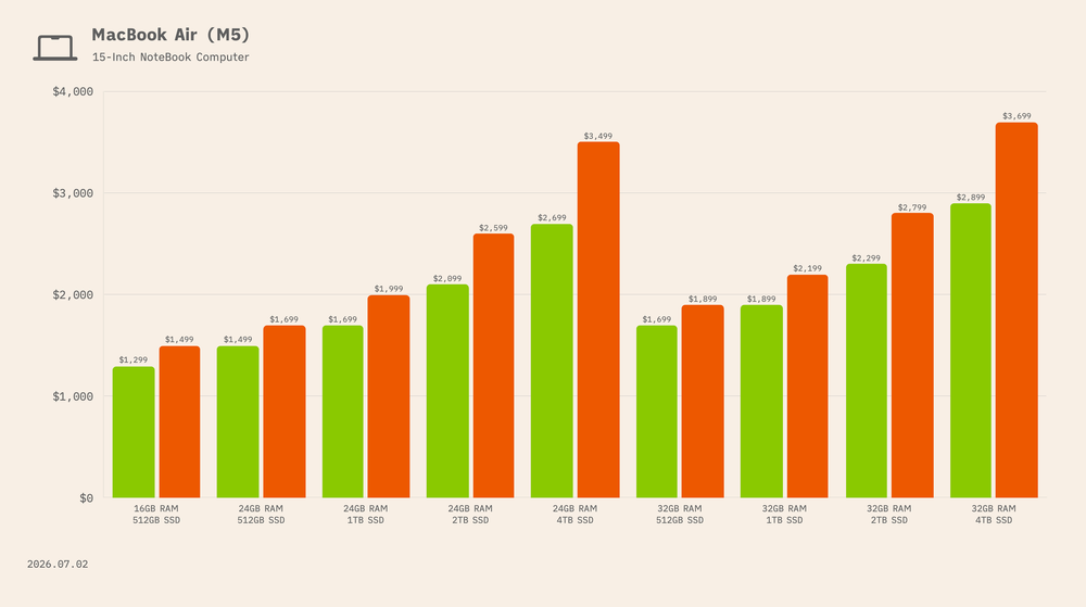
For the 15-inch M5 MacBook Air, the base 16GB memory / 512GB storage configuration increased from $1,299 to $1,499, a $200 jump, or 15.4%.
Moving up to 24GB of memory, the 512GB model increased from $1,499 to $1,699, a $200 increase, or 13.3%. The 1TB model went from $1,699 to $1,999, a $300 increase, or 17.7%. The 2TB model climbed from $2,099 to $2,599, a $500 increase, or 23.8%. And the fully loaded 24GB / 4TB configuration rose from $2,699 to $3,499, an $800 increase, or 29.6%.
For the 32GB memory configurations, the 512GB model increased from $1,699 to $1,899, a $200 increase, or 11.8%. The 1TB model went from $1,899 to $2,199, a $300 increase, or 15.8%. The 2TB model jumped from $2,299 to $2,799, a $500 increase, or 21.7%. And the top-specced 32GB / 4TB model rose from $2,899 to $3,699, an $800 increase, or 27.6%.
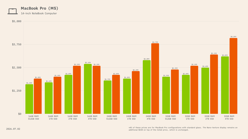
For the 14-inch M5 MacBook Pro, the base 16GB memory / 512GB storage configuration increased from $1,599 to $1,899, a $300 jump, or 18.8%.
Moving up to 16GB of memory with 1TB of storage, the price increased from $1,699 to $1,999, a $300 increase, or 17.7%. The 2TB model went from $2,099 to $2,599, a $500 increase, or 23.8%. And the 4TB configuration rose from $2,699 to $3,499, an $800 increase, or 29.6%.
For the 24GB memory configurations, the 512GB model increased from $1,799 to $2,099, a $300 increase, or 16.7%. The 1TB model went from $1,899 to $2,299, a $400 increase, or 21.1%. The 2TB model climbed from $2,299 to $2,899, a $600 increase, or 26.1%. And the 24GB / 4TB configuration rose from $2,899 to $3,799, a $900 increase, or 31.0%.
For the 32GB memory configurations, the 512GB model increased from $1,999 to $2,399, a $400 increase, or 20.0%. The 1TB model went from $2,099 to $2,599, a $500 increase, or 23.8%. The 2TB model jumped from $2,499 to $3,199, a $700 increase, or 28.0%. And the top-specced 32GB / 4TB configuration rose from $3,099 to $4,099, a $1,000 increase, or 32.3%.
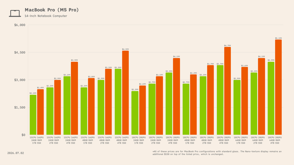
For the 14-inch M5 Pro MacBook Pro with the 15-core CPU / 16-core GPU configuration, the base 24GB memory / 1TB storage model increased from $2,199 to $2,499, a $300 jump, or 13.6%. The 2TB model went from $2,599 to $2,999, a $400 increase, or 15.4%. And the 4TB configuration rose from $3,199 to $3,999, a $800 increase, or 25.0%.
For the 48GB memory configurations on that same M5 Pro chip, the 1TB model increased from $2,599 to $3,099, a $500 increase, or 19.2%. The 2TB model climbed from $2,999 to $3,599, a $600 increase, or 20.0%. And the 48GB / 4TB configuration rose from $3,599 to $4,599, a $1,000 increase, or 27.8%.
Moving up to the M5 Pro with the 18-core CPU / 20-core GPU, the 24GB memory / 1TB storage model increased from $2,399 to $2,699, a $300 jump, or 12.5%. The 2TB model went from $2,799 to $3,199, an $400 increase, or 14.3%. And the 4TB configuration rose from $3,399 to $4,199, a $800 increase, or 23.5%.
For the 48GB memory configurations on the 18-core CPU / 20-core GPU M5 Pro chip, the 1TB model increased from $2,799 to $3,299, an $500 increase, or 17.9%. The 2TB model climbed from $3,199 to $3,799, a $600 increase, or 18.8%. And the 48GB / 4TB configuration rose from $3,799 to $4,799, a $1,000 increase, or 26.3%.
And for the 64GB memory configurations, the 1TB model increased from $2,999 to $3,699, a $700 increase, or 23.3%. The 2TB model jumped from $3,399 to $4,199, a $800 increase, or 23.5%. And the top-specced 64GB / 4TB configuration rose from $3,999 to $5,199, a $1,200 increase, or 30.0%.
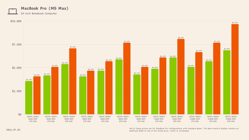
The 14-inch M5 Max MacBook Pro also saw steep increases, especially at the higher storage tiers. For the 18-core CPU and 32-core GPU model, the 36GB / 2TB configuration rose from $3,599 to $4,099, a $500 increase, or 13.9%. The 4TB model climbed by $900 to $5,099, or 21.4%, while the 8TB model jumped by $1,700 to $7,099, or 31.5%.
For the 18-core CPU and 40-core GPU model, the 48GB configurations increased by $600–$1,800, with the 8TB model reaching $7,699, up 30.5%. The 64GB configurations rose by $800–$2,000, topping out at $8,099 for the 8TB model, a 32.8% increase.
The 128GB configurations were hit hardest. The 2TB model climbed from $5,099 to $6,999, up $1,900, or 37.3%. The 4TB model rose by $2,000 to $7,699, or 35.1%, while the fully loaded 8TB configuration jumped by $2,800 to $9,699, or 40.6%.
For the 16-inch M5 Pro MacBook Pro with an 18-core CPU and 20-core GPU, the 24GB memory configurations rose by $300–$900. The 1TB model increased from $2,699 to $2,999, or 11.1%; the 2TB model climbed from $3,099 to $3,599, or 16.1%; and the 4TB model jumped from $3,699 to $4,599, or 24.3%.
The 48GB configurations saw even larger increases. The 1TB model rose from $3,099 to $3,599, a $500 increase, or 16.1%. The 2TB model climbed from $3,499 to $4,199, a $700 increase, or 20.0%. And the 4TB model jumped by $1,100, from $4,099 to $5,199, or 26.8%.
The 64GB configurations were hit hardest. The 1TB model increased from $3,299 to $3,899, a $600 jump, or 18.2%. The 2TB model rose from $3,699 to $4,599, a $900 increase, or 24.3%. And the 4TB configuration climbed from $4,299 to $5,499, a $1,200 increase, or 27.9%.

The 16-inch M5 Max MacBook Pro saw some of the steepest increases in the lineup. For the model with an 18-core CPU and 32-core GPU, the 36GB memory / 2TB storage configuration rose from $3,899 to $4,899, a $1,000 increase, or 25.6%. The 4TB model climbed from $4,499 to $5,799, a $1,300 increase, or 28.9%. And the 8TB configuration jumped by $2,000, from $5,699 to $7,699, or 35.1%.
For the higher-end M5 Max with an 18-core CPU and 40-core GPU, the 48GB configurations rose by $1,200–$2,200. The 2TB model increased from $4,399 to $5,599, or 27.3%; the 4TB model climbed from $4,999 to $6,599, or 32.0%; and the 8TB configuration jumped from $6,199 to $8,399, or 35.5%.
The 64GB configurations were hit even harder. The 2TB model increased from $4,599 to $5,999, a $1,400 jump, or 30.4%. The 4TB model rose from $5,199 to $6,899, a $1,700 increase, or 32.7%. And the 8TB configuration climbed from $6,399 to $8,799, a $2,400 increase, or 37.5%.
Finally, the 128GB configurations saw the largest dollar increases. The 2TB model rose from $5,399 to $7,199, an increase of $1,800, or 33.3%. The 4TB model climbed from $5,999 to $8,099, a $2,100 increase, or 35.0%. And the fully loaded 128GB / 8TB configuration jumped from $7,199 to $9,999, an increase of $2,800, or 38.9%.
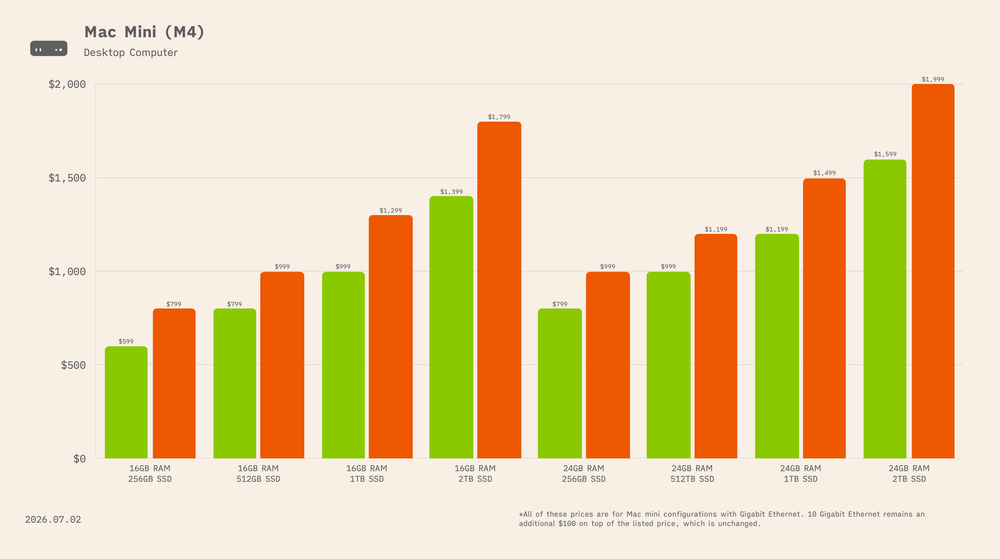
For the Mac mini with the 10-core CPU and 10-core GPU M4 chip, the 16GB unified memory / 256GB storage model increased from $599 to $799, a $200 jump, or 33.3%. The 512GB model rose from $799 to $999, a $200 increase, or 25.0%. The 1TB configuration climbed from $999 to $1,299, a $300 increase, or 30.0%. And the 16GB / 2TB model increased from $1,399 to $1,799, a $400 jump, or 28.6%.
Moving up to the 24GB unified memory configurations, the 256GB model increased from $799 to $999, a $200 jump, or 25.0%. The 512GB model rose from $999 to $1,199, a $200 increase, or 20.0%. The 1TB configuration climbed from $1,199 to $1,499, a $300 increase, or 25.0%. And the 24GB / 2TB model rose from $1,599 to $1,999, a $400 increase, or 25.0%.
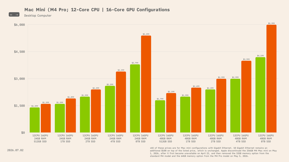
For the Mac mini with the 12-core CPU and 16-core GPU M4 Pro chip, the 24GB unified memory configurations saw increasingly steep price hikes as storage increased. The 512GB model rose from $1,399 to $1,599, a $200 increase, or 14.3%. The 1TB model increased from $1,599 to $1,899, a $300 jump, or 18.8%. The 2TB configuration climbed from $1,999 to $2,399, an increase of $400, or 20.0%. The 4TB model rose from $2,599 to $3,399, an $800 increase, or 30.8%. And the 8TB configuration jumped from $3,799 to $5,399, a substantial $1,600 increase, or 42.1%.
For the Mac mini with the 12-core CPU and 16-core GPU M4 Pro chip, prices for the 48GB unified memory configurations climbed sharply as storage increased. The 512GB model rose from $1,799 to $2,199, a $400 increase, or 22.2%. The 1TB model went from $1,999 to $2,499, a $500 jump, or 25.0%. The 2TB configuration increased from $2,399 to $2,999, a $600 increase, or 25.0%. The 4TB model climbed from $2,999 to $3,999, a $1,000 increase, or 33.3%. And the 8TB configuration saw the largest jump, rising from $4,199 to $5,999, an increase of $1,800, or 42.9%.
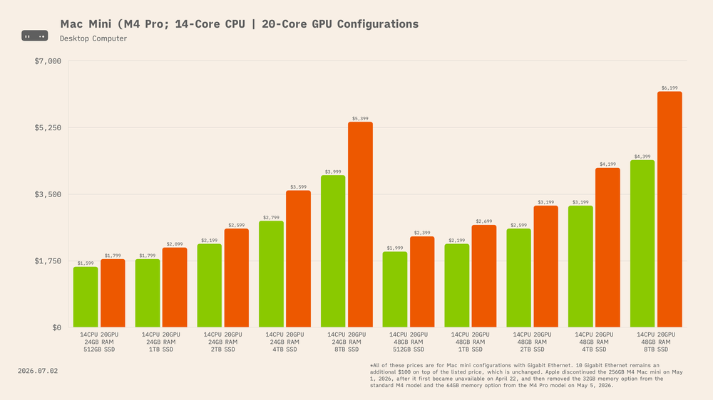
For the Mac mini with the 14-core CPU and 20-core GPU M4 Pro chip, the 24GB unified memory configurations became significantly more expensive at the higher storage tiers. The 512GB model increased from $1,599 to $1,799, a $200 rise, or 12.5%. The 1TB model moved from $1,799 to $2,099, a $300 increase, or 16.8%. The 2TB configuration rose from $2,199 to $2,599, adding $400, or 18.2%. The 4TB model climbed from $2,799 to $3,599, an $800 increase, or 28.6%. At the top end, the 8TB model jumped from $3,999 to $5,399, a $1,400 increase, or 35.0%.
The increases were even larger for models equipped with 48GB of unified memory. The 512GB configuration rose from $1,999 to $2,399, an increase of $400, or 20.0%. The 1TB model went from $2,199 to $2,699, a $500 jump, or 22.7%. The 2TB configuration climbed from $2,599 to $3,199, adding $600, or 23.1%. The 4TB model increased from $3,199 to $4,199, a $1,000 rise, or 31.3%. And the 8TB model saw the steepest increase, climbing from $4,399 to $6,199, a $1,800 jump, or 40.9%.
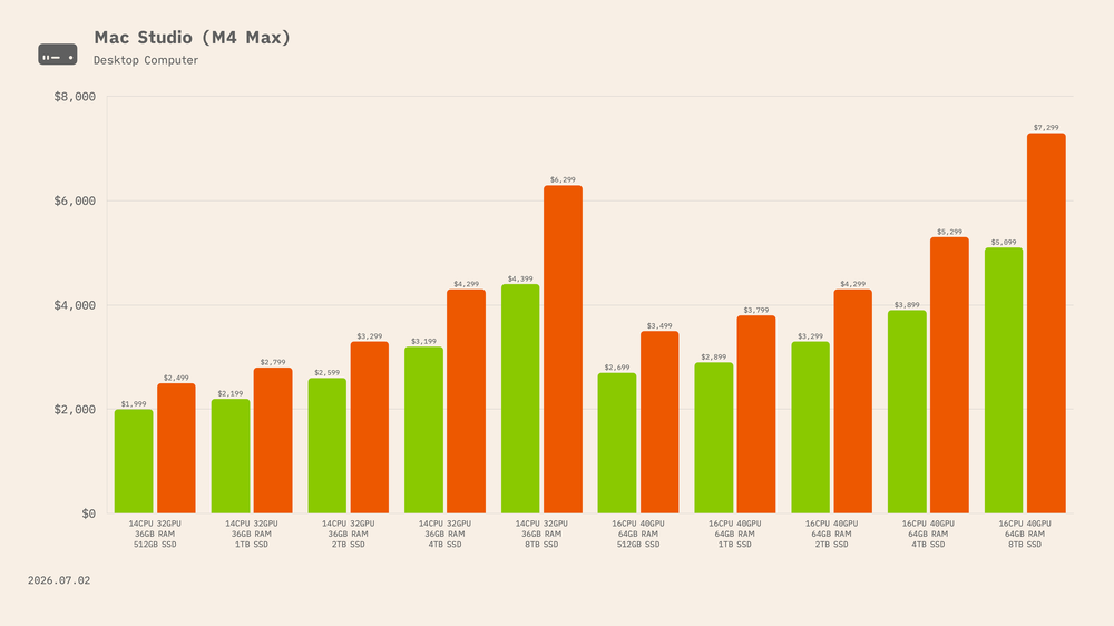
As of June 27, 2026, the Mac Studio is available with two M4 Max configurations: a binned 14-core CPU and 32-core GPU model with 36GB of unified memory, and a higher-end 16-core CPU and 40-core GPU model with 64GB of unified memory.
For the 36GB unified memory model with the binned 14-core CPU and 32-core GPU, the 512GB configuration increased from $1,999 to $2,499, a $500 jump, or 25.0%. The 1TB model rose from $2,199 to $2,799, an increase of $600, or 27.3%. The 2TB configuration climbed from $2,599 to $3,299, adding $700, or 26.9%. The 4TB model increased from $3,199 to $4,299, a $1,100 jump, or 34.4%. And the 8TB configuration saw the steepest increase, rising from $4,399 to $6,299, an increase of $1,900, or 43.2%.
The increases were even larger for the Mac Studio with 64GB of unified memory, a 16-core CPU, and a 40-core GPU. The 512GB configuration rose from $2,699 to $3,499, an $800 increase, or 29.6%. The 1TB model increased from $2,899 to $3,799, a $900 jump, or 31.0%. The 2TB configuration climbed from $3,299 to $4,299, an increase of $1,000, or 30.3%. The 4TB model rose from $3,899 to $5,299, adding $1,400, or 35.9%. And the 8TB configuration jumped from $5,099 to $7,299, a $2,200 increase, or 43.1%.
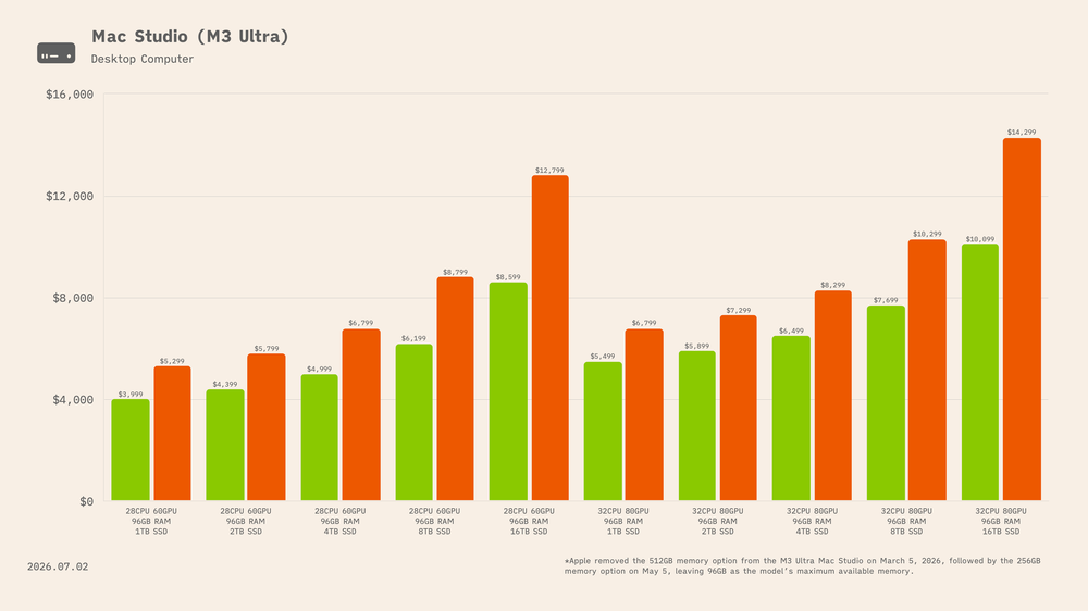
As of June 27, 2026, Apple sells the Mac Studio with M3 Ultra in just one memory configuration: 96GB of unified memory. When the model debuted in 2025, it was also available with 256GB and 512GB. Apple discontinued the 512GB option on March 5, 2026, followed by the 256GB configuration on May 5, leaving 96GB as the maximum memory available.
The M3 Ultra Mac Studio is offered with either a binned 28-core CPU and 60-core GPU or a fully enabled 32-core CPU and 80-core GPU.
For the binned M3 Ultra model with 96GB of unified memory, the 1TB configuration increased from $3,999 to $5,299, a $1,300 jump, or 32.5%. The 2TB model rose from $4,399 to $5,799, an increase of $1,400, or 31.8%. The 4TB configuration climbed from $4,999 to $6,799, adding $1,800, or 36.0%. The 8TB model increased from $6,199 to $8,799, a $2,600 jump, or 41.9%. And the 16TB configuration saw the steepest increase, rising from $8,599 to $12,799, an increase of $4,200, or 48.8%.
For the fully enabled M3 Ultra chip with a 32-core CPU and 80-core GPU, the 1TB configuration rose from $5,499 to $6,799, a $1,300 increase, or 23.6%. The 2TB model increased from $5,899 to $7,299, a $1,400 jump, or 23.7%. The 4TB configuration climbed from $6,499 to $8,299, adding $1,800, or 27.7%. The 8TB model rose from $7,699 to $10,299, an increase of $2,600, or 33.8%. And the 16TB configuration jumped from $10,099 to $14,299, a $4,200 increase, or 41.6%.
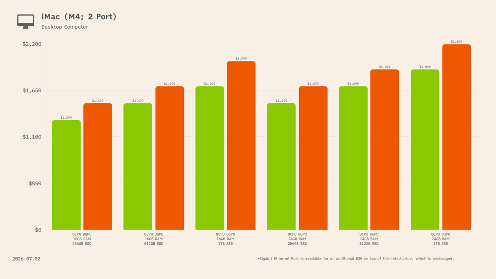
Price increases also came to the iMac. The base two-port model, featuring the binned M4 with an 8-core CPU and 8-core GPU, saw increases of $200–300 across the board.
The base 16GB unified memory / 256GB storage configuration increased from $1,299 to $1,499, a $200 jump, or 15.4%. The 512GB model rose from $1,499 to $1,699, also a $200 increase, or 13.3%. And the 1TB configuration climbed from $1,699 to $1,999, a $300 increase, or 17.7%.
The two-port configuration with 24GB of unified memory also increased in price. The 256GB storage model rose from $1,499 to $1,699, a $200 increase, or 13.3%. The 512GB model increased from $1,699 to $1,899, also a $200 jump, or 11.8%. And the 1TB configuration climbed from $1,899 to $2,199, a $300 increase, or 15.8%.
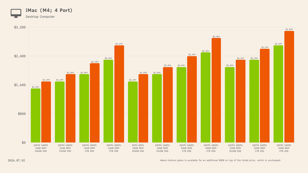
The four-port iMac is available with 16GB, 24GB, or 32GB of unified memory, and every configuration saw a sizeable price increase.
The M4 iMac with a 10-core CPU, 10-core GPU, and 16GB of unified memory saw increases across every storage tier. The 256GB model rose from $1,499 to $1,699, a $200 increase, or 13.3%. The 512GB model increased from $1,699 to $1,899, also a $200 jump, or 11.8%. The 1TB configuration climbed from $1,899 to $2,199, a $300 increase, or 15.8%. And the 2TB model rose from $2,299 to $2,699, a $400 increase, or 17.4%.
The model with 24GB of unified memory also increased in price. The 256GB configuration rose from $1,699 to $1,899, a $200 increase, or 11.8%. The 512GB model increased from $1,899 to $2,099, also a $200 jump, or 10.5%. The 1TB model climbed from $2,099 to $2,399, a $300 increase, or 14.3%. And the 2TB configuration jumped from $2,499 to $2,899, a $400 increase, or 16.0%.
Finally, the 32GB unified memory configurations also saw sizeable increases. The 512GB model rose from $2,099 to $2,299, a $200 increase, or 9.5%. The 1TB model increased from $2,299 to $2,599, a $300 jump, or 13.0%. And the 2TB configuration climbed from $2,699 to $3,099, a $400 increase, or 14.8%.
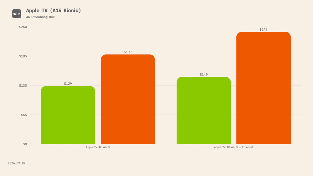
Despite not having been updated in nearly four years, with the current model dating back to November 2022, the Apple TV 4K still managed to catch a stray during Apple’s price increases.
The 64GB Wi-Fi model increased from $129 to $199, a $70 jump, or 54.3%, while the 128GB Wi-Fi + Ethernet model rose from $149 to $249, a $100 increase, or 67.1%. To add insult to injury, those are the two largest percentage increases across Apple’s entire product lineup.
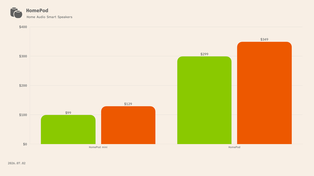
Like the Apple TV, both HomePod models were hit with price increases. The full-size HomePod increased from $299 to $349, a $50 jump, or 16.7%, while the HomePod mini rose from $99 to $129, a $30 increase, or 30.3%.
Keep in mind that the HomePod mini is now one of the oldest products currently on sale in Apple’s lineup, having been released in November 2020, during the wildest depths of the COVID-19.
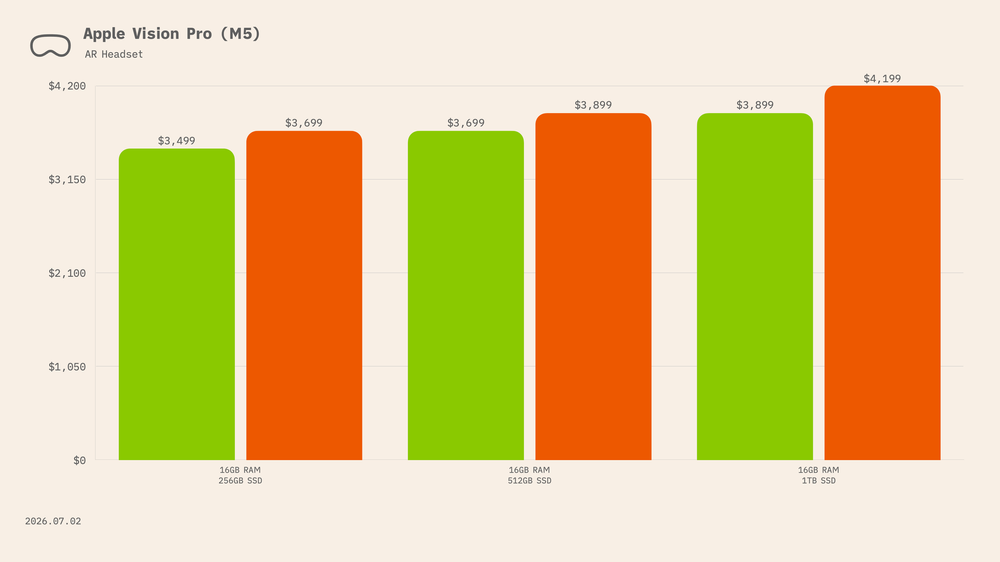
Did Apple really need to raise the price of the Vision Pro? I’d bet dollars to doughnuts that Apple makes more money selling iPhone cases than it does from the margins on Vision Pro, but even the headset wasn’t spared from the price increases.
The 256GB model rose from $3,499 to $3,699, a $200 increase, or 5.7%, while the 512GB configuration climbed from $3,699 to $3,899, also a $200 jump, or 5.4%. The 1TB model increased from $3,899 to $4,199, a $300 rise, or 7.7%.
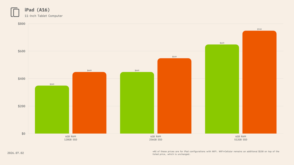
For the 11th-generation iPad with the A16 chip, Apple raised prices by $100 across all three storage tiers. The 128GB model increased from $349 to $449, a jump of 28.7%. The 256GB configuration rose from $449 to $549, an increase of 22.3%. And the 512GB model climbed from $649 to $749, a 15.4% increase.
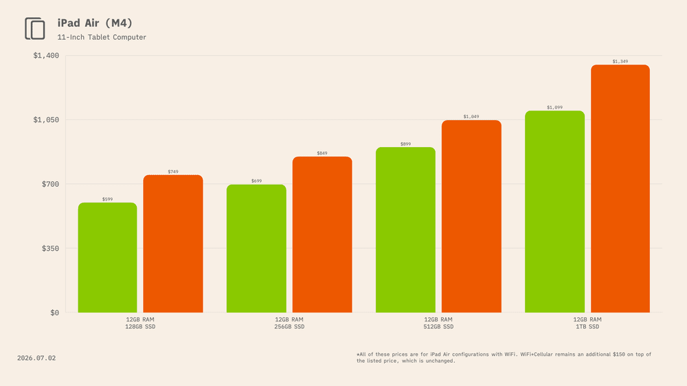
For the 11-inch M4 iPad Air, the 128GB model increased from $599 to $749, a $150 jump, or 25.0%. The 256GB configuration rose from $699 to $849, also a $150 increase, or 21.5%. The 512GB model climbed from $899 to $1,099, a $200 increase, or 22.2%. And the 1TB configuration increased from $1,099 to $1,349, a $250 jump, or 22.7%.
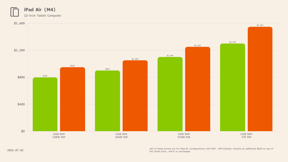
For the 13-inch M4 iPad Air, the 128GB model increased from $799 to $949, a $150 jump, or 18.8%. The 256GB configuration rose from $899 to $1,049, also a $150 increase, or 16.7%. The 512GB model climbed from $1,099 to $1,299, a $200 increase, or 18.2%. And the 1TB configuration increased from $1,299 to $1,549, a $250 jump, or 19.2%.
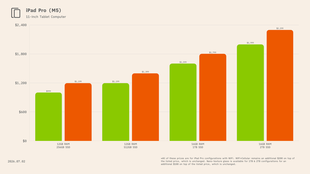
For the 11-inch M5 iPad Pro with standard glass, the 256GB model increased from $999 to $1,199, a $200 jump, or 20.0%. The 512GB configuration rose from $1,199 to $1,399, also a $200 increase, or 16.7%. The 1TB model with 16GB of unified memory climbed from $1,599 to $1,849, a $250 increase, or 15.6%. And the 2TB configuration rose from $1,999 to $2,299, a $300 jump, or 15.0%.
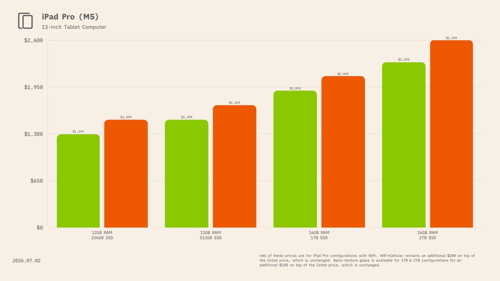
For the 13-inch M5 iPad Pro with standard glass, the 256GB model increased from $1,299 to $1,499, a $200 jump, or 15.4%. The 512GB configuration rose from $1,499 to $1,699, also a $200 increase, or 13.3%. The 1TB model with 16GB of unified memory climbed from $1,899 to $2,149, a $250 increase, or 13.2%. And the 2TB configuration increased from $2,299 to $2,599, a $300 jump, or 13.0%.
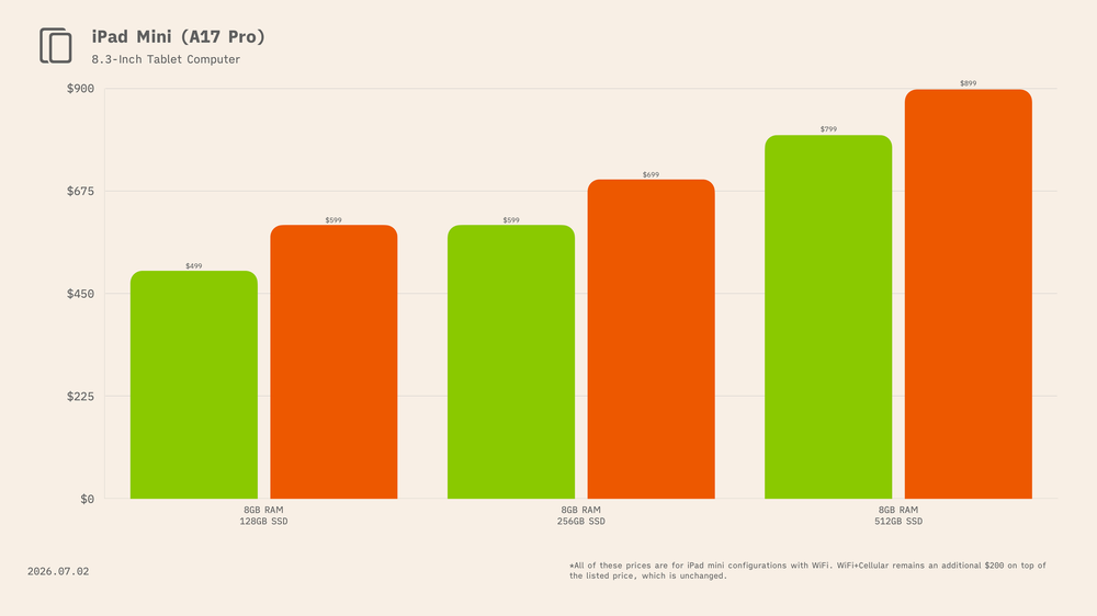
For the iPad mini with the A17 Pro chip, Apple increased prices by $100 across all three storage tiers. The 128GB model rose from $499 to $599, a 20.0% increase. The 256GB configuration climbed from $599 to $699, an increase of 16.7%. And the 512GB model went from $799 to $899, a 12.5% jump.
Apple TV 4K was hit hardest, rising by as much as 67.1%, despite the device not being updated since 2022.
The biggest dollar increase was $4,200 on the 16TB Mac Studio with M3 Ultra.
The most expensive Mac Studio now costs $14,299.
More storage generally meant a much larger price increase.
The base Mac mini jumped 33.3%, from $599 to $799.
The cheapest iPad rose 28.7%, from $349 to $449.
The HomePod mini rose 30.3%, from $99 to $129, despite originally launching in November 2020.
High-end Mac buyers were hit hardest in dollars, with increases of $1,000 to $4,200.
The top Mac mini now costs $6,199, after an $1,800 increase.
Vision Pro saw the smallest increases, rising by only 5.4% to 7.7%.
2026-06-25 09:00:16
Let’s take a 3,000-mile zigzag tour across California, tracing the past decade and a half of macOS releases.![]()
macOS, the operating system formerly known as OS X (2012–2016), Mac OS X (2001–2012), and Mac OS (1994–2001), has spent nearly a decade and a half drawing inspiration from locations scattered across the state of California.
Before that, Apple famously named its operating system releases after big cats: Cheetah (2001), Puma (2001), Jaguar (2002), Panther (2003), Tiger (2005), Leopard (2007), Snow Leopard (2009), Lion (2011), and finally Mountain Lion (2012).
Apple’s transition to California-inspired names coincided with the company’s now-familiar annual release cadence. Since the debut of OS X 10.9 Mavericks in 2013, Apple has released 14 versions of macOS bearing the names of beaches, mountain ranges, islands, valleys, and landmarks from across the Golden State.
But what exactly is a Mavericks? Where is Sonoma? And how many Mac users could point to where Ventura or Tahoe on a map?
Curious myself, I decided to trace the history and real-world locations behind every California-inspired macOS release and the wallpapers used to market the them to the world. Enjoy.
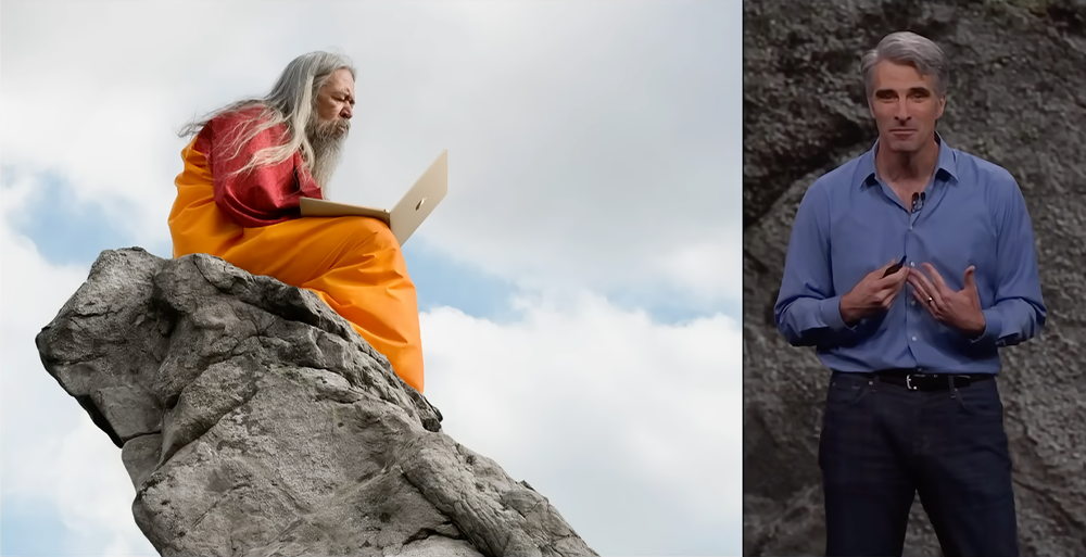
Lets first start with how, nearly a decade & a half ago (2013), Craig Federighi introduced the transition to the world:
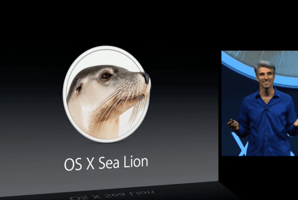
Craig Federighi teasing OS X Sea Lion at WWDC 2013
“Good morning, let’s talk about OS X. Our latest release, Mountain Lion, is the ninth of our big cat-named releases in just over a decade. As we turn our attention now toward the 10th, we’ve hit a real issue. We do not want to be the first software in history to be delayed due to a dwindling supply of cats.
Now, fortunately, we do have a creative group at Apple and we can think out of the box. And so, we thought, may be we could take this lion thing in a different direction. So, I’m proud to present to you today OS X Sea Lion. What do you think?
OK, maybe not. That could be a bit of a dead-end, so. In fact, we’re really excited about the future of the Mac and we want a set of names that are going to carry us for at least the next 10 years. And, you know, the answer really was really obviously to us. It’s those places that inspire us here in California, in the place where OS X is designed and built.
So for our first California-themed release, it went just outside our backyard, just off the coast, to a place with some of the biggest waves and most extreme surfing in all of North America, OS X Mavericks.”
Released: October 22, 2013
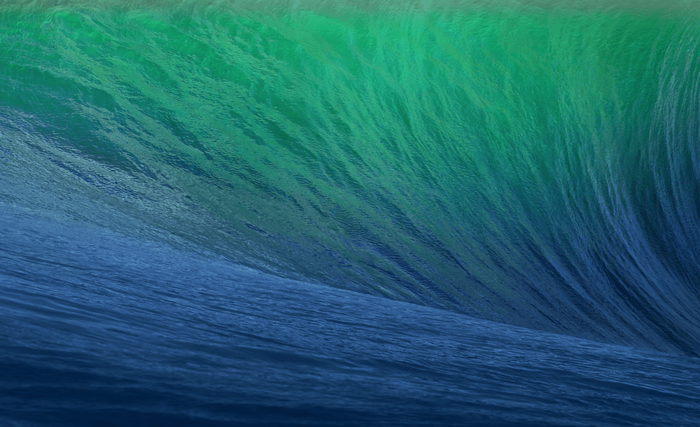
The wallpaper for OS X 10.9 Mavericks.
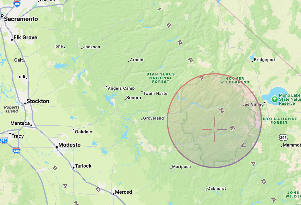
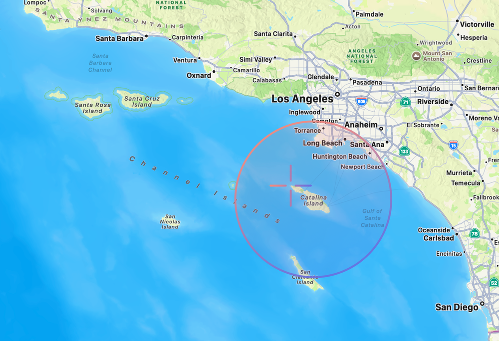
Mavericks Location: Mavericks surf break, offshore from Pillar Point / Princeton-by-the-Sea, near Half Moon Bay, California
Coordinates: 37.493°N, 122.501°W
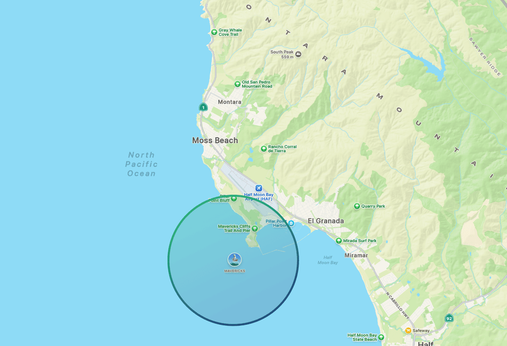
The circle shows the general area of the Mavericks Surf Zone in California.
The default wallpaper for OS X 10.9, introduced by Apple in 2013, featured the shoulder and pocket of a deep blue-turquoise wave. Apple named their first California release after Mavericks, the legendary big-wave surfing destination located about half a mile off the coast of Pillar Point, roughly 20 miles south of San Francisco.
Short of tracking down the photographer and getting their metadata, there’s no way to know whether Apple’s image was actually taken at Mavericks. But for the sake of this entry, let’s say it was.
On the software side, OS X Mavericks focused on battery life, performance, and efficiency, while introducing Finder Tabs and Tags, improved multi-display support, iBooks and Maps for Mac, and a redesigned Safari.
But let’s dry off, we’re off to the mountains!
“You may remember that we’re able to deftly shift from names based on big cats to names based on beautiful places in California, starting of course with OS X Mavericks. Well, it’s another year and time for another name and so we collected our crack product marketing team, shoved them in their VW Minibus and set them out on the road. Now, they first ventured south discovering OS X, Oxnard. This wasn’t quite right. But undeterred, they headed east, landed in OS X Rancho Cucamonga.
Still, we hadn’t quite hit the mark. So, they boldly ventured north landing at OS X Weed. Now... Strangely, this one had large pockets of support within the product marketing organization, but saner heads did prevail and they set off on what then was somewhat more circuitous path. It took them ultimately to a place that embodies the beauty and power of OS X. We discovered OS X Yosemite.”
Released: October 16, 2014

The main wallpaper for OS X 10.10 Yosemite.
Location: Half Dome in Yosemite National Park, likely taken from a ridge near the Ahwahnee Meadow area using a telephoto lens.
Coordinates: 37.747°N, 119.586°W
The circle shows the general area of Yosemite National Park while the target shows the location the photo of Half Dome was taken.
From the surf at Mavericks Beach we travel 4.15 hours (196 mi/315 km) East until we arrive at the Ahwahnee Meadows and see soaring above us the famous granite cliffs of Yosemite National Park.
Perhaps the more infamous introduction was OS X Yosemite’s, when Craig Federighi joked about possible names including OS X Rancho Cucamonga and OS X Weed before Apple’s “Crack Marketing Team” settled on OS X Yosemite.
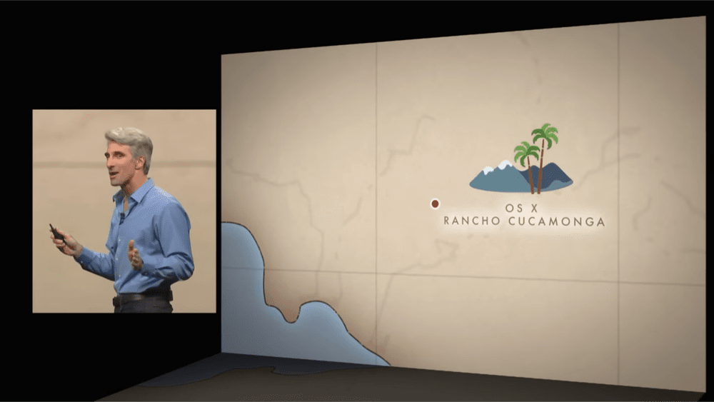
I dunno Craig, I think Rancho Cucamonga would make a great version of OS X.
Amazingly, back in 2019, three friends: Andrew Levitt, Jacob Phillips, and Taylor Gray, went on a road trip to track down and recreate Apple’s macOS wallpaper locations, from Mavericks to Catalina. The video they created chronicling their trip is an absolute must-watch and was an essential resource for many parts of this post.
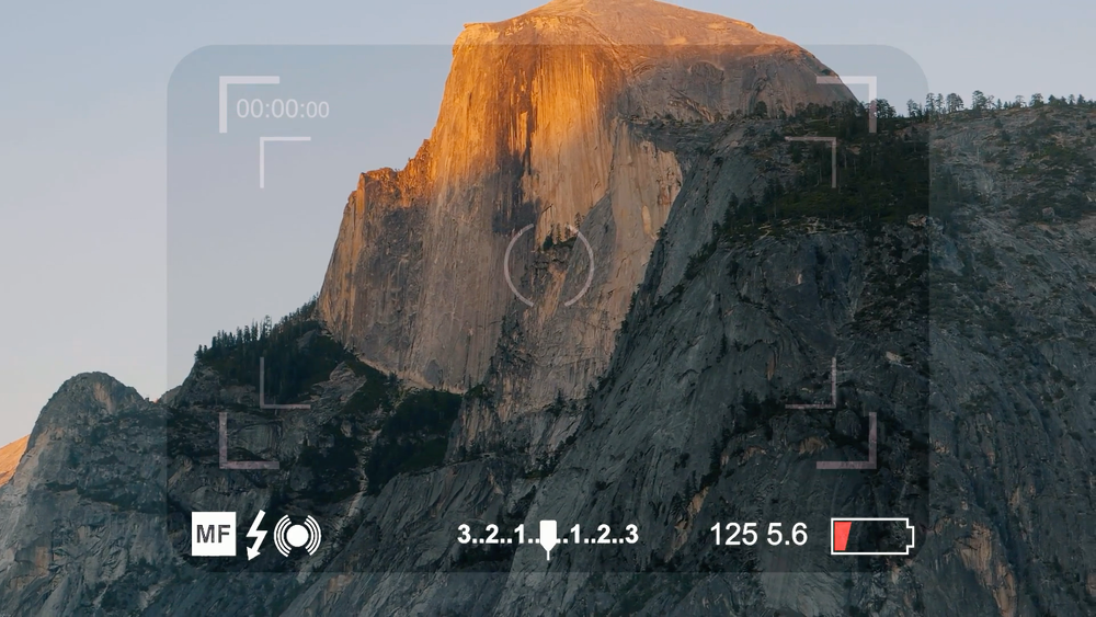
Photo of Half Dome taken by Andrew Levitt, Jacob Phillips, and Taylor Gray during their 2019 road trip to track down and recreate the locations featured in Apple’s California-themed macOS wallpapers. - Source
The main wallpaper used for marketing Yosemite features Half Dome, a 8,850 ft granite monolith located inside Yosemite National Park. The particular place this photo was shot was most likely near the Ahwahnee Meadow inside the park grounds, potentially from a ridge slightly overlooking the valley.
As for the operating system itself, OS X Yosemite brought one of the biggest visual redesigns in Mac history, introducing a flatter, cleaner interface with translucent elements and a refreshed look inspired by iOS. It also debuted Continuity, allowing Macs and iPhones to work together more seamlessly through features like Handoff, Instant Hotspot, SMS relay, and phone call forwarding.
But, we got more to see in Yosemite, onto our next location…
“So for our next big release of OS X, we knew we wanted to build on those strengths of Yosemite with some really great refinements and advances. The only real question, of course, was what to call it. So we had to once again turn to our crack Apple Marketing Team.
Now, in typical California fashion, they started with a project kickoff meeting, and then headed immediately into a team building off site.
Now, of course they are in their traditional Apple Marketing Free-Bottom Fridays attire. They say it’s all part of their ‘process’. I am not sure I get it. Ultimately, this didn’t yield any names, so they called in a consultant. He told them the answer was to be found within. Not within themselves, but within Yosemite. And so the new name for OS X is OS X El Capitan.”
The “Consultant” Apple used to help name the next version of OS X.
Released: September 30, 2015
The main wallpaper for OS X 10.11 El Capitan.
Location: El Capitan as seen from Tunnel View, Wawona Rd, California
Coordinates: 37.716°N, 119.679°W
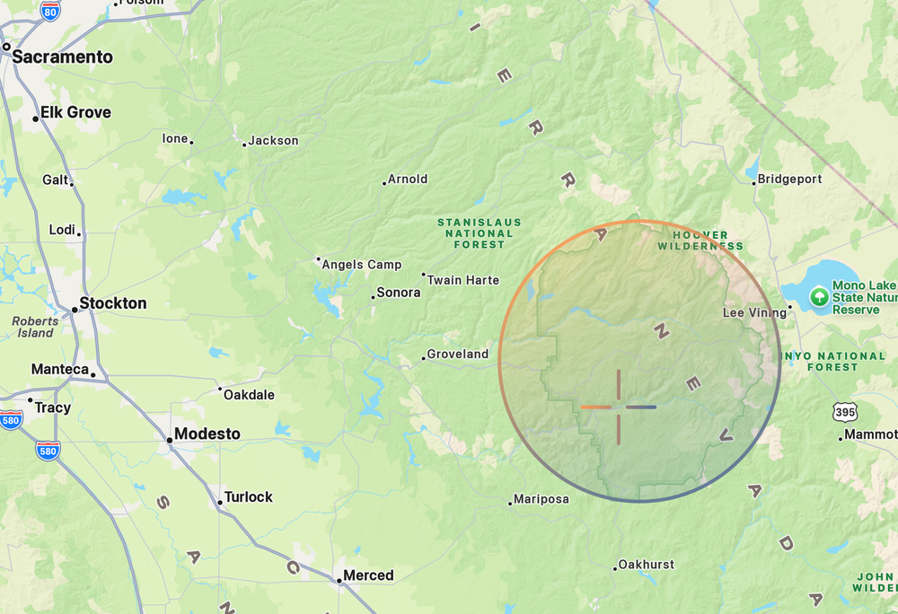
The circle shows the general area of Yosemite National Park, home to the famous El Capitan granite monolith, while the target marks the location from which the El Capitan wallpaper photo was taken.
Our next stop is only a 20-minute drive from the Ahwahnee Meadow (7.8 mi/12.6 km) to another famous landmark inside Yosemite National Park.
The third California-named release of macOS was El Capitan, named after the nearly 900-metre granite monolith that rises above the floor of Yosemite National Park. Apple’s wallpaper was most likely photographed from Tunnel View, one of Yosemite’s most iconic overlooks, where El Capitan rises from the left side of the valley, Bridalveil Fall runs down the cliffs on the right, and Half Dome stands in the distance.
A little bit on OS X El Capitan: it was a release focused on making the Mac faster and more polished. It introduced Split View for side-by-side multitasking, a smarter Spotlight that could understand natural language searches, Safari Pinned Tabs, improvements to Notes and Mail, and Metal graphics technology for better performance in games and professional apps.
“Now of course each version of Mac OS does have a special name after a place that’s especially important to us here in California. And this year’s Mac OS is no different. But the choice this time was obvious. Our latest newest OS X is macOS Sierra.”
Released: September 20, 2016
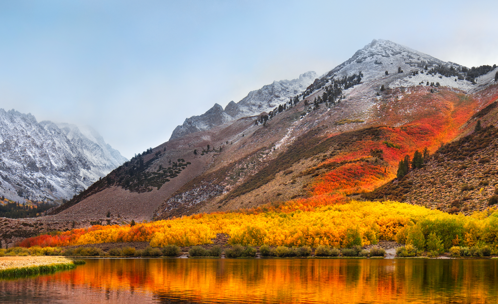
The main wallpaper for macOS 10.12 Sierra.
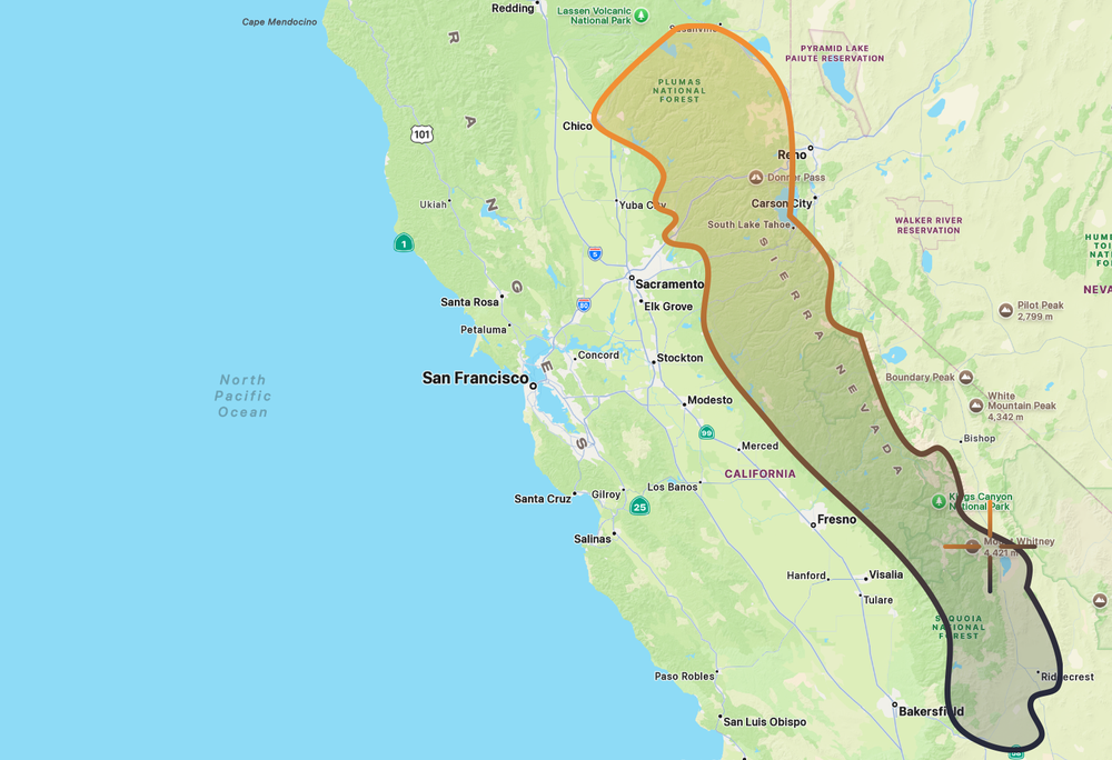
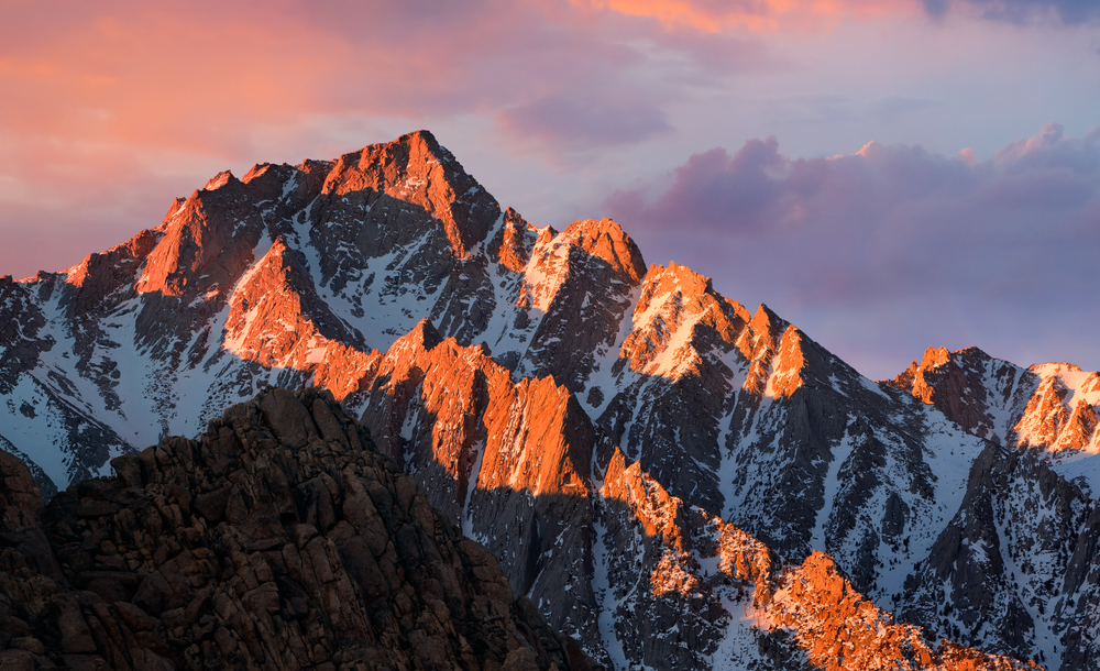
The outline above shows the boundary of the Sierra Nevada Mountain Range, a 300-mile-long range stretching along the eastern edge of California, while the target marks the location of Lone Pine Peak, the mountain photographed for macOS Sierra.
Location: Alabama Hills, near Lone Pine, with Lone Pine Peak area as the subject
Coordinates: 36.609°N, 118.122°W
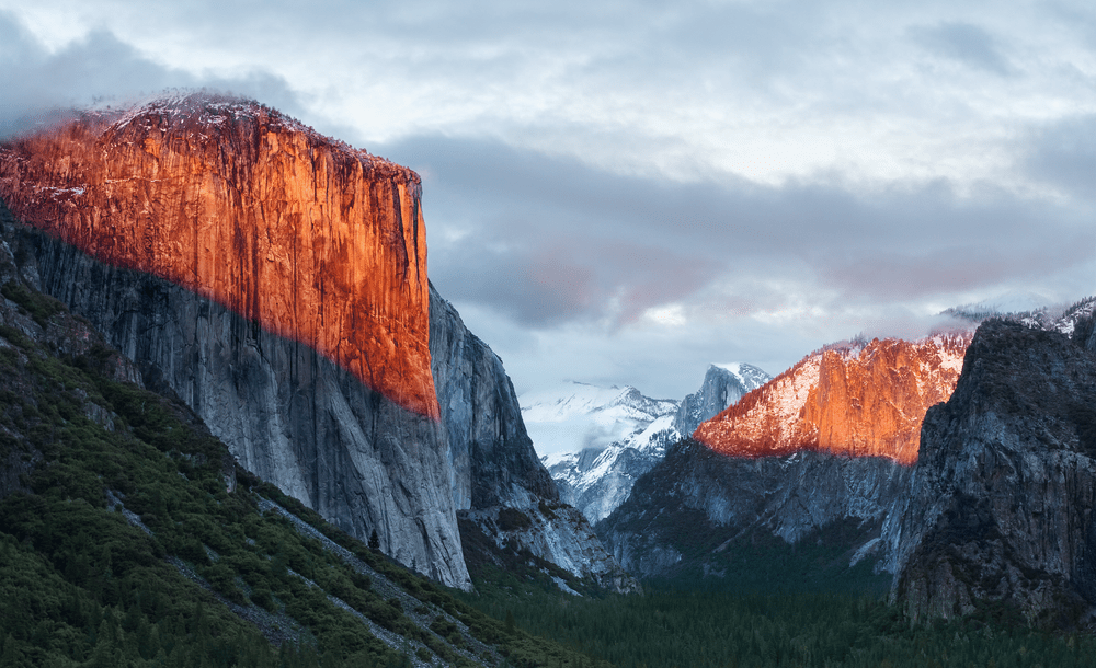
From Yosemite, it’s a 4.5 hour drive (210 mi/338km) South through the Sierra Nevada until you arrive at the Alabama Hills near the town of Lone Pine, California, on the eastern side of the range. Here, just west of the famous summit of Mount Whitney, sits Lone Pine Peak, the rugged mountain that appears in the wallpaper for macOS 10.12 Sierra.
As an operating system, Sierra marked the naming transition from OS X to macOS, bringing the Mac’s name in line with Apple’s other platforms. It introduced Siri to the Mac, Auto Unlock with Apple Watch, Universal Clipboard for copying and pasting between devices, and iCloud Desktop & Documents, making it easier to move between working on your Mac, iPhone, and iPad.
“Now, people are loving Sierra and we love it too. So, we wanted to spend this year perfecting it. Of course, the question is, what do we call it?
So we enlisted once again our crack marketing team. They were giddy to hop in their mini bus and this time, venture east, deep into the Sierras but this time, ascending its highest peaks. And when they finally came back, they had a name they said felt really, really good. And it’s my privilege to announce for you today, macOS High Sierra.”
Released: September 25, 2017
The main wallpaper for macOS 10.13 High Sierra.

The outline above shows the boundary of the Sierra Nevada Mountain Range, while the target marks the location of North Lake, the area photographed for macOS High Sierra.
Location: North Lake, Bishop Creek Canyon, Eastern Sierra, west of Bishop, California
Coordinates: 37.231°N, 118.614°W
From Lone Pine Peak, we continue about 80 minutes north (80 mi/129 km), deeper into the Sierra Nevada. At the small town of Bishop, we turn west into the mountains and eventually arrive at North Lake, a picturesque alpine lake nestled amongst the Sierra mountains. This is the location Apple photographed for the wallpaper of macOS 10.13 High Sierra.
The details of the photo suggest it was taken in autumn, with the trees turning shades of yellow and red while a light dusting of frost clings to the surrounding peaks.
As an operating system, macOS High Sierra was less about flashy new features and more about giving the Mac a tune-up under the hood (think the Snow Leopard for the California releases). In High Sierra, Apple introduced the new APFS file system, brought support for modern HEVC and HEIF video and photo formats, and upgraded graphics performance with Metal 2.
“Now after spending a year by the ocean, we not only modernized the look and feel of macOS, but we headed to the mountains with macOS Yosemite. Now, as you may be aware, our naming of Mac releases is handled by our crack marketing organization, and as you’ve probably noticed, they went on a four-year mountain-bound bender.
In El Capitan we added metal, our ground-breaking graphics technology. In Sierra, we brought Siri to the Mac and extended our capabilities and continuity. And last year with High Sierra, we focused on deep technology, preparing the Mac for future innovation. Well this year, we made some striking changes to macOS, and we’ve left the high country for a place entirely different but not less beautiful and here still in California, and I’d like to take you there now. Our next release of macOS is macOS Mojave.”

Mojave being introduced at WWDC2018. It was the first version of macOS to feature a dark mode UI.
Released: September 24, 2018
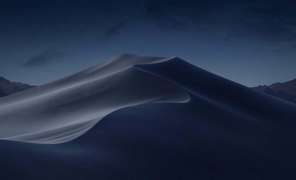
The main (night mode) wallpaper for macOS 10.14 Mojave.
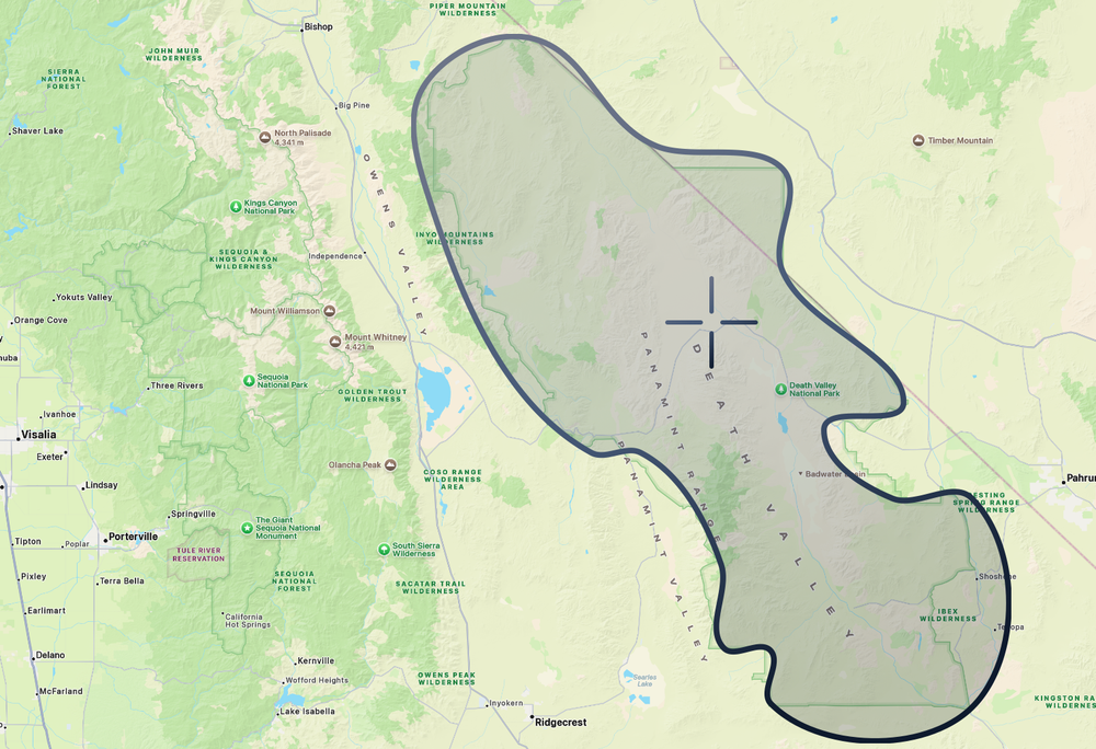
The outline above shows the general boundary of Death Valley National Park, a 3-million-acre desert region along the southeastern edge of California. The target marks the Mesquite Flat Sand Dunes, the likely location of the dune photographed for macOS Mojave.
Location: Death Valley National Park, most commonly identified as Mesquite Flat Sand Dunes near Stovepipe Wells
Coordinates: 36.606°N, 117.115°W
After four back-to-back years of mountain named operating systems, Apple took a 3 hour (157 mi/253 km)drive to Death Valley National Park and introduced us to macOS Mojave.
Now, the thing about sand dunes is that they’re constantly shifting, but the clever trio of Andrew Levitt, Jacob Phillips, and Taylor Gray used the mountains in the background to help pinpoint the area where the dune featured in macOS Mojave was most likely photographed.
“Now here's where things get a little tricky. We were trying to get the right shot by lining up the mountains in the background with the sand dunes, but there was no way to line up the mountains you see on either side correctly with the right view of the ridge. So we ended up having to settle and getting the shot from both angles.”
As an OS, Mojave is perhaps best known for introducing Dark Mode, one of the most requested Mac features ever. It also added Desktop Stacks for organizing files, a redesigned Mac App Store, Dynamic Desktop wallpapers, and brought apps like News, Stocks, Voice Memos, and Home to the Mac.
“Great to be back with all of you again. So, for our next major release of macOS, we are moving out of the desert into the beautiful waters off the California coast, a place for sailing, diving and so much more. It’s macOS Catalina.”
Released: October 07, 2019
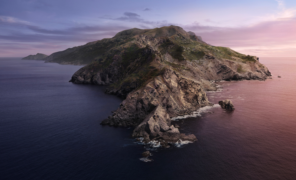
The main wallpaper for macOS 10.15 Catalina.
The outline above shows Catalina Island, a 76-square-mile island off the coast of Southern California. The target marks the northwestern part of the island, near the location where the macOS Catalina desktop wallpaper was photographed.
Location: Aerial photograph of the northwestern end of Santa Catalina Island, off Southern California.
Coordinates: 33.479°N, 118.605°W
From the Mojave Desert, we make our way to Catalina Island, the namesake of the next version of macOS. The journey takes us about 5.5 hours west by road (266 mi/428 km) to the coast, followed by a one-hour ferry ride across the Pacific (22 mi / 35 km) to the island itself.
Now, Catalina Island, and especially the area where the wallpaper was photographed, is incredibly remote. For the trio of Andrew Levitt, Jacob Phillips, and Taylor Gray, reaching it required a 7.5-mile (12 km) hike from the ferry landing to a campsite, followed by a 16-mile (26 km) round-trip trek the next day to reach the location itself:
“So here's the deal. It was an eight-mile hike to where the wallpaper was taken at the west end of Catalina. And to get there, we had to climb a thousand feet of elevation then descend a thousand feet and then turn around and go back all in the same day.”
For their wallpaper, Apple used a helicopter or drone to fly offshore and capture the island from over the water, returning multiple times to photograph the scene under different lighting conditions to create Catalina’s dynamic wallpaper.
A bit about macOS Catalina: it marked the end of iTunes and introduced separate Music, TV, and Podcasts apps, and introduced Sidecar, which lets an iPad act as a second display for your Mac. It also added Voice Control, enhanced security features, and new tools that made it easier for developers to bring iPad apps to the Mac.
“But what should we call it? Well, if you’re a student of macOS, you know this question can only be answered by Apple’s legendary crack marketing team. Their drug-fueled, minibus-driven vision quests have yielded some great names and, sadly, spawned a host of imitators. The truth is, we can’t responsibly continue to inadvertently lead our competition to copy these methods when they clearly can’t handle the trip. So this year, we’re leaving our process shrouded in mystery and taking you straight to the glorious destination. Our next release of macOS is macOS Big Sur.”
Released: November 12, 2020
The main photographic wallpaper for macOS 11 Big Sur.
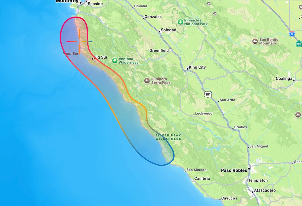
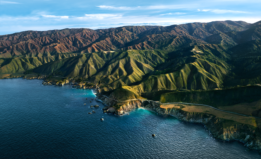
The outline above shows the general area of Big Sur, a 90-mile mountainous stretch of California’s Central Coast between Monterey and San Simeon. The target marks the location of Bixby Creek Bridge, the bridge photographed for macOS Big Sur.
Location: Aerial Photograph of the Bixby Creek Bridge
Coordinates: 36.371°N, 121.902°W
Hopping back on the hour-long ferry and leaving Catalina Island behind, we travel 5.5 hours (326 mi / 524 km) North along California’s rugged, mountainous coastline, until we come across the iconic Bixby Creek Bridge, the wallpaper location of the next version of macOS: Big Sur.
The Bixby Creek Bridge, which opened in 1932, spans a dramatic section of the Big Sur coastline, a rugged region renowned for its winding coastal highway, breathtaking views, and forests.
This shot was captured overlooking the Bixby Creek Bridge and the coastline of Big Sur. The team of Andrew Levitt, Jacob Phillips, and Taylor Gray discovered that the image was taken from such a high altitude that a drone would not only have been illegal to operate, but likely incapable of reaching the required height. So they chartered a helicopter, even tracking down the same pilot who had flown Apple’s Crack Marketing Team during the creation of the original wallpaper, and flew roughly 4,000 feet (1,220 m) out over the Pacific to recreate the shot. This one was definitely not an easy shot to capture, never mind at numerous points in the day, given the regions propensity for dense fog.
As for the software, macOS Big Sur delivered another large visual redesign to the Mac, with refreshed icons, translucent materials, a redesigned Dock, Control Center, and Notification Center. It was also the first version of macOS designed to support Apple’s transition from Intel processors to Apple Silicon.
“But what should we call it? Well, that brings us to the latest exploits of our crack marketing team. With their annual vision quest postponed, our merry band of nomadic namers wandered aimlessly through the California hills before donning their technicolor wet suits and immersing themselves in the inspiration of the beautiful, rich waters of Monterey. macOS Monterey gives you the power to accomplish more than ever and helps you work fluidly across all your devices.”
Released: October 25, 2021

The main wallpaper for macOS 12 Monterey.
Location: Monterey County
Coordinates: 36.598°N, 121.894°W (of Monterey, California)
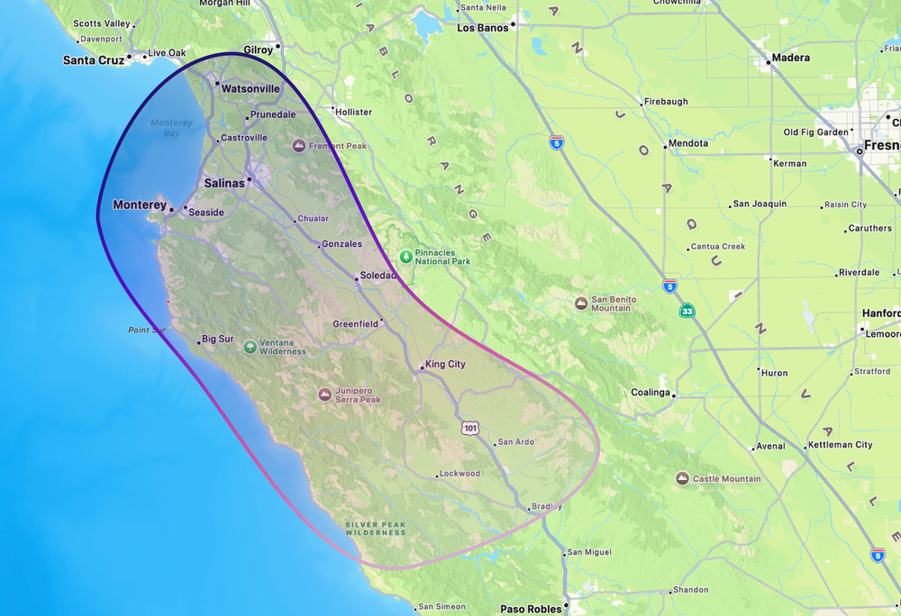
The outline above shows Monterey County, a 3,300-square-mile region known for its coastline, vineyards, and farmland. macOS Monterey was the first of Apple’s California releases not to feature a photographic wallpaper from its namesake location.
Still in the area of Big Sur, Monterey county encapsulates the rugged coastline Big Sur but also the inland hills and farmland.
However, this time Apple broke with tradition, opting not to include a photographic wallpaper or screensaver. Instead, the OS shipped with only a dynamic illustrated wallpaper and matching screensaver.
Monterey focused on bringing features to the Mac like Universal Control, which lets a single mouse and keyboard move seamlessly between a Mac and iPad. It also brought Shortcuts to the Mac, AirPlay to Mac, Focus modes, and SharePlay support in FaceTime.
“So what should we call it? Well, that brings us to the latest exploits of Apple's crack product marketing team. They've been absolutely riding high since their naming coup on M1 and M2, and needless to say, they were exhausted. But after their requisite three-month rejuvenation retreat in Monterey, with their chakras now in complete alignment, the team once again piled into their macOS naming microbus and wove their way down Highway 1. Chasing the vibrant display of colorful California wildflowers, they finally came to rest where stunning surf meets lush alluvial plains, in beautiful Ventura.”
Released: October 24, 2022

The main wallpaper for macOS 13 Ventura.
Location: Ventura County
Coordinates: 34.282°N, 119.293°W (of Ventura, California)

The outline above shows the general area of Ventura County, a 2,200-square-mile region along the southern coast of California known for its beaches, farmland, mountains, and proximity to the Channel Islands. Like macOS Monterey before it, macOS Ventura did not feature a photographic wallpaper from its namesake location.
Around 4.5 hours (281 mi/452 km) south of Monterey County we arrive in Ventura County, a diverse region of California known for its beaches, rugged hills, and fertile farmland.
Once again, however, Apple opted not to include a photographic wallpaper with the release. Instead, macOS Ventura shipped with only an illustrated, flower-like wallpaper and matching screensaver.
What was Ventura about? It introduced Stage Manager, a new way to organize and switch between apps and windows. It also added Continuity Camera, allowing an iPhone to serve as a Mac webcam, and provided updates to Mail, Messages, Safari, and perhaps most controversially, System Settings.
“Now, when it came to naming this release, we turned once again to Apple's legendary crack Product Marketing team. The instructions were simple and explicit: travel far and wide, leave no stone unturned. Well, as far as we can reconstruct, that search consisted of piling into their micro bus, punching the words "awesome vineyard" into Maps, and beelining straight to one of the most famous wine regions in the world, a place celebrated by the team perhaps a bit too much, and beloved by millions. Introducing macOS Sonoma, a big new release that will make your Mac more delightful and even more productive.”
Released: September 26, 2023
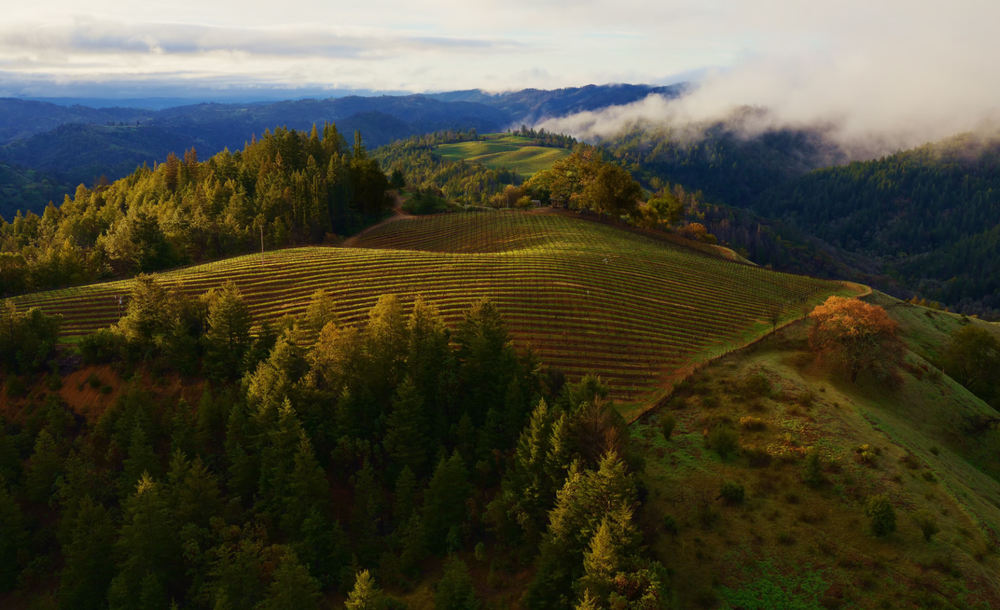
The main live aerial wallpaper for macOS 14 Sonoma.
Location: Likely Warm Springs Ranch in California
Coordinates: 38.670°N, 123.081°W
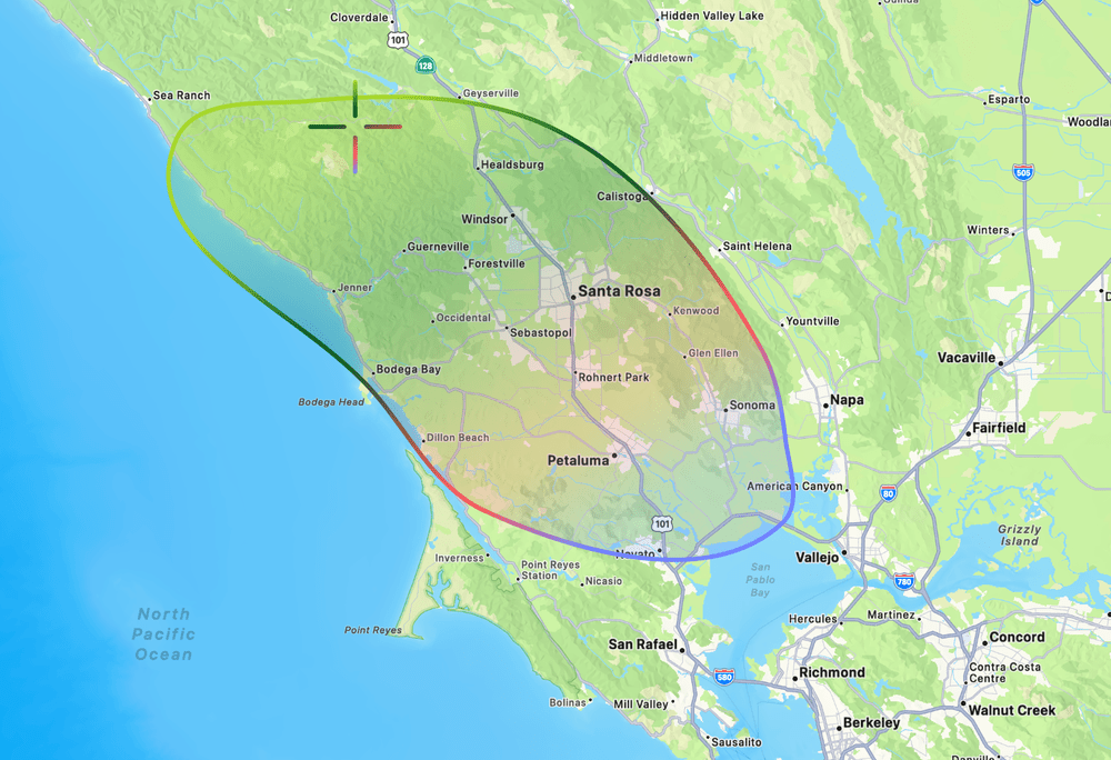
The outline above shows the general area of Sonoma County, a 1,800-square-mile region in Northern California known for its vineyards and rolling hills. The target marks what is most likely Warm Springs Ranch, the vineyard where Sonoma’s featured aerial wallpaper was photographed.
From Ventura county is a nearly 7.25 hour drive (465 mi/748 km) north to Sonoma, a area just north of San Francisco perhaps best known for it’s over 400 wineries dotted across it’s rolling hills.
After a two-year absence, Apple brought back photographic wallpapers to macOS, this time in the form of live Aerial screensavers that slowly come to rest after you log in. Many of these aerial videos first debuted on Apple TV before making their way to the Mac, but several were brand new, including Sonoma Horizon, one of the wallpapers Apple used to showcase macOS Sonoma at WWDC.
Sonoma Horizon was filmed on the property of the Mazzocco Sonoma winery, most likely at Warm Springs Ranch. According to Josh Post, who tracked down the location, the footage was most likely captured early in the morning, based on the low eastern sunlight illuminating the hills.
The release of macOS Sonoma brought interactive desktop widgets, aerial screen savers & wallpapers to the Mac, and Game Mode to improve gaming performance. It also introduced web apps in the Dock, enhanced video conferencing with Presenter Overlay and Reactions, and several updates to Safari that made everyday tasks faster and more convenient.
“But what should we call it? Well, that brings us once again to the annual escapades of our legendary crack marketing team. Distracted briefly from their marathon hacky sack session, they stumbled into their minibus and wove a trail toward the Sierras, eventually rolling to a stop in a beautiful national park. Staring skyward up the towering trunks surrounding them, they felt a deep kinship with anything that could get that high. They knew they'd found their spot. Welcome to macOS Sequoia.”
Released: September 16, 2024
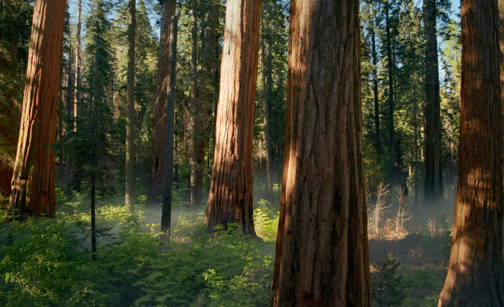
The main live wallpaper for macOS 15 Sequoia.
Location: Likely from Sequoia National Park/Forest, but the exact location of the grove featured is not known.
Coordinates: 36.479°N, 118.564°W (Sequoia National Park)
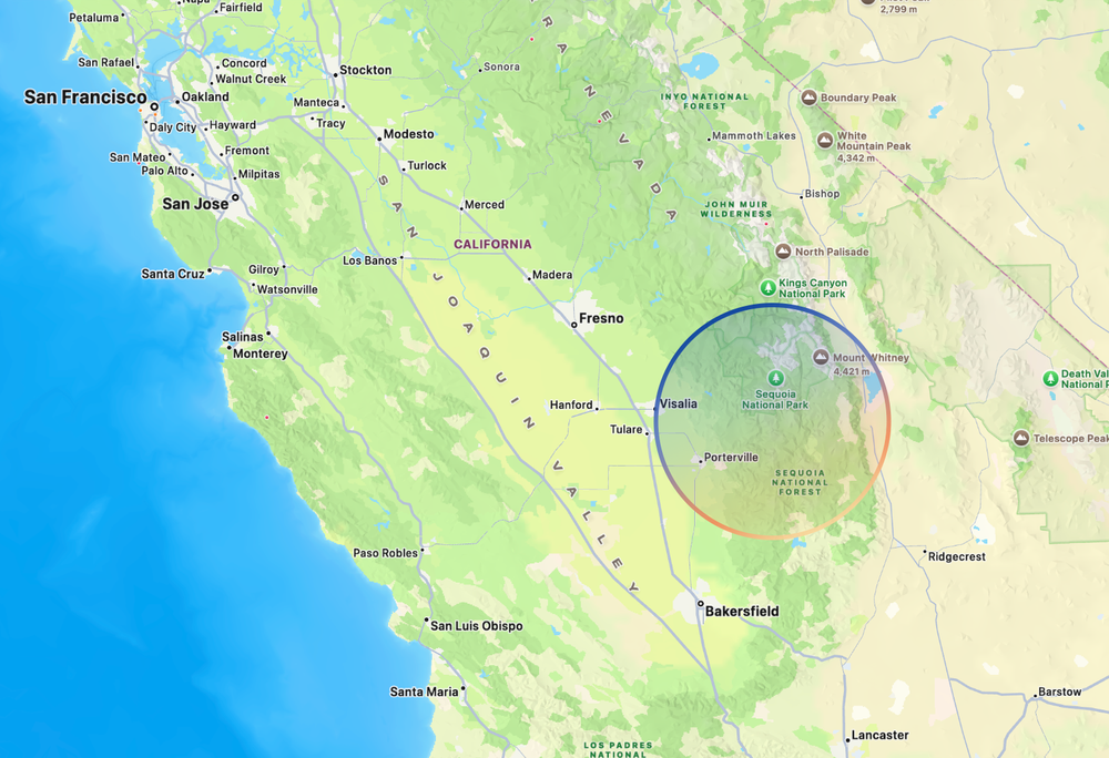
The outline above shows the general area of Sequoia National Park, a 630-square-mile region in California’s southern Sierra Nevada. Giant sequoias are found only in scattered groves along the western slopes of the Sierra Nevada, with some of the most famous stands located in and around Sequoia and Kings Canyon National Parks. The most likely location of macOS Sequoia’s wallpaper is somewhere in this general area, though the precise grove featured in Apple’s wallpaper is not known.
From Sonoma we once again head south through California, travelling nearly 7 hours (340 mi/547 km) until we arrive at Sequoia National Park.
Giant sequoias are among the largest trees on Earth and are found naturally only in scattered groves along the western slopes of California’s Sierra Nevada. Reaching 250-300 feet (75-90 m) tall and nearly 30 feet (9 m) in diameter, some of these trees can live for nearly 3,000 years.
However, despite receiving another aerial wallpaper featuring a sweeping pan through the forest, Apple has never publicly disclosed the exact location where the macOS Sequoia wallpaper was filmed. Given the trees’ limited natural range, it was almost certainly captured somewhere within the giant sequoia groves of the Sierra Nevada, but the precise location remains unknown.
The release of macOS Sequoia introduced iPhone Mirroring, allowing users to view and control their iPhone directly from their Mac, along with a new Passwords app, improved window tiling, and the first wave of Apple Intelligence features.
“But what should we call it? Well, our crack product marketing team was adamant that they’d fully earned their annual paycheck the moment they noticed that years end in two-digit numbers. But macOS demands more. Fortunately, after carving some bodacious tracks during one of their mandatory weekly Ski Strategy Sessions, they bumbled into their legendary microbus and let gravity guide them to a breathtaking spot where crystal clear waters meet majestic mountain peaks. They’d found it. Let me introduce you to macOS Tahoe.”
Released: September 15, 2025
The main live wallpaper for macOS 26 Tahoe.
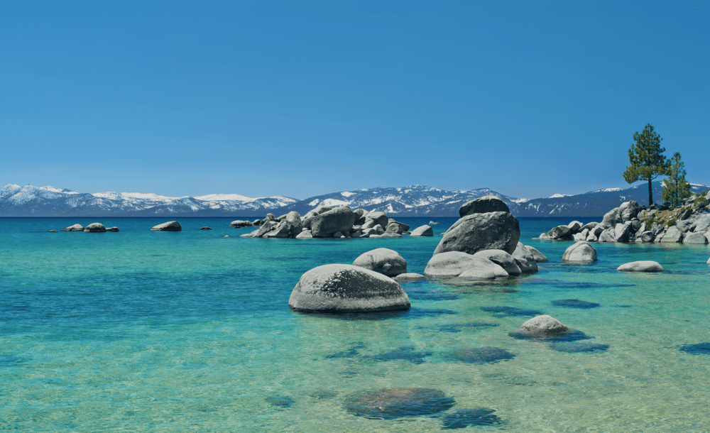
Location: Speedboat Beach, Lake Tahoe
Coordinates: 39.223°N, 120.009°W
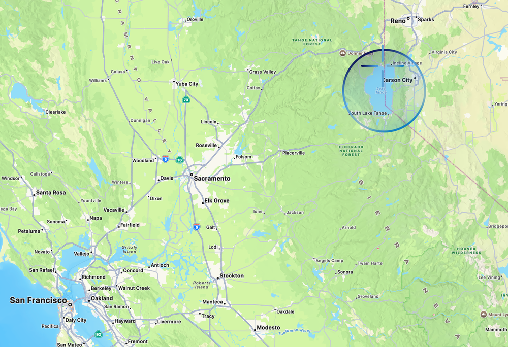
The outline above shows Lake Tahoe, a large alpine lake in the Sierra Nevada straddling the border of California and Nevada. The target marks Speedboat Beach, the location featured in Apple’s dynamic wallpaper for macOS Tahoe.
From Sequoia National Park we make our way north, travelling another 6.25 hours (363 mi / 584 km) to Lake Tahoe, an alpine lake that borders California and Nevada. Measuring 22 miles (35 km) long and 12 miles (19 km) wide, it is the largest alpine lake in North America and sits high in the Sierra Nevada at an elevation of 6,225 feet (1,897 m).
Known for having some of the clearest water on Earth, the macOS Tahoe wallpaper features a low-angle view across the lake, overlooking the granite boulders, two pine trees, and the Sierra Nevada mountains in the distance.
And those two pine trees are what gave one Redditor a clue about where on the lake the images for Tahoe came from. Using Google Maps, they were able to determine the location of the wallpaper as coming from Speedboat Beach, a quiet a secluded beach on the north end of Lake Tahoe.
As an operating system, macOS Tahoe introduced another major redesign to macOS, our third since we started this trip, with the arrival of Liquid Glass. It also expanded Continuity with iPhone Live Activities, overhauled Spotlight, and introduced further Apple Intelligence refinements throughout the platform.

Apple’s crack marketing team went on quite the adventure before eventually arriving at Golden Gate.
“Speaking of macOS, for those of you that are WWDC regulars, you of course know that this is the moment where I relay the latest exploits of Apple's crack marketing team, and their, shall we say, unconventional methods for naming macOS releases. In this case, I'm afraid the story is incomplete.
Last I saw them, they just spilled out of their recently installed Apple Park ‘experiential ideation yurt’ and piled into their microbus. I tried to catch them, but they just handed me this note out the window before motoring northward. So here's all I've got.
‘Dude, our chakra alignment has set our compass toward the summer of love. But like, further. Our corporeal forms know no earthly tether. We shall float on a span of gold over infinite seas, flying so high. Marketing is such a great job.’
Okay, well, I'm afraid they haven't returned and I'm lacking the sensory amplifiers to crack this code. So I guess the great era of macOS names must come to an end.
Joz: It's Golden Gate, man.
Oh thank goodness. Perfect. Our next version of macOS is macOS Golden Gate.”

This also marks the first time we’ve actually caught a glimpse of the infamous VW Minibus that Craig Federighi’s crack marketing team has apparently been travelling around California in for the past decade and a half.
Released: Fall, 2026

As of macOS 27 Beta 2, this is the default wallpaper for macOS Golden Gate.
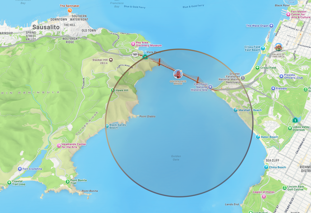
The outline above shows Golden Gate, a narrow strait that connects the San Francisco Bay to the Pacific. The area is perhaps most famously know for the Golden Gate Bridge and Karl the Fog, the dense coastal fog that funnels through the strait.
Location: Golden Gate, San Francisco
Coordinates: 37.820°N, 122.479°W
The last stop takes us from the eastern edge of California back down south on a 3.5 hour (205 mi/330 km) trek to the gateway of the San Francisco Bay.
And spanning the Golden Gate Strait, this area is perhaps most famously known for the Golden Gate Bridge, a 1.7 mi (2.7 km) bridge built in the late 30s between San Francisco and Sausalito.
As of Beta 2 (June 24, 2026), Apple has yet to release a photographic wallpaper for macOS Golden Gate, instead opting for a unified abstract wallpaper shared across iOS, iPadOS, and macOS. However, there's absolutely no shortage of iconic photos of the Golden Gate Bridge, and I also released a couple variations from screen grabs during the keynote and a wallpaper I generated.
macOS Golden Gate was announced at WWDC26 and features a refinement of Liquid Glass, significant performance enhancements across the operating system, child protection features, and a significant teardown and rearchitecting of Apple Intelligence.
And with that, our journey across California comes to an end, having followed Apple’s wallpapers from crashing waves and granite peaks to vineyards, giant sequoias, alpine lakes, and finally the Golden Gate. Over the course of 14 macOS releases, we’ve zigzagged across the state, covering nearly 3,000 miles (4,700 km) through 55 hours of driving, 44 miles on a ferry, a dozen miles of hiking, and even a helicopter ride along the way.
If this is the end of Apple’s California era, I’ll be a little sad to see it go. Putting this entry together has been a lot of fun and taught me far more about California’s landscapes, geography, and diversity than I ever expected. It’s been a wonderful excuse to follow along with one of my favourite traditions in macOS history.
One more thing…
If you're interested in a more interactive version of this California tour, app developer Baptiste Dajon has included a map of all the OS releases in his application 9:41 that chronicles a host of Apple hardware history. Definitely worth checking out and worth your support if you're interested.
2026-06-14 04:13:33
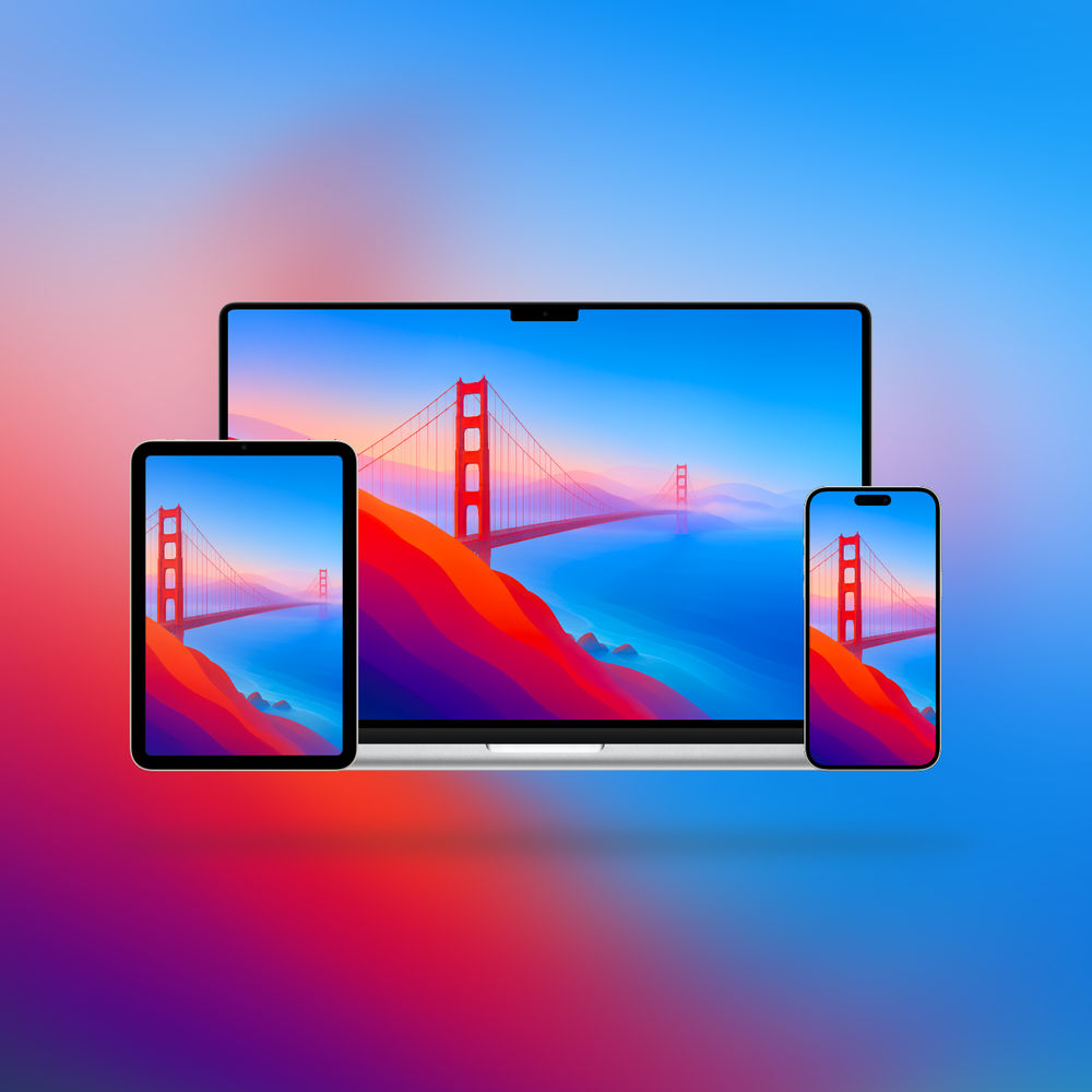
macOS Golden Gate deserved a wallpaper inspired by its namesake.![]()
Apple announced the next version of macOS at its annual developers conference this past week, introducing macOS Golden Gate. But one thing was suspiciously absent from the beta: a wallpaper inspired by the operating system’s namesake. Instead, we got a much more muted, abstract grey-blue-taupe wallpaper designed to unify all the platforms. It’s fine enough, but a proper Golden Gate wallpaper it is not.
The new unified wallpaper of OS27 across Mac, iPadOS, and iOS.
So I set out to right that wrong.
Using Apple’s previous California wallpapers as inspiration, I tried to generate something that felt like it belonged with the OS. What came back was a good start, but in usual AI fashion, the devil was in the details. The trusses were a mangled mess, the cables were hallucinated nonsense, and the longer I looked, the more oddities I found.
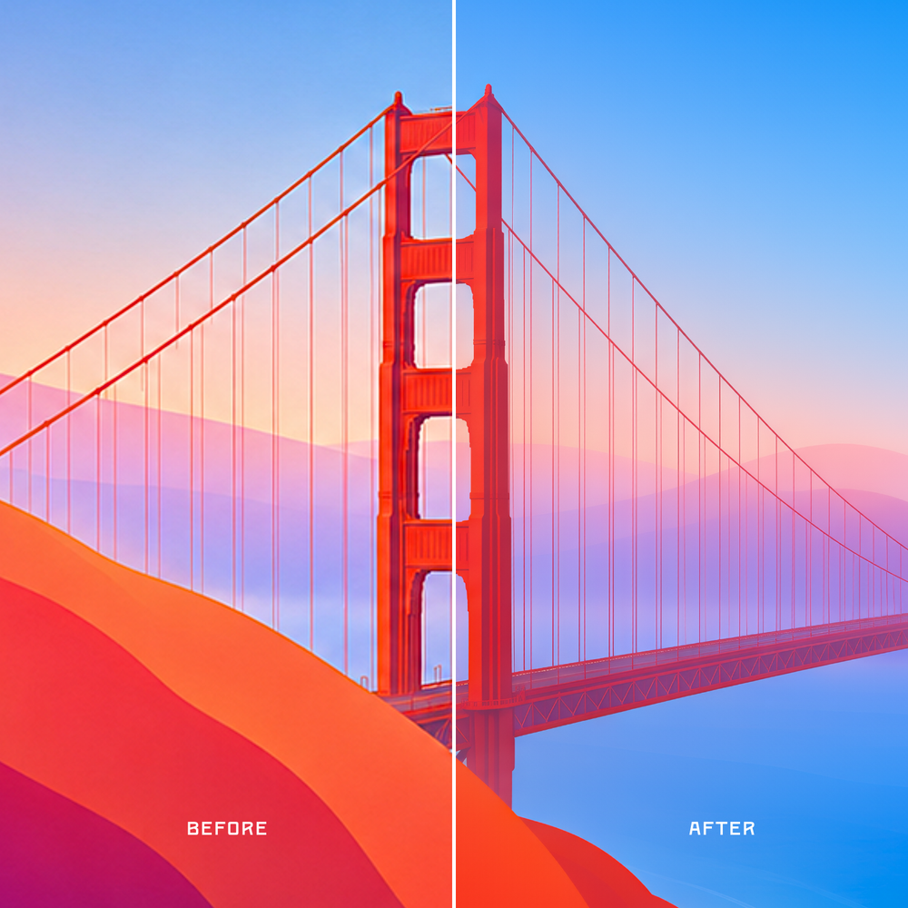
Left: the original generated image.
Right: the final version after upscaling, editing, denoising, and cleanup.
So I spent a bunch of time polishing it into something I felt comfortable sharing. That included various stages of upscaling, denoising, refining, colour editing, and more.
It may still be, as the kids say, AI slop. But it’s AI slop I spent a lot of time trying my hardest to make look as good as I possibly could. Enjoy.
2026-06-10 00:05:39
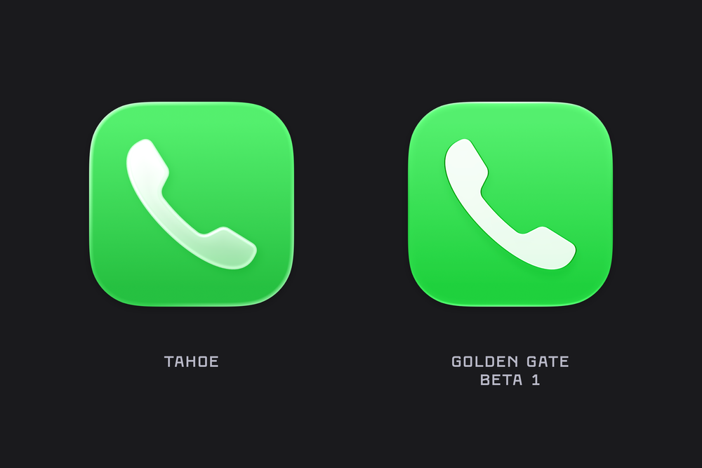
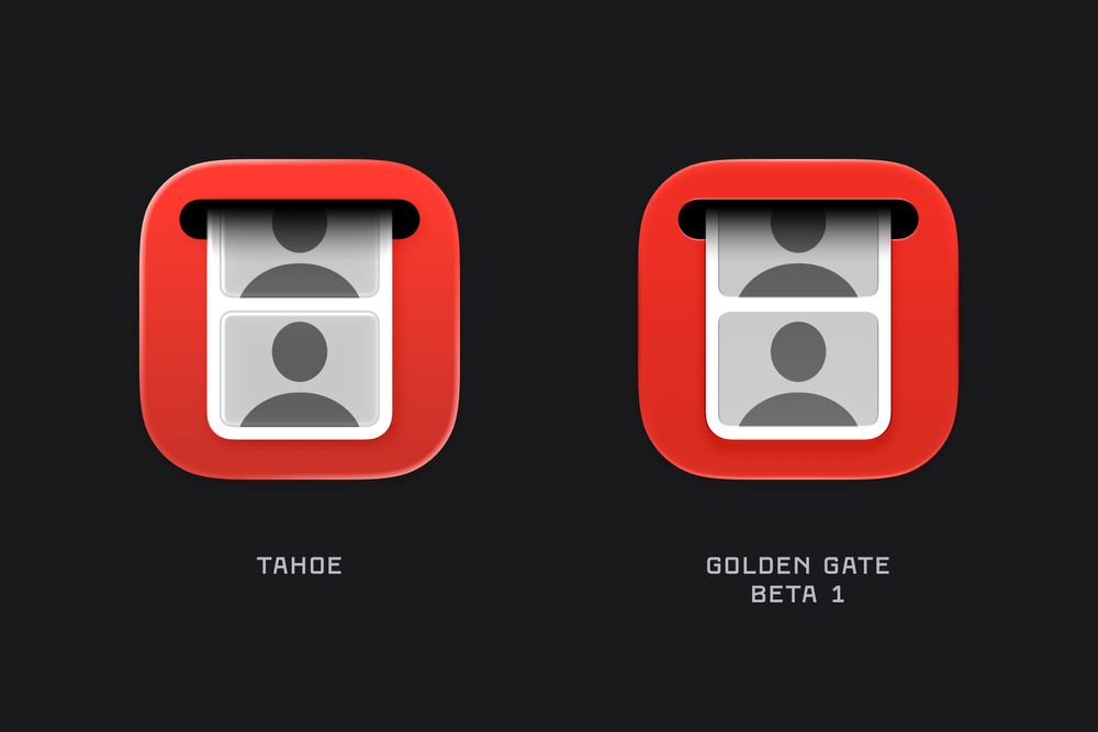
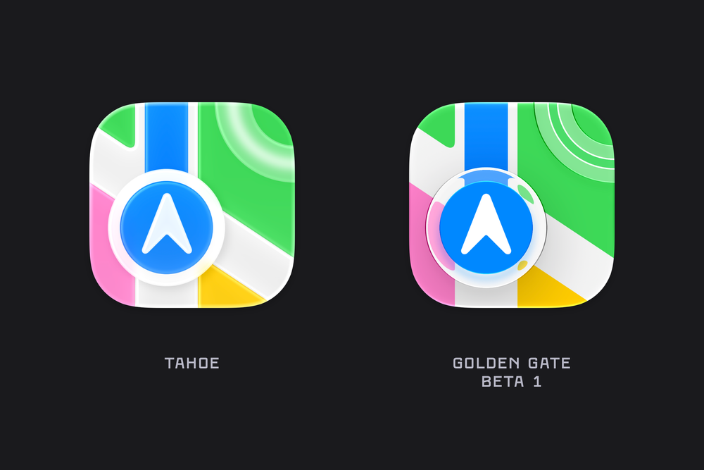
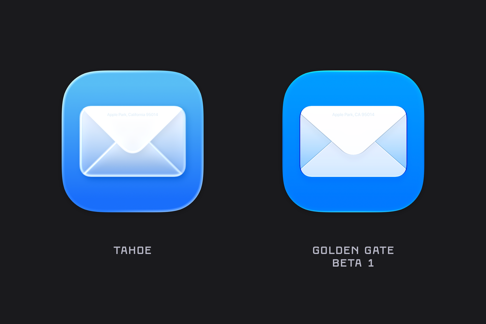
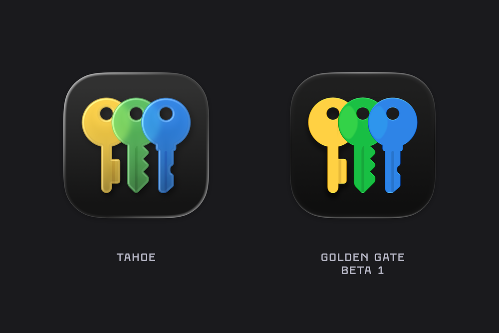
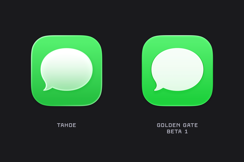
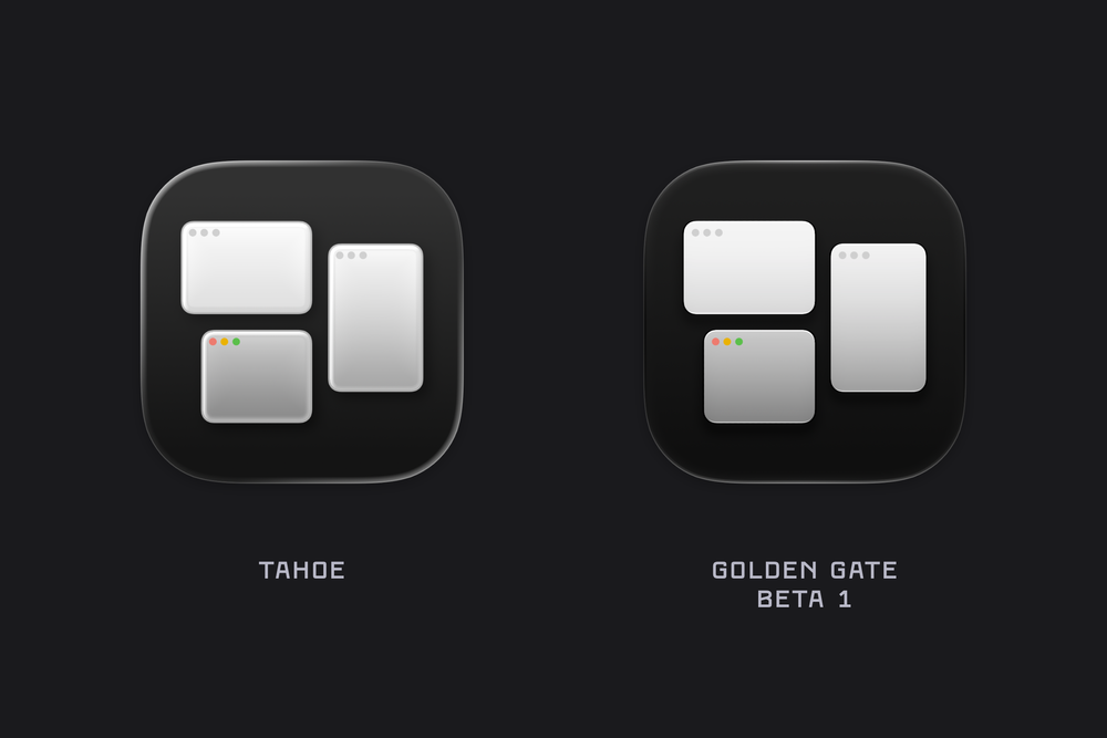
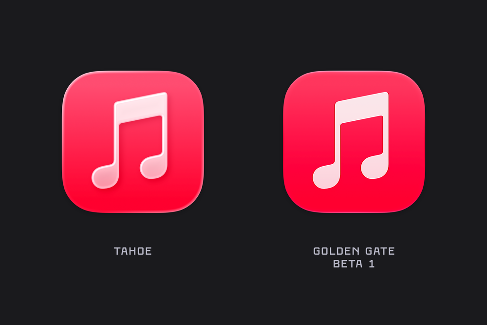
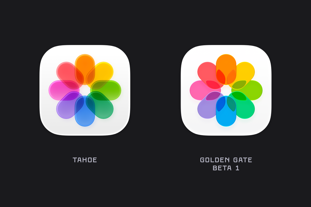
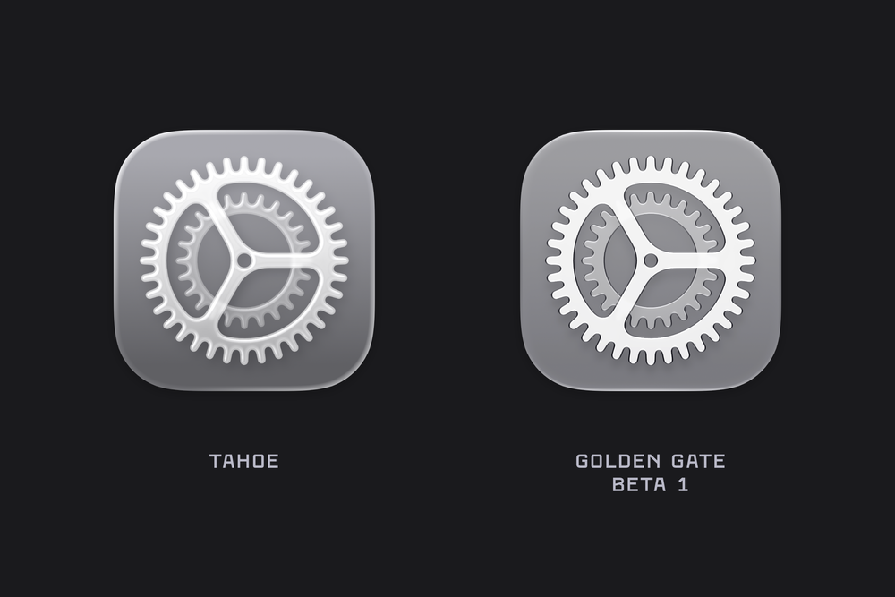
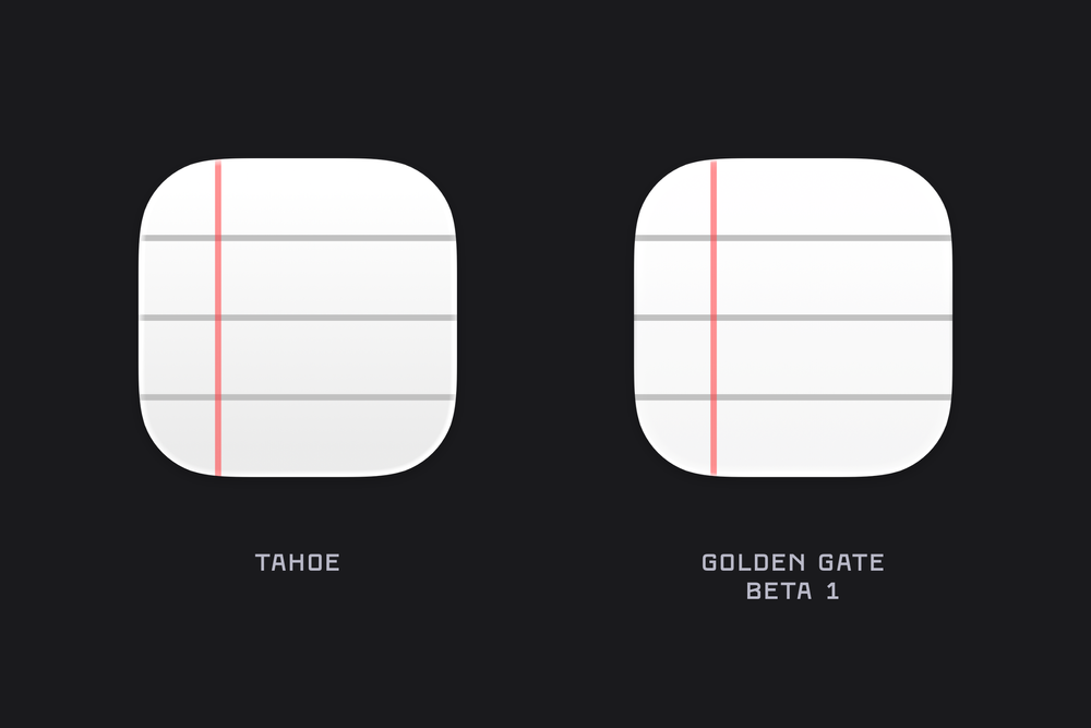
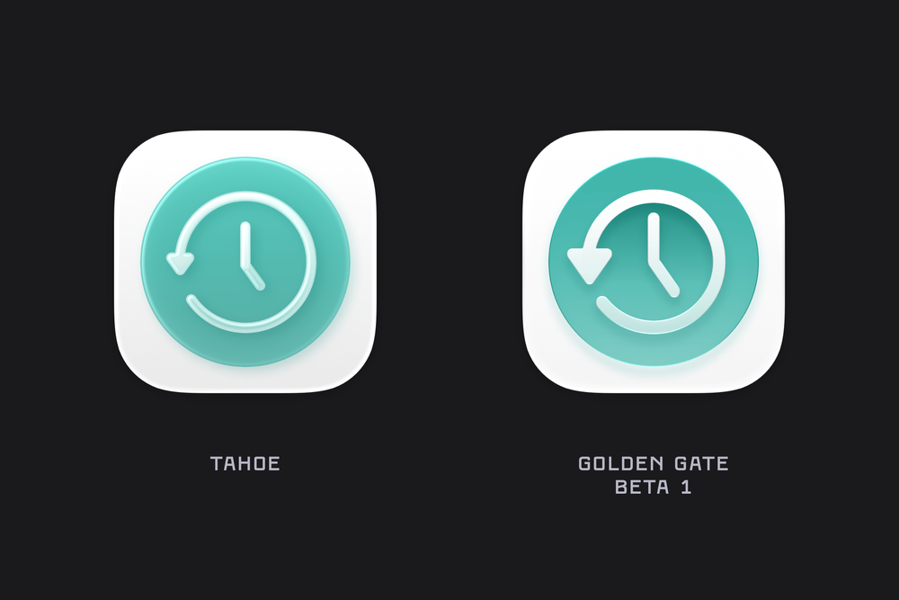
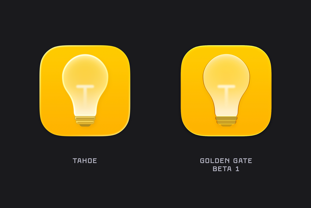
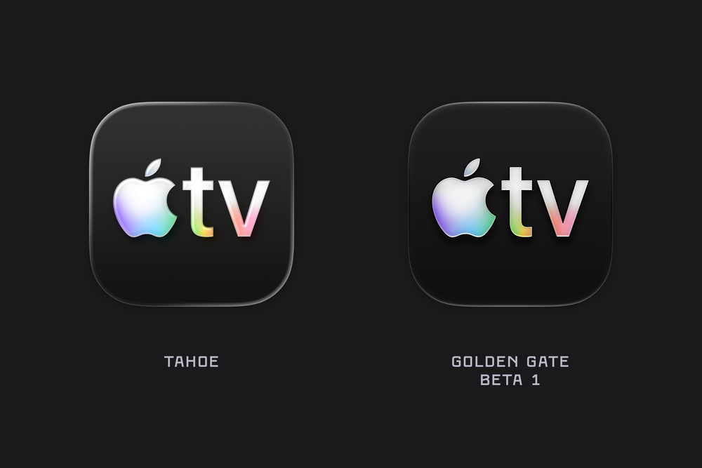
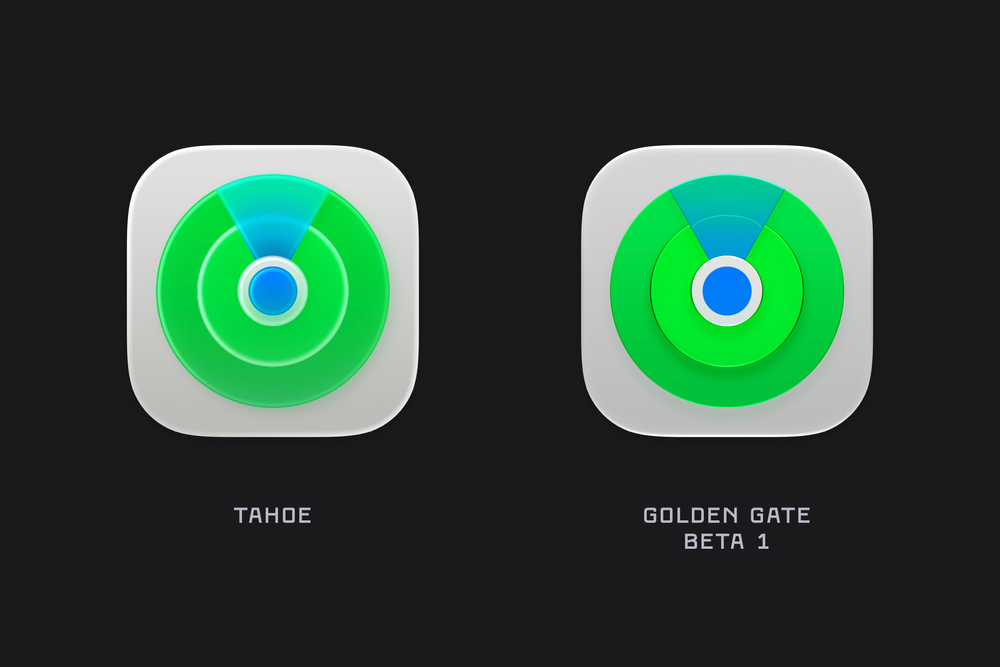
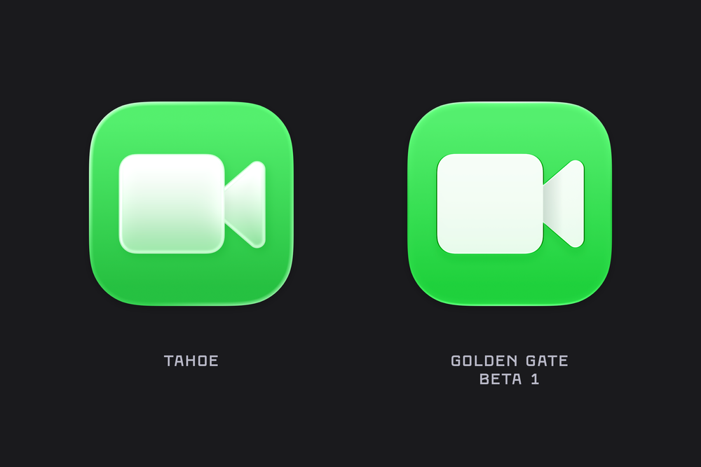
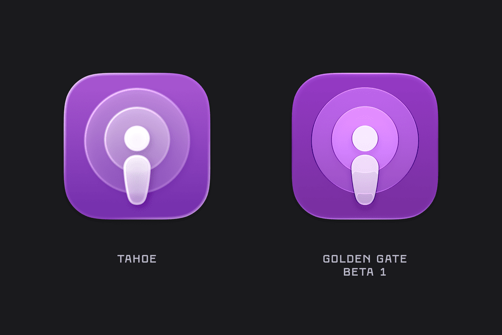
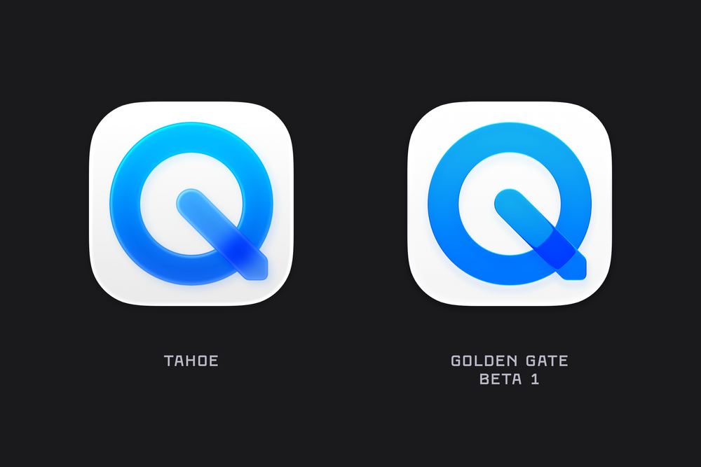
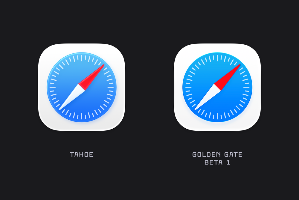
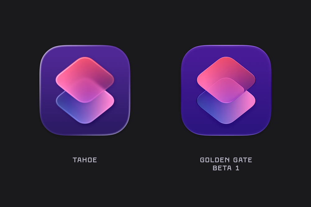
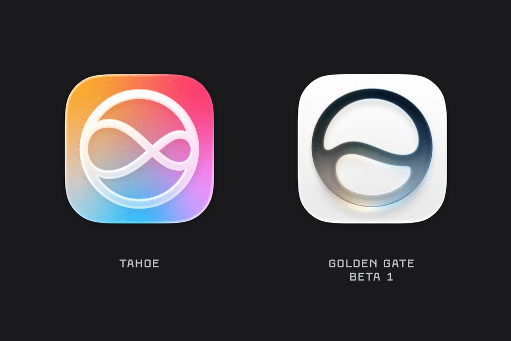
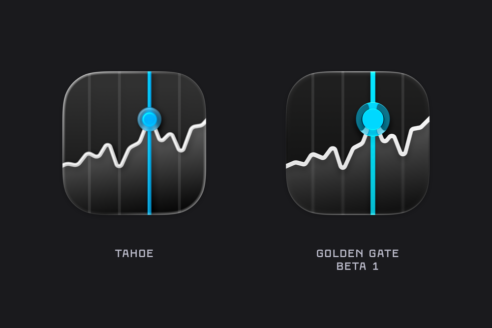
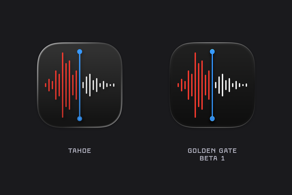
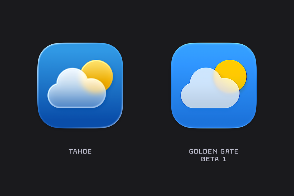
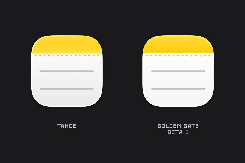
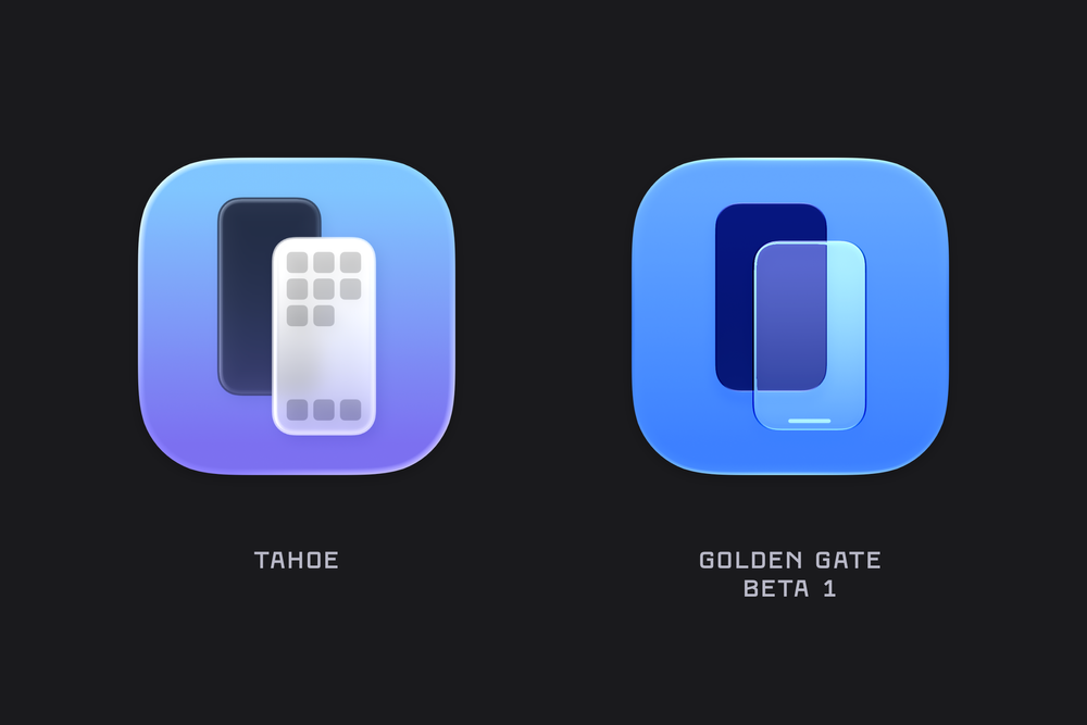
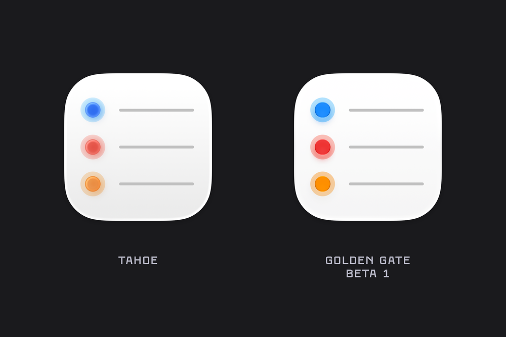
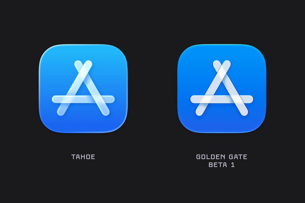
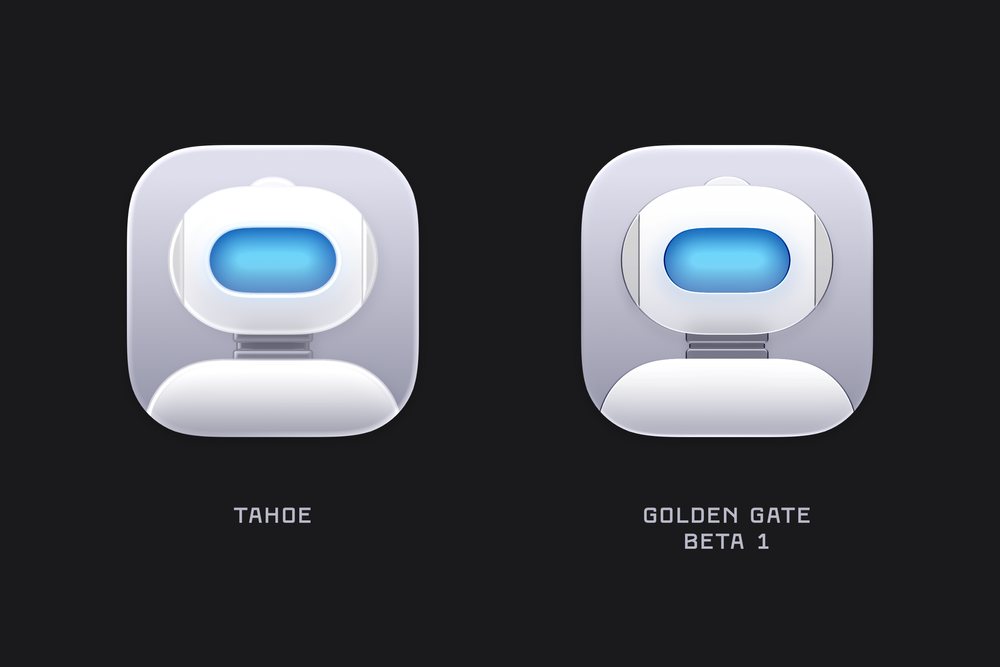
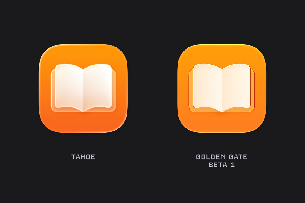
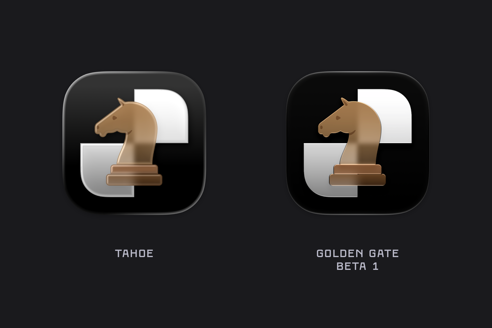
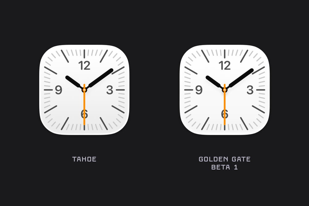
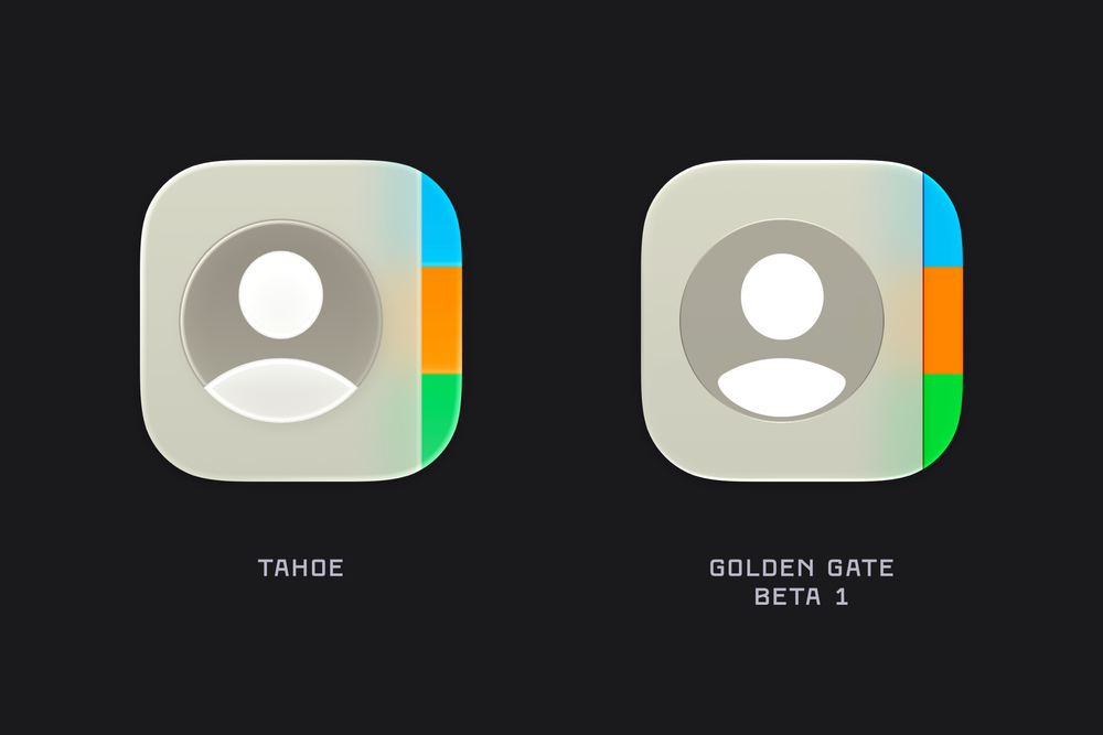
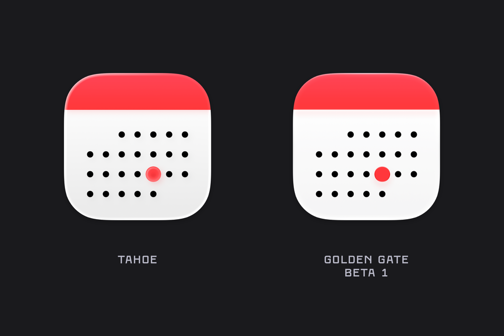
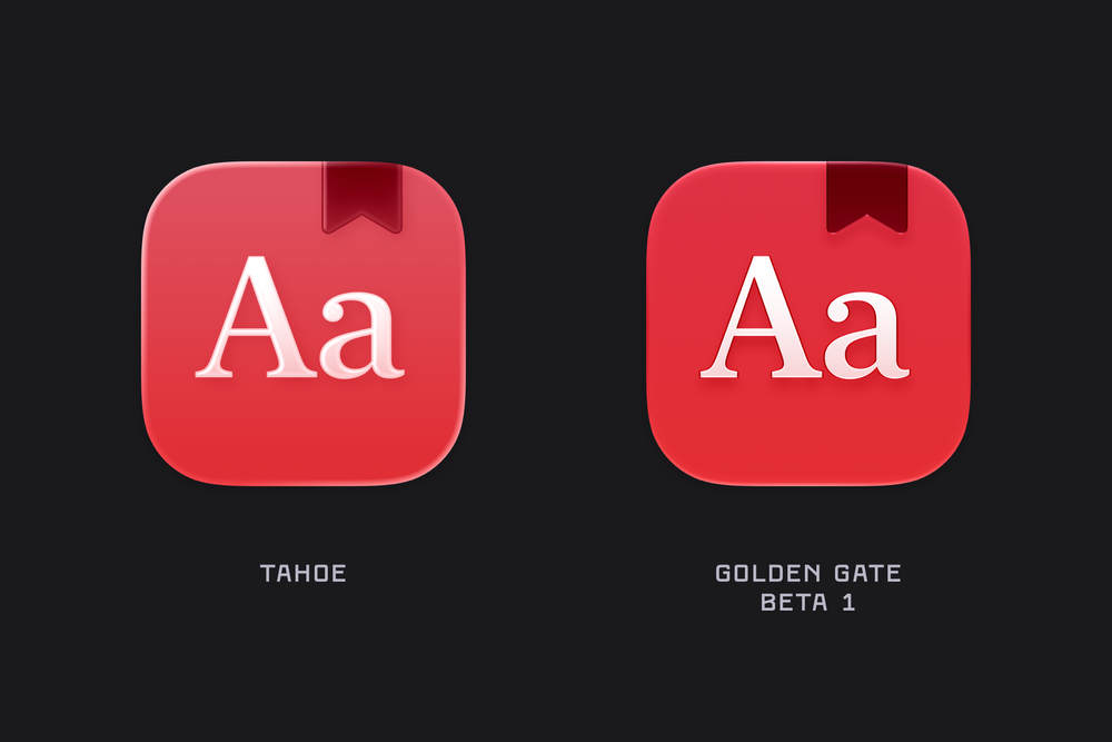
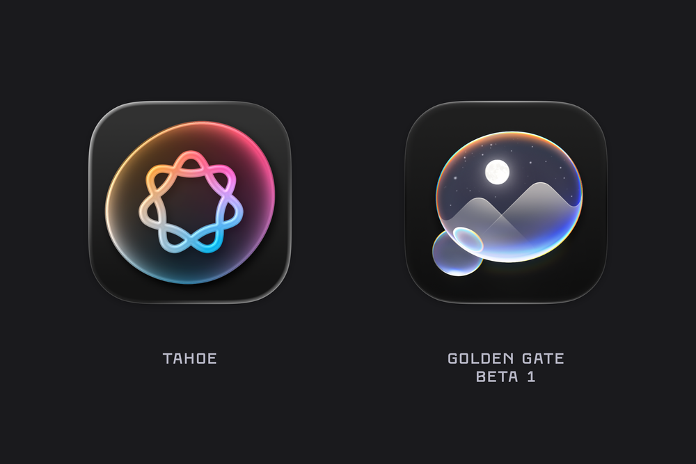
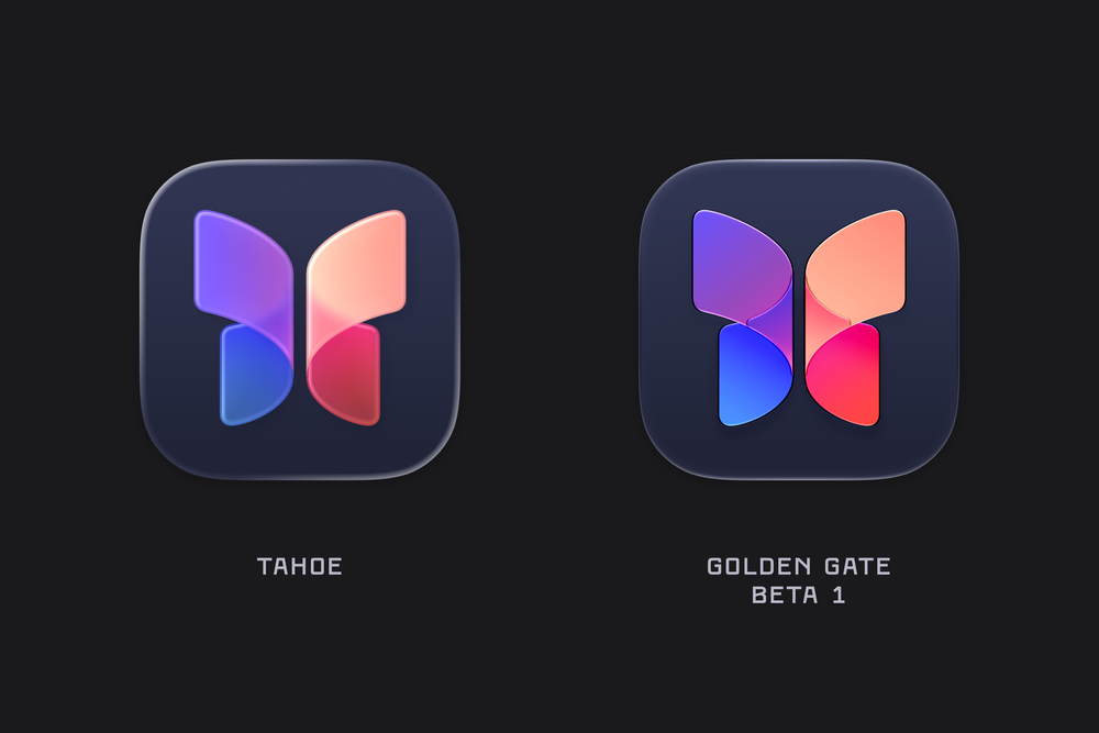
Comparing the macOS System Icons between Tahoe & Golden Gate (beta 1).![]()
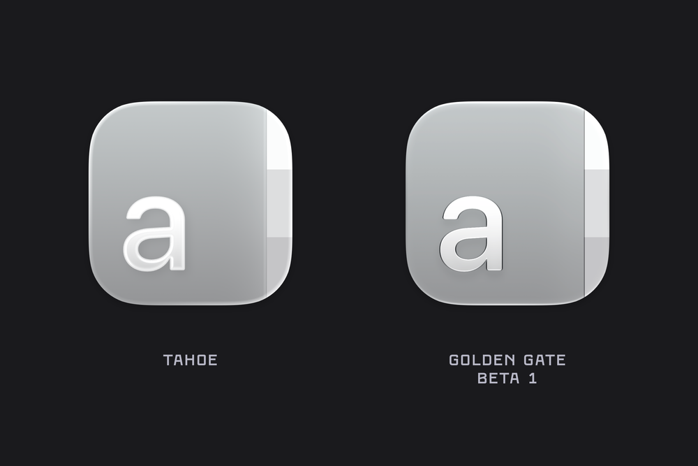
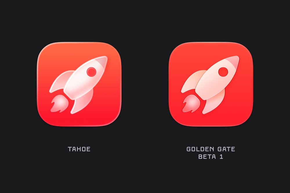
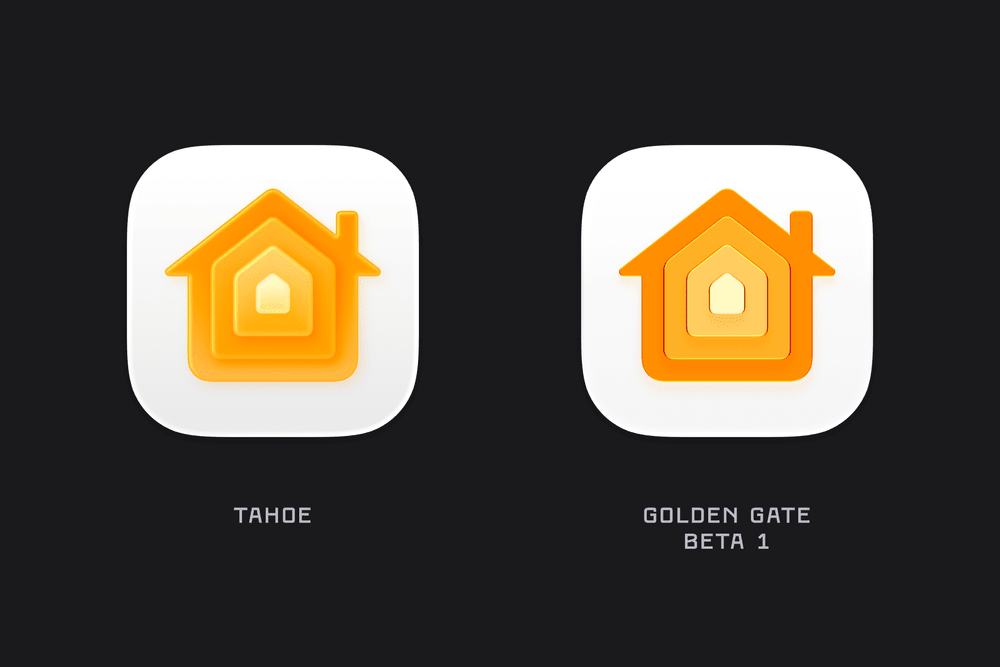
WWDC always brings a torrent of new content, details, and platform-wide changes. One of the first things I noticed after installing the macOS Golden Gate beta was the updated icon design. The colours are much bolder, several icons have been adjusted, and the refraction in the Liquid Glass effect has changed significantly, especially in icons like Journal.
There’s also a noticeable sharpness to the icons, along with a flattening of the Liquid Glass effect. I’m not sure yet whether this is simply an early-beta artifact or the intended final look. For example, while I really like the redesigned Finder icon, the sharp black edges around the nose currently feel a little unrefined.
Here are a list of many of the icons across macOS Golden Gate (beta 1) compared to their liquid glass Tahoe counterpart. Enjoy!
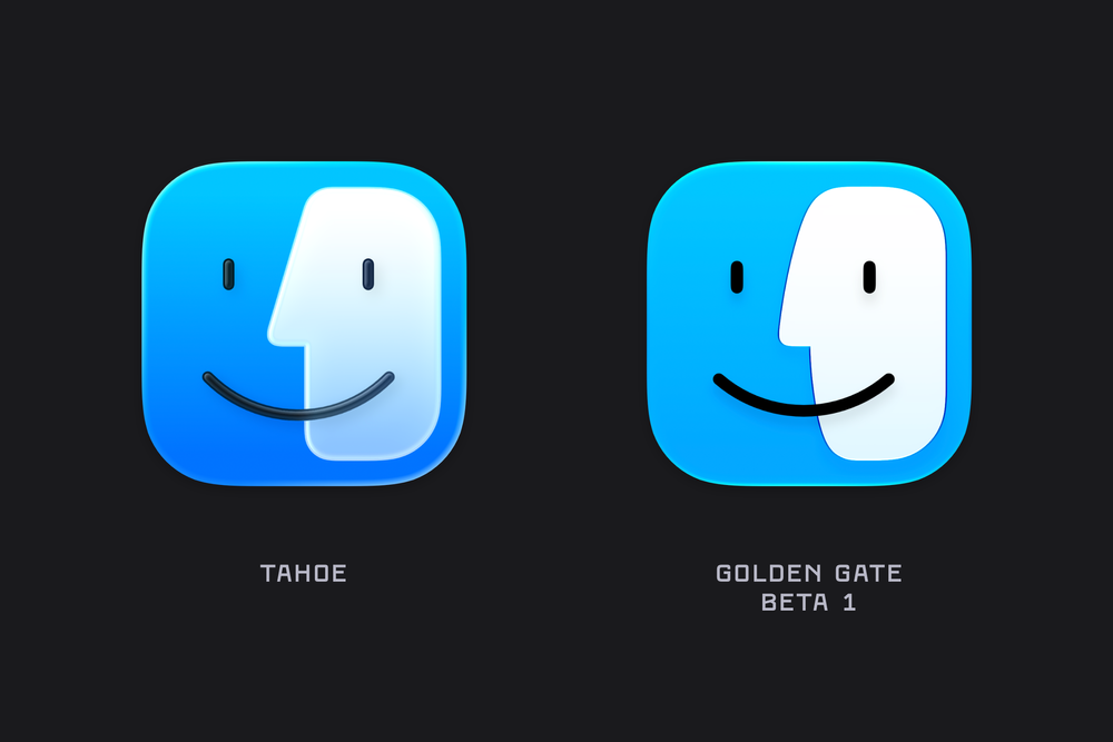
Finder has undergone a bit of rhinoplasty over the past year, returning to the more rounded nose that recalls earlier iterations of the icon.
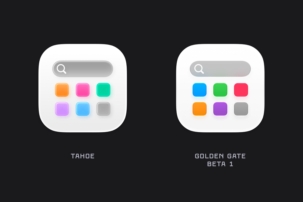
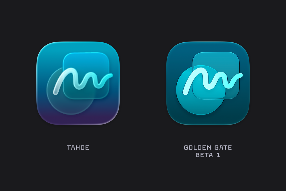
Updated colours, and the refractive properties of the Golden Gate icons are especially noticeable when you compare how the circle distorts as it approaches the edges of the rounded rectangle layered over it.
Journal is another example where we can see the updated refraction brought to macOS icons.