2026-06-14 12:32:35
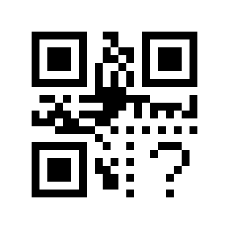
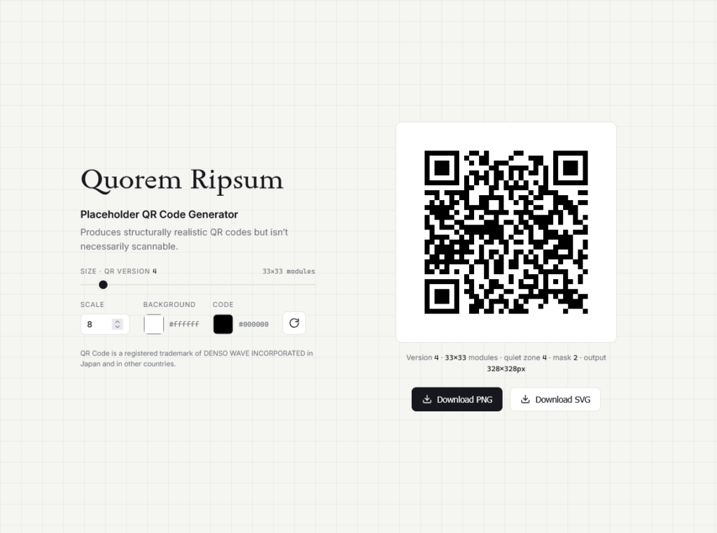
A simple web tool to generate a realistic looking QR code that is not really scannable. Useful for creating QR code placeholders for your designs.
QR Code is a registered trademark of DENSO WAVE INCORPORATED in Japan and in other countries.
Quorem Ripsum appeared first on 1A23 Studio.
2026-06-10 02:42:40
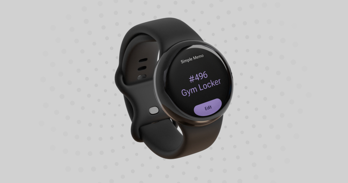
Simple Memo for Wear OS keeps your essential information just a glance away on your smartwatch. Perfect for remembering gym locker combinations, parking spot numbers, temporary door codes, room numbers, or meeting PINs.
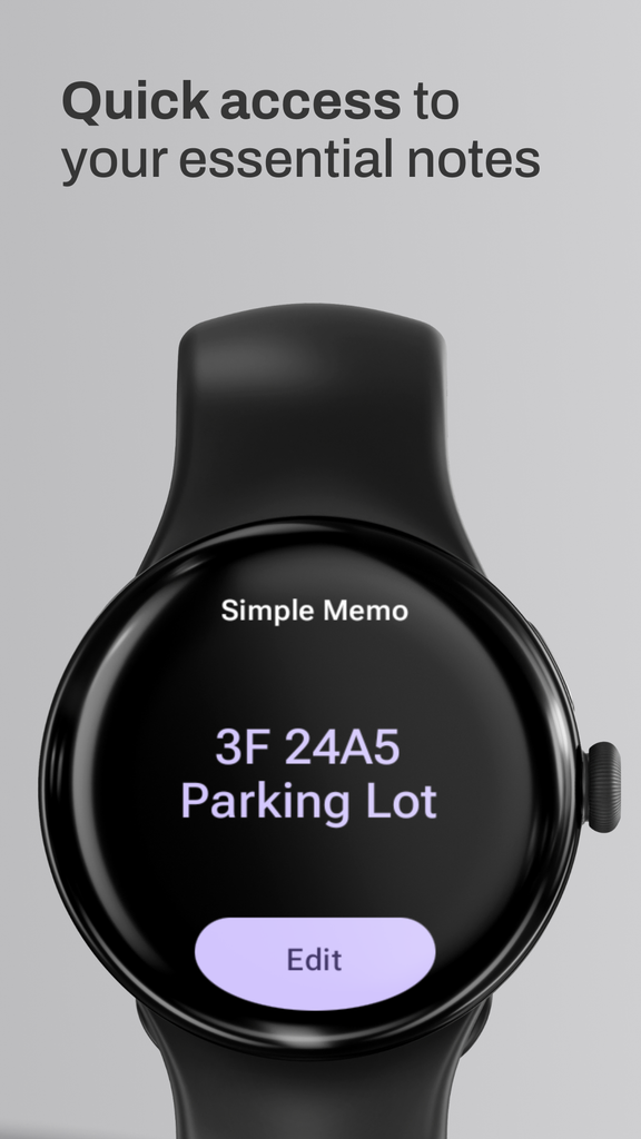
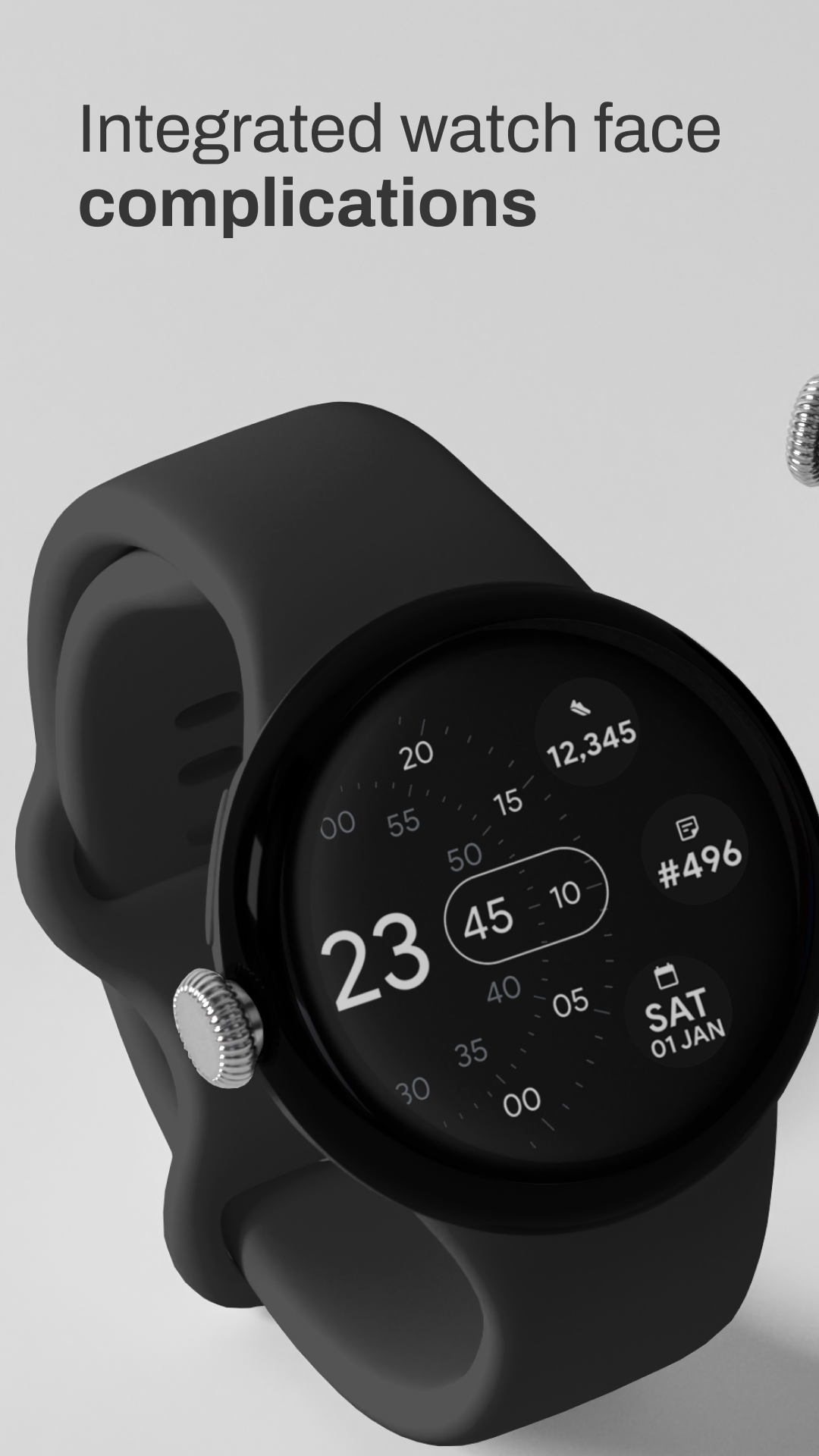
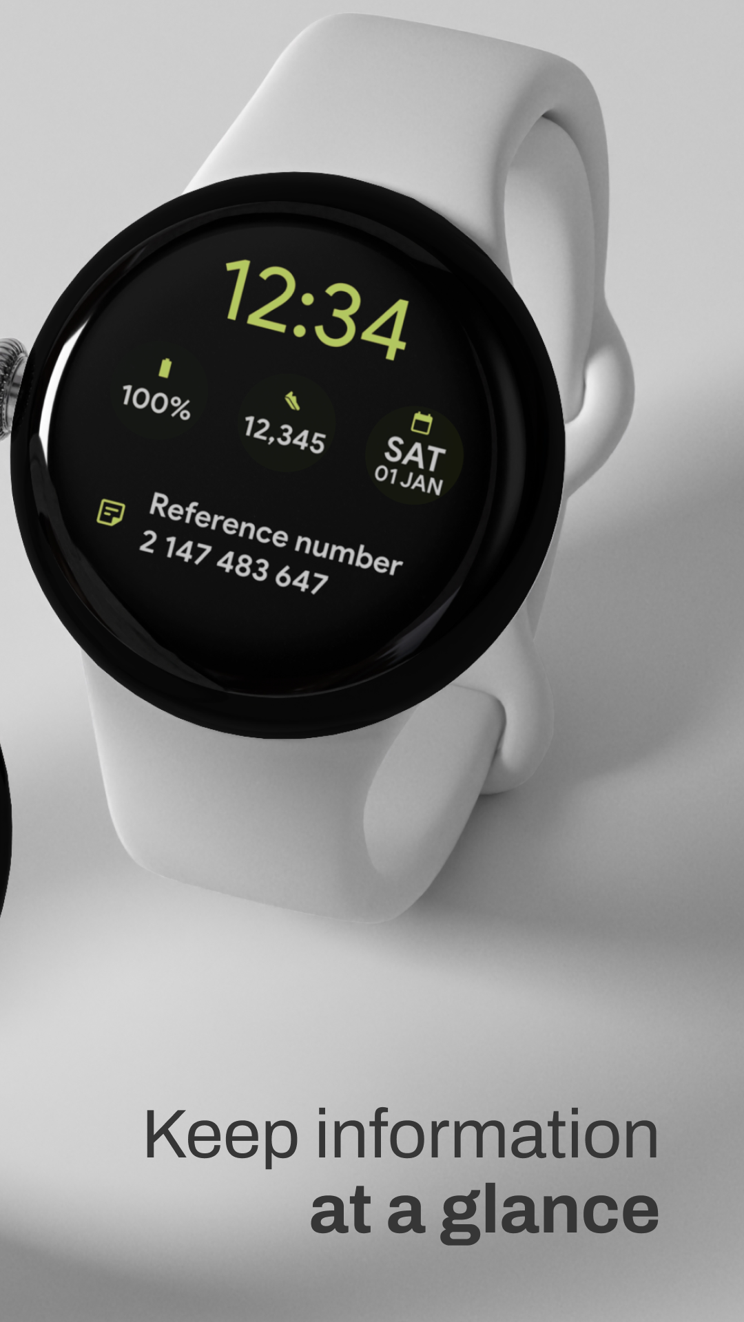
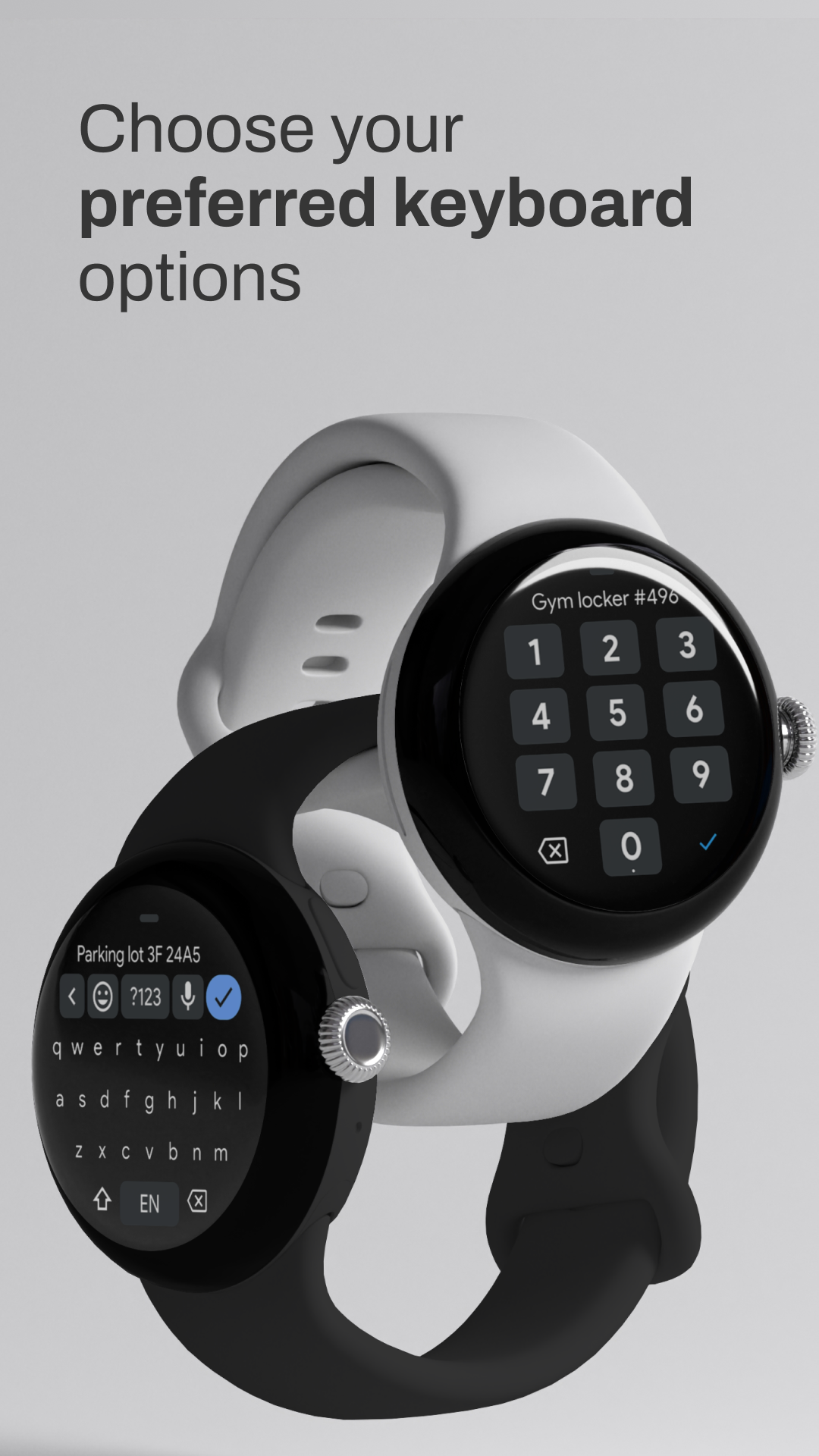
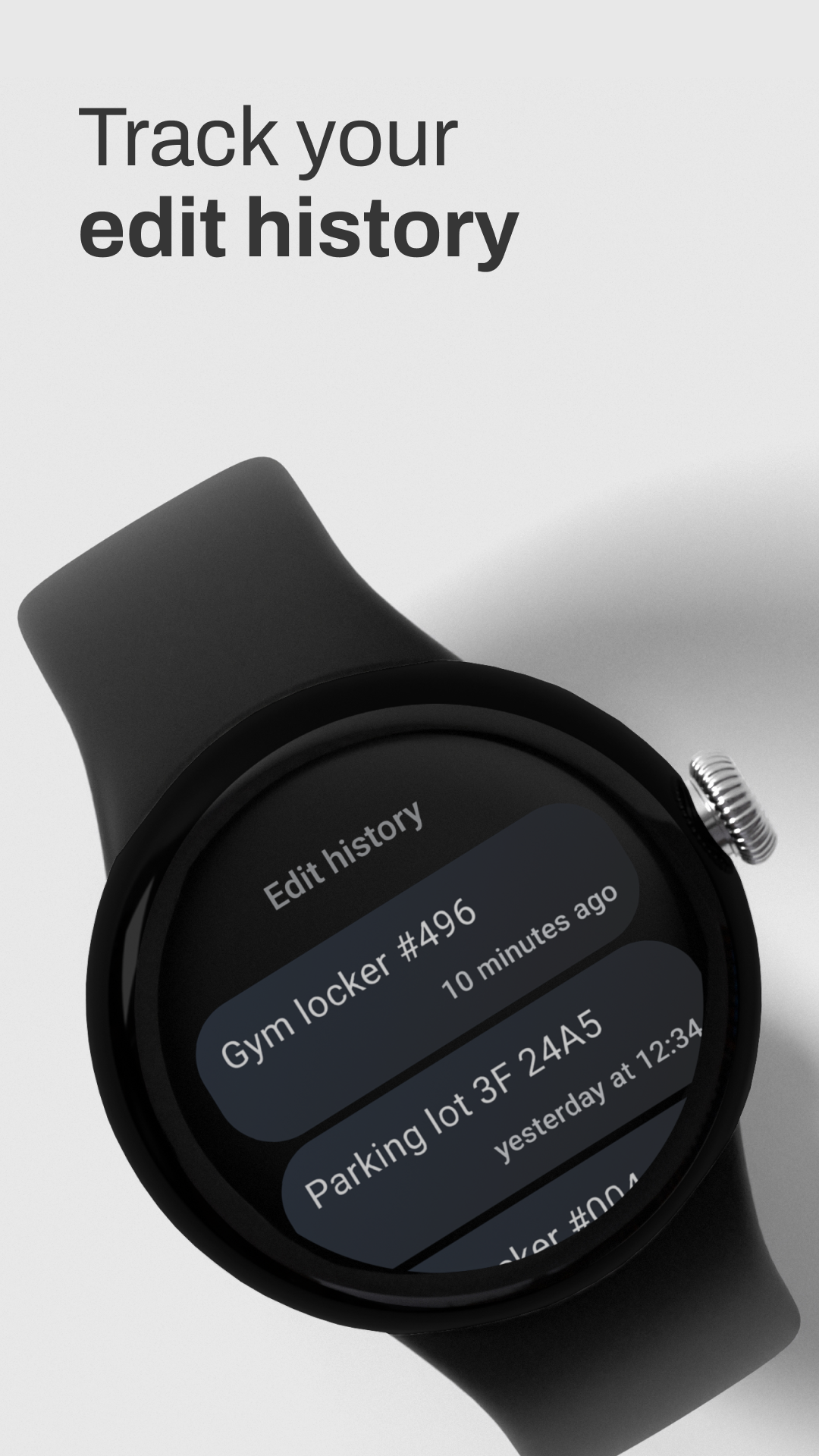
This lightweight app lets you quickly note down and edit a single piece of important information right on your Wear OS watch. Access your memo instantly through the app, a customizable watch face complication, or a convenient Wear OS tile.
The perfect companion for those moments when you need to remember just one crucial detail.
If you have any bug report or feedback, feel free to share it on GitHub.
Simple Memo appeared first on 1A23 Studio.
2026-06-04 09:58:51
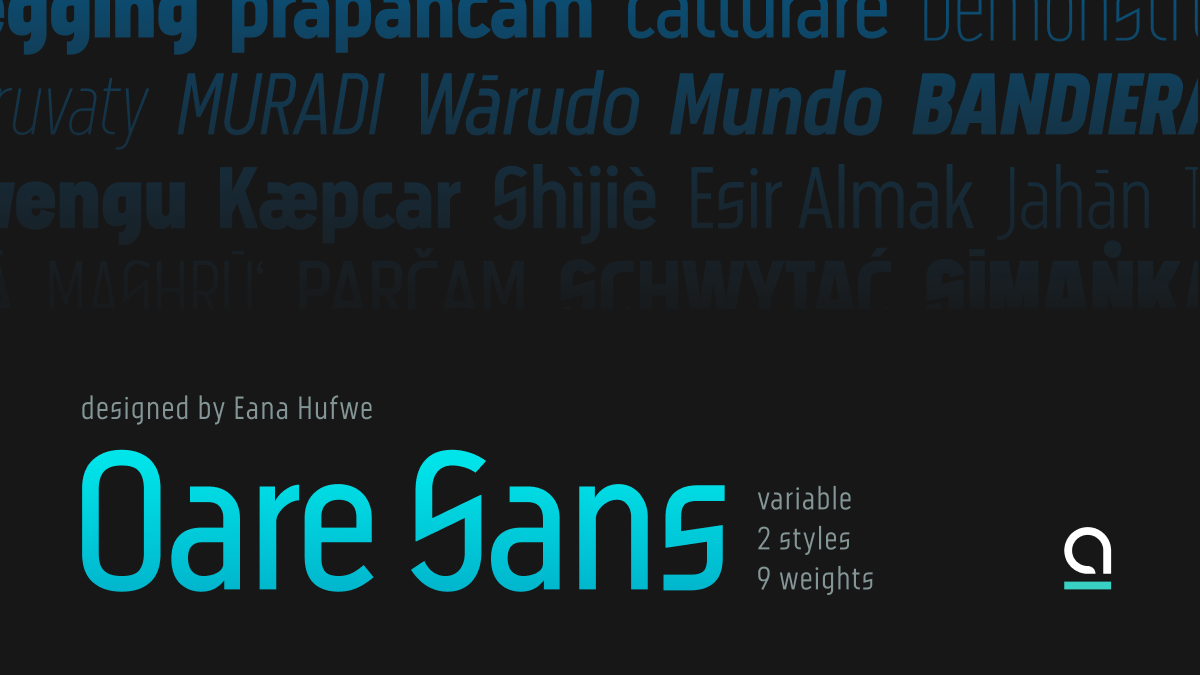
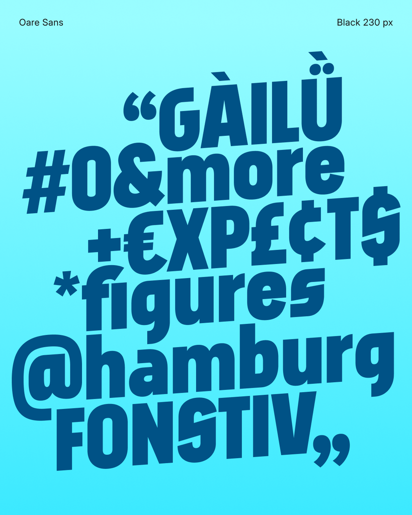
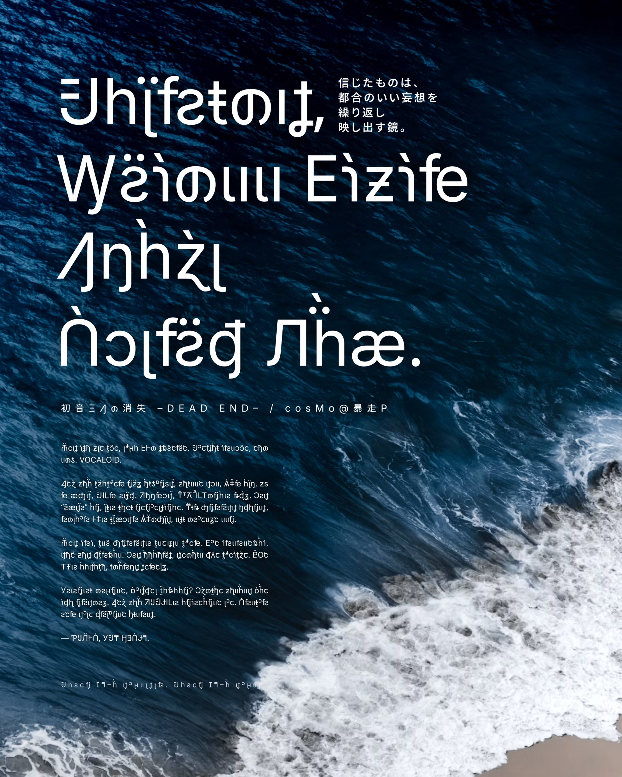
oare n. [o.ˈa.ɾɛ] moon
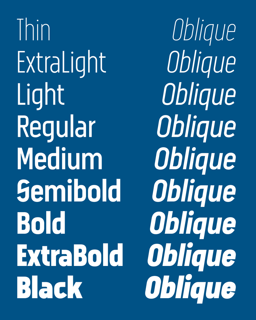
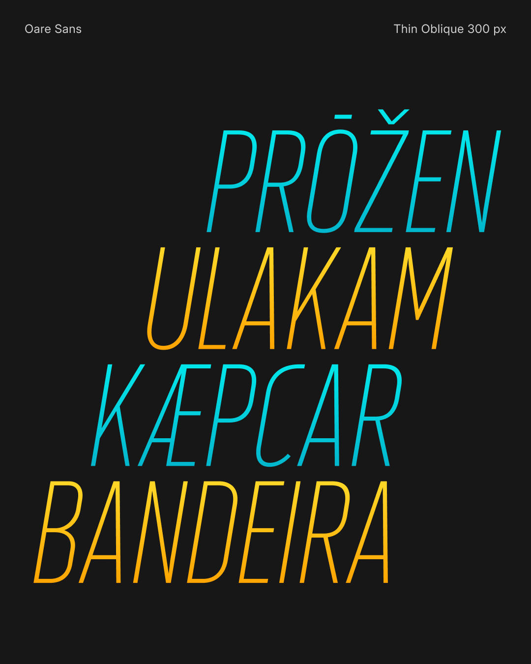
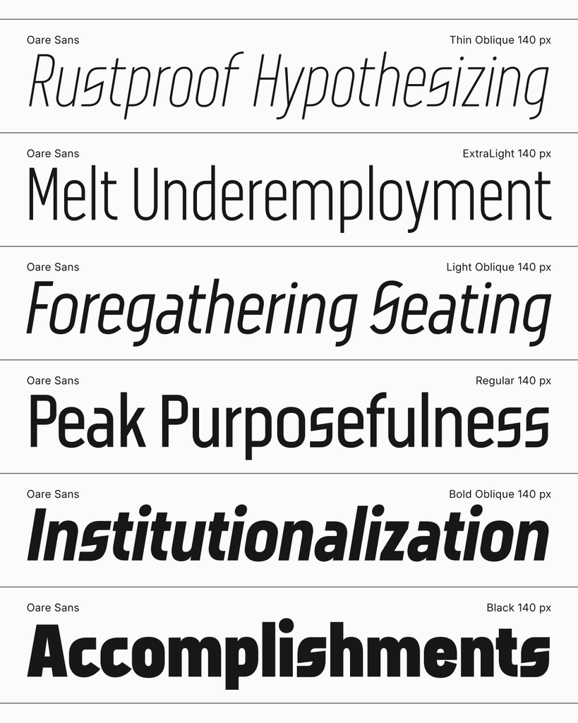
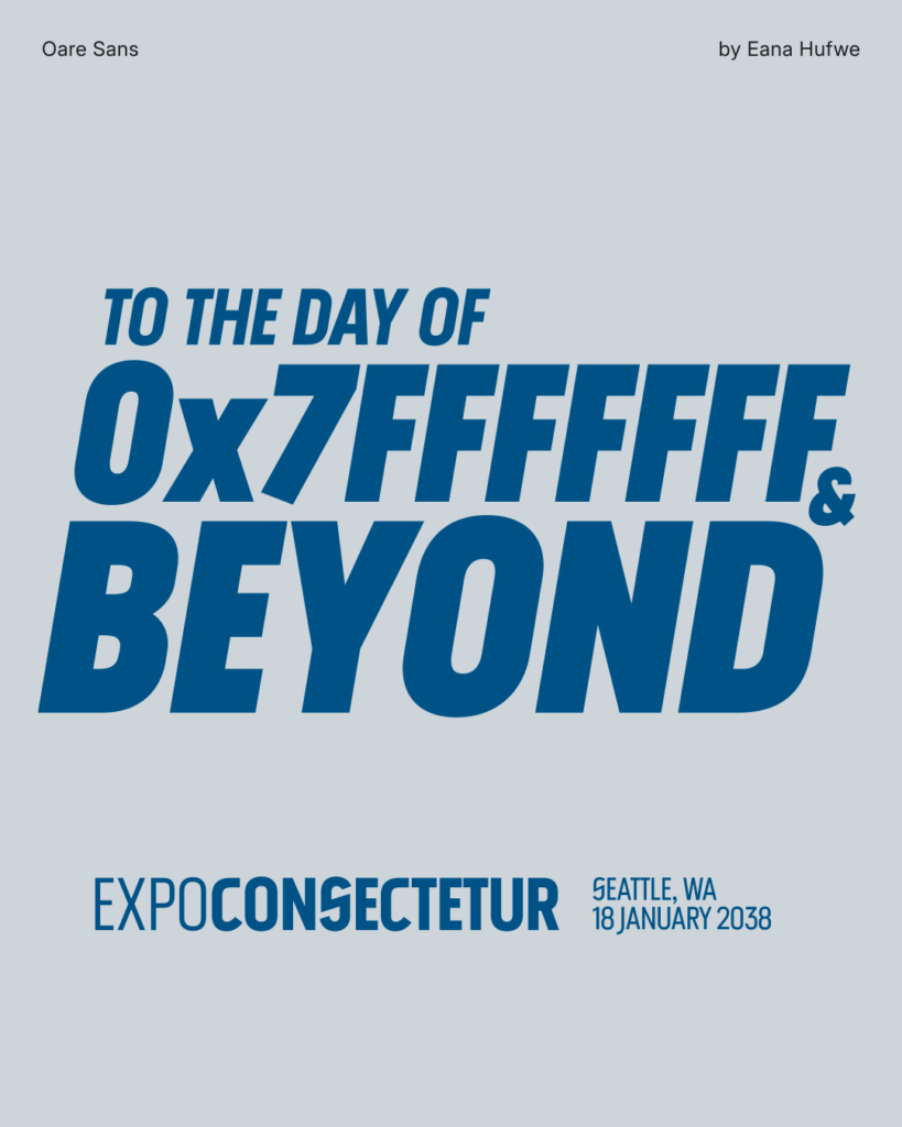
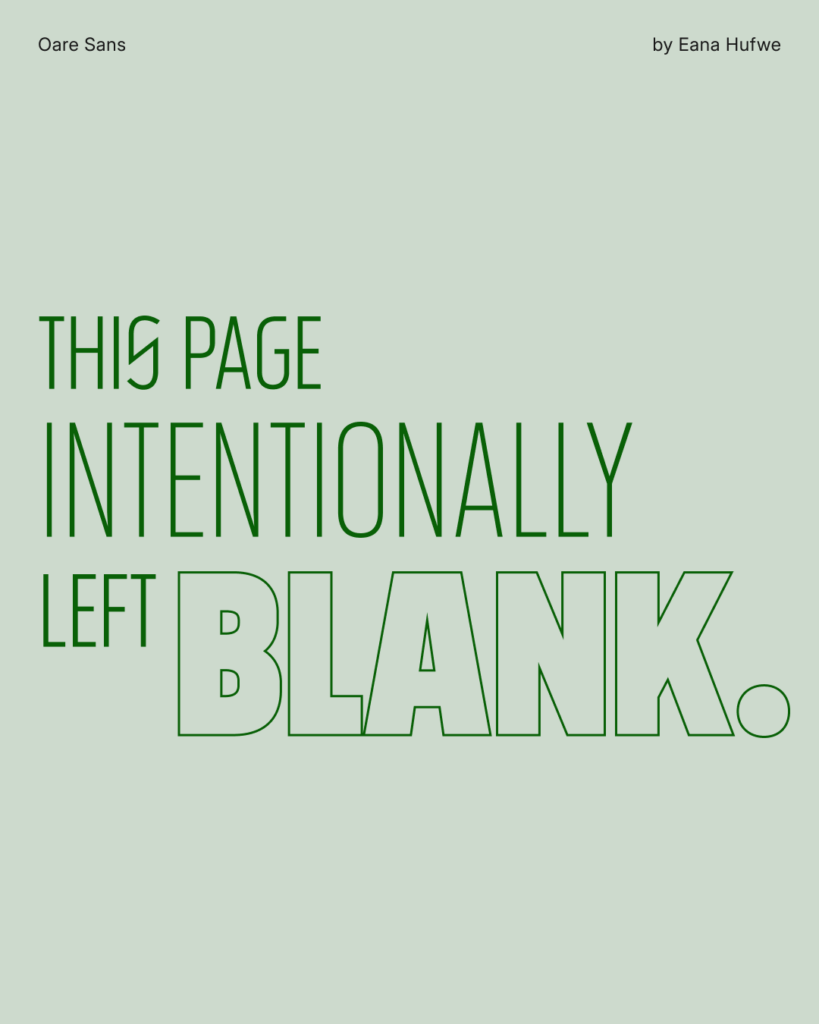
Oare Sans is a condensed geometric display sans-serif typeface with variable axes for weight and slant. This typeface is an expansion of the custom logotype created for PSCTF from a limited set of letters to cover the GF Latin Core character set, and with variable expansion from Thin to Black and Regular to Oblique. This design was initiated from the desire to create a typeface that would match the initial design of the unconventional letter shapes of S and C. The name “Oare” is also named after the Luna CTFd theme commissioned by the same team.
kern, Ligautures liga, Ordinals ordn, Glyph Composition/Decomposition ccmp
locl: Moldavian MOL, Romanian ROU, Turkish TUR, Dutch NLD, and Catalan CAT
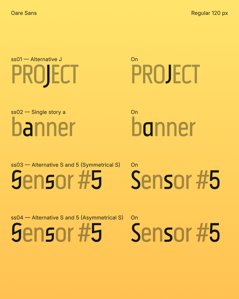
ss01: Alternative Jss02: Single story ass03: Alternative S and 5 (Symmetrical S)ss04: Alternative S and 5 (Asymmetrical S)Copyright (c) 2026 Eana Hufwe, 1A23 Studio (https://1A23.studio)
This Font Software is licensed under the SIL Open Font License, Version 1.1.
This license is in this repo LICENSE.md, and is also available with a FAQ at:
https://openfontlicense.org
Oare Sans appeared first on 1A23 Studio.
2026-06-04 09:57:24
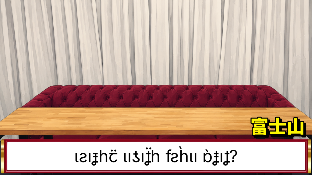
mìkam adp. [mɪ.ˈkam] between.
みっかん 3⃞ 〔mìkam〕(両者)の間に。
Mìkam Kana is a Japanese Kana font built from a patchwork of Inter, to design Japanese Hiragana and Katakana characters that resemble the appearance of Latin-Cyrillic-Greek letters in a Neo-Grotesque Sans-Serif style. The inspiration of the font is to develop a reverse font of Electroharmonix, a font that designs Latin letters in a style that resembles the appearance of Japanese Hiragana and Katakana characters. It is known as the font that “only Japanese people can’t read”. Despite the fact that Mìkam Kana is conceptually a reverse font of Electroharmonix, due to the fact that most Japanese speakers can also read Latin alphabets, Mìkam Kana has ended up being an “exotic and cryptic” font.
The name Mìkam, which means “between”, is both a reference to the fact that the font is designed to be a “between” of Latin and Japanese characters, and also a reference to the name of the base font Inter.
『みっかん』は、Inter のもとにつぎはぎして作られた、ローマ字ゴシック体風の仮名フォントである。インスピレーションは、カタカナに見えるローマ字フォントで、かの有名な「日本人だけが読めないフォント」として知られている Electroharmonix の逆バージョンのようなフォントを作りたかったのですが、いかんせん日本語話者は皆おおむねローマ字も読めるため、普通に暗号フォントのようなものを作ってしまいました。
フォント名の「みっかん」は、「両者の間に」(between)という意味で、フォントがローマ字と仮名の「間」に位置することを表すとともに、ベースフォントである Inter へのオマージュでもあります。
This font covers most hiragana, katakana, and selected punctuation characters.
Recommended pairing fonts: Inter, Gen Interface JP, Source Han Sans.
このフォントは、ひらがな、カタカナ、および一部の約物を収録しています。
推奨の混植フォント:Inter、Gen Interface JP、源ノ角ゴシック。
Copyright (c) 2026 Eana Hufwe, 1A23 Studio (https://1A23.studio)
Copyright (c) 2016 The Inter Project Authors (https://github.com/rsms/inter)This Font Software is licensed under the SIL Open Font License, Version 1.1.
This license is in this repo LICENSE.md, and is also available with a FAQ at:
https://openfontlicense.orgこのフォントソフトウェアは、SIL Open Font License, Version 1.1 のもとでライセンスされています。
このライセンスはこのリポジトリの LICENSE.md に記載されており、FAQ とともに https://openfontlicense.org にも公開されています。
Mìkam Kana みっかん appeared first on 1A23 Studio.
2026-02-09 04:25:38
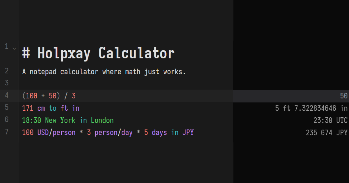
holpxay n. [hol.ˈp’aj] number.
A notepad calculator where math just works. Type expressions, see results instantly.
Arithmetic & Numbers
+, -, *, /, ^, !, mod, and parentheses×, ·, ÷
50%, 200 * 15%), scientific notation, underscore separators0xFF), binary (0b1010), octal (0o777), arbitrary bases (ABC base 16)pi, e, phi) and functions (sin, cos, sqrt, log, round, abs, random, …)Units & Conversions
5 km + 500 m, 100 ft^2 + 5 m^2
60 km/h, 9.8 m/s^2, 50 watts per square meter
5 ft 7 in, 2 hr 30 min 15 sec
to, in, as, ->, →
171 cm to ft in
150 apples / 30 apples/day
Date & Time
today, 3 days ago, 2 weeks from now)now + 100 days, 2038 Jan 19 - today
18:30 Tokyo, now in London, UTC offsets1700000000 unix
today to weekday, now to hour
Currency
100 USD + 50 EUR, 100 USD to JPY
150 USD/person * 4 person
Variables & Conditionals
price = 49.99
&&, ||, !
if 5 > 3 then 100 else 200
&, |, xor, ~, <<, >>
Output Formats
to hex, to binary), fractions, scientific notation, percentages, ordinalspi to 2 decimals, 12345 to 3 sig figs
Editor
#)Holpxay Calculator appeared first on 1A23 Studio.
2026-01-13 00:25:58
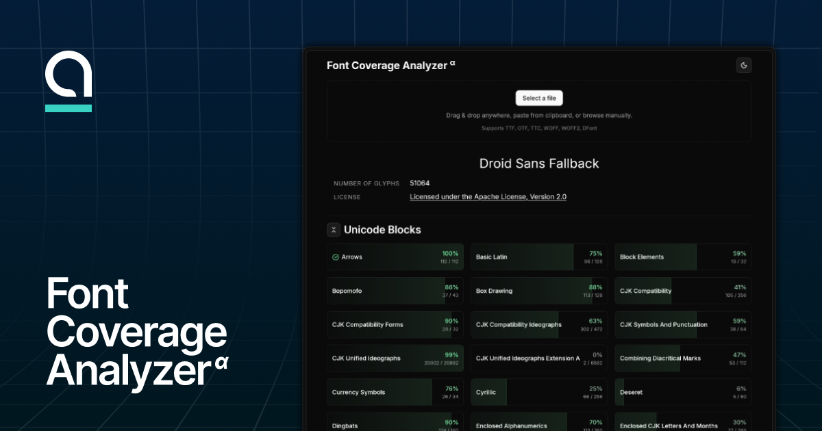
A web tool to check codepoint / glyph coverages of a font. Capable of checking coverage of the following collections:
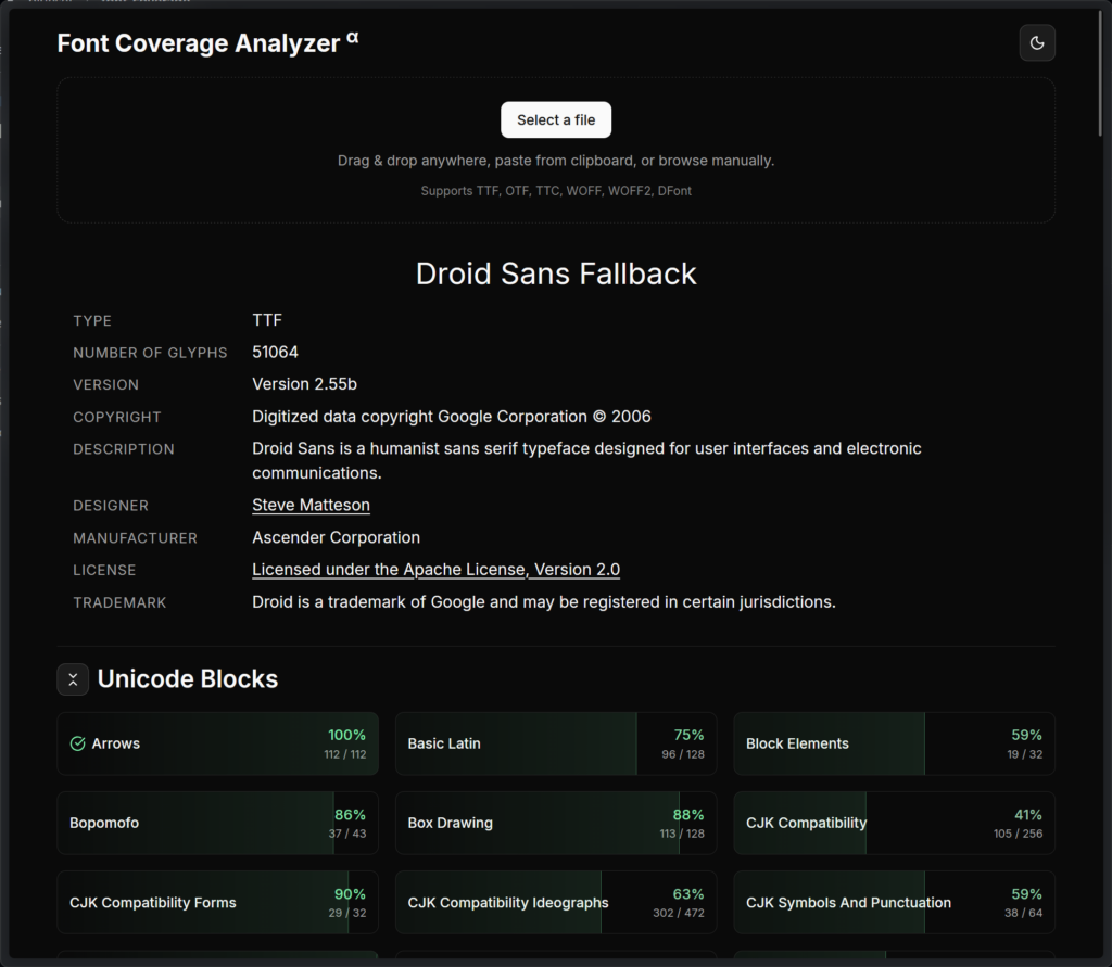
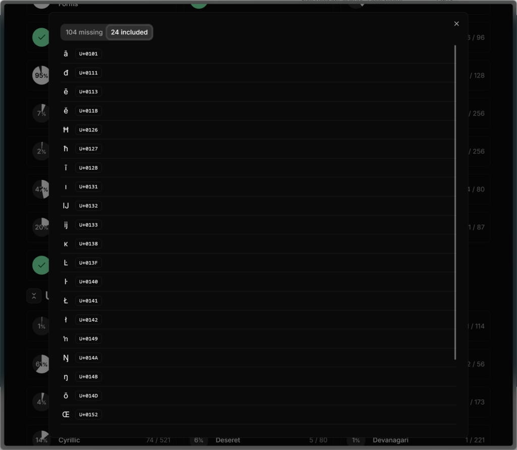
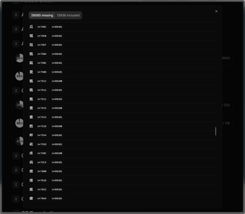
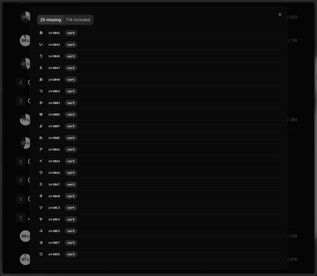
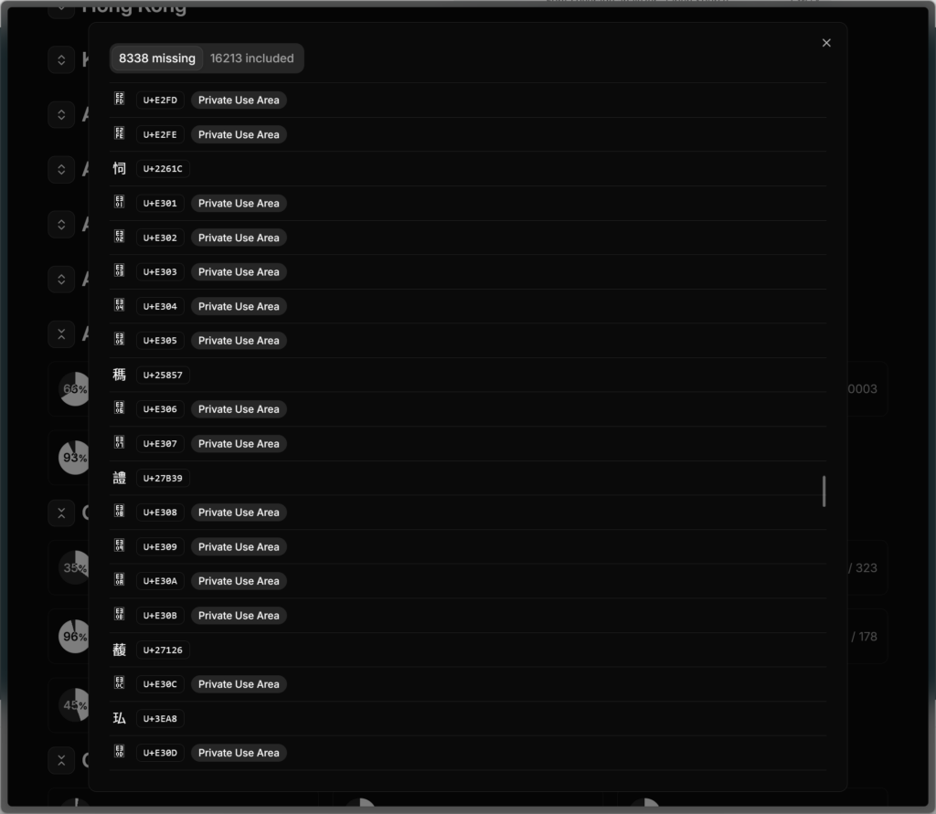
Font coverage analyzer appeared first on 1A23 Studio.